Navigation
In this chapter, you will:
- Build hierarchical navigation with
NavigationStackandNavigationView- Push screens with
NavigationLinkand route values withNavigationLink::value- Drive the stack programmatically with
NavigationPathandNavigationPathController- Organize your app with tabs using
TabsandTab
As your app grows beyond a single screen, you need a way to move between them. A user taps a contact to see their details, navigates to settings, or switches between tabs. WaterUI provides a declarative navigation system that lowers to native platform patterns — UINavigationController on Apple platforms, fragment navigation on Android — giving your app a first-class feel on every platform.
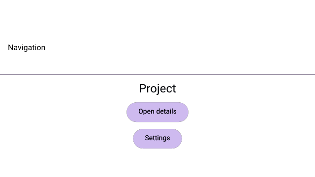
A Hydrolysis preview of WaterUI navigation chrome and links. Example source.
NavigationStack
NavigationStack is the container that manages a stack of navigation views. Think of it as a deck of cards: the root screen is at the bottom, and each navigation action pushes a new card on top.
use waterui::prelude::*;

fn home_screen() -> impl View { text("Home") }

fn app_root() -> impl View {
    NavigationStack::new(home_screen())
}
The root view is displayed initially. When navigation occurs (via NavigationLink or programmatically), new screens slide in on top.
NavigationView
Every screen in a stack is a NavigationView. It pairs a navigation bar with your content. The most ergonomic way to build one is the .title(...) modifier from ViewExt, which wraps any view in a NavigationView:
use waterui::prelude::*;

fn detail_screen(name: &str) -> NavigationView {
    vstack((
        text(name.to_string()).title(),
        text("Some detail content"),
    ))
    .title("Detail")
}
You can also call NavigationView::new(title, content) directly when you want full control over the bar.
Title display mode
Control how the title appears in the navigation bar:
use waterui::prelude::*;

fn settings(content: impl View) -> NavigationView {
    content.title("Settings").large_title()
}

fn detail(content: impl View) -> NavigationView {
    content.title("Detail").inline_title()
}
The NavigationTitleDisplayMode enum has three variants:
| Mode | Behavior |
|---|---|
Automatic | System decides (large on root, inline when pushed) |
Inline | Always small inline title |
Large | Large title that collapses on scroll |
Tip: Follow platform conventions — use
.large_title()on root screens and.inline_title()on pushed detail screens. This matches what users expect on iOS and macOS.
Bar slots
NavigationView exposes leading and trailing slots so you can place toolbar content beside the title:
use waterui::prelude::*;

fn toolbar_screen(content: impl View) -> NavigationView {
    content
        .title("Inbox")
        .navigation_bar_leading(button("Cancel").action(|| {}))
        .navigation_bar_trailing(button("Done").action(|| {}))
}
For full customisation — bar background color, hidden state, or a search field — set the Bar fields directly via NavigationView::new(...) and friends.
NavigationLink
The simplest way to add push navigation is NavigationLink. It renders as a tappable element that pushes a new screen when activated:
use waterui::prelude::*;

fn settings_content() -> impl View { text("Settings") }
fn profile_content() -> impl View { text("Profile") }

fn home_screen() -> impl View {
    vstack((
        text("Home").title(),
        NavigationLink::new(
            "Go to Settings",
            || settings_content().title("Settings"),
        ),
        NavigationLink::new(
            "View Profile",
            || profile_content().title("Profile"),
        ),
    ))
}
The first argument is the label (any IntoLabel), and the second is a closure that returns the destination NavigationView when the link is tapped. The closure is a ViewBuilder, so it only runs when navigation actually occurs.
Note:
NavigationLinkmust live inside aNavigationStack. A debug assertion fires if it is used outside a navigation context.
Programmatic navigation with NavigationPath
NavigationLink is great for simple drill-downs, but real apps need deep links, “back to root” actions, and routing from button handlers. For programmatic control, model navigation with a typed NavigationPath<T>:
use waterui::prelude::*;

#[derive(Clone, PartialEq, Eq)]
enum Route {
    Detail(i32),
    Settings,
}

fn detail_screen(id: i32) -> impl View { text!("Detail {id}") }
fn settings_screen() -> impl View { text("Settings") }
fn home_screen() -> impl View { text("Home") }

fn app() -> impl View {
    let path: NavigationPath<Route> = NavigationPath::new();

    NavigationStack::with(path.clone(), home_screen())
        .destination(|route| match route {
            Route::Detail(id) => detail_screen(id).title("Detail"),
            Route::Settings => settings_screen().title("Settings"),
        })
}
The destination closure maps each route value to a NavigationView. This pattern gives you type-safe routing — the compiler ensures every variant is handled.
Pushing with NavigationLink::value
When the stack is path-backed, prefer NavigationLink::value for declarative pushes. The link reads NavigationPathController<T> from the environment automatically and pushes the value when tapped:
use waterui::prelude::*;

#[derive(Clone, PartialEq, Eq)] enum Route { Detail(i32) }
fn home_with_links() -> impl View {
    vstack((
        text("Home").title(),
        NavigationLink::value("Show item 42", Route::Detail(42)),
    ))
}
Driving the path imperatively
NavigationPath is backed by a reactive list. Mutate it from button handlers via NavigationPathController<T>, which is automatically extracted from the environment:
use waterui::prelude::*;

#[derive(Clone, PartialEq, Eq)] enum Route { Detail(i32) }
fn manual_push() -> impl View {
    button("Open detail")
        .action(|controller: NavigationPathController<Route>| {
            controller.push(Route::Detail(42));
        })
}

fn back_to_root() -> impl View {
    button("Reset")
        .action(|controller: NavigationPathController<Route>| controller.clear())
}
NavigationPathController exposes push, pop, pop_n, and clear. Pre-populating a path is just as easy:
use waterui::prelude::*;
#[derive(Clone, PartialEq, Eq)] enum Route { Detail(i32), Settings }
fn prepopulated_stack() -> impl View {
    let path = NavigationPath::from(vec![Route::Settings, Route::Detail(1)]);
    NavigationStack::with(path, text("Home"))
}
Navigation transitions
Control the transition animation style on the stack:
use waterui::prelude::*;
use waterui::navigation::NavigationTransition;

#[derive(Clone, PartialEq, Eq)] enum Route { Settings }
fn fade_stack(root: impl View) -> impl View {
    let path: NavigationPath<Route> = NavigationPath::new();
    NavigationStack::with(path, root)
        .destination(|_| text("placeholder").title("placeholder"))
        .transition(NavigationTransition::Fade)
}| Transition | Description |
|---|---|
PushPop | Platform-standard push/pop (default) |
Fade | Fade between screens |
None | No transition animation |
Imperative navigation with NavigationController
For navigation outside a typed path — pushing an arbitrary NavigationView directly — extract NavigationController from the environment:
use waterui::prelude::*;

fn detail_content() -> impl View { text("Detail") }

fn back_button() -> impl View {
    button("Go Back").action(|nav: NavigationController| nav.pop())
}

fn detail_button() -> impl View {
    button("Show Detail").action(|nav: NavigationController| {
        nav.push(detail_content().title("Detail"));
    })
}
NavigationController wraps a CustomNavigationController provided by the backend renderer; you typically never implement it yourself.
Tabs
Most apps organise their top-level screens with tabs. Tabs provides a tabbed container with a tab bar:
use waterui::prelude::*;
use waterui::id::{Mapping, TaggedView};
use waterui::navigation::tab::{Tab, Tabs};

fn home_content() -> impl View { text("Home") }
fn settings_content() -> impl View { text("Settings") }

fn main_app() -> impl View {
    let tabs = Mapping::new();
    let home_id = tabs.register("home");
    let settings_id = tabs.register("settings");
    let selection = Binding::container(home_id);

    Tabs::new(
        selection,
        vec![
            Tab::new(
                TaggedView::new(home_id, AnyView::new(text("Home"))),
                || home_content().title("Home"),
            ),
            Tab::new(
                TaggedView::new(settings_id, AnyView::new(text("Settings"))),
                || settings_content().title("Settings"),
            ),
        ],
    )
}
Tab structure
Each Tab consists of:
- Label: A
TaggedView<Id, AnyView>that provides both the visual tab label and a unique identifier for selection. - Content: A
ViewBuilderthat returns aNavigationView. Each tab gets its own independent navigation experience.
Tab position
Control whether the tab bar appears at the top or bottom:
use waterui::prelude::*;
use waterui::navigation::tab::{TabPosition, Tabs};
use waterui::id::{Id, Mapping};

fn placeholder_tabs() -> Vec<waterui::navigation::tab::Tab<Id>> { Vec::new() }
fn top_tabs() -> impl View {
    let tabs = Mapping::new();
    let selected = tabs.register("home");
    Tabs::new(Binding::container(selected), placeholder_tabs()).position(TabPosition::Top)
}| Position | Description |
|---|---|
Bottom | Tab bar at the bottom (default) |
Top | Tab bar at the top |
Selection binding
The selection binding is a Binding<Id> that tracks the currently active tab. You can read and write it programmatically to switch tabs from anywhere in the app.
Convenience constructor
navigation(title, view) is a shortcut equivalent to NavigationView::new(title, view):
use waterui::prelude::*;

fn ad_hoc() -> NavigationView {
    navigation("Inbox", text("Empty"))
}
Putting it all together
Here is a complete app skeleton with tabs, a typed navigation path, and programmatic routing:
use waterui::prelude::*;
use waterui::id::{Mapping, TaggedView};
use waterui::navigation::tab::{Tab, Tabs};

#[derive(Clone, PartialEq, Eq)]
enum BrowseRoute {
    Item(i32),
}

fn browse_root() -> impl View {
    vstack((
        text("Browse Items").title(),
        NavigationLink::value("View item 42", BrowseRoute::Item(42)),
    ))
}

fn item_detail(id: i32) -> impl View {
    vstack((
        text(format!("Item #{id}")).headline(),
        button("Go Back")
            .action(|nav: NavigationController| nav.pop()),
    ))
}

fn profile_view() -> impl View { text("Profile Screen") }

fn app() -> impl View {
    let tabs = Mapping::new();
    let browse_id = tabs.register("browse");
    let profile_id = tabs.register("profile");
    let tab_selection = Binding::container(browse_id);

    Tabs::new(
        tab_selection,
        vec![
            Tab::new(
                TaggedView::new(browse_id, AnyView::new(text("Browse"))),
                || {
                    let path: NavigationPath<BrowseRoute> = NavigationPath::new();
                    NavigationStack::with(path, browse_root())
                        .destination(|route| match route {
                            BrowseRoute::Item(id) => item_detail(id).title("Item"),
                        })
                        .title("Browse")
                },
            ),
            Tab::new(
                TaggedView::new(profile_id, AnyView::new(text("Profile"))),
                || profile_view().title("Profile"),
            ),
        ],
    )
}
Navigation tips
- Use
NavigationLinkfor simple push navigation. It hides theNavigationControllerextraction for you. - Use
NavigationPath<T>plusNavigationLink::valuefor typed routing. The compiler keeps every destination in sync with every push site. - Each tab gets its own navigation stack. Wrap each tab’s content in a
NavigationStack(or useNavigationViewdirectly) to give each tab an independent stack of pushed screens. - Keep route types small. The type parameter
TinNavigationPath<T>must beClone + 'static. Use enums with associated data for the cleanest destination match. - Use
.large_title()on root screens. Following platform conventions, root screens typically use large titles that collapse on scroll, while pushed screens use inline titles.
Congratulations — you have now covered the complete Building UIs section. You know how to display text, lay out views, handle user input, build forms, render lists, conditionally show content, and navigate between screens. With these tools, you can build fully functional app interfaces. In Part IV: Rich Content, you will learn how to add media, maps, web views, and more to your apps.