Introduction
In this chapter, you will:
- Discover what WaterUI is and why it exists
- Understand how native rendering differs from web-view approaches
- See the full range of supported platforms and backends
- Get a taste of WaterUI with a working counter example
Pinned to upstream: every example and API name in this book is verified against waterui dev
bee793e6305f(2026-05-29, “Install widget theme for webview semantics”). When the submodule bumps, the chapters bump with it.
Imagine writing your UI once in Rust and having it render as a truly native app on iOS, Android, macOS, and Linux – no web views, no custom rendering, just real platform widgets. That is what WaterUI gives you. If you have ever wished for the safety of Rust’s type system combined with the ergonomics of SwiftUI or Jetpack Compose, you are in the right place.
What is WaterUI?
WaterUI is a cross-platform, reactive, declarative UI framework for Rust. You describe what your interface should look like, and the framework takes care of how it renders – on every platform.
Unlike electron-style approaches that draw their own pixels inside a web view, WaterUI renders to native platform widgets. On Apple platforms (iOS and macOS) it bridges to SwiftUI/UIKit/AppKit through a Swift backend. On Android it bridges to Android Views via JNI/Kotlin. On Linux it delegates to GTK4. The result is an application that looks, feels, and performs like a first-class citizen on each operating system.
Rust View Tree  --->  FFI (C ABI)  --->  Native Backend  --->  Platform UI
                                          Swift / Kotlin / GTK4
Key Features
- Cross-platform: iOS, Android, macOS, and Linux from one Rust codebase. The default native backends are Apple, Android, and GTK4; Hydrolysis provides an experimental self-drawn path for macOS, Linux, Windows, and Web.
- Type-safe: Leverage Rust’s type system, ownership, and lifetimes to eliminate whole categories of runtime errors at compile time.
- Reactive: WaterUI’s
Binding<T>,Computed<T>, andSignaltypes automatically propagate changes through the view tree so the UI stays in sync with your data. - Declarative: Describe your UI as a composition of
Viewvalues. Layout, styling, and interaction are expressed through method chaining and tuple composition rather than imperative mutation. - Native rendering: Each backend maps Rust views to the platform’s own widgets, giving you native text rendering, accessibility, animations, and input handling for free.
Supported Backends
| Backend | Platform(s) | Technology | Status |
|---|---|---|---|
| Apple | iOS, macOS | SwiftUI / UIKit / AppKit via Swift | Stable |
| Android | Android | Android Views via Kotlin / JNI | Stable |
| GTK4 | Linux | GTK4 via gtk4-rs | Stable |
| Hydrolysis | macOS, Linux, Windows, Web | Self-drawn (Vello / tiny-skia / wgpu) | Experimental |
Note: You only need one backend to get started. Most readers begin with whichever platform they already have tooling for – macOS if you have a Mac, Linux with GTK4, or Android if you have Android Studio installed.
Framework Architecture
WaterUI is organised as a Cargo workspace. The table below lists the most
important crates. You do not need to depend on them individually – the
top-level waterui crate re-exports everything through waterui::prelude::*.
| Crate | Path | Role |
|---|---|---|
waterui | / | Facade crate, re-exports components, prelude, macros |
waterui-core | core/ | View trait, Environment, AnyView, reactive primitives |
waterui-layout | components/foundation/layout/ | VStack, HStack, ZStack, ScrollView, Spacer, grids |
waterui-text | components/foundation/text/ | Text view, fonts, styled text, markdown |
waterui-controls | components/foundation/controls/ | Button, Toggle, Slider, Stepper, TextField |
waterui-navigation | components/foundation/navigation/ | Navigation containers, TabView |
waterui-form | components/foundation/form/ | #[form] derive macro, form builder |
waterui-media | components/multimedia/media/ | Photos, video, audio playback |
waterui-graphics | components/visual/graphics/ | GPU surfaces, filters, gradients, image analysis |
waterui-canvas | components/visual/canvas/ | Workspace canvas crate; not re-exported by waterui at this checkpoint |
waterui-icon | components/foundation/icon/ | Cross-platform icon system |
waterui-webview | components/platform/webview/ | Embedded web views |
waterui-macros | macros/ | Proc macros: text!, #[form], #[preview] |
waterui-ffi | ffi/ | C FFI bridge, export!() macro |
waterui-cli | cli/ | The water CLI for scaffolding, building, running, packaging |
waterui-str | utils/str/ | Shared string utilities |
waterui-url | utils/url/ | URL handling utilities |
waterui-locale | utils/locale/ | Localisation and formatting |
waterui-assets | components/assets/ | Asset loading and management |
nami | utils/nami/ (vendored submodule) | Fine-grained reactive implementation behind waterui::reactive; app code should use WaterUI re-exports |
Backend Crates
| Crate | Path | Role |
|---|---|---|
waterui-backend-core | backends/core/ | Shared backend abstractions |
| Apple backend | backends/apple/ | Swift Package (git submodule) |
| Android backend | backends/android/ | Gradle project (git submodule) |
waterui-gtk | backends/gtk/ | GTK4 backend implementation |
| Hydrolysis | backends/hydrolysis/ | Self-drawn renderer (experimental) |
Tip: You will rarely interact with individual crates directly. The
waterui::prelude::*import gives you everything you need in day-to-day development.
Prerequisites
Before starting this book, you should be comfortable with:
- Basic Rust – ownership, borrowing, traits, generics, and closures. If you are new to Rust, we recommend working through The Rust Programming Language first.
- The command line – you will use the
waterCLI andcargoextensively. - One target platform – having Xcode (for Apple targets), Android Studio (for Android), or GTK4 development libraries (for Linux) installed will let you run examples on real hardware.
How to Use This Book
The book is structured in eight parts that build on each other:
- Getting Started – Install the toolchain, learn the CLI, create your first app, and understand the project layout.
- Core Concepts – The
Viewtrait, WaterUI reactive state, environment-based dependency injection, and modifiers. - Building UIs – Text, layout, controls, forms, lists, conditional rendering, and navigation.
- Rich Content – Media, maps, web views, and barcodes.
- Graphics and Effects – Canvas drawing, GPU rendering, shaders, filters, particles, and gradients.
- Advanced Patterns – Animation, gestures, async views, error handling, accessibility, internationalisation, and plugins.
- Developer Tools – The preview system and hot reload.
- Under the Hood – How WaterUI renders, the FFI bridge, the layout engine, and backend architecture.
Most chapters contain runnable code examples. Clone the repository and use
water create "Counter" --mode playground to set up sandbox projects as you
follow along. Chapters that discuss workspace-only internals call that out
explicitly.
A Taste of WaterUI
Here is a minimal counter application to give you a feel for the framework:
use waterui::prelude::*;
use waterui::app::App;

pub fn main() -> impl View {
    let counter = Binding::i32(0);

    vstack((
        text!("Count: {counter}"),
        hstack((
            button("Decrement")
                .action(|State(c): State<Binding<i32>>| c.set(c.get() - 1))
                .state(&counter),
            button("Increment")
                .action(|State(c): State<Binding<i32>>| c.set(c.get() + 1))
                .state(&counter),
        )),
    ))
}

pub fn app(env: Environment) -> App {
    App::new(main, env)
}
This is the user crate’s src/lib.rs: it defines your root view and the
public app(env) constructor. The CLI generates a companion FFI crate that
exports the C entry points native backends need, so you do not write
waterui_ffi::export!() in this file. The same Rust view code runs on the
supported native targets without platform-specific #[cfg] branches.
Contributing
This book is open source. Found a typo, an unclear explanation, or want to add a chapter?
- Book source: github.com/water-rs/book
- Framework source: github.com/water-rs/waterui
- Issues and pull requests: contributions are welcome on either repository
Head to The Water CLI to install your tools and create your first project.
The Water CLI
In this chapter, you will:
- Install the
watercommand-line tool- Understand the difference between playground and app project modes
- Learn the key commands:
create,run,build,package, and more
Every WaterUI project starts with the water CLI. It is your single entry
point for creating projects, compiling Rust for mobile and desktop targets,
launching apps on simulators and devices, and packaging for distribution. Think
of it as cargo for cross-platform native apps – it wraps the complexity of
Xcode, Gradle, and GTK4 build systems so you can focus on writing Rust.
Installation
The CLI is part of the WaterUI repository. Install it from source:
cargo install --path cli --locked
After installation, verify the tool is on your PATH:
water --help
Tip: If you are actively developing the CLI itself, use
cargo build -p waterui-clifor faster iteration, then reinstall withcargo install --path cliwhen you need the updated binary in yourPATH.
Project modes
WaterUI supports two project modes, each suited to a different stage of development. Choosing the right one upfront will save you time.
Playground mode
Playground mode is designed for quick experimentation. When you create a
project with --mode playground, the CLI manages all native backend projects
automatically inside the global build cache under
~/.water/build_cache/<absolute-project-path>/managed_backends/. You only
write Rust.
water create "My Experiment" --mode playground
What you get on disk:
my-experiment/
  Cargo.toml
  Water.toml          # type = "playground"
  src/lib.rs
  assets/
    raw/
    images/
Playground projects:
- Auto-initialise Apple and Android backends on every
water run. - Re-scaffold backend templates automatically so manifest changes (such as permissions) are always picked up.
- Store all generated native projects in the global build cache, keeping your working directory clean and free of platform clutter.
Tip: Playground mode is what you want while following this book. It keeps the boilerplate out of your way so you can concentrate on learning WaterUI itself.
App project mode
App mode (the default) gives you explicit control over backend
configuration. Native backend projects live under a backends/ directory in
your project root and are checked into version control.
water create "Production App" --backends apple,android
What you get:
production-app/
  Cargo.toml
  Water.toml          # type = "app"
  src/lib.rs
  assets/
    raw/
    images/
  backends/
    apple/            # Swift Package, checked in
    android/          # Gradle project, checked in
    gtk4/             # GTK4 backend crate, checked in
    ffi/              # Generated FFI companion crate
App projects are required for:
- Customising native build settings (Xcode schemes, Gradle dependencies, etc.)
- Adding platform-specific native code
- Production deployment pipelines
Now that you understand both modes, let’s look at what the CLI can do.
Command Reference
water create
Scaffold a new WaterUI project.
# Interactive mode (prompts for name, bundle ID, backends)
water create

# Playground project
water create "Counter" --mode playground

# App project with explicit backends
water create "My App" --backends apple,android

# With custom bundle identifier
water create "My App" --bundle-id dev.waterui.myapp --backends apple

# Link to a local WaterUI checkout (for framework development)
water create "Dev App" --waterui-path ../waterui --backends apple
Arguments:
| Argument | Description |
|---|---|
name | Project display name (for example, “Water Example”). The folder name is derived as kebab-case. |
--bundle-id | Bundle identifier (defaults to com.example.<snake_case_name>). |
--backends | Comma-separated list: apple, android, gtk4, hydrolysis. Only valid in app mode. |
--mode | app (default) or playground. |
--waterui-path | Path to a local WaterUI checkout (for framework development). |
When run without arguments in an interactive terminal, the CLI prompts for each value with sensible defaults.
GTK4 app backends can only be scaffolded on Linux hosts at this checkpoint. Hydrolysis is available for macOS, Linux, Windows, and Web.
water run
This is the command you will use most often. It builds, packages, and runs the application on a target device – all in one step.
# Run on iOS Simulator (default device)
water run --platform ios

# Run on a specific iOS Simulator
water run --platform ios --device "iPhone 16 Pro"

# Run on Android (connected device or first emulator)
water run --platform android

# Run on macOS
water run --platform macos

# Run on macOS with the Hydrolysis renderer
water run --platform macos --backend hydrolysis

# Run on Linux (defaults to the GTK4 backend)
water run --platform linux

# Run on Windows
water run --platform windows

# Stream debug logs
water run --platform ios --logs debug

# Include native platform logs (verbose)
water run --platform ios --logs debug --native-logs
If you omit --platform, water run defaults to the host platform: macos
on macOS, linux on Linux, and windows on Windows.
Arguments:
| Argument | Description |
|---|---|
--platform, -p | Target platform: ios, android, macos, linux, windows, web. Defaults to the host platform. |
--backend, -b | Override the default backend for the platform. |
--device, -d | Device name or identifier. If omitted, uses the first booted or available device. |
--path | Project directory (defaults to .). |
--logs | Minimum log level to stream: error, warn, info, debug, verbose. |
--native-logs | Include all native logs (NSLog, Android logcat), not just WaterUI logs. |
The default backend for each platform is:
| Platform | Default backend |
|---|---|
| iOS | Apple |
| macOS | Apple |
| Android | Android |
| Linux | GTK4 |
| Windows | Hydrolysis |
| Web | Hydrolysis |
Valid backend/platform combinations:
| Backend | Supported platforms |
|---|---|
| Apple | iOS, macOS |
| Android | Android |
| GTK4 | Linux |
| Hydrolysis | macOS, Linux, Windows, Web |
Note: If you have multiple simulators or emulators available,
water runpicks the first booted one. Use--deviceto target a specific device by name.
water build
Compile the Rust library for a target platform without packaging or running.
This is useful in CI pipelines or when you want to check compilation without
launching an app. water build only operates on app-mode projects; playground
projects are built and packaged via water run and water package.
# Build for iOS device
water build --platform ios

# Build for iOS Simulator (specific architecture)
water build --platform ios-simulator --arch arm64

# Build for Android
water build --platform android --arch arm64

# Release build
water build --platform macos --release

# Build and copy to a specific output directory
water build --platform macos --output-dir ./out
Arguments:
| Argument | Description |
|---|---|
--platform, -p | Target: ios, ios-simulator, android, macos, linux, windows. |
--backend, -b | Backend override. |
--arch, -a | Architecture: arm64, x86_64, armv7, x86. Apple/Android backends only. |
--release | Build in release mode. |
--path | Project directory (defaults to .). |
--output-dir | Copy the built library to this directory (Apple/Android backends only). |
water package
Package the application for distribution. When you are ready to ship, this is
how you produce installable artifacts. --backend is required.
# Package for iOS (physical device)
water package --platform ios --backend apple

# Release build for distribution
water package --platform ios --backend apple --release --distribution

# Package for Android (must specify architecture)
water package --platform android --backend android --arch arm64

# Package for Android (multiple architectures)
water package --platform android --backend android --arch arm64,x86_64
Arguments:
| Argument | Description |
|---|---|
--platform, -p | Target: ios, ios-simulator, android, macos, linux, windows, web. |
--backend, -b | Required. Backend to package with. |
--release | Build in release mode (optimised). |
--distribution | Package for store distribution (App Store, Play Store). |
--arch | Target architecture(s) for Android (comma-separated). Required for Android. |
--path | Project directory (defaults to .). |
water preview
Render a view function to a PNG image without launching the full application. This is useful for visual testing and documentation.
# Preview a function on macOS
water preview my_card --platform macos --path ./app

# Custom frame size
water preview dashboard --platform ios --frame 390x844

# Custom output path
water preview login_screen --platform macos --output login.png
The function must be annotated with the #[preview] attribute macro:
use waterui::prelude::*;

#[preview]
fn my_card() -> impl View {
    text("Hello Preview!")
}
Arguments:
| Argument | Description |
|---|---|
function_path | Function name or path (for example, dashboard::admin::card). |
--platform, -p | Target: ios, macos, android. |
--backend | apple, android, or hydrolysis. Defaults to the platform’s native preview backend. |
--frame, -f | Frame size as WIDTHxHEIGHT (default: 375x667). |
--output, -o | Output file path (default: preview.png). |
--path | Project directory (defaults to .). |
water doctor
Not sure if your environment is set up correctly? water doctor checks
everything for you.
# Check toolchain
water doctor

# Attempt to fix missing dependencies automatically
water doctor --fix
The doctor checks for:
- Rust toolchain and required targets
- Xcode and command-line tools (macOS)
- Android SDK and NDK
- GTK4 development libraries
sccache(optional, for build caching)
Items marked [fixable] can be installed automatically with --fix.
Tip: Run
water doctorany time something does not compile as expected. It often catches missing targets or outdated toolchains before you start debugging your own code.
water devices
List available simulators, emulators, and connected devices.
# List all devices across all platforms
water devices

# List only iOS simulators
water devices --platform ios

# List only Android devices and emulators
water devices --platform android

# JSON output (for scripting). --json is a global flag.
water --json devices --platform all
The output shows each device’s name, identifier, and state (booted/available).
water clean
Remove build artifacts.
# Clean all backends in the current project
water clean

# Clean only the Apple backend
water clean --backend apple

# Clean only the Android backend
water clean --backend android

# Recursively clean all WaterUI projects under a directory
water clean --recursive --path ~/projects

# Skip confirmation in recursive mode
water clean --recursive --yes

# Wipe the global managed build cache under ~/.water/build_cache
water clean --global-cache --yes
In recursive mode, the CLI finds every directory containing a valid
Water.toml and clears each project’s managed build cache (for playgrounds)
or target/ directory (for app projects).
water gc
Garbage-collect stale entries in the global managed build cache. Run this if
playground caches under ~/.water/build_cache/ have piled up across many
abandoned projects.
water gc build-cache
Next steps
With the CLI installed, continue to Installation and Setup to configure your platform toolchains, or jump straight to Your First App if you already have everything in place.
Installation and Setup
In this chapter, you will:
- Install Rust and the required cross-compilation targets
- Set up platform toolchains for Apple, Android, or Linux
- Install the Water CLI and verify everything with
water doctor- Create and run your first project to confirm the full pipeline works
Before you can build native apps with WaterUI, you need a working toolchain.
This chapter walks you through every step – from installing Rust to seeing
your first app launch on a real device or simulator. By the end, water doctor
will give you a clean bill of health.
Note: You only need one target platform to get started. Pick the one you are most comfortable with and skip the rest for now. You can always come back and add more later.
Step 1: Install Rust
WaterUI requires Rust 1.88 or later (edition 2024). Install Rust with rustup:
curl --proto '=https' --tlsv1.2 -sSf https://sh.rustup.rs | sh
After installation, confirm the version:
rustc --version
# rustc 1.88.0 (... 2025-...)
If your installed version is older, update:
rustup update stable
Required Rust Targets
Depending on which platforms you want to target, add the appropriate cross-compilation targets:
# iOS (physical devices)
rustup target add aarch64-apple-ios

# iOS Simulator (Apple Silicon)
rustup target add aarch64-apple-ios-sim

# iOS Simulator (Intel)
rustup target add x86_64-apple-ios

# Android (most common)
rustup target add aarch64-linux-android

# Android (emulator on Intel/AMD)
rustup target add x86_64-linux-android

# Android (older devices)
rustup target add armv7-linux-androideabi
rustup target add i686-linux-android
Tip: You do not need to add all targets right away. Start with the platform you plan to develop on first. The
water doctor --fixcommand can install missing targets automatically.
Step 2: Editor setup
Any editor with Rust support will work. A common starting point is Visual Studio Code with the following extensions:
- rust-analyzer – code completion, inline errors, go-to-definition
- Even Better TOML
– syntax highlighting for
Cargo.tomlandWater.toml - CodeLLDB – native debugger for Rust
Other popular choices include RustRover (JetBrains), Zed, and Helix.
Step 3: Platform toolchains
Install the tools for every platform you intend to target. Remember, you only need one to get started – you can always add the others later.
Apple (iOS / macOS)
Requirements:
- macOS (required – Apple development tools only run on Mac)
- Xcode 16 or later
- Xcode Command Line Tools
Install Xcode from the Mac App Store, then install the command-line tools:
xcode-select --install
Verify the installation:
xcodebuild -version
# Xcode 16.x
# Build version ...

xcrun simctl list devices available
# Lists available simulators
You also need to accept the Xcode license if you have not already:
sudo xcodebuild -license accept
Warning: If you skip the license acceptance, builds will fail with a cryptic error. Save yourself the debugging and run this command now.
Android
Requirements:
- Android SDK (API level 24+)
- Android NDK (version 26+)
- Java Development Kit (JDK 17+)
The easiest path is to install Android Studio, which bundles the SDK, NDK, and an emulator. After installation:
- Open Android Studio and go to Settings > Languages & Frameworks > Android SDK.
- Under the SDK Platforms tab, install at least one recent API level (e.g. Android 14, API 34).
- Under the SDK Tools tab, ensure NDK (Side by side) and Android SDK Command-line Tools are installed.
Set the required environment variables. Add these to your shell profile
(~/.zshrc, ~/.bashrc, etc.):
export ANDROID_HOME="$HOME/Library/Android/sdk"  # macOS default
# export ANDROID_HOME="$HOME/Android/Sdk"        # Linux default

export ANDROID_NDK_HOME="$ANDROID_HOME/ndk/<version>"
export PATH="$ANDROID_HOME/platform-tools:$ANDROID_HOME/tools/bin:$PATH"
Verify:
adb --version
# Android Debug Bridge version ...

emulator -list-avds
# Lists available Android Virtual Devices
If you do not have an AVD yet, create one through Android Studio’s Device Manager or via the command line:
avdmanager create avd -n Pixel_9 -k "system-images;android-34;google_apis;arm64-v8a"
Linux (GTK4)
Requirements:
- GTK4 development libraries (4.x)
- pkg-config
On Debian/Ubuntu:
sudo apt install libgtk-4-dev pkg-config
On Fedora:
sudo dnf install gtk4-devel pkg-config
On Arch Linux:
sudo pacman -S gtk4 pkgconf
On macOS (for running GTK4 apps locally):
brew install gtk4 pkg-config
Verify:
pkg-config --modversion gtk4
# 4.x.x
Step 4: Install the Water CLI
Clone the WaterUI repository and install the CLI:
git clone https://github.com/water-rs/waterui.git
cd waterui
cargo install --path cli --locked
Verify the installation:
water --help
Step 5: Verify with water doctor
This is the moment of truth. Run the doctor command to check your entire toolchain at once:
water doctor
You will see output like:
Checking development environment...
  ✓ Rust toolchain
  ✓ Xcode Command Line Tools
  ✓ iOS Simulator SDK
  ✓ Android SDK
  ✓ Android NDK
  ✓ GTK4
  ✓ sccache

All checks passed!
If any checks fail, items marked [fixable] can be repaired automatically:
water doctor --fix
For items that cannot be auto-fixed, the doctor output includes instructions for manual installation.
Tip: Bookmark this command. It is your first line of defense whenever something goes wrong with your build environment.
Step 6: Discover your devices
See which simulators, emulators, and physical devices are available:
water devices
Example output:
iOS Simulators
  ● iPhone 16 Pro (A1B2C3D4-...)
  ○ iPad Air (E5F6G7H8-...)

Android
  ○ Pixel_9 (emulator)

macOS
  ● Current Machine
Booted/connected devices are marked with a filled circle. Devices that need
to be launched first are marked with an open circle. The water run command
handles launching automatically.
Step 7: Create your first project
With everything in place, confirm the full pipeline works end-to-end. Create a playground project and run it:
water create "Hello World" --mode playground
cd hello-world
water run --platform macos
If you have an iOS Simulator available:
water run --platform ios
Or Android:
water run --platform android
You should see the default WaterUI demo application running on your chosen platform. The demo includes a counter, a form, controls, and a progress indicator – all rendered with native platform widgets.
Tip: If the app launches successfully, your environment is fully set up. If it does not, check the terminal output for errors and re-run
water doctorto diagnose the issue.
Optional: build caching with sccache
WaterUI projects cross-compile for multiple architectures, which means you often recompile the same crates. sccache caches compilation results and can significantly speed up rebuilds.
# macOS
brew install sccache

# Linux
cargo install sccache
The Water CLI detects sccache automatically and uses it when available. If
it is not found, you will see a warning:
⚠ sccache not found. Build efficiency may be reduced. Install with: brew install sccache
Troubleshooting
“No iOS simulators available”
You need to download a simulator runtime in Xcode:
- Open Xcode.
- Go to Settings > Platforms.
- Click the + button and download an iOS Simulator runtime.
“Android emulator not found”
Ensure ANDROID_HOME is set correctly and that you have at least one AVD
created. See the Android section above.
“GTK4 not found”
Install the GTK4 development libraries for your operating system. See the
Linux section above. On macOS, brew install gtk4 is required if you want
to use the GTK4 backend.
Permission denied when running water
Make sure the cargo bin directory is on your PATH:
export PATH="$HOME/.cargo/bin:$PATH"
Next steps
Your development environment is ready. Continue to Your First App to build a counter application step by step and learn the fundamental WaterUI patterns along the way.
Your First App
In this chapter, you will:
- Build a counter application from scratch
- Learn how views, layout stacks, and reactive state work together
- Add buttons with actions that update the UI automatically
- Run the same code on macOS, iOS, Android, and Linux
There is no better way to learn a UI framework than to build something with it. In this chapter, you will create a counter app – simple enough to understand in one sitting, but rich enough to introduce the core WaterUI patterns you will use in every project: views, layout, reactive state, and user interaction.
Create the project
Scaffold a playground project:
water create "Counter" --mode playground
cd counter
This generates the following files:
counter/
  Cargo.toml
  Water.toml
  src/lib.rs
  assets/
    raw/
    images/
Open src/lib.rs in your editor. The template includes a full demo app, but
you will replace it with your own code, building it up step by step.
Step 1: a minimal view
Replace the contents of src/lib.rs with the simplest possible WaterUI app:
use waterui::app::App;
use waterui::prelude::*;

fn main() -> impl View {
    "Hello, WaterUI!"
}

pub fn app(env: Environment) -> App {
    App::new(main, env)
}
Here is what each piece does:
use waterui::prelude::*imports all commonly used items:View,Environment,Binding, layout functions, control constructors, macros, and more.fn main() -> impl Viewis the root view function. It returns any type that implements theViewtrait. A&'static strimplementsView, so a bare string literal is a valid view that renders as text.pub fn app(env: Environment) -> Appis the application entry point. The native backends call this function through the generated FFI companion crate to obtain theAppinstance. TheEnvironmentis passed in by the backend and carries platform-provided services such as theme information.
You do not need to write waterui_ffi::export!() yourself. In playground
mode, the CLI generates an FFI companion crate behind the scenes that calls
your app(env) function and exports the C entry points the native backends
expect. In app mode, the same companion lives at backends/ffi/.
Run it:
water run --platform macos
You should see a window displaying “Hello, WaterUI!” rendered with native platform text.
Tip: Try changing the string to something else and re-running
water run. Each invocation rebuilds the project incrementally.
Step 2: using the text view
String literals work, but the text() function and text! macro give you
control over styling and reactive interpolation. Use text() for static
strings and text! whenever the displayed value depends on a reactive
binding.
fn main() -> impl View {
    text("Hello, WaterUI!").bold().title()
}
The text() function creates a Text view. Method calls chain to configure
it:
.bold()sets the font weight to bold..title()selects the platform’s title font preset.- Other options include
.size(24.0),.italic(true),.underline(true),.headline(),.caption(), and more.
Now that you can display styled text, arrange multiple views together.
Step 3: layout with vstack and hstack
A single text view is not much of an app. WaterUI uses stacks to arrange views:
vstack((...))arranges children vertically (top to bottom).hstack((...))arranges children horizontally (left to right).
Children are passed as a tuple:
fn main() -> impl View {
    vstack((
        text("Counter App").bold().title(),
        "A simple counting application",
    ))
}
vstack accepts a tuple of views. Each element can be a different type –
the framework composes them without forcing you to box the children.
Tip: Try nesting an
hstackinside avstackto see how stacks compose. This nesting pattern is how you build complex layouts in WaterUI.
Step 4: adding reactive state
Now for the interesting part. WaterUI uses reactive bindings to manage state. When a binding’s value changes, any view that depends on it updates automatically – no manual refresh calls, no diffing.
Create a binding with one of the typed Binding constructors:
fn main() -> impl View {
    let counter = Binding::i32(0);

    vstack((
        text("Counter App").bold().title(),
        text!("Count: {counter}"),
    ))
}
Key concepts:
Binding::i32(0)creates aBinding<i32>initialised to0. There are typed constructors for the common primitive shapes:Binding::i32,Binding::u32,Binding::f64,Binding::bool. For heap types such asString, useBinding::container(String::new()). There is noBinding::new.text!("Count: {counter}")is thetext!macro. It only accepts named placeholders that match a binding in scope (or an explicit alias such astext!("Count: {n}", n = counter)). Whencounterchanges, the text updates automatically.
Important: Do not call
.get()on signals directly inside a view body. Doing so reads the value once and breaks reactivity. Instead, usetext!,watch(),.map(), or.zip()to create derived signals that track changes.
The display updates, but there is no way to change the count yet. Add some buttons.
Step 5: buttons and actions
A counter needs buttons. The button() function creates a Button view:
pub fn main() -> impl View {
    let counter = Binding::i32(0);

    vstack((
        text("Counter App").bold().title(),
        text!("Count: {counter}"),
        hstack((
            button("Decrement")
                .action(|State(c): State<Binding<i32>>| c.set(c.get() - 1))
                .state(&counter),
            button("Increment")
                .action(|State(c): State<Binding<i32>>| c.set(c.get() + 1))
                .state(&counter),
        )),
    ))
}
Breaking down the button pattern:
button("Increment")creates a button with a text label. The label can be anyView, not just a string..action(|State(c): State<Binding<i32>>| ...)runs when the button is clicked. EachState<T>parameter extracts the matching injected value from the environment, in the order it was injected..state(&counter)injects thecounterbinding into the button’s environment. Chain multiple.state(...)calls to inject multiple values – each becomes available to the action closure through aState<T>parameter.
Inside the action, c.get() reads the current value and c.set(...) writes
a new one. The write triggers the reactive system, which updates the
text!("Count: {counter}") view.
Run this and you have a working counter. Click the buttons and watch the count change in real time.
Button styles
Buttons support several visual styles:
// Primary action (filled background)
button("Submit").bordered_prominent().action(|| { /* ... */ });

// Secondary action (bordered)
button("Cancel").bordered().action(|| { /* ... */ });

// Link style (hyperlink appearance)
button("Learn more").link().action(|| { /* ... */ });

// Plain (no background or border)
button("Skip").plain().action(|| { /* ... */ });
Tip: Try changing
.bordered_prominent()to.link()on one of your counter buttons to see how the style affects the appearance on your platform.
Async actions
For actions that need to perform asynchronous work, use action_async:
button("Fetch Data")
    .action_async(|| async {
        let data = fetch_from_server().await;
        process(data);
    });
Step 6: adding a spacer
Use spacer() to push views apart within a stack:
pub fn main() -> impl View {
    let counter = Binding::i32(0);

    vstack((
        text("Counter App").bold().title(),
        spacer(),
        text!("Count: {counter}").size(48.0),
        spacer(),
        hstack((
            button("Decrement")
                .bordered()
                .action(|State(c): State<Binding<i32>>| c.set(c.get() - 1))
                .state(&counter),
            spacer(),
            button("Increment")
                .bordered_prominent()
                .action(|State(c): State<Binding<i32>>| c.set(c.get() + 1))
                .state(&counter),
        )),
    ))
}
Spacers are flexible – they expand to fill all remaining space. In this layout:
- The two
spacer()calls in thevstackpush the title to the top and the buttons to the bottom, centering the count in between. - The
spacer()in thehstackpushes the two buttons to opposite edges.
The complete counter app
Here is the full src/lib.rs:
use waterui::app::App;
use waterui::prelude::*;

pub fn main() -> impl View {
    let counter = Binding::i32(0);

    vstack((
        text("Counter App").bold().title(),
        spacer(),
        text!("Count: {counter}").size(48.0),
        spacer(),
        hstack((
            button("Decrement")
                .bordered()
                .action(|State(c): State<Binding<i32>>| c.set(c.get() - 1))
                .state(&counter),
            spacer(),
            button("Increment")
                .bordered_prominent()
                .action(|State(c): State<Binding<i32>>| c.set(c.get() + 1))
                .state(&counter),
        )),
    ))
    .padding()
}

pub fn app(env: Environment) -> App {
    App::new(main, env)
}
Note the .padding() call at the end – this adds platform-appropriate
padding around the entire stack, preventing content from touching the screen
edges.
Tip: Try extending this app on your own. Add a “Reset” button that sets the counter back to zero, or make the increment step configurable with a second binding.
Running on different platforms
The same code runs on every supported platform:
# macOS
water run --platform macos

# iOS Simulator
water run --platform ios

# Android
water run --platform android

# Linux (GTK4)
water run --platform linux
Each platform renders the counter using its own native widgets. The buttons look like iOS buttons on iOS, Material buttons on Android, and GTK4 buttons on Linux. You did not write a single line of platform-specific code.
Concepts recap
| Concept | What you learned |
|---|---|
View trait | The fundamental building block. Every UI element implements View. |
text() / text! | Display text, with optional formatting and reactive interpolation. |
vstack() / hstack() | Arrange views vertically or horizontally using tuple children. |
Binding::i32() etc. | Create reactive state. Changes propagate to dependent views automatically. |
button() | Create interactive buttons with .state() and .action() (extracted via State<T>). |
spacer() | Flexible space that pushes views apart within stacks. |
App::new() | Create the application entry point. |
Next steps
Continue to Project Structure and Water.toml to
see how WaterUI projects are organised, what goes in the Water.toml
manifest, and how assets and fonts are managed.
Project structure and Water.toml
In this chapter, you will:
- Understand how playground and app projects are laid out on disk
- Learn every section of the
Water.tomlmanifest- Discover how assets, fonts, and permissions are managed
- Know when to switch from playground to app project mode
Every WaterUI project follows a consistent layout. Understanding this
structure early will save you time when you need to add assets, configure
permissions, or prepare for production. This chapter covers both project
modes, the Water.toml and Cargo.toml manifests, and the asset system.
Playground project layout
When you create a project with --mode playground, the on-disk layout is
minimal. This is the mode you have been using throughout this tutorial:
my-app/
  Cargo.toml           # Rust crate configuration
  Water.toml           # WaterUI project manifest
  src/
    lib.rs             # Your application code
  assets/
    raw/               # Arbitrary files (JSON, fonts, data)
    images/            # Image resources
The generated native backend projects live outside your project tree, in the global managed cache at:
~/.water/build_cache/<absolute-project-path>/managed_backends/
  apple/               # Generated Apple backend (Swift Package)
  android/             # Generated Android backend (Gradle project)
  ffi/                 # Generated FFI companion crate
  preview_ffi/         # Generated preview wrapper crate
Key characteristics:
- You only edit Rust files and assets. The native backend projects in the global cache are generated and managed by the CLI.
- The cache is rebuilt on every
water run. Changes toWater.toml(such as adding permissions) flow into the native projects automatically. - Backend configuration is not allowed in
Water.toml. The[backends]section must be absent for playground projects. - Permissions are configured in
Water.toml. The[permissions]section is only available in playground mode.
Tip: Playground mode is ideal for learning, prototyping, and following this book’s examples. You do not need to think about native build systems at all. To reclaim disk space across abandoned playgrounds, run
water gc build-cacheorwater clean --global-cache --yes.
App project layout
When you need more control – custom Xcode settings, platform-specific
native code, or CI/CD integration – create a project with explicit
--backends. The native projects live inside your repository under a
backends/ directory:
my-app/
  Cargo.toml
  Water.toml
  src/
    lib.rs
  assets/
    raw/
    images/
  backends/
    apple/             # Swift Package (checked in)
      Package.swift
      Sources/
      ...
    android/           # Gradle project (checked in)
      app/
      build.gradle.kts
      ...
    gtk4/              # GTK4 backend crate (checked in)
    ffi/               # FFI companion crate (checked in)
Key characteristics:
- Backend directories are version-controlled. You can customise native build settings, add platform-specific code, and manage backend dependencies.
- The
[backends]section inWater.tomltracks which backends are configured and their per-backend settings. - Permissions are managed in native projects directly (
Info.plistfor Apple,AndroidManifest.xmlfor Android).
Now let’s look at the configuration files that tie everything together.
Water.toml
The Water.toml file is the central configuration for a WaterUI project. It
is a TOML file with the following sections.
[package]
The [package] section defines the application identity:
[package]
type = "playground"          # or "app"
name = "My Application"
bundle_identifier = "dev.waterui.myapp"
Fields:
| Field | Type | Description |
|---|---|---|
type | "playground" or "app" | Project mode. Playground auto-manages backends; app requires explicit backend directories. |
name | string | Human-readable application name displayed in the OS. |
bundle_identifier | string | Unique identifier (reverse domain notation). Used for iOS bundle ID and Android application ID. |
assets_path | string | Path to the assets directory relative to project root. Defaults to "assets". Omitted from the file when it equals the default. |
accessory | boolean | When true, builds a headless (accessory) app on macOS – no dock icon, no menu bar. Defaults to false. Omitted from the file when false. |
[backends]
The [backends] section is only present in app (type = "app") projects.
It is populated when you run water create with --backends, or when you
add a backend to an existing project with water backend add <name>.
[backends]
path = "backends"            # Base path for backend directories (relative to project root)

[backends.apple]
# Apple backend configuration (auto-generated)

[backends.android]
# Android backend configuration (auto-generated)

[backends.gtk4]
# GTK4 backend configuration (auto-generated)
For playground projects, this section must be absent. The CLI stores backend data in the global build cache instead.
Warning: Adding a
[backends]section to a playground project or a[permissions]section to an app project causes the CLI to reject the manifest with an error. Each mode has its own configuration approach.
waterui_path
For framework developers who work on WaterUI itself, the waterui_path
field points to a local checkout of the WaterUI repository:
waterui_path = "../waterui"
When set, all backends use this local path instead of published crate
versions. The CLI sets this automatically when you create a project with
--waterui-path.
[permissions]
The [permissions] section is only available in playground mode. It
provides a declarative way to request native platform permissions without
editing native project files:
[permissions.camera]
enable = true
description = "Required for barcode scanning"

[permissions.location]
enable = true
description = "Used to show nearby stores"

[permissions.microphone]
enable = true
description = "Needed for voice recording"
Each permission entry has two fields:
| Field | Type | Description |
|---|---|---|
enable | boolean | Whether to request this permission. |
description | string | A user-facing explanation of why the permission is needed. This text appears in the system permission dialog. |
When water run rebuilds a playground project, it reads these permissions and
injects the appropriate entries into Info.plist (Apple) and
AndroidManifest.xml (Android) automatically.
For app projects (type = "app"), permissions are managed directly in the
native project files. Attempting to use [permissions] in an app project
causes the CLI to reject the manifest with an error.
Note: Always write clear, user-facing descriptions for permissions. Vague descriptions like “We need this” will get your app rejected from app stores. Explain why the permission is needed in terms the user understands.
Cargo.toml
The Cargo.toml file is a standard Rust crate manifest. When water create
scaffolds a project, it generates a Cargo.toml that:
- Defines a plain library crate (
crate-type = ["lib"]). The CLI generates a separate FFI companion crate that handlesstaticlib/cdylibexports, so your user crate stays a normal Rust library. - Depends on
wateruiwith theassets,media,webview, andflow-markdownfeatures enabled on native targets. - Uses Rust edition 2024.
A minimal generated Cargo.toml looks like:
[package]
name = "counter"
version = "0.1.0"
edition = "2024"

[lib]
crate-type = ["lib"]

[dependencies]
waterui = { version = "0.2", default-features = false }

[target."cfg(not(target_arch = \"wasm32\"))".dependencies]
waterui = { version = "0.2", default-features = false, features = ["assets", "media", "webview", "flow-markdown"] }

[features]
dev = ["waterui/dynamic_linking"]
Font management
Custom fonts are declared in Cargo.toml metadata so the build system can
bundle them into native projects:
[[package.metadata.waterui.assets.font]]
name = "Inter"
local_path = "assets/raw/Inter-Variable.ttf"

[[package.metadata.waterui.assets.font]]
name = "JetBrainsMono"
local_path = "assets/raw/JetBrainsMono-Regular.ttf"
Each entry declares a font family name and either a local_path (relative
to the crate root) or a remote_path URL the CLI downloads on demand. The
Water CLI reads this metadata during packaging and copies the font files
into the appropriate locations for each native backend. Built-in font names
such as Inter, Roboto, JetBrainsMono, FiraCode, and SourceCodePro
resolve from the registry automatically when neither path is provided.
Tip: Place local font files in
assets/raw/and declare them here. WaterUI handles bundling them into every platform’s app package automatically – no need to configure Xcode or Gradle font resources manually.
Asset Directory Layout
WaterUI enforces a strict asset layout to ensure cross-platform
compatibility. All assets live under the directory specified by
package.assets_path (default: assets/).
assets/
  raw/             # Arbitrary files: JSON, fonts, data files, etc.
    data.json
    Inter-Variable.ttf
  images/          # Image resources
    logo.png
    [email protected]
assets/raw/
Files placed here are bundled as-is into the application package. Use this for:
- Custom fonts (
.ttf,.otf) - Data files (
.json,.csv,.toml) - Shaders (
.wgsl,.metal) - Any other non-image resource
assets/images/
Image files placed here are processed by the asset pipeline. The pipeline handles:
- Resolution variants (
@2x,@3xsuffixes) - Format conversion as needed per platform
The Application Entry Point
Every WaterUI application requires three things in src/lib.rs. You have seen
all three in the previous chapter, but let’s formalise them here.
1. The Root View Function
A function that returns impl View:
fn main() -> impl View {
    text("Hello, World!")
}
The name main is a convention, not a requirement. You can name it anything.
2. The App Constructor
A public function named app that takes an Environment and returns an
App:
pub fn app(env: Environment) -> App {
    App::new(main, env)
}
The App struct holds the application’s windows and environment. The
simplest form creates a single window with a default title. You can
customise:
pub fn app(env: Environment) -> App {
    App::new(main, env).title("My Counter App")
}
For multi-window applications:
use waterui::app::App;
use waterui::prelude::*;
use waterui::window::Window;
use waterui::window::WindowState;

fn main_view() -> impl View { text("Main") }
fn settings_view() -> impl View { text("Settings") }
pub fn app(env: Environment) -> App {
    App::new_with_windows(
        [
            Window::new("Main", Binding::container(WindowState::Normal), main_view),
            Window::new("Settings", Binding::container(WindowState::Normal), settings_view),
        ],
        env,
    )
}
3. The generated FFI companion
Your user crate stops at app(env). The CLI generates a separate FFI
companion crate in the managed backend cache for playground projects, or in
backends/ffi/ for app projects. That companion depends on your crate and
waterui-ffi, calls the export macro, and exposes the C-ABI functions native
backends load.
Do not add waterui_ffi::export!() to src/lib.rs; it belongs in the
generated companion crate, not in your application crate.
Putting It All Together
A complete, well-structured project looks like this:
my-app/
  Cargo.toml
  Water.toml
  src/
    lib.rs             # Entry point: main(), app(), export!()
    views/
      mod.rs           # View module declarations
      home.rs          # Home screen view
      settings.rs      # Settings screen view
  assets/
    raw/
      config.json
    images/
      logo.png
# Water.toml
[package]
type = "playground"
name = "My App"
bundle_identifier = "dev.waterui.myapp"
# Cargo.toml
[package]
name = "my-app"
version = "0.1.0"
edition = "2024"

[lib]
crate-type = ["lib"]

[dependencies]
waterui = { version = "0.2", default-features = false }

[target."cfg(not(target_arch = \"wasm32\"))".dependencies]
waterui = { version = "0.2", default-features = false, features = ["assets", "media", "webview", "flow-markdown"] }

[features]
dev = ["waterui/dynamic_linking"]
// src/lib.rs
use waterui::prelude::*;
use waterui::app::App;

mod views;

fn main() -> impl View {
    views::home()
}

pub fn app(env: Environment) -> App {
    App::new(main, env).title("My App")
}
Playground vs Full: When to Switch
Start with playground mode for:
- Learning and experimentation
- Prototyping ideas
- Small personal projects
- Following this book’s examples
Switch to full project mode when you need:
- Custom native build settings
- Platform-specific native code (Swift/Kotlin extensions)
- CI/CD integration with native build tools
- App Store or Play Store submission
- Fine-grained control over backend dependencies
To move from playground to app mode, create a fresh app project with the
backends you want and move your src/, assets/, and manifest settings over.
If you intentionally want to keep generated native projects, copy them from the
managed cache at
~/.water/build_cache/<absolute-project-path>/managed_backends/, set
type = "app", and add a matching [backends] section.
Tip: There is no rush to switch. Many developers stay in playground mode well into development and only convert when they are ready to customise native settings for release.
What’s Next
With a solid understanding of how WaterUI projects are structured, you are
ready to dive into the framework’s core concepts. In
The View System, you will learn how the View
trait works, how views compose, and how the framework turns your Rust types
into platform-native UI.
The view system
In this chapter, you will:
- Understand the
Viewtrait and how WaterUI builds UIs from composable pieces- Learn to create views using functions, structs, and built-in types
- Discover how
AnyViewsolves Rust’s type system challenges for dynamic UIs- See how raw views and composite views work together to form the rendering tree
Every piece of UI you see on screen – a text label, a button, a card, an entire page – is a View in WaterUI. Views are composable, declarative descriptions of what the screen should look like. You describe what you want, and the framework figures out how to render it.
If you have used SwiftUI or Jetpack Compose, this will feel familiar. If not, do not worry – the concept is straightforward, and this chapter will walk you through it from the ground up.
The View trait
At the heart of WaterUI lies a single trait:
pub trait View: 'static {
    fn body(self, env: &Environment) -> impl View;
}
A View consumes itself and, given an Environment, produces another View. The framework calls body() recursively until it reaches a raw view – a leaf node that the native backend knows how to render (such as Text, Button, or Color).
Key properties:
- Consuming:
bodytakesselfby value. Views are cheap descriptors, created and consumed during rendering. - Contextual: The
Environmentcarries dependency-injected values such as theme tokens, locale, and your own configuration. - Recursive: Composite views return other views, which themselves have bodies. The recursion terminates at raw views.
'staticbound: Views own all their data. No borrowed references, which keeps the lifecycle simple.
Note:
'staticdoes not mean “lives forever”. It means views cannot hold temporary references. Wrap shared mutable data in aBinding.
Function views
The simplest way to create a view is with a plain function. Any FnOnce() -> V where V: View automatically implements View:
use waterui::prelude::*;

fn greeting() -> impl View {
    "Hello, World!" // &'static str implements View
}
Function views are the recommended starting point. They compose naturally and work with Rust’s type inference:
use waterui::prelude::*;
use waterui::widget::condition::when;

fn counter(count: Binding<i32>) -> impl View {
    vstack((
        text!("Count: {count}"),
        button("Increment")
            .action(|State(count): State<Binding<i32>>| count.set(count.get() + 1))
            .state(&count),
    ))
}
text!("Count: {count}") captures the count binding from scope and rebuilds the rendered text whenever it changes. There is no need to wrap text construction in Dynamic::watch – the macro already takes care of subscribing to the signal.
Tip: Start with function views. Most components never need to become structs.
Struct views
When a component needs named configuration fields or builder-pattern ergonomics, define it as a struct:
use waterui::prelude::*;
use waterui::widget::condition::when;

struct ProfileCard {
    name: Binding<String>,
    avatar_url: Str,
    show_bio: bool,
}

impl View for ProfileCard {
    fn body(self, env: &Environment) -> impl View {
        let Self { name, avatar_url, show_bio } = self;
        vstack((
            text!("{name}"),
            when(show_bio, || text!("Bio goes here")),
        ))
    }
}
Struct views shine when:
- The component has multiple configuration parameters.
- You want a clear, self-documenting API surface.
- The component is reused across many call sites with varying configurations.
Built-in view implementations
You do not always need to define your own views. Several standard types implement View directly:
| Type | Behavior |
|---|---|
() | Empty view (renders nothing). Useful as a placeholder. |
&'static str, String, Cow<'static, str> | Render as text via Str. |
Option<V: View> | Renders the inner view if Some, nothing if None. |
Result<V: View, E: View> | Renders the Ok or Err view. |
(V,) | Single-element tuple renders the contained view. |
FnOnce() -> V | Calls the closure and renders the returned view. |
Computed<V: View> | Re-renders whenever the computed signal emits. |
Tip:
Option<V>is the simplest way to conditionally render. For full if/elif/else, usewhen(...).or(...).otherwise(...)fromwaterui::widget::conditioninstead of branching toAnyView.
The IntoView trait
IntoView converts arbitrary types into views within a given environment:
pub trait IntoView {
    type Output: View;
    fn into_view(self, env: &Environment) -> Self::Output;
}
Every View automatically implements IntoView (returning itself). The trait is useful for APIs that want to accept “anything that can become a view” while still allowing environment-aware conversions.
The TupleViews trait
When you build layouts, you often want to pass multiple children of different types to a container. TupleViews converts tuples of views (and Vec<V> / [V; N]) into a Vec<AnyView>:
pub trait TupleViews {
    fn into_views(self) -> Vec<AnyView>;
}
It is implemented for tuples up to 15 elements:
use waterui::prelude::*;

vstack((
    text!("Title"),
    button("Click me").action(|| {}),
    Color::red().height(2.0),
))
Layout containers also accept Vec<V> and [V; N] as children of a uniform type:
use waterui::prelude::*;

let items: Vec<_> = (0..5).map(|i| text!("Row {i}").anyview()).collect();
vstack(items)
Note: Tuples allow heterogeneous children (each element can be a different type).
Vecand arrays require a single element type, so erase toAnyViewif needed.
AnyView: type erasure
Rust requires every branch of an if/match to return the same type. AnyView erases the concrete type so heterogeneous branches can share a return type:
pub struct AnyView(Box<dyn AnyViewImpl>);Create one with AnyView::new or the .anyview() modifier from ViewExt:
use waterui::prelude::*;

fn conditional_view(show_detail: bool) -> AnyView {
    if show_detail {
        text!("Detailed information here").anyview()
    } else {
        text!("Summary").anyview()
    }
}
AnyView::new automatically unwraps a nested AnyView, so wrapping is idempotent. It also supports inspection and downcasting:
use core::any::TypeId;
use waterui::prelude::*;

let view = text("hello").anyview();

assert!(view.is::<waterui::text::Text>());
assert_eq!(view.type_id(), TypeId::of::<waterui::text::Text>());

if let Some(text_view) = view.downcast_ref::<waterui::text::Text>() {
    let _ = text_view;
}
Tip: Prefer
when(...).otherwise(...)overif/elsewith.anyview().AnyViewincurs a heap allocation and dynamic dispatch – reach for it only when you really do need heterogeneous storage.
Raw views vs composite views
WaterUI distinguishes two categories of views.
Raw views (leaf nodes)
Raw views are recognized by the backend and mapped to platform widgets. Their body() wraps the value in Native<T>, which the renderer intercepts before recursion. Examples: Str, Color, Spacer, Divider, and configuration structs like ButtonConfig.
The raw_view! macro implements both NativeView and View for a type:
// Default stretch axis (None) -- content-sized
raw_view!(MyCustomLeaf);

// Explicit stretch axis -- fills available space
raw_view!(Color, StretchAxis::Both);
raw_view!(Spacer, StretchAxis::MainAxis);
Composite views
Composite views have a meaningful body() that returns other views. The framework calls body() to expand them, recursing until it reaches raw views. Every function view and every struct that implements View manually is composite.
Tip: Think HTML: raw views are native elements (
<div>,<input>,<img>), composite views are your custom components.
ConfigurableView and ViewConfiguration
Some raw views support hook-based theming through ConfigurableView and ViewConfiguration. This is how WaterUI lets you restyle built-in components without modifying their source.
pub trait ConfigurableView: View {
    type Config: ViewConfiguration;
    fn config(self) -> Self::Config;
}

pub trait ViewConfiguration: 'static {
    type View: View;
    fn render(self) -> Self::View;
}
When a configurable view’s body() runs:
- It extracts its
Config. - It looks up
Hook<Config>in theEnvironment. - If a hook is present, the hook returns the custom view.
- Otherwise the default native rendering is used.
A theme plugin installs hooks for ButtonConfig, ToggleConfig, etc., and the rest of your app stays untouched.
The configurable! macro
configurable! generates the boilerplate for a hookable raw view:
// Basic -- content-sized view
configurable!(Button, ButtonConfig);

// With explicit stretch axis
configurable!(Slider, SliderConfig, StretchAxis::Horizontal);

// With dynamic stretch axis based on configuration
configurable!(Progress, ProgressConfig, |config| match config.style {
    ProgressStyle::Linear => StretchAxis::Horizontal,
    ProgressStyle::Circular => StretchAxis::None,
});
It generates the wrapper struct, the ConfigurableView and ViewConfiguration impls, the NativeView impl, the View impl that consults Hook<Config>, and the From<Config> conversion.
Note: You will rarely call
configurable!in application code. It is primarily for building component libraries or custom backends.
Putting it together
Here is a small example combining function views, struct views, conditionals, and reactive state:
use waterui::prelude::*;
use waterui::widget::condition::when;

fn header(title: &'static str) -> impl View {
    text(title)
        .padding()
        .background(Color::blue())
        .foreground(Color::srgb(255, 255, 255))
}

struct ItemRow {
    label: Str,
    count: Binding<i32>,
    highlighted: bool,
}

impl View for ItemRow {
    fn body(self, env: &Environment) -> impl View {
        let Self { label, count, highlighted } = self;
        hstack((
            text(label),
            Spacer::flexible(),
            text!("{count}"),
        ))
        .padding()
        .background(when(highlighted, || Color::yellow().with_opacity(0.3)))
    }
}

fn shopping_list() -> impl View {
    let apples = Binding::i32(3);
    let bananas = Binding::i32(7);

    vstack((
        header("Shopping List"),
        ItemRow { label: "Apples".into(),  count: apples,  highlighted: true  },
        ItemRow { label: "Bananas".into(), count: bananas, highlighted: false },
    ))
}
Try adding an “Oranges” row and watch the layout pick it up automatically.
Next up: reactive state. The next chapter introduces Binding, Computed, and the signal combinators that drive UI updates.
Reactive state
In this chapter, you will:
- Learn how
Binding<T>gives your views mutable, reactive state- Understand how
Computed<T>and signal combinators derive new values from existing ones- Use macros like
s!andtext!for reactive string formatting and localization- Discover
List<T>for reactive collections and#[derive(Project)]for struct decomposition- Master the “golden rule” of reactivity that prevents subtle bugs
Imagine a counter app. The user taps a button and the number on screen updates instantly – no manual DOM manipulation, no message passing, no diffing algorithm. You change the data; the UI follows.
WaterUI delivers that through waterui::reactive, a fine-grained reactivity
system re-exported by the top-level waterui crate. It provides signals,
bindings, collections, and combinators so your views update automatically when
data changes. This chapter walks through every reactive primitive you will use
day to day.
The Signal trait
At the foundation of WaterUI reactivity is the Signal trait:
pub trait Signal: Clone + 'static {
    type Output;
    type Guard;

    fn get(&self) -> Self::Output;
    fn watch(&self, watcher: impl Fn(Context<Self::Output>) + 'static) -> Self::Guard;
}get()returns the current value synchronously.watch()registers a callback that fires whenever the value changes. It returns a guard – dropping the guard unsubscribes the watcher.Context<T>wraps the new value along with optional metadata (e.g., animation hints). Callctx.into_value()to extract the raw value.
Every reactive type in waterui::reactive implements Signal. This uniform interface is what makes the combinator system work – any signal can be mapped, zipped, filtered, or composed with any other signal.
Binding<T>: mutable reactive state
Binding<T> is the primary mutable state container. It is readable as a Signal and writable. Think of it as a reactive variable: read the current value, write a new value, and watchers get notified automatically.
Creating bindings
use waterui::prelude::*;
use waterui::Str;

// Typed constructors for primitives
let count = Binding::i32(0);
let ratio = Binding::f64(3.14);
let flag = Binding::bool(true);

// Container constructor for complex types
let name = Binding::container(String::from("Alice"));
let title = Binding::container(Str::from("Welcome"));

// Default value
let items: Binding<Vec<String>> = Binding::default();
Use the typed constructors (Binding::i32, Binding::u32, Binding::i64, Binding::u64, Binding::isize, Binding::usize, Binding::f32, Binding::f64, Binding::bool) for primitives, and Binding::container(value) for everything else (String, Str, Vec<T>, Option<T>, your own types).
Reading values
use waterui::prelude::*;

let count = Binding::i32(10);
let current = count.get(); // 10
Writing values
use waterui::prelude::*;

let count = Binding::i32(0);

// Direct set
count.set(42);

// Set with Into conversion
let name = Binding::container(String::from("Alice"));
name.set_from("Bob"); // &str -> String automatically

// Arithmetic operations on numeric bindings
count.add_assign(5);   // count += 5
count.sub_assign(2);   // count -= 2
count.mul_assign(3);   // count *= 3
count.div_assign(2);   // count /= 2
count.rem_assign(3);   // count %= 3

// Bitwise operations on integer bindings
count.bitand_assign(0xFF);
count.bitor_assign(0x10);
count.bitxor_assign(0x01);
count.shl_assign(2);
count.shr_assign(1);

// Append to a string-like or vec-like binding
let text = Binding::container(String::from("Hello"));
text.append(" World"); // "Hello World"
Mutating In Place
For complex mutations, use with_mut or get_mut:
let items = Binding::container(vec!["a".to_string(), "b".to_string()]);

// with_mut -- preferred, avoids extra clone for Container bindings
items.with_mut(|vec| {
    vec.push("c".into());
    vec.sort();
});

// get_mut -- returns a guard that writes back on drop
*count.get_mut() += 10; // modify and auto-commit

// IMPORTANT: Do NOT bind get_mut() to `let _`
// let _ = count.get_mut(); // This keeps the guard alive until scope end!
// Instead, use the one-liner pattern above.
Warning: Be careful with
get_mut(). The returned guard writes the value back when it is dropped. If you accidentally bind it to a variable, the write-back is delayed until the variable goes out of scope, which can cause surprising behavior.
The with_mut method is more efficient for Container-backed bindings because it avoids an intermediate clone.
take()
Extract the value and replace it with the default:
let name = Binding::container("hello".to_string());
let taken = name.take(); // taken == "hello", name is now ""
Now that you know how to read and write bindings, let’s look at the specialized methods available for common types.
Boolean Bindings
Binding<bool> has specialized methods that make working with toggles and flags ergonomic:
let dark_mode = Binding::bool(false);

dark_mode.toggle();     // false -> true
let light = dark_mode.reverse(); // Binding<bool> that is always the opposite

// Conditional selection
let theme = dark_mode.bidirectional_select("dark".to_string(), "light".to_string());
// theme.get() == "dark" when dark_mode is true

// Produce Option from bool
let username = dark_mode.then("admin".to_string());
// Some("admin") when true, None when false

// Logical NOT via operator
let enabled = !dark_mode; // same as dark_mode.reverse()
Option Bindings
Binding<Option<T>> provides unwrapping helpers so you do not have to manually match on Some/None:
let maybe_name = Binding::container::<Option<String>>(None);

// Unwrap with default
let name = maybe_name.unwrap_or("Anonymous".to_string());
let name = maybe_name.unwrap_or_default();
let name = maybe_name.unwrap_or_else(|| generate_name());

// Check equality through Option
let is_alice = maybe_name.some_equal_to("Alice".to_string());
Setting a value on the unwrapped binding wraps it in Some automatically.
Numeric Bindings
For PartialOrd types:
let volume = Binding::container(0.5f32);

// Only accept values in range (reject out-of-range sets)
let safe = volume.range(0.0..=1.0);

// Clamp values to range (out-of-range values clamped to bounds)
let clamped = volume.clamp(0.0..=1.0);
For Signed types:
let number = Binding::i32(10);

let sign = number.sign();      // Binding<bool>: true if non-negative
let neg = number.negate();     // Binding<i32>: always the negation
let neg2 = -number;            // operator syntax for negate()
Tip: Use
.range()for validation (silently rejects bad values) and.clamp()for correction (forces values into bounds). A volume slider, for example, would typically use.clamp(0.0..=1.0).
Bidirectional Mappings
Sometimes you need a derived binding that can be written to as well as read. Binding::mapping creates a two-way derived binding:
let celsius = Binding::f64(0.0);

let fahrenheit = Binding::mapping(
    &celsius,
    |c| c * 9.0 / 5.0 + 32.0,        // getter: celsius -> fahrenheit
    |binding, f| binding.set((f - 32.0) * 5.0 / 9.0), // setter: fahrenheit -> celsius
);

fahrenheit.set(212.0);
assert_eq!(celsius.get(), 100.0);
Try setting fahrenheit to 32.0 and check what celsius.get() returns.
Filtering
Create a binding that rejects invalid values:
let age = Binding::i32(25);
let valid_age = age.filter(|&a| a >= 0 && a <= 150);
valid_age.set(-1); // silently ignored
assert_eq!(age.get(), 25); // unchanged
Condition and Equality
let score = Binding::i32(85);

// Condition: arbitrary predicate -> Binding<bool>
let is_passing = score.condition(|&s| s >= 60);

// Equal to a specific value -> Binding<bool>
let is_perfect = score.equal_to(100);
Computed<T>: Derived Read-Only State
While Binding is for state you own and modify, Computed is for values you derive from other signals. It is a type-erased, read-only signal that wraps any Signal implementation behind a Box<dyn ...>:
pub struct Computed<T>(Box<dyn ComputedImpl<Output = T>>);Create computed values from other signals:
let count = Binding::i32(5);

// From a binding (zero-cost conversion)
let computed: Computed<i32> = count.computed();

// Constant computed (never changes)
let always_42 = Computed::constant(42);

// Default computed
let zero: Computed<i32> = Computed::default(); // wraps 0
Computed<V: View> also implements View directly – it watches itself and dynamically re-renders whenever the inner view changes.
Note:
Computedis useful when you need to store a signal in a struct field or pass it across an API boundary where the concrete signal type would be inconvenient. In most cases, you can work with concrete signal types directly.
SignalExt Combinators
The SignalExt trait is automatically available on all Signal types. It provides a rich set of combinators for deriving new signals – similar to how iterator adapters work in Rust’s standard library.
Transforming: map
The most fundamental combinator. It creates a new signal whose value is derived from another:
let count = Binding::i32(5);
let doubled = count.map(|n| n * 2);
assert_eq!(doubled.get(), 10);

count.set(10);
assert_eq!(doubled.get(), 20);
Combining: zip
When you need a value that depends on two signals, use zip:
let width = Binding::container(100.0f32);
let height = Binding::container(50.0f32);

let area = width.zip(&height).map(|(w, h)| w * h);
assert_eq!(area.get(), 5000.0);
zip creates a signal that emits whenever either input changes.
Type Conversion: map_into
let count = Binding::i32(42);
let as_i64 = count.map_into::<i64>();
Side Effects: inspect
let value = Binding::i32(0);
let inspected = value.inspect(|v| tracing::debug!("Value changed to {v}"));
inspect runs a side-effect function on each value but passes the original value through unchanged.
Deduplication: distinct
let noisy = Binding::i32(5);
let quiet = noisy.distinct(); // only emits when value actually changes
Tip: Use
distinct()after expensivemap()operations to avoid redundant downstream updates when the mapped result has not actually changed.
Caching: cached
let expensive = count.map(|n| heavy_computation(n));
let cached_result = expensive.cached(); // memoizes the last value
Type Erasure: computed
let signal = count.map(|n| n * 2);
let erased: Computed<i32> = signal.computed();
Comparison Helpers
These produce boolean signals from numeric or comparable values:
let score = Binding::i32(85);

let is_100 = score.equal_to(100);          // Signal<Output = bool>
let is_high = score.condition(|s| *s > 90); // arbitrary predicate
let above_50 = score.gt(50);               // greater than
let below_50 = score.lt(50);               // less than
let at_least_60 = score.ge(60);            // greater or equal
let at_most_90 = score.le(90);             // less or equal
Boolean Combinators
Combine boolean signals with familiar logical operations:
let logged_in = Binding::bool(true);
let is_admin = Binding::bool(false);

let not_logged = logged_in.not();
let can_edit = logged_in.and(&is_admin);
let can_view = logged_in.or(&is_admin);

// Conditional values
let badge = is_admin.then_some("Admin");    // Signal<Output = Option<&str>>
let role = is_admin.select("admin", "user"); // Signal<Output = &str>
Numeric Combinators
let temp = Binding::i32(-5);

let abs_temp = temp.abs();          // 5
let neg_temp = temp.negate();       // 5
let is_pos = temp.is_positive();    // false
let is_neg = temp.is_negative();    // true
let is_zero = temp.is_zero();       // false
let sign = temp.sign();             // false (negative)
Option Combinators
Work with Signal<Output = Option<T>> without unwrapping manually:
let maybe = Binding::container(Some(42i32));

let is_some = maybe.is_some();              // true
let is_none = maybe.is_none();              // false
let value = maybe.unwrap_or(0);             // 42
let value = maybe.unwrap_or_default();      // 42
let value = maybe.unwrap_or_else(|| 99);    // 42
let eq = maybe.some_equal_to(42);           // true

let nested = Binding::container(Some(Some(5i32)));
let flat = nested.flatten();                // Some(5)

let mapped = maybe.map_some(|n| n.to_string());  // Some("42")
let chained = maybe.and_then_some(|n| if n > 0 { Some(n) } else { None });
Result Combinators
let result = Binding::container::<Result<i32, String>>(Ok(42));

let is_ok = result.is_ok();
let is_err = result.is_err();
let ok_val = result.ok();       // Signal<Output = Option<i32>>
let err_val = result.err();     // Signal<Output = Option<String>>
let safe = result.unwrap_or_result(0);
let mapped = result.map_ok(|n| n * 2);
let mapped_err = result.map_err(|e| format!("Error: {e}"));
String Combinators
let text = Binding::container("hello world".to_string());

let empty = text.is_empty();             // false
let len = text.str_len();                // 11
let has_world = text.contains("world");  // true
Timer Combinators
These require the timer feature and are essential for handling rapid user input:
use std::time::Duration;

let rapid_input = Binding::container(String::new());

// Only emit after 300ms of inactivity
let debounced = rapid_input.debounce(Duration::from_millis(300));

// Emit at most once per 100ms
let throttled = rapid_input.throttle(Duration::from_millis(100));
Tip: Use
debouncefor search-as-you-type (wait until the user stops typing). Usethrottlefor scroll or resize handlers (limit update frequency).
constant(): Static Signals
For values that never change but need to participate in the signal graph:
use waterui::reactive::constant;

let tax_rate = constant(0.08);
let price = Binding::f64(100.0);

let total = price.zip(&tax_rate).map(|(p, r)| p * (1.0 + r));
assert_eq!(total.get(), 108.0);
A Constant<T> implements Signal but its watch() is a no-op – watchers are never notified because the value never changes. This makes it zero-overhead in the reactive graph.
Lazy: Deferred Constants
For expensive constant computations that should only run on first access:
use waterui::reactive::constant::Lazy;

let config = Lazy::new(|| {
    // Expensive computation, runs only once
    load_config_from_disk()
});

// First call computes and caches; subsequent calls return cached value
let value = config.get();
The s! Macro: Reactive String Formatting
Building formatted strings from multiple reactive values is a common need. The s! macro creates a signal that produces a formatted String, automatically capturing reactive variables from scope:
let name = Binding::container("Alice".to_string());
let age = Binding::i32(30);

// Named variable capture -- variables are found by name in scope
let greeting = s!("Hello {name}, you are {age} years old");
// greeting is a Signal<Output = String> that updates when name or age change

// Positional arguments
let msg = s!("Value: {}", count);
The macro supports up to 4 reactive variables. It automatically zips and maps them, producing a signal that re-formats whenever any input changes.
Rules:
- Named placeholders like
{name}are auto-captured from scope. - Positional placeholders like
{}require explicit arguments. - You cannot mix named and positional placeholders in the same call.
Note:
s!produces aSignal<Output = String>. If you need aTextview, usetext!instead.
The text! Macro: Localized Reactive Text
The text! macro creates a localized Text view with full i18n support:
// Simple text -- looked up in i18n/*.toml files
text!("Hello, World!")

// With reactive placeholders
let name = Binding::container("Alice".to_string());
text!("Hello, {name}")

// Plural support -- {#count} marks the plural source
let count = Binding::i32(3);
text!("I have {#count} apple")
// English: "I have 3 apples" (other)
// English: "I have 1 apple" (one)

// Context disambiguation
text!("Right" @ "direction")  // different from text!("Right" @ "correct")

// Explicit binding
text!("Hello, {name}", name = get_current_user())
Translation files are TOML in the i18n/ directory:
# i18n/en.toml
"Hello, World!" = "Hello, World!"
"I have {#count} apple" = { one = "I have {count} apple", other = "I have {count} apples" }

# i18n/zh.toml
"Hello, World!" = "你好,世界!"
"I have {#count} apple" = { other = "我有{count}个苹果" }
The #[derive(Project)] Macro
When you have a Binding<Struct>, you often need to pass individual fields to different child views. The Project derive macro lets you decompose a struct binding into per-field bindings:
#[derive(Clone, Project)]
struct Person {
    name: String,
    age: u32,
}

let person = Binding::container(Person {
    name: "Alice".to_string(),
    age: 30,
});

// Decompose into individual field bindings
let projected: PersonProjected = person.project();
// projected.name: Binding<String>
// projected.age: Binding<u32>

// Changes propagate bidirectionally
projected.name.set_from("Bob");
projected.age.set(25);
assert_eq!(person.get().name, "Bob");
assert_eq!(person.get().age, 25);
The macro generates a PersonProjected struct with Binding<T> for each field. Each projected binding uses Binding::mapping internally, so changes in either direction are reflected.
Tuples also implement Project natively (up to 14 elements):
let pair = Binding::container((42i32, "hello".to_string()));
let (num, text) = pair.project();
num.set(100);
assert_eq!(pair.get().0, 100);
Tip:
Projectis especially useful when you have a form that edits a struct. Project the struct into per-field bindings and pass each one to its corresponding input control.
List<T>: Reactive Collections
For dynamic lists – think todo items, chat messages, or search results – Binding<Vec<T>> works but does not tell you what changed. List<T> is a reactive Vec that notifies watchers when its contents change, with fine-grained information about insertions, removals, and reorderings:
use waterui::reactive::collection::{Collection, List};

let items = List::new();

// Mutation methods
items.push("first".to_string());
items.push("second".to_string());
items.insert(1, "middle".to_string());
let removed = items.remove(0);  // returns "first"
let last = items.pop();         // returns Some("middle")
items.clear();
items.sort(); // for Ord types

// Reading
let snapshot: Vec<String> = items.snapshot(); // clone current contents
let len = items.len(); // via Collection trait

// Iteration (clones the list to avoid borrow conflicts)
for item in &items {
    // ...
}
List<T> implements the Collection trait, which supports range-based watching:
// Watch the entire collection
let all_items_guard = items.watch(.., |ctx| {
    let current = ctx.into_value();
    tracing::debug!("Items: {current:?}");
});

// Watch a specific range
let visible_items_guard = items.watch(1..4, |ctx| {
    tracing::debug!("Items 1..4: {:?}", ctx.into_value());
});
List<T> is reference-counted internally – cloning a List creates a shared handle. Modifications through any handle notify all watchers.
Using List with ForEach
To render a reactive list, use ForEach:
use waterui::views::ForEach;
use waterui::Identifiable;

#[derive(Clone)]
struct TodoItem {
    id: i32,
    title: String,
    completed: Binding<bool>,
}

impl Identifiable for TodoItem {
    type Id = i32;

    fn id(&self) -> Self::Id {
        self.id
    }
}

let todos: List<TodoItem> = List::new();
let list_view = ForEach::new(todos, |item| {
    hstack((
        text(item.title),
        Spacer,
        Toggle::new(&item.completed),
    ))
});
Each item must implement Identifiable so the framework can track insertions, removals, and reorderings efficiently.
Warning: Do not use
VecwithDynamic::watchfor lists that change frequently. You will lose all diffing benefits and re-render the entire list on every change. UseList<T>withForEachinstead.
The BindingMailbox: Cross-Thread Access
Since Binding<T> is !Send (it uses Rc internally), you cannot send it across threads. If you need to update UI state from a background task – say, after fetching data from a network – the BindingMailbox provides an async interface:
let count = Binding::i32(0);
let mailbox = count.mailbox();

// Send from another task
async fn background_work(mailbox: BindingMailbox<i32>) {
    let current = mailbox.get().await;
    mailbox.set(current + 1).await;

    // Or send a mutation job
    mailbox.handle(|binding| {
        binding.add_assign(10);
    });
}
The mailbox spawns a local task that processes jobs sequentially on the UI thread.
Watching Signals Manually
While most reactive updates happen automatically through the view system, you can watch signals manually for side effects like logging, analytics, or synchronizing with external systems:
let count = Binding::i32(0);

let guard = count.watch(|ctx| {
    let new_value = ctx.into_value();
    tracing::debug!("Count changed to {new_value}");
});

// IMPORTANT: The guard keeps the watcher alive.
// Dropping the guard unsubscribes the watcher.
// Use .retain(guard) to tie it to a view's lifecycle.
To keep a manual watcher alive for the lifetime of a view:
fn my_view(count: Binding<i32>) -> impl View {
    let guard = count.watch(|ctx| {
        tracing::debug!("Count: {}", ctx.into_value());
    });

    text!("Hello")
        .retain(guard) // guard lives as long as the view
}
Feeding Signals into Views
There are several ways to connect reactive state to the UI. Let’s look at each approach and when to use it.
Dynamic::watch
Rebuild a view section whenever a signal changes:
let count = Binding::i32(0);

Dynamic::watch(count, |n| {
    text!("Count: {n}")
})
This is the most general approach – the closure receives the raw value and returns any View.
The text! and s! macros
For text content, the macros handle reactivity automatically:
let name = Binding::container("World".to_string());
text!("Hello, {name}") // updates when name changes
Component-level reactivity
Many WaterUI components accept signals directly:
let is_on = Binding::bool(false);
Toggle::new(&is_on) // Toggle reads and writes the binding

let progress = Binding::f64(0.5);
Slider::new(&progress) // Slider binds to the value

let label = Binding::container("Click me".to_string());
Button::new(text!("{label}")).action(|| { /* action */ })
The Golden Rule
Never call
.get()in view body code to feed values into the UI.
This is the single most important rule for working with WaterUI reactivity. When you call .get(), you take a snapshot of the current value. The UI will never update when the signal changes because no watcher was registered:
// BAD -- breaks reactivity
fn bad_view(count: Binding<i32>) -> impl View {
    let n = count.get(); // snapshot! never updates
    text!("Count: {n}")  // n is a plain i32, not a signal
}

// GOOD -- reactive
fn good_view(count: Binding<i32>) -> impl View {
    Dynamic::watch(count, |n| text!("Count: {n}"))
}

// GOOD -- text! captures the binding reactively by name
fn also_good(count: Binding<i32>) -> impl View {
    text!("Count: {count}")
}
Warning: This is the number one source of “my UI is not updating” bugs. If your view is not reacting to state changes, check whether you are accidentally calling
.get()in the view body.
Use .get() only in:
- Event handlers and callbacks (e.g.,
on_tap(|| { let x = count.get(); ... })) - Watcher closures
- Async tasks
- Tests
Combining Multiple Signals
Use zip and map to derive values from multiple signals without breaking reactivity:
let first_name = Binding::container("Alice".to_string());
let last_name = Binding::container("Smith".to_string());

// Combine two signals
let full_name = first_name.zip(&last_name)
    .map(|(f, l)| format!("{f} {l}"));

// Use in a view
Dynamic::watch(full_name, |name| text!("{name}"))
For more than two signals, chain zip:
let a = Binding::i32(1);
let b = Binding::i32(2);
let c = Binding::i32(3);

let sum = a.zip(&b).zip(&c)
    .map(|((a, b), c)| a + b + c);
Tip: If you find yourself zipping more than three signals, consider whether they belong in a struct with
#[derive(Project)]. It often leads to cleaner code.
Summary Table
| Type | Readable | Writable | Use Case |
|---|---|---|---|
Binding<T> | Yes | Yes | Primary mutable state |
Computed<T> | Yes | No | Type-erased derived value |
Constant<T> | Yes | No | Static value in signal graph |
Lazy<F, T> | Yes | No | Deferred constant computation |
Map<S, F, O> | Yes | No | Transformed signal |
Zip<A, B> | Yes | No | Combined signals |
Distinct<S> | Yes | No | Deduplicated signal |
Cached<S> | Yes | No | Memoized signal |
Debounce<S> | Yes | No | Time-delayed signal |
Throttle<S> | Yes | No | Rate-limited signal |
List<T> | Yes | Yes | Reactive collection |
| Macro | Purpose |
|---|---|
s!("...") | Reactive string formatting |
text!("...") | Localized reactive text view |
#[derive(Project)] | Decompose struct bindings into per-field bindings |
With reactive state under your belt, the next chapter introduces the Environment – WaterUI’s dependency injection system that lets you share configuration, themes, and services across your entire view tree.
The Environment
In this chapter, you will:
- Understand how WaterUI’s type-indexed dependency injection works
- Learn to insert, read, and override values that flow through the view tree
- Use
use_envand extractors to access shared configuration from any view- Build plugins and hooks that customize component rendering globally
Picture this: you are building an app with a dark mode toggle. When the user flips the switch, every single component – buttons, text labels, backgrounds – needs to update its colors. You could pass a theme parameter to every view function… but that would be tedious and fragile. What if a deeply nested component also needs the current locale, or an API client, or a navigation controller?
The Environment solves this. It is WaterUI’s type-indexed dependency injection system – a shared bag of values that flows automatically through the view hierarchy. Any view can read from it, and any view can extend it for its descendants. Think of it like React Context or SwiftUI’s @Environment, but with Rust’s type system as the key.
How It Works
Environment is a type-indexed map – each unique type can store at most one visible value. When a view’s body() is called, it receives a reference to the current environment. Child views inherit the parent’s environment, and any view can extend it with additional values for its descendants.
Internally, Environment is implemented as a structurally-shared overlay chain (an Rc<EnvironmentState> linked list backed by a BTreeMap at the root). That means cloning an environment is an Rc bump, and extending one is an O(1) overlay – no map copy required.
This design gives you:
- Zero boilerplate: No keys, strings, or registration ceremonies. The type is the key.
- Automatic scoping: Values inserted by a parent are visible to all descendants.
- Override-friendly: A child can shadow a parent’s value for its subtree.
- Clone-cheap:
Environmentclones share their backing state throughRc.
Note: Since each type can appear at most once, inserting the same type again replaces the previous value. If you need multiple values of the same type (e.g., two different
Colorvalues), see theStoresection below.
Creating and Seeding
Empty Environment
let env = Environment::new();Inserting Values
Use insert for imperative insertion. Both insert and with mutate the environment in place; with returns &mut Self so successive calls can be chained on a mutable handle:
let mut env = Environment::new();

// Imperative
env.insert(String::from("hello"));
env.insert(42i32);

// Fluent chaining on a &mut Environment
env.with(String::from("hello"))
   .with(42i32);
Since types are keys, each type can appear at most once. Inserting the same type replaces the previous value. To extend a borrowed environment without mutation, use env.extending(value), which returns a fresh Environment that overlays the new value on the original.
The store() Method: Namespaced Keys
What if you need two values of the same type? Use Store<K, V> where K is a zero-sized marker type. store consumes the environment and returns a new one (it is the chainable cousin of with):
use waterui_core::env::Store;

struct PrimaryColor;
struct AccentColor;

let env = Environment::new()
    .store::<PrimaryColor, _>(Color::blue())
    .store::<AccentColor, _>(Color::orange());
Now the environment holds two Color values distinguished by their marker type. Query them with:
let primary: Option<&Color> = env.query::<PrimaryColor, Color>();
let accent: Option<&Color> = env.query::<AccentColor, Color>();
Tip:
Storeis a lightweight pattern for when you need the same type in multiple roles. The marker types are zero-sized, so they add no runtime overhead.
Installing Plugins
let mut env = Environment::new();
env.install(MyThemePlugin);
env.install(LocalizationPlugin::new("en"));
The install method calls the plugin’s install method, which can insert multiple values, hooks, or other plugins. We will cover plugins in detail later in this chapter.
Reading Values
Direct Lookup
// Returns Option<&T>
if let Some(theme) = env.get::<MyTheme>() {
    // use theme
}
get_or_insert_with
Lazily initialize a value if it does not exist:
let config = env.get_or_insert_with(|| AppConfig::default());Removing Values
env.remove::<MyTheme>();Now that you know how to seed and query the environment directly, let’s see how views interact with it.
Accessing the Environment from Views
The use_env Function
use_env creates a view that receives extracted values from the environment. This is the primary way your views consume shared configuration:
use waterui_core::env::use_env;

let view = use_env(|theme: MyTheme| {
    let name = theme.name.clone();
    text!("Current theme: {name}")
        .foreground(theme.text_color)
});
The closure parameter must implement the Extractor trait (more on this below). If extraction fails (the value is not in the environment), the view panics.
For optional values, wrap the extractor in Option:
let view = use_env(|theme: Option<MyTheme>| {
    match theme {
        Some(theme) => {
            let name = theme.name.clone();
            text!("Theme: {name}").anyview()
        }
        None => text("No theme set").anyview(),
    }
});
Note:
text!accepts only named placeholders captured from scope or aliased explicitly (text!("Hello, {name}", name = greeting())). Positional{}placeholders are rejected at compile time.
Tuple Extraction
Extract multiple values at once:
let view = use_env(|(nav, db): (NavigationController, Database)| {
    let name = db.name();
    text!("Connected to {name}")
});
Tuple extractors are implemented for tuples up to 8 elements.
The ViewExt::with Method
Inject a value into the environment for a view’s subtree:
// All descendants of this view will see MyConfig in their environment
my_view.with(MyConfig { debug: true })
This creates a With<V, T> wrapper that clones the current environment, inserts the value, and passes the modified environment to the child.
Tip:
.with()is how you scope configuration to a subtree. For example, you can set a different theme for just the settings page without affecting the rest of the app.
The ViewExt::install Method
Install a plugin into the environment for a subtree:
my_view.install(MyPlugin)This is equivalent to use_env(|mut env: Environment| { env.install(plugin); Metadata::new(view, env) }).
Extractor and Use<T>
The Extractor trait defines how to pull values from an Environment:
pub trait Extractor: 'static + Sized {
    fn extract(env: &Environment) -> Result<Self, Error>;
}
Built-in Extractors
| Type | Behavior |
|---|---|
Environment | Clones the entire environment |
Use<T> | Looks up T in the environment, clones it |
Option<T: Extractor> | Wraps extraction – returns None instead of error |
(A, B, ...) | Extracts each element, up to 8-tuples |
The Use<T> Wrapper
Use<T> is the standard way to extract a value. It implements Deref<Target = T>:
use waterui_core::extract::Use;

let view = use_env(|Use(config): Use<AppConfig>| {
    let debug = config.debug;
    text!("Debug: {debug}")
});
If the type is not found, extraction returns an error with a clear message describing the missing type.
Custom Extractors
The impl_extractor! macro generates an Extractor impl that delegates to Use<T>:
impl_extractor!(MyConfig);

// Now you can write:
let view = use_env(|config: MyConfig| {
    // config is extracted directly, no Use<> wrapper needed
});
Tip: Use
impl_extractor!for types you access frequently. It saves you from writingUse<MyConfig>everywhere.
Metadata<T> and IgnorableMetadata<T>
Metadata attaches additional rendering instructions to views. There are two kinds, depending on whether the instruction is mandatory or optional.
Metadata<T> (Mandatory)
pub struct Metadata<T: MetadataKey> {
    pub content: AnyView,
    pub value: T,
}
If a renderer encounters Metadata<T> and does not handle it, calling body() will panic. This ensures critical rendering instructions (e.g., environment overrides, lifecycle hooks) are not silently dropped.
// Attach mandatory metadata
let view = Metadata::new(my_view, LifeCycleHook::new(LifeCycle::Appear, || {
    tracing::info!("View appeared!");
}));
IgnorableMetadata<T> (Optional)
pub struct IgnorableMetadata<T: MetadataKey> {
    pub content: AnyView,
    pub value: T,
}
If a renderer does not handle this metadata, body() simply returns the content view – the metadata is silently discarded. Use this for hints that improve the experience but are not required (e.g., accessibility labels).
let view = IgnorableMetadata::new(my_view, AccessibilityLabel::new("Submit button"));MetadataKey
Both metadata types require the value to implement MetadataKey:
pub trait MetadataKey: 'static {}This is a simple marker trait. Implement it for any type you want to attach as metadata.
Retain: Keeping Guards Alive
When you set up a manual watcher on a signal, the watcher is unsubscribed as soon as its guard is dropped. But view body functions are one-shot – they return a view and then their local variables go out of scope. Retain solves this by keeping an arbitrary value alive for the lifetime of the view:
pub struct Retain {
    // private fields
}
Use it through ViewExt::retain:
fn my_view(data: Binding<String>) -> impl View {
    let guard = data.watch(|ctx| {
        tracing::debug!("Data changed: {}", ctx.into_value());
    });

    text!("Watching data")
        .retain(guard)  // guard lives as long as this view
}
Without .retain(), the guard would be dropped at the end of the function, immediately unsubscribing the watcher.
You can retain multiple values by chaining or passing a tuple:
text!("Hello")
    .retain(guard1)
    .retain(guard2)

// Or combine into one retain
text!("Hello")
    .retain((guard1, guard2, some_subscription))
Warning: Forgetting to
.retain()a watcher guard is a common bug. Your watcher will appear to “not work” because it gets unsubscribed immediately. If your side effect never fires, check that you are retaining the guard.
Hooks: Intercepting View Configuration
Hooks allow global interception of configurable views. This is the mechanism that powers WaterUI’s theming system. A Hook<C> wraps a function that receives an Environment and a ViewConfiguration, and returns a custom view:
pub struct Hook<C>(Box<dyn Fn(&Environment, C) -> AnyView>);Construct one with Hook::new(|env, config| ...), where the closure may return any impl View – the constructor erases it to AnyView for you.
Installing a Hook
env.insert_hook(|env: &Environment, config: ButtonConfig| {
    // Return a custom view instead of the default button
    custom_button(config.label, config.action)
        .padding()
        .background(Color::blue())
});
Or using Hook::new directly when you need to keep the hook value around:
use waterui_core::view::Hook;

let hook: Hook<ButtonConfig> = Hook::new(|env, config: ButtonConfig| {
    my_custom_button(config)
});
env.insert(hook);
How Hooks Work
When a configurable view’s body() is called:
- It extracts its configuration via
ConfigurableView::config(). - It checks
env.get::<Hook<Config>>(). - If a hook exists,
hook.apply(env, config)is called. - The hook receives a modified environment with itself removed (preventing infinite recursion).
- If no hook exists, the default native rendering is used.
This is the mechanism behind WaterUI’s theming system – a theme plugin installs hooks for ButtonConfig, ToggleConfig, SliderConfig, etc., replacing the default platform rendering with themed versions.
Note: The hook receives an environment with itself removed. This means if your hook calls
config.render(), the default rendering will be used for the inner view – no infinite recursion. This is intentional and allows hooks to wrap the default rendering rather than fully replace it.
Plugins: The Plugin Trait
Plugins bundle related environment setup into a reusable unit. Instead of manually inserting values, hooks, and configurations, you define a plugin that does it all:
pub trait Plugin: Sized + 'static {
    fn install(self, env: &mut Environment) {
        env.insert(self);
    }

    fn uninstall(self, env: &mut Environment) {
        env.remove::<Self>();
    }
}
The default install implementation stores the plugin itself in the environment. Override it to perform custom setup:
struct DarkThemePlugin;

impl Plugin for DarkThemePlugin {
    fn install(self, env: &mut Environment) {
        // Store self so we can check if installed
        env.insert(self);

        // Install hooks for themed components
        env.insert_hook(|env: &Environment, config: ButtonConfig| {
            dark_themed_button(config)
        });

        env.insert_hook(|env: &Environment, config: ToggleConfig| {
            dark_themed_toggle(config)
        });

        // Store theme colors
        env.insert(ThemeColors::dark());
    }
}
Install plugins at the app level or per-subtree:
// App-wide: install into the root environment before constructing App.
pub fn app(mut env: Environment) -> App {
    env.install(DarkThemePlugin);
    App::new(main, env)
}

// Per-subtree: only affects descendants of `settings_form`.
fn settings_page() -> impl View {
    settings_form()
        .install(HighContrastPlugin)
}
Practical Examples
Let’s see the environment in action with some real-world patterns.
Theming with Environment
use waterui::prelude::*;

#[derive(Clone, Debug)]
struct AppTheme {
    primary: Color,
    background: Color,
    text: Color,
}

impl AppTheme {
    fn light() -> Self {
        Self {
            primary: Color::blue(),
            background: Color::srgb(255, 255, 255),
            text: Color::srgb(0, 0, 0),
        }
    }

    fn dark() -> Self {
        Self {
            primary: Color::cyan(),
            background: Color::srgb(26, 26, 26),
            text: Color::srgb(255, 255, 255),
        }
    }
}

fn themed_card(title: &'static str) -> impl View {
    use_env(|theme: AppTheme| {
        text(title)
            .foreground(theme.text)
            .padding()
            .background(theme.background)
    })
}

fn app_root() -> impl View {
    // Inject a static theme into the subtree's environment. Each descendant
    // re-extracts `AppTheme` from the environment via `use_env`.
    vstack((
        themed_card("Welcome"),
        themed_card("Settings"),
    ))
    .with(AppTheme::light())
}
Tip: To swap themes reactively, scope two subtrees behind a
when(dark_mode, || ...).otherwise(|| ...)– each branch installs the appropriate theme, and the framework rebuilds the relevant subtree whendark_modeflips.
Configuration Injection
#[derive(Clone, Debug)]
struct ApiConfig {
    base_url: String,
    timeout_ms: u32,
}

impl Plugin for ApiConfig {
    fn install(self, env: &mut Environment) {
        env.insert(self);
    }
}

fn api_status() -> impl View {
    use_env(|config: ApiConfig| {
        let base_url = config.base_url.clone();
        let timeout_ms = config.timeout_ms;
        text!("API: {base_url} ({timeout_ms}ms timeout)")
    })
}

pub fn app(mut env: Environment) -> App {
    env.install(ApiConfig {
        base_url: "https://api.github.com".into(),
        timeout_ms: 5000,
    });
    App::new(main, env)
}
Button Hook Customization
use waterui::prelude::*;
use waterui::shape::RoundedRectangle;

struct RoundedButtonPlugin;

impl Plugin for RoundedButtonPlugin {
    fn install(self, env: &mut Environment) {
        env.insert(self);
        env.insert_hook(|env: &Environment, config: ButtonConfig| {
            // Re-render the default button, then wrap it in chrome.
            config.render()
                .padding()
                .background(Color::blue())
                .clip(RoundedRectangle::new(0.2))
        });
    }
}

fn my_screen() -> impl View {
    vstack((
        // These buttons render through RoundedButtonPlugin's hook.
        button("Save").action(|| {}),
        button("Cancel").action(|| {}),
    ))
    .install(RoundedButtonPlugin)
}
Note:
RoundedRectangle::newtakes a normalized corner radius in0.0..=0.5, not points. The0.2above produces softly rounded corners regardless of the button size.
Try installing RoundedButtonPlugin on just one section of your app and observe how only that subtree’s buttons are affected.
Summary
| Concept | Purpose |
|---|---|
Environment | Type-indexed key-value store flowing through the view tree |
env.insert() / env.with() | Store a value (type = key) |
env.get::<T>() | Retrieve a value by type |
Store<K, V> | Namespace multiple values of the same type |
use_env(closure) | Create a view that accesses the environment |
ViewExt::with(value) | Inject a value for descendants |
Extractor / Use<T> | Type-safe extraction from environment |
Metadata<T> | Mandatory rendering instructions attached to views |
IgnorableMetadata<T> | Optional hints that renderers may discard |
Retain | Keep RAII guards alive for a view’s lifetime |
Hook<C> | Intercept and customize configurable view rendering |
Plugin trait | Modular environment extensions with install/uninstall |
With the environment in hand, you have a powerful tool for sharing state across your view tree. The next chapter covers modifiers – the chainable methods that let you style, position, and add behavior to any view.
Modifiers and ViewExt
In this chapter, you will:
- Learn how modifier chaining works under the hood
- Use layout modifiers to control sizing, spacing, and alignment
- Apply visual effects like backgrounds, borders, shadows, and filters
- Add interactivity with tap, gesture, and drag-and-drop modifiers
- Understand why modifier order matters and how to get it right
You have your views and your reactive state. Now you need to make them look good and respond to user input. In WaterUI, you do this with modifiers – chainable methods that add styling, layout, and behavior to any view. Instead of passing dozens of parameters to a constructor, you build up the description one modifier at a time:
text!("Hello")
    .padding()
    .background(Color::blue())
    .on_tap(|| { /* ... */ })
This approach keeps your view constructors simple and your styling composable.
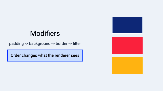
A Hydrolysis preview showing how modifier order changes rendered output. Example source.
How Modifiers Work
Every modifier method on ViewExt takes self (consuming the view) and returns a new type that wraps it. For example:
text!("Hello")          // Text
    .padding()          // Padding (wraps Text)
    .background(Color::blue())  // Background (wraps Padding)
    .border(Color::srgb(0, 0, 0), 1.0) // Metadata<Border> (wraps Background)
The resulting type is a nested structure. The renderer walks this structure from outside to inside, applying each modifier’s effect as it goes.
Because modifiers are type-level wrappers (not runtime property bags), the compiler can optimize aggressively and catch errors at compile time.
The ViewExt Trait
ViewExt is an extension trait automatically implemented for every View:
pub trait ViewExt: View + Sized {
    // ... modifier methods ...
}

impl<V: View + Sized> ViewExt for V {}
All methods are available through the WaterUI prelude – no special imports needed. The following sections catalog every modifier by category.
Layout Modifiers
Layout modifiers control sizing, spacing, and alignment – the fundamentals of placing your views on screen.
padding
Every UI needs breathing room. padding adds space around the view’s content:
// Default padding (14.0 points on all sides)
text!("Hello").padding()

// Custom edge insets
text!("Hello").padding_with(EdgeInsets::new(10.0, 20.0, 10.0, 20.0))

// EdgeInsets also supports From<f32> for uniform padding
text!("Hello").padding_with(16.0)
width, height, size
Fix the view to specific dimensions:
Color::red().width(100.0)
Color::red().height(50.0)
Color::red().size(100.0, 50.0) // both at once
min/max constraints
When you want a view that flexes within bounds:
text!("Flexible")
    .min_width(80.0)
    .max_width(300.0)
    .min_height(40.0)
    .max_height(200.0)

// Both axes at once
text!("Bounded").min_size(80.0, 40.0).max_size(300.0, 200.0)
alignment
Position the view within its allocated frame:
text!("Top Left").alignment(Alignment::TopLeading)
text!("Center").alignment(Alignment::Center)
text!("Bottom Right").alignment(Alignment::BottomTrailing)
ignore_safe_area
Extend the view’s bounds beyond safe area insets (useful for full-bleed backgrounds):
use waterui::prelude::*;

// Fill entire screen including notch/status bar area
Color::red().ignore_safe_area(EdgeSet::ALL)

// Only extend to top (under status bar)
header_view.ignore_safe_area(EdgeSet::TOP)
Frame Builder
The width, height, alignment, and constraint methods all return a Frame, which supports further chaining:
text!("Hello")
    .width(200.0)        // returns Frame
    .height(50.0)        // Frame method
    .min_width(100.0)    // Frame method
    .alignment(Alignment::Center) // Frame method
Tip: You can chain all frame-related modifiers together in one fluent call since they all return
Frame.
Visual Modifiers
Visual modifiers affect the appearance of views without changing their layout. These are what make your views look polished.
background
Render content behind the view:
// Solid color
text!("Hello").background(Color::red())

// Material (platform blur effect)
text!("Hello").background(Material::Regular)

// Any view as background
text!("Hello").background(
    hstack((Color::red(), Color::blue()))
)
The background fills the view’s bounds. The content determines the layout size; the background stretches to fill it.
foreground
Set the foreground color for text and icons in the subtree:
// All text in this VStack will be red
vstack((
    text!("Hello"),
    text!("World"),
)).foreground(Color::red())
This works by injecting a ForegroundOverride into the environment, so it affects all descendants that do not override it themselves.
opacity
Control transparency. Any IntoSignalF32 is accepted, including a constant f32 or a reactive Binding<f32>:
// Static opacity
text!("Faded").opacity(0.5)

// Reactive opacity (useful for animations)
let alpha = Binding::f32(1.0);
text!("Dynamic").opacity(alpha)
The opacity modifier maps to compositor-native operations (no GPU pass) and is available directly on ViewExt.
overlay
Render content on top of the view, without affecting the base view’s size:
text!("Hello").overlay(
    Color::red().opacity(0.5)
)
Unlike ZStack, an overlay does not influence the layout of the underlying view.
Tip:
overlayis great for badges, status indicators, or decorative elements that should sit on top of content without affecting layout.
shadow
Add a drop shadow. Shadow::new takes a color, an offset vector, and a blur radius:
use waterui::style::{Shadow, Vector};

text!("Shadowed").shadow(Shadow::new(
    Color::srgb(0, 0, 0).with_opacity(0.3),
    Vector { x: 2.0, y: 2.0 },
    4.0,
))
border
Add a border around the view:
// Simple border on all edges
text!("Bordered").border(Color::red(), 2.0)

// Full customization via Border builder
let custom = Border::new(Color::blue(), 2.0)
    .corner_radius(12.0)
    .edges(EdgeSet::HORIZONTAL);

text!("Custom").border_with(custom)
clip
Clip the view to a shape. The shape is normalized to the view’s bounds, so RoundedRectangle::new accepts a corner radius in 0.0..=0.5:
use waterui::shape::{Circle, RoundedRectangle};

// Clip to circle
avatar_view.clip(Circle)

// Clip to rounded rectangle (10% corner radius)
card_view.clip(RoundedRectangle::new(0.1))
visible
Control visibility. visible is implemented as a composition of opacity and hit testing – when hidden, the view fades to opacity 0.0 and stops receiving touches:
let show = Binding::bool(true);
text!("Now you see me").visible(show)
Transform Modifiers
Transforms are purely visual – they change how the view is drawn but do not affect layout calculations. This makes them ideal for animations.
scale
Scale the view around its center. Both axes accept any IntoSignalF32:
// Uniform scale
star_view.scale(1.5, 1.5)

// Non-uniform scale
text!("Stretched").scale(2.0, 1.0)

// Reactive (for animations)
let s = Binding::f32(1.0);
heart_view.scale(s.clone(), s)

// Scale from a specific anchor point
star_view.scale_from(0.5, 0.5, Anchor::TOP_LEFT)
rotation
Rotate the view in degrees:
// Static (positive = clockwise)
arrow_view.rotation(45.0)

// Reactive
let angle = Binding::f32(0.0);
spinner_view.rotation(angle)

// Rotate around a specific anchor
dial_view.rotation_from(90.0, Anchor::TOP_LEFT)
offset
Translate the view:
// Static offset
badge.offset(10.0, -5.0)

// Reactive (great for drag or animation)
let x = Binding::f32(0.0);
let y = Binding::f32(0.0);
draggable_view.offset(x, y)
Tip: Combine
offsetwith reactive bindings and animations to create smooth drag interactions or slide-in effects.
Interaction Modifiers
These modifiers add gesture recognition and touch handling to views. They turn passive content into interactive controls.
on_tap
The simplest interaction – recognize a single tap:
text!("Click me").on_tap(|| {
    tracing::info!("Tapped!");
})
on_tap_gesture_count
Require a specific number of taps:
text!("Double-tap me").on_tap_gesture_count(2, || {
    tracing::info!("Double tapped!");
})
on_long_press_gesture
Recognize a long press:
text!("Press and hold").on_long_press_gesture(500, || {
    tracing::info!("Long pressed for 500ms!");
})
gesture
Attach any gesture recognizer:
use waterui::gesture::*;

text!("Custom gesture")
    .gesture(TapGesture::repeat(3), || {
        tracing::info!("Triple tap!");
    })
hittable
Control whether the view responds to touch/click events:
// Disable hit testing -- touches pass through
overlay_decoration.hittable(false)

// Reactive control
let interactive = Binding::bool(true);
my_view.hittable(interactive)
disabled
Disable the view – grays it out and blocks all interactions:
// Static
button("Submit").action(|| {}).disabled(true)

// Reactive
let is_loading = Binding::bool(false);
button("Submit").action(|| {}).disabled(is_loading)
disabled is a convenience that composes opacity(0.5), hittable(false), and the corresponding accessibility state.
draggable
Make a view draggable:
use waterui::drag_drop::DragData;

text!("Drag me").draggable(DragData::text("Hello!"))
drop_destination
Make a view accept dropped content:
text!("Drop here").drop_destination(|data: DragData| {
    tracing::info!("Received: {:?}", data);
})
Stateful Event Handlers
Sometimes your event handlers need to capture mutable state – for example, tracking a hover count or toggling a flag. Use ViewExt::state to inject cloneable state into the view’s environment, then extract it in handlers via the State<T> extractor:
use waterui::extract::State;

let count = Binding::i32(0);
let is_hovered = Binding::bool(false);

text("Hover Me!")
    .padding()
    .state(&count)
    .state(&is_hovered)
    .on_hover_enter(
        |State(count): State<Binding<i32>>,
         State(hovered): State<Binding<bool>>| {
            count.set(count.get() + 1);
            hovered.set(true);
        },
    )
    .on_hover_exit(|State(hovered): State<Binding<bool>>| {
        hovered.set(false);
    })
Each .state(&value) call inserts that binding into the subtree’s environment. Handlers extract whichever values they need via State<T> parameters; missing values become a clear runtime error.
Feedback Modifiers
These modifiers provide sensory feedback to the user, making your app feel more responsive and native.
on_tap_haptic
Trigger haptic feedback on tap (requires the std feature):
use waterkit_haptic::Intensity;

text!("Haptic tap").on_tap_haptic(Intensity::MEDIUM, || {
    // action
})

// Default medium intensity
text!("Haptic tap").on_tap_haptic_default(|| {
    // action
})
cursor
Set the cursor style when hovering (desktop platforms):
use waterui::cursor::CursorStyle;

text!("Click me").cursor(CursorStyle::PointingHand)
badge
Add a numeric badge overlay (common for notification counts):
let unread = Binding::i32(5);
SystemIcon::new("envelope").badge(unread)
Filter Modifiers
Filter modifiers apply GPU-accelerated visual effects. They come from the FilterViewExt trait (included in the prelude) and are great for image processing and polished UI effects.
blur
Apply a Gaussian blur:
photo_view.blur(10.0)

// Reactive
let blur_amount = Binding::f32(0.0);
photo_view.blur(blur_amount)
brightness
Adjust brightness:
photo_view.brightness(0.2)  // increase
photo_view.brightness(-0.2) // decrease
contrast
Adjust contrast:
photo_view.contrast(1.5) // higher contrast
photo_view.contrast(0.5) // lower contrast
saturation
Adjust color saturation:
photo_view.saturation(1.5) // more vivid
photo_view.saturation(0.0) // completely desaturated
grayscale
Convert to grayscale:
photo_view.grayscale(1.0) // fully grayscale
photo_view.grayscale(0.5) // partially desaturated
hue_rotation
Rotate the hue of all colors (degrees):
photo_view.hue_rotation(90.0)  // shift by 90 degrees
photo_view.hue_rotation(180.0) // invert hues
All filter modifiers accept any impl IntoSignalF32, which means you can pass a static f32, a Binding<f32>, or any signal-based value for animated filters.
Tip: Try animating
blurorsaturationwith a reactive binding for smooth transition effects – for example, blurring the background when a modal appears.
Lifecycle Modifiers
These modifiers let you run code at specific points in a view’s lifecycle.
on_appear
Execute code when the view becomes visible:
text!("Hello").on_appear(|| {
    tracing::info!("View is now visible");
})
Note:
body()being called does not mean the view is visible. A lazy container may resolve views ahead of time. Useon_appearfor code that should run when the view is actually displayed on screen.
on_disappear
Execute code when the view is removed from the view hierarchy:
text!("Hello").on_disappear(|| {
    tracing::info!("View removed from hierarchy");
})
on_change
Monitor a signal and execute a handler when the value changes:
let search = Binding::container(String::new());

text_field("Search", search.clone())
    .on_change(&search, |value: String| {
        tracing::info!("Search changed to: {value}");
    })
This is a convenience over manual watch() + retain() – the watcher lifecycle is managed automatically. The handler receives the new Output value of the source signal.
task
Spawn an async task tied to the view’s lifecycle:
text!("Loading...").task(async {
    let data = fetch_data().await;
    // The task is cancelled when the view is removed
})
Event Modifiers
on_hover_enter / on_hover_exit
React to cursor hover (macOS, iPadOS with trackpad, Android API 24+):
text!("Hover me")
    .on_hover_enter(|| tracing::info!("Mouse entered"))
    .on_hover_exit(|| tracing::info!("Mouse exited"))
event
Attach a handler for any Event variant:
use waterui_core::event::Event;

text!("Interactive")
    .event(Event::HoverEnter, || { /* ... */ })
    .event(Event::HoverExit, || { /* ... */ })
Other Modifiers
metadata
Attach arbitrary metadata to a view:
text!("Important").metadata(MyCustomMetadata { priority: 1 })tag
Tag a view for identification:
text!("Item").tag(42)anyview
Convert to a type-erased AnyView:
let view: AnyView = text!("Hello").anyview();retain
Keep a value alive for the view’s lifetime:
let guard = some_signal.watch(|_| { /* ... */ });
text!("Watching").retain(guard)
title
Wrap in a navigation view with a title:
content_view.title(text!("Settings"))focused
Mark the view as focused when a binding matches:
let focus = Binding::container::<Option<Field>>(None);
text_field("Name", name).focused(&focus, Field::Name)
secure
Prevent screenshots of the view:
sensitive_content.secure()context_menu
Attach a context menu (long-press on mobile, right-click on desktop). Menu content is built from MenuView implementations – ordinary Buttons with .action() work directly:
text("Right-click me").context_menu((
    button("Copy").action(|| { /* ... */ }),
    button("Paste").action(|| { /* ... */ }),
))
a11y_label / a11y_role
Set accessibility attributes:
SystemIcon::new("star").a11y_label("Favorite")
SystemIcon::new("star").a11y_role(AccessibilityRole::Button)
Tip: Always add
a11y_labelto icon-only buttons and interactive elements. Screen readers rely on these labels to describe your UI to users with visual impairments.
Modifier Order
Modifier order matters in WaterUI because each modifier wraps the previous result. The outermost modifier is applied first during rendering. Getting the order wrong is one of the most common sources of “why does my layout look wrong?”
A common pattern where order matters:
// Padding INSIDE the background
text!("Hello")
    .padding()           // padding applied first
    .background(Color::red()) // background wraps the padded view

// Padding OUTSIDE the background
text!("Hello")
    .background(Color::red()) // background applied first
    .padding()           // padding wraps the background
Similarly for transforms:
// Rotate then offset -- rotates in place, then translates
view.rotation(45.0).offset(100.0, 0.0)

// Offset then rotate -- translates first, then rotates around original center
view.offset(100.0, 0.0).rotation(45.0)
Warning: If your background does not seem to extend behind your padding, or your border appears inside your content area, check your modifier order.
General guidelines:
- Layout modifiers (padding, frame, alignment) should go before visual modifiers.
- Gestures should go after layout/visual modifiers so the hit area matches what the user sees.
- Lifecycle hooks can go anywhere – they do not affect rendering.
- Background goes after padding if you want the background to include the padded area.
Try swapping .padding() and .background() on a view and observe the difference.
Complete Example
Here is a complete example that puts many modifier categories together:
use waterui::prelude::*;
use waterui::shape::RoundedRectangle;
use waterui::style::{Shadow, Vector};

fn card(title: &'static str, count: Binding<i32>) -> impl View {
    let is_highlighted = count.clone().map(|n| n > 10);
    let background = is_highlighted.map(|on| {
        if on { Color::blue() } else { Color::grey() }
    });

    vstack((
        text(title).foreground(Color::srgb(255, 255, 255)),
        text!("{count}"),
        button("Increment").action(move || {
            count.set(count.get() + 1);
        }),
    ))
    .padding()
    .background(background)
    .border(Color::srgb(0, 0, 0), 1.0)
    .clip(RoundedRectangle::new(0.15))
    .shadow(Shadow::new(
        Color::srgb(0, 0, 0).with_opacity(0.2),
        Vector { x: 0.0, y: 2.0 },
        4.0,
    ))
    .on_appear(|| tracing::info!("Card appeared"))
}
Summary
| Category | Modifiers |
|---|---|
| Layout | padding, padding_with, width, height, size, min_width, max_width, min_height, max_height, min_size, max_size, alignment, ignore_safe_area |
| Visual | background, foreground, overlay, shadow, border, border_with, clip, visible |
| Transform | scale, scale_from, rotation, rotation_from, offset |
| Interaction | on_tap, on_tap_gesture, on_tap_gesture_count, on_long_press_gesture, gesture, gesture_observer, hittable, disabled, draggable, drop_destination, state |
| Feedback | on_tap_haptic, on_tap_haptic_default, cursor, badge |
| Filter | blur, brightness, contrast, saturation, grayscale, hue_rotation, opacity |
| Lifecycle | on_appear, on_disappear, on_change, task |
| Event | event, on_hover_enter, on_hover_exit |
| Other | metadata, tag, anyview, retain, title, focused, secure, context_menu, a11y_label, a11y_role, with, install |
You now have the complete toolkit for building views, managing reactive state, sharing configuration through the environment, and styling everything with modifiers. The next part of the book, Building UIs, puts all of these concepts together as you work with text, layouts, controls, forms, and navigation.
Text and typography
In this chapter, you will:
- Display text using
text()for static content andtext!for reactive, localized strings- Style text with semantic fonts, weights, colors, and decorations
- Build rich text with
StyledStr, including Markdown and concatenation- Add syntax highlighting for source code
Text is the most fundamental building block in any user interface. Whether you are showing a headline, a label beside a toggle, or a paragraph of help text, you reach for the Text component first. WaterUI gives you a small two-function API: text() for plain content that does not change, and the text! macro for reactive strings that interpolate captured bindings and (optionally) consult a translation catalog.
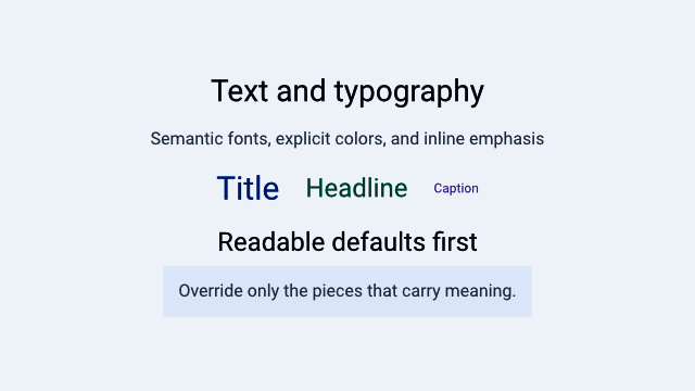
A Hydrolysis preview of WaterUI text rendered with semantic typography and colors. Example source.
Static text with text()
The simplest way to display text is the text() function. It accepts anything that converts into Text — a &'static str becomes localized through the catalog, while String and Str are used verbatim:
use waterui::prelude::*;

fn greeting() -> impl View {
    text("Hello, World!")
}
Text sizes itself to fit its content and never stretches to fill extra space. When the available width is limited, it wraps to multiple lines automatically.
Layout behavior
Here is what you need to know about how Text participates in layout:
- Sizing: fits its content naturally, like a label.
- In stacks: takes only the space it needs, leaving room for siblings.
- Wrapping: wraps when width is constrained — for example by a parent
Frame.
use waterui::prelude::*;

fn row() -> impl View {
    // Push two labels apart in a row.
    hstack((text("Name"), spacer(), text("Value")))
}
Tip: Because
Textnever stretches on its own, you can safely place it in any stack without worrying about it gobbling up space from sibling views.
Reactive text with text!
Static strings are fine for fixed labels, but most apps need text that updates in response to state. The text! macro captures any named placeholder from the surrounding scope and re-evaluates whenever those bindings change. When a i18n/<locale>.toml catalog is present, the same call site also resolves the matching translation:
use waterui::prelude::*;

fn counter_label(count: &Binding<i32>) -> impl View {
    // Captures `count` from scope; the rendered text updates on every change.
    text!("Count: {count}")
}
The macro only accepts named placeholders. Either name a binding directly ({count}), or alias an expression with name = expr:
use waterui::prelude::*;

fn welcome(get_name: impl Fn() -> String) -> impl View {
    text!("Hello, {name}", name = get_name())
}
Warning:
text!does not accept positional{}placeholders. Writingtext!("Count: {}", count)will not compile. Use a named placeholder ({count}) and capture the binding from scope, or pass an explicit alias (name = expr).
Why not .get() and format!?
Calling .get() on a binding inside a view body reads the current value once and never re-runs. The text would freeze at construction time. Always express formatting through text! so the framework tracks the dependency:
use waterui::prelude::*;

fn show(value: &Binding<f64>) -> impl View {
    // Reactive: updates whenever `value` changes.
    text!("Value: {value:.2}")
}
Displaying arbitrary values
Any signal whose output type implements Display can be rendered with Text::display:
use waterui::prelude::*;

fn show_price(price: &Binding<f64>) -> impl View {
    Text::display(price.clone())
}
Text::display maps the signal through to_string() internally, so the text updates whenever the signal does.
Locale-aware formatting
For specialised formatting — locale-specific dates or numbers — use Text::format:
use waterui::prelude::*;
use waterui::text::locale::Formatter;

fn formatted<T: 'static + Clone>(value: &Binding<T>, fmt: impl Formatter<T> + 'static) -> impl View {
    Text::format(value.clone(), fmt)
}
Implement the Formatter<T> trait for any type whose presentation depends on the active locale.
Translation files for text!
If your app supports multiple languages, place TOML files under i18n/ in the crate root:
# i18n/en.toml
"Count: {count}" = "Count: {count}"

# i18n/zh.toml
"Count: {count}" = "计数:{count}"
The macro picks the right translation based on the active Locale in the environment. Missing translation files are not an error — text! falls back to the format string itself.
Note: Plural forms use
{#count}syntax in the format string and a TOML table withone/otherkeys. Seewaterui/macros/src/locale.rsfor the full grammar.
Font system
WaterUI provides a semantic font system with six built-in presets. Each preset resolves to a platform-appropriate size and weight through the environment, so a “Larger Text” accessibility setting cascades into your screen automatically:
| Preset | Default Size | Default Weight |
|---|---|---|
Body | 16pt | Normal |
Title | 24pt | SemiBold |
Headline | 32pt | Bold |
Subheadline | 20pt | SemiBold |
Caption | 12pt | Normal |
Footnote | 10pt | Light |
Use the convenience methods on Text. They work on values produced by both text() and text!:
use waterui::prelude::*;

fn typography() -> impl View {
    vstack((
        text("Page Title").title(),
        text("Main heading").headline(),
        text("Section header").sub_headline(),
        text("Body content").body(),
        text("Small note").caption(),
        text("Legal text").footnote(),
    ))
}
Custom font configuration
For fine-grained control, build a Font value and pass it to .font():
use waterui::prelude::*;
use waterui::text::font::{Font, FontWeight};
fn custom() -> impl View {
text("Custom").font(
Font::default()
.size(18.0)
.weight(FontWeight::Medium)
.family("monospace"),
)
}Font weights
The FontWeight enum provides nine standard weights:
pub enum FontWeight {
Thin, // 100
UltraLight, // 200
Light, // 300
Normal, // 400 (default)
Medium, // 500
SemiBold, // 600
Bold, // 700
UltraBold, // 800
Black, // 900
}Size, weight, italic shortcuts
You do not always need to construct a Font. Text provides direct shortcuts. .size() and .weight() accept signals, so they can react:
use waterui::prelude::*;
fn highlight(emphasised: &Binding<bool>) -> impl View {
vstack((
text("Large bold text").size(28.0).bold(),
// Italic toggles reactively from the binding.
text("May be italic").italic(emphasised.clone()),
))
}Color
Colors are zero-sized marker types you can pass into .color() or .foreground(). The built-in palette includes Red, Blue, Green, Orange, Purple, Cyan, Yellow, Pink, and Grey:
use waterui::prelude::*;
fn status() -> impl View {
vstack((
text("Error message").color(Red),
text("Success").color(Green),
text("Highlighted").background_color(Yellow),
))
}Note:
.color()onTextsets an explicit foreground color for that specific text view. The more general.foreground()modifier fromViewExtsets the inherited foreground for an entire view subtree, so children respect the cascade.
Text decorations
Underline
use waterui::prelude::*;
fn link_label(highlighted: &Binding<bool>) -> impl View {
text("Click here").underline(highlighted.clone())
}.underline() accepts any IntoSignal<bool>, so the decoration can toggle reactively.
Strikethrough
Strikethrough lives on StyledStr, not on Text:
use waterui::prelude::*;
use waterui::text::styled::StyledStr;
fn deprecated() -> impl View {
text(StyledStr::plain("Deprecated").strikethrough(true))
}Concatenating text
Sometimes you need mixed styles within a single line. Text implements Add and AddAssign, so styled fragments compose with +:
use waterui::prelude::*;
fn name_row() -> impl View {
text("Name: ").bold() + text("Alice")
}The resulting Text preserves the styling of each fragment.
Rich text with StyledStr
For full control over rich text, build a StyledStr directly. Each chunk carries its own Style, which includes font, foreground color, background color, italic, underline, and strikethrough:
use waterui::prelude::*;
use waterui::text::styled::{Style, StyledStr};
fn intro() -> impl View {
let mut styled = StyledStr::empty();
styled.push("Bold intro: ", Style::default().bold());
styled.push("normal continuation", Style::default());
text(styled)
}Markdown shorthand
StyledStr::from_markdown parses a small subset of Markdown — headings, bold, italic, strikethrough, inline code, and paragraphs — into a styled string in one step:
use waterui::prelude::*;
use waterui::text::styled::StyledStr;
fn release_notes() -> impl View {
text(StyledStr::from_markdown("**Bold** and *italic* with `code`"))
}Syntax highlighting
If your app displays source code, WaterUI ships a syntect-backed highlighter. highlight_text is synchronous: it consumes a borrowed source string and a mutable highlighter, and returns a fully styled StyledStr:
use waterui::prelude::*;
use waterui::text::highlight::{DefaultHighlighter, Language, highlight_text};
fn code_view(source: &str) -> impl View {
let mut highlighter = DefaultHighlighter::default();
text(highlight_text(Language::Rust, source, &mut highlighter))
}The Language enum covers Rust, Swift, Python, TypeScript, and many others. Each chunk in the resulting StyledStr carries the appropriate syntax color.
Quick reference
| Method / Function | Purpose |
|---|---|
text("...") | Static text, localized for &'static str |
text!("Count: {n}") | Reactive, localized text capturing n |
Text::display(sig) | Render any Signal<Output: Display> |
Text::format(v, fmt) | Locale-aware formatted text |
.title() | Apply the Title font preset |
.headline() | Apply the Headline font preset |
.sub_headline() | Apply the Subheadline font preset |
.body() | Apply the Body font preset |
.caption() | Apply the Caption font preset |
.footnote() | Apply the Footnote font preset |
.size(f64) | Set a custom font size (accepts signals) |
.bold() | Set font weight to Bold |
.weight(w) | Set a specific font weight (accepts signals) |
.italic(sig) | Toggle italic styling reactively |
.color(c) | Set the text foreground color |
.background_color(c) | Set the text background color |
.underline(sig) | Toggle underline reactively |
.font(f) | Apply a fully custom Font |
Now that you can display and style text, it is time to learn how to arrange views on screen. In the next chapter, you will explore stacks, frames, grids, and the rest of the layout system.
Layout: stacks, frames, and grids
In this chapter, you will:
- Arrange views vertically, horizontally, and in layers using stacks
- Control spacing, alignment, and sizing with frames and padding
- Build grid-based layouts and scrollable content
- Use absolute positioning and pin constraints for free-form layouts
Every app needs to place things on screen — a title at the top, a button at the bottom, a sidebar on the left. WaterUI uses a declarative layout system inspired by SwiftUI: you compose views using stacks, spacers, frames, and grids, and the framework resolves sizes and positions through a proposal-based layout protocol. All values are in logical pixels (points/dp) — the same unit as Figma and Sketch. Native backends convert to physical pixels automatically.
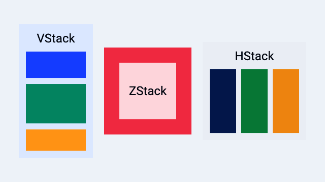
A Hydrolysis preview of WaterUI stack layout primitives. Example source.
Stacks
Stacks are your primary tool for arranging views. Think of them as the rows and columns of your interface. WaterUI provides three kinds: vstack (vertical), hstack (horizontal), and zstack (overlay).
vstack — vertical layout
vstack arranges children from top to bottom. It accepts a tuple of views:
use waterui::prelude::*;
fn profile_card() -> impl View {
vstack((
text("Alice").title(),
text("Software Engineer"),
text("San Francisco"),
))
}Default spacing between children is 10pt and alignment is center.
Custom spacing and alignment
Use the struct constructor for full control:
use waterui::prelude::*;
fn left_aligned() -> impl View {
VStack::new(HorizontalAlignment::Leading, 16.0, (
text("Left-aligned"),
text("Also left-aligned"),
))
}Or chain the builder methods on vstack:
use waterui::prelude::*;
fn trailing_8pt() -> impl View {
vstack((
text("Item 1"),
text("Item 2"),
))
.alignment(HorizontalAlignment::Trailing)
.spacing(8.0)
}Horizontal alignment options
pub enum HorizontalAlignment {
Leading, // left in LTR locales
Center, // default
Trailing, // right in LTR locales
}hstack — horizontal layout
hstack arranges children left to right. This is what you reach for when building toolbars, rows of buttons, or any side-by-side arrangement:
use waterui::prelude::*;
fn toolbar() -> impl View {
hstack((
text("WaterUI"),
spacer(),
button("Settings").action(|| {}),
))
}Default spacing is 10pt and alignment is center (vertical).
Custom spacing and alignment
use waterui::prelude::*;
fn top_aligned() -> impl View {
HStack::new(VerticalAlignment::Top, 20.0, (
text("Top-aligned"),
text("Also top"),
))
}Vertical alignment options
pub enum VerticalAlignment {
Top,
Center, // default
Bottom,
FirstBaseline,
LastBaseline,
}zstack — overlay layout
When you need to layer views on top of each other — a badge on an avatar, text over an image — reach for zstack. The last child in the tuple renders on top, and the stack sizes itself to fit the largest child:
use waterui::prelude::*;
fn badge() -> impl View {
zstack((
Blue,
text("Overlay").color(Yellow),
))
}zstack alignment
Control where children are positioned within the stack:
use waterui::prelude::*;
fn corner_badge(image: impl View, dot: impl View) -> impl View {
ZStack::new(Alignment::TopTrailing, (image, dot))
}The Alignment enum has nine positions:
pub enum Alignment {
TopLeading, Top, TopTrailing,
Leading, Center, Trailing, // Center is the default
BottomLeading, Bottom, BottomTrailing,
}Spacer
Spacer is a flexible gap that expands to push views apart. It adapts to its parent container: in an HStack it expands horizontally, in a VStack it expands vertically. This is one of the most useful layout tools you have.
use waterui::prelude::*;
fn pushed_to_the_edge() -> impl View {
hstack((
text("Title"),
spacer(),
button("Done").action(|| {}),
))
}Minimum length
Use spacer_min to set a minimum length the spacer never shrinks below:
use waterui::prelude::*;
fn at_least_20pt() -> impl View {
hstack((text("A"), spacer_min(20.0), text("B")))
}Divider
The Divider widget draws a thin line for visual separation between sections:
use waterui::prelude::*;
fn sectioned() -> impl View {
vstack((
text("Section 1"),
Divider,
text("Section 2"),
))
}Padding
Add breathing room around a view with the Padding wrapper, or its ViewExt shortcuts. padding() applies a default 14pt inset; use padding_with(EdgeInsets) for exact control:
use waterui::prelude::*;
fn padded() -> impl View {
vstack((
// Default 14pt on every side.
text("Default").padding(),
// Equal padding on all sides.
text("Padded").padding_with(EdgeInsets::all(16.0)),
// Symmetric vertical and horizontal.
text("Symmetric").padding_with(EdgeInsets::symmetric(8.0, 16.0)),
// Explicit edges.
text("Custom").padding_with(EdgeInsets::new(10.0, 20.0, 15.0, 25.0)),
))
}EdgeInsets provides three constructors. Note the explicit-edge order:
| Constructor | Description |
|---|---|
EdgeInsets::all(v) | Equal inset on every edge |
EdgeInsets::symmetric(vertical, horiz) | Vertical and horizontal insets |
EdgeInsets::new(top, bottom, leading, trailing) | Explicit edges |
Frame
When you need a view to be a specific size, or at least a minimum width, wrap it in Frame. It supports minimum, ideal, and maximum dimensions:
use waterui::prelude::*;
use waterui::layout::frame::Frame;
fn fixed() -> impl View {
Frame::new(text("Fixed"))
.width(200.0)
.height(100.0)
}
fn bounded() -> impl View {
Frame::new(text("Bounded"))
.max_width(300.0)
.max_height(200.0)
}Frame alignment
Control how the child is positioned within the frame:
use waterui::prelude::*;
use waterui::layout::frame::Frame;
fn bottom_right() -> impl View {
Frame::new(text("Bottom-right"))
.width(300.0)
.height(200.0)
.alignment(Alignment::BottomTrailing)
}Frame methods
| Method | Description |
|---|---|
.width(f32) | Set the ideal width |
.height(f32) | Set the ideal height |
.min_width(f32) | Set the minimum width |
.max_width(f32) | Set the maximum width |
.min_height(f32) | Set the minimum height |
.max_height(f32) | Set the maximum height |
.alignment(a) | Align the child in frame |
Tip: Use
Frameonly when you need explicit size constraints. Most views have sensible natural sizes, and stacks distribute space for you.
Scrolling
When content might exceed the available space, wrap it in a scroll view. This is essential for long lists and tall forms:
use waterui::prelude::*;
fn long_list() -> impl View {
scroll(
vstack((
text("Item 1"),
text("Item 2"),
text("Item 3"),
)),
)
}Three convenience constructors map to ScrollView:
| Function | Direction |
|---|---|
scroll(content) | Vertical only |
scroll_horizontal(c) | Horizontal only |
scroll_both(c) | Both directions |
Grid
For content that naturally falls into rows and columns — a settings panel with labels and values, or an image gallery — use Grid. You specify the number of columns, and the grid distributes children into rows automatically:
use waterui::prelude::*;
fn settings_grid() -> impl View {
grid(2, [
row((text("Name"), text("Alice"))),
row((text("Age"), text("30"))),
row((text("City"), text("SF"))),
])
}Grid customisation
use waterui::prelude::*;
use waterui::layout::grid::{Grid, GridRow};
fn three_col(rows: Vec<GridRow>) -> impl View {
Grid::new(3, rows)
.spacing(16.0)
.alignment(Alignment::Leading)
}Default spacing is 8pt in both directions, and default alignment is Center. The grid sizes columns equally based on the available width; row heights are determined by the tallest item in each row.
Overlay
An Overlay layers content on top of a base view without changing the base’s layout sizing. Use it for badges, highlights, and decorations:
use waterui::prelude::*;
fn avatar_with_badge(avatar: impl View, dot: impl View) -> impl View {
overlay(avatar, dot).alignment(Alignment::TopTrailing)
}Unlike zstack, the overlay’s size is determined entirely by the base child. The overlay content is positioned within those bounds according to the alignment.
Note: If you need both children to contribute to the overall size, use
zstackinstead.Overlayis for decorations that should not affect layout.
Background
background() renders a view behind another view. The content child determines the size, and the background fills those bounds:
use waterui::prelude::*;
fn highlighted() -> impl View {
background(text("Foreground content"), Blue)
}Absolute positioning
For the rare cases where stacks and grids are not enough — floating action buttons, custom popovers, canvas-like UIs — use absolute with the PositionExt extensions:
use waterui::prelude::*;
fn floating_ui(fab: impl View) -> impl View {
absolute((
Color::grey(),
text("Center").position_in(UnitPoint::CENTER),
fab.position_in_offset(
UnitPoint::BOTTOM_TRAILING,
UnitPoint::BOTTOM_TRAILING,
-16.0,
-16.0,
),
))
}Positioning methods
The PositionExt trait provides these methods on any View:
| Method | Description |
|---|---|
.position(x, y) | Center at absolute coordinates |
.position_anchor(anchor, x, y) | Anchor point at absolute coordinates |
.position_in(unit) | Center at fractional parent position |
.position_in_anchor(anchor, pos) | Anchor at fractional parent position |
.position_in_offset(anchor, pos, dx, dy) | Fractional position plus offset |
.pin(constraints) | Edge-based pinning |
UnitPoint constants
UnitPoint uses normalised coordinates (0.0 to 1.0):
UnitPoint::TOP_LEADING // (0.0, 0.0)
UnitPoint::TOP // (0.5, 0.0)
UnitPoint::TOP_TRAILING // (1.0, 0.0)
UnitPoint::LEADING // (0.0, 0.5)
UnitPoint::CENTER // (0.5, 0.5)
UnitPoint::TRAILING // (1.0, 0.5)
UnitPoint::BOTTOM_LEADING // (0.0, 1.0)
UnitPoint::BOTTOM // (0.5, 1.0)
UnitPoint::BOTTOM_TRAILING // (1.0, 1.0)Pin constraints
Pin-based positioning uses edge distances to compute position and size. This is useful when you want a child to stretch between edges or sit at a fixed offset from a corner:
use waterui::prelude::*;
use waterui::layout::PinConstraints;
fn fill_with_inset(child: impl View) -> impl View {
child.pin(PinConstraints::all(12.0))
}
fn corner_badge(badge: impl View) -> impl View {
badge.pin(
PinConstraints::new()
.trailing(12.0)
.bottom(12.0)
.width(28.0)
.height(28.0),
)
}When both leading and trailing are set, the width is computed automatically. The same applies to top and bottom. Explicit .width() and .height() override the computed dimensions.
StretchAxis
Every view has an associated StretchAxis that tells parent layouts whether it wants to expand along one or both axes. Understanding this concept helps you predict how views behave inside stacks:
pub enum StretchAxis {
None, // content-sized (e.g. Text, Button)
Horizontal, // expands width (e.g. TextField, Slider, VStack)
Vertical, // expands height
Both, // fills available space (e.g. ScrollView, Absolute)
MainAxis, // expands along parent stack's main axis (Spacer)
CrossAxis, // expands along parent stack's cross axis
}Stacks use this information to distribute surplus space. For example, Spacer reports MainAxis, so in an HStack it expands horizontally and in a VStack it expands vertically. A TextField reports Horizontal, so it fills available width but keeps its intrinsic height.
Tip: If a view is not expanding as you expect, check its stretch axis. A
Textview never stretches; aTextFieldstretches horizontally; aScrollViewstretches in both directions.
Dynamic stacks via for_each
Stacks support dynamic children through for_each. Instead of a fixed tuple, you provide a reactive collection and a generator that returns one view per element:
use waterui::prelude::*;
use waterui::reactive::collection::List as ReactiveList;
#[derive(Clone)]
struct TodoItem { id: i32, title: String }
impl Identifiable for TodoItem {
type Id = i32;
fn id(&self) -> i32 { self.id }
}
fn todo_list(items: ReactiveList<TodoItem>) -> impl View {
VStack::for_each(items, |item| text(item.title))
.spacing(8.0)
.alignment(HorizontalAlignment::Leading)
}This integrates with the LazyContainer system for efficient rendering of large collections. See the Lists and collections chapter for the full story.
Layout tips
- Start with stacks. Most layouts can be expressed as nested
vstackandhstackcalls. Usespacer()to distribute remaining space. - Use
Frameonly when needed. Text and controls have natural sizes; apply explicit frames only for fixed-size regions or constraints. - Prefer
Alignmentover manual positioning. Stack alignment handles most needs. Reserveabsolutefor truly free-form layouts. - Logical pixels everywhere. Backends handle screen density for you.
- Inspect
StretchAxiswhen something refuses to fit. It tells you whether a view will fight for or yield space.
With layout under your belt, you are ready to make your interfaces interactive. In the next chapter, you will learn about buttons, toggles, sliders, and other controls that let users take action.
Buttons and controls
In this chapter, you will:
- Wire button actions to reactive state with
.action()and theState<T>extractor- Use
Toggle,Slider,Stepper, andTextFieldfor primary user input- Apply button styles to convey hierarchy (primary vs. secondary actions)
- Build dropdown menus from labels and nested submenus
Imagine you are building a settings screen. You need toggles for on/off preferences, a slider for brightness, a text field for a username, and buttons to save or cancel. WaterUI provides a comprehensive set of interactive controls for exactly these scenarios. Each control follows a consistent pattern: you create it with a constructor or convenience function, configure it with builder methods, and wire it to reactive state through bindings.
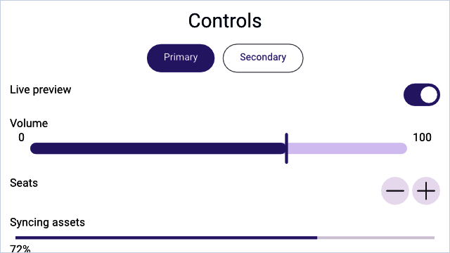
A Hydrolysis preview of WaterUI controls rendered from real bindings. Example source.
Button
Buttons are the most common interactive element. WaterUI buttons support multiple action patterns, custom labels, and visual styles.
Simple action
The simplest button takes a label and a closure with no arguments:
use waterui::prelude::*;
fn dismiss() -> impl View {
button("Dismiss").action(|| {
// Handle click.
})
}Reactive state via .state() and State<T>
Most real buttons need to mutate some reactive state — for example, increment a counter. The pattern is two-sided: pass the binding into the action through State<T> extractors, then attach the binding to the button’s environment with .state():
use waterui::prelude::*;
fn increment(counter: &Binding<i32>) -> impl View {
button("Increment")
.action(|State(count): State<Binding<i32>>| {
count.set(count.get() + 1);
})
.state(counter)
}Chain several .state() calls when an action needs more than one binding. They line up positionally with the State<T> parameters in the action closure:
use waterui::prelude::*;
fn reset(x: &Binding<i32>, y: &Binding<i32>) -> impl View {
button("Reset")
.action(|State(x): State<Binding<i32>>, State(y): State<Binding<i32>>| {
x.set(0);
y.set(0);
})
.state(x)
.state(y)
}Note:
.state()is aViewExtmethod that injects the value into the button’s local environment. Inside the action, theState<T>extractor pulls it back out by type and position. This avoids manualclone()dances at every call site and keeps the binding free of accidental capture.
Environment extraction
Any value already present in the environment can be extracted directly — no State wrapper needed. For example, the navigation controller is injected by NavigationStack:
use waterui::prelude::*;
use waterui::navigation::NavigationController;
fn back_button() -> impl View {
button("Go Back").action(|nav: NavigationController| nav.pop())
}You can mix State<T> parameters with environment extractors in the same action; the extraction order follows the parameter order.
Async actions
Use action_async when the handler needs to await something. The future is spawned on the local executor, so it can await network calls or file I/O:
use waterui::prelude::*;
async fn fetch_from_server() -> String { unimplemented!() }
fn fetch_button(result: &Binding<String>) -> impl View {
button("Fetch Data")
.action_async(|State(result): State<Binding<String>>| async move {
let data = fetch_from_server().await;
result.set(data);
})
.state(result)
}Button styles
ButtonStyle controls visual emphasis. Choose the right style to communicate the importance of an action:
| Style | Description |
|---|---|
Automatic | Platform default (default) |
Plain | No background or border |
Link | Hyperlink appearance |
Borderless | No visible border, hover/press effects |
Bordered | Subtle border, for secondary actions |
BorderedProminent | Filled background, for primary actions |
Apply with .style() or convenience methods:
use waterui::prelude::*;
fn cta_row() -> impl View {
hstack((
button("Primary").bordered_prominent().action(|| {}),
button("Secondary").bordered().action(|| {}),
button("Subtle").plain().action(|| {}),
button("Learn More").link().action(|| {}),
))
}Tip: Use
bordered_prominentfor the main call-to-action on a screen, andborderedorplainfor secondary actions. This creates a clear visual hierarchy.
Custom labels
button(...) accepts any value that converts into a semantic Label, including raw strings. For richer content — an icon plus text, for instance — build a Label:
use waterui::prelude::*;
use waterui::icon::system_icon;
fn add_button() -> impl View {
button(label("Add Item").icon(system_icon::plus())).action(|| {})
}Buttons inside a Menu must use a semantic label or set accessibility_label, otherwise the menu cannot announce them to assistive technology.
Toggle
Toggle is a boolean switch backed by a Binding<bool>. It is the natural choice for any on/off setting — Wi-Fi, dark mode, or notification preferences:
use waterui::prelude::*;
fn settings(is_enabled: &Binding<bool>, dark_mode: &Binding<bool>) -> impl View {
vstack((
// With a label.
toggle("Wi-Fi", is_enabled),
// Without a label.
Toggle::new(dark_mode),
))
}Toggle styles
pub enum ToggleStyle {
Automatic, // platform default
Switch, // sliding pill
Checkbox, // square with checkmark
}Apply with .style():
use waterui::prelude::*;
fn dark_mode_switch(dark: &Binding<bool>) -> impl View {
Toggle::new(dark)
.label("Dark Mode")
.style(ToggleStyle::Switch)
}Layout behavior
With a label, Toggle expands horizontally to fill available space, placing the label on the leading edge and the switch on the trailing edge. Without a label, it is content-sized.
Slider
Slider lets users select a value from a continuous range by dragging a thumb. The constructor takes the binding directly; the range defaults to 0.0..=1.0 and is overridden with .range(...):
use waterui::prelude::*;
fn volume_slider(volume: &Binding<f64>) -> impl View {
slider(volume).range(0.0..=100.0)
}Labels
use waterui::prelude::*;
fn brightness_slider(brightness: &Binding<f64>) -> impl View {
slider(brightness)
.label("Brightness")
.min_value_label("Dark")
.max_value_label("Bright")
}Layout behavior
Slider expands horizontally to fill available space but has a fixed height. In an hstack, it takes up all remaining width after other views are sized:
use waterui::prelude::*;
fn volume_row(volume: &Binding<f64>) -> impl View {
hstack((
text("Volume"),
slider(volume).range(0.0..=100.0),
))
}Stepper
Stepper provides +/- buttons for incrementing or decrementing an i32 value. Use it for precise, discrete adjustments — picking a quantity, setting a timer:
use waterui::prelude::*;
fn quantity_stepper(quantity: &Binding<i32>) -> impl View {
stepper(quantity)
}Configuration
use waterui::prelude::*;
fn item_stepper(count: &Binding<i32>) -> impl View {
stepper(count)
.label("Items")
.range(1..=10)
.step(1)
}By default, the stepper displays the current value as its label. Use .label(...) to replace it with custom content, or .value_formatter(...) to customise how the value is rendered:
use waterui::prelude::*;
fn temperature_stepper(temperature: &Binding<i32>) -> impl View {
stepper(temperature)
.value_formatter(|v| format!("{v}°C"))
.range(-20..=50)
.step(5)
}Layout behavior
With a label, Stepper expands horizontally. The label sits on the leading edge and the +/- buttons on the trailing edge, with flexible space between.
TextField
TextField is a single-line text input field backed by a Binding<Str>. You will use it for usernames, search queries, email addresses, and any short text input:
use waterui::prelude::*;
fn username_field(username: &Binding<Str>) -> impl View {
vstack((
// With a label.
field("Username", username),
// Without a label, with a placeholder prompt.
TextField::new(username).prompt("Enter your name"),
))
}Styled text binding
For rich text editing, bind to a StyledStr directly:
use waterui::prelude::*;
use waterui::text::styled::StyledStr;
fn rich_field(value: &Binding<StyledStr>) -> impl View {
TextField::styled(value)
}Multi-line input
TextField defaults to a single line. Set a higher line limit, or disable it entirely, for paragraph-style entry:
use waterui::prelude::*;
fn notes(notes: &Binding<Str>) -> impl View {
TextField::new(notes).line_limit(5)
}
fn unbounded(notes: &Binding<Str>) -> impl View {
TextField::new(notes).disable_line_limit()
}Custom selection menu
.selection_menu(...) adds custom actions to the text selection context menu. It accepts any MenuView — most commonly a tuple of buttons or Menu instances:
use waterui::prelude::*;
fn field_with_menu(value: &Binding<Str>) -> impl View {
TextField::new(value).selection_menu((
button("Custom Action").action(|| {}),
))
}Layout behavior
TextField expands horizontally to fill available space but has a fixed height. This makes it work naturally in forms and hstack layouts.
Menu
Menu displays a popup of commands when its label is tapped. The items argument is any MenuView — most commonly a tuple of Button, nested Menu, or Divider:
use waterui::prelude::*;
fn options_menu(selected: &Binding<String>) -> impl View {
Menu::new(
"Options",
(
button("Copy").action(|| {}),
button("Paste")
.action(|State(s): State<Binding<String>>| s.set("Pasted".into()))
.state(selected),
Divider,
Menu::new(
"More",
(button("Reset").action(|| {}),),
),
),
)
}The first argument is the menu’s semantic label (any IntoLabel). Buttons inside a menu convert automatically into MenuItem::Commands.
Control summary
Here is a quick reference of the controls covered in this chapter and how they behave in layout:
| Control | Binding type | Stretch | Purpose |
|---|---|---|---|
Button | Action closure | None | Trigger actions |
Toggle | Binding<bool> | Horizontal | On/off switch |
Slider | Binding<f64> | Horizontal | Continuous range selection |
Stepper | Binding<i32> | Horizontal | Discrete value adjustment |
TextField | Binding<Str> / Binding<StyledStr> | Horizontal | Single-line text input |
Menu | Action closures | None | Popup of commands |
These controls are the building blocks, but what if you need to collect several pieces of data at once? In the next chapter, you will learn how WaterUI’s form system can automatically generate an entire editing UI from a Rust struct.
Forms and data entry
In this chapter, you will:
- Generate a complete form UI from a Rust struct with
#[derive(FormBuilder)]- Understand how Rust types map to UI controls automatically
- Use pickers, date pickers, color pickers, and secure fields
- Validate user input with composable validators
- Build a registration form from scratch
Every app that collects user data needs forms — registration screens, settings panels, profile editors. Building these by hand means wiring up a text field for each string, a toggle for each boolean, a stepper for each number. WaterUI’s form system solves this by generating UI controls from your Rust data structures. Derive a single trait, and your struct becomes an editable form.
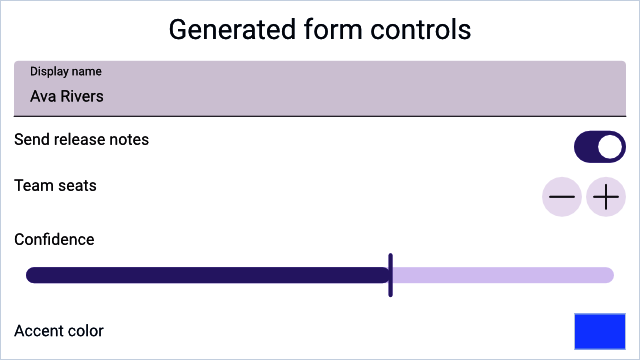
A Hydrolysis preview of stable WaterUI data-entry controls used by forms. Example source.
The FormBuilder trait
The FormBuilder trait is the foundation of the form system. It maps a type to a view that can edit a Binding of that type:
pub trait FormBuilder: Sized {
type View: View;
fn view<L: IntoLabel>(
binding: &Binding<Self>,
label: L,
placeholder: Str,
) -> Self::View;
fn binding() -> Binding<Self>
where
Self: Default + Clone,
{
Binding::default()
}
}You can implement this trait manually for full control, but in most cases the derive macro does the work for you.
The derive macro
Annotate your struct with #[derive(FormBuilder)], and each field generates an appropriate control:
use waterui::prelude::*;
#[derive(Default, Clone, Debug, FormBuilder, Project)]
pub struct UserProfile {
/// Display name
pub name: String,
/// Account active status
pub active: bool,
/// User's current level
pub level: i32,
}That is it — three lines of fields, and WaterUI knows how to render a text field, a toggle, and a stepper. The derive macro relies on the Project derive to expose per-field bindings; you can either derive both or use the #[form] attribute, which derives Default, Clone, Debug, FormBuilder, and Project in one step.
Rendering a form
Use the form() function to create a view from a binding:
use waterui::prelude::*;
#[derive(Default, Clone, Debug, FormBuilder, Project)] struct UserProfile { name: String }
fn profile_editor() -> impl View {
let profile = UserProfile::binding();
form(&profile)
}Pre-fill with initial data by constructing the binding directly:
use waterui::prelude::*;
#[derive(Default, Clone, Debug, FormBuilder, Project)] struct UserProfile { name: String }
fn edit_profile(initial: UserProfile) -> impl View {
let profile = Binding::container(initial);
form(&profile)
}Tip: Try it yourself — define a struct with a mix of
String,bool, andi32fields, derive the form, and watch the controls appear.
Type-to-component mapping
The derive macro maps Rust types to controls automatically:
| Rust type | UI component | Notes |
|---|---|---|
String | TextField | Doc comment becomes placeholder |
Str | TextField | WaterUI’s interned string type |
bool | Toggle | Switch-style control |
i32 (and other integers) | Stepper | With +/- buttons |
f64 / f32 | Slider | Range 0.0..=1.0 by default |
Color | ColorPicker | Platform-native color selector |
Field labels and placeholders
The derive macro converts each field name from snake_case to a "Title Case" label. A doc comment on the field becomes the placeholder argument passed to FormBuilder::view:
use waterui::prelude::*;
#[form]
pub struct ContactForm {
/// Enter your email address
pub email: String,
}For a String field, that doc comment surfaces as the TextField’s prompt.
Numeric fields
i32(and other integer widths) maps to aStepperwith the fulli32::MIN..=i32::MAXrange.f64andf32map to aSliderwith range0.0..=1.0.
If you need different ranges or formatting, use a manual implementation (below).
Color fields
Color fields produce a ColorPicker with platform-native UI:
use waterui::prelude::*;
#[form]
pub struct ThemeConfig {
pub accent_color: Color,
}Manual form implementation
For custom layouts or fields outside the automatic mapping, implement FormBuilder yourself:
use waterui::prelude::*;
use waterui::form::secure::{Secure, secure};
#[derive(Clone, Project)]
struct LoginForm {
username: String,
password: Secure,
}
impl FormBuilder for LoginForm {
type View = waterui::layout::stack::VStack<((waterui::component::TextField, waterui::form::SecureField),)>;
fn view<L: IntoLabel>(binding: &Binding<Self>, label: L, placeholder: Str) -> Self::View {
// Project the struct binding into per-field bindings.
let projected = binding.project();
vstack((
<String as FormBuilder>::view(&projected.username, label, placeholder),
secure("Password", &projected.password),
))
}
}The key trick is Project. Deriving it (or using #[form]) gives you a LoginForm::project(binding) helper that returns a struct of per-field Bindings, so each control sees only the slice of state it needs.
Individual form controls
Beyond the automatic mapping, WaterUI provides specialised controls for specific data entry tasks. You can use these in both auto-generated and manually built forms.
Color picker
ColorPicker provides a platform-native color selection interface:
use waterui::prelude::*;
use waterui::form::picker::color::ColorPicker;
fn accent_picker(accent: &Binding<Color>) -> impl View {
ColorPicker::new("Accent Color", accent).with_alpha()
}.with_alpha() enables the alpha channel; .with_hdr() enables HDR color selection.
Date picker
DatePicker adapts to the bound type — jiff::civil::Date, Time, or DateTime — and supports several picker layouts:
use waterui::prelude::*;
use waterui::form::picker::date::{DatePicker, DatePickerType};
use jiff::civil::Date;
fn birthday_picker(date: &Binding<Date>) -> impl View {
DatePicker::new(date)
.label("Birthday")
.ty(DatePickerType::Date)
}Date picker types:
| Type | Shows |
|---|---|
DatePickerType::Date | Date only |
HourAndMinute | Hour and minute |
HourMinuteAndSecond | Hour, minute, and second |
DateHourAndMinute | Date, hour, and minute |
DateHourMinuteAndSecond | Date, hour, minute, and second |
Picker (selection list)
Picker lets users select from a list of options. Each item is a text(label).tag(value) — the label is what the user sees, the tag is the value written back into the binding:
use waterui::prelude::*;
use waterui::form::picker::{Picker, PickerStyle};
#[derive(Clone, Copy, PartialEq, Eq, PartialOrd, Ord)]
enum Plan { Free, Pro, Team }
fn plan_picker(selection: &Binding<Plan>) -> impl View {
let items = vec![
text("Free").tag(Plan::Free),
text("Pro").tag(Plan::Pro),
text("Team").tag(Plan::Team),
];
Picker::new(items, selection).style(PickerStyle::Menu)
}Picker styles:
| Style | Appearance |
|---|---|
Automatic | Platform default (segmented on iOS) |
Menu | Dropdown menu button |
Radio | Vertical radio button group |
Secure field
SecureField masks input and uses automatic memory zeroing (via zeroize) for password-grade security. Use it for passwords, API keys, and other sensitive data:
use waterui::prelude::*;
use waterui::form::secure::{Secure, secure};
fn password_field(password: &Binding<Secure>) -> impl View {
secure("Password", password)
}The Secure type wraps a String with:
- Display redaction:
Debugoutput showsSecure(****). - Memory zeroing: the inner string is zeroed on drop.
- Hashing helper:
.hash()produces a bcrypt hash.
Warning: Never store raw passwords. Always use
.hash()before persisting to a database or sending over the network.
Building a registration form
Here is a complete example that ties auto-generation, a submit button, and reactive state together:
use waterui::prelude::*;
#[form]
pub struct Registration {
pub username: String,
pub email: String,
pub age: i32,
pub newsletter: bool,
}
fn registration_form() -> impl View {
let form_data = Registration::binding();
vstack((
text("Create Account").title(),
// Auto-generated form
form(&form_data),
// Submit button: capture the form state and read it on click.
button("Register")
.bordered_prominent()
.action(|State(data): State<Binding<Registration>>| {
let registration = data.get();
waterui::log::info!(
username = %registration.username.as_str(),
"registration submitted"
);
})
.state(&form_data),
))
}Validation
A form is only as good as the data it collects. WaterUI provides a composable validation system through the Validator trait and the Validatable extension. Range<T>, regex::Regex, and the marker Required come out of the box:
use waterui::prelude::*;
use waterui::form::valid::{Required, Validator};
use regex::Regex;
fn build_validators() {
// Range validator (note: `Range<T>`, exclusive end)
let age_validator = 18i32..100;
assert!(age_validator.validate(42).is_ok());
// Regex validator (validates `&str` and `String`).
let email_validator = Regex::new(r"^[^@]+@[^@]+\.[^@]+$")
.expect("email validator regex must compile");
assert!(email_validator.validate("[email protected]").is_ok());
// Combine validators with `.and()` and `.or()`.
let required_email = Required.and(
Regex::new(r"^[^@]+@[^@]+\.[^@]+$")
.expect("email validator regex must compile"),
);
assert!(required_email.validate("").is_err());
}Built-in validators
| Validator | Validates |
|---|---|
Range<T> | Value falls within start..end (exclusive end) |
Regex | String matches a regular expression |
Required | Value is Some(...) for Option<T>, or non-empty for &str |
Combinators
validator_a.and(validator_b)— both must pass; short-circuits on first failure.validator_a.or(validator_b)— at least one must pass.
ValidatableView
Wrap a form control with validation to get automatic error display:
use waterui::prelude::*;
use waterui::form::valid::ValidatableView;
use regex::Regex;
fn validated_email(value: &Binding<Str>) -> impl View {
ValidatableView::new(
TextField::new(value),
Regex::new(r"^[^@]+@[^@]+\.[^@]+$").unwrap(),
)
}ValidatableView filters the binding (rejecting invalid values from being committed) and displays the validation error message below the control.
Accessing form data
The binding returned by FormBuilder::binding() provides field-level access through projection:
use waterui::prelude::*;
#[form] pub struct Registration { pub username: String }
fn show_summary() -> impl View {
let form_data = Registration::binding();
let projected = Registration::project(&form_data);
vstack((
// Read a field value.
text(projected.username.get()),
// Display reactive values.
text!("Name: {username}", username = projected.username.clone()),
))
}Form layout tips
- Use
vstackfor vertical forms. Stack form controls vertically for a natural settings-screen layout. - Mix auto-generated and manual controls. Use
form()for the basic fields, then add custom controls (pickers, buttons) manually around it. - Validate before submission. Use the
Validatorcombinators to check all fields before processing the form data. - Pre-fill with initial data. Pass an initial struct to
Binding::container()instead of relying onDefault.
You now know how to collect structured data from users. But what about displaying collections of data back to them? In the next chapter, you will learn how to render dynamic lists and collections efficiently.
Lists and collections
In this chapter, you will:
- Display dynamic collections with
List::for_eachand theIdentifiabletrait- Use
waterui::reactive::collection::Listfor reactive, fine-grained collection updates- Group rows with the new
ListSectionsemantic marker- Build a complete contacts list with add and remove operations
Every app needs a way to show lists of data — a chat thread, a to-do list, a feed of posts, a directory of contacts. Unlike a fixed set of views you write by hand, these collections grow and shrink at runtime as data changes. WaterUI provides List<V> as the native list surface, for_each to map collections to views, and the new ListSection marker to group rows under semantic headers.
A Hydrolysis preview of sectioned WaterUI lists. Example source.
A first dynamic list
List::for_each is the bridge between a data collection and the rows on screen. You give it a collection and a generator that returns one ListItem per element:
use waterui::prelude::*;
use waterui::Identifiable;
use waterui::component::list::{List, ListItem};
#[derive(Clone)]
struct TodoItem {
id: i32,
title: String,
done: bool,
}
impl Identifiable for TodoItem {
type Id = i32;
fn id(&self) -> i32 { self.id }
}
fn todo_list(items: Vec<TodoItem>) -> impl View {
List::for_each(items, |item| {
ListItem::new(hstack((
text(item.title),
spacer(),
if item.done { text("Done") } else { text("Pending") },
)))
})
}List is a native, scrolling, platform-styled surface. On iOS it renders as an inset-grouped UITableView; on macOS as an NSTableView with group rows; on Material backends as a list with section dividers.
The Identifiable trait
Every item in a for_each generator must implement Identifiable. The trait provides a stable identity for each element so the framework can efficiently diff, insert, and remove rows when the collection changes:
use core::hash::Hash;
pub trait Identifiable {
type Id: Hash + Ord + Clone;
fn id(&self) -> Self::Id;
}Common Id types are integers, UUIDs, and string keys.
Warning: The identity must be stable — the same data item should always return the same id. Changing an item’s id forces the framework to treat it as a removal followed by an insertion, which is more expensive than an in-place update.
Reactive collections with waterui::reactive::collection::List
A plain Vec works for static data, but lists usually change at runtime. The
List<T> type from waterui::reactive::collection is a reactive collection:
every mutation emits a fine-grained change notification that the UI observes:
use waterui::reactive::collection::List as ReactiveList;
#[derive(Clone)] struct TodoItem { id: i32, title: String, done: bool }
fn seed() {
let items: ReactiveList<TodoItem> = ReactiveList::new();
items.push(TodoItem { id: 1, title: "Buy milk".into(), done: false });
items.push(TodoItem { id: 2, title: "Write docs".into(), done: false });
let _ = items.pop();
items.insert(0, TodoItem { id: 3, title: "Urgent".into(), done: false });
}Note: Both the rendering surface and the data backend are called
List. To keep them apart in code, alias one of them — this chapter usesReactiveListfor the data type and the bareListfor the view.
Initialise from a Vec:
use waterui::reactive::collection::List as ReactiveList;
#[derive(Clone)] struct TodoItem { id: i32, title: String, done: bool }
fn from_seed(item1: TodoItem, item2: TodoItem) {
let _ = ReactiveList::from(vec![item1, item2]);
}Sectioned lists
The pinned waterui adds a ListSection semantic marker so a single List can express multiple logical groups. Mark the first row of a section with .section(ListSection::new("Header")) and subsequent items belong to that section until another marker is encountered:
use waterui::prelude::*;
use waterui::Identifiable;
use waterui::component::list::{List, ListItem, ListSection};
#[derive(Clone)]
struct ContactRow {
id: i32,
name: String,
section: Option<&'static str>,
}
impl Identifiable for ContactRow {
type Id = i32;
fn id(&self) -> i32 { self.id }
}
fn directory(contacts: Vec<ContactRow>) -> impl View {
List::for_each(contacts, |contact| {
let mut row = ListItem::new(text(contact.name.clone()));
if let Some(section) = contact.section {
row = row.section(ListSection::new(section));
}
row
})
}ListSection carries an optional header label and footer. Use ListSection::unlabeled() for a visual divider with no header, and .footer(...) to append a caption-style note below the section. The visual treatment is delegated to the platform — iOS renders inset-grouped sections, macOS uses NSTableView group rows, and Material backends translate the marker into section dividers.
Tip: Reach for
ListSectionwhenever a list contains more than one kind of row. Grouping rows by topic is exactly the use case the upstream dev branch added the marker for.
Editing: delete and reorder
List exposes editing(...), on_delete(...), and on_move(...) builders. The handlers pull ListDelete (a row index) and ListMove (from/to indices) from the environment so you can dispatch on them just like any other extractor:
use waterui::prelude::*;
use waterui::Identifiable;
use waterui::component::list::{List, ListDelete, ListItem, ListMove};
use waterui::reactive::collection::List as ReactiveList;
#[derive(Clone)] struct Contact { id: i32 }
impl Identifiable for Contact { type Id = i32; fn id(&self) -> i32 { self.id } }
fn editable(items: ReactiveList<Contact>) -> impl View {
let editing = Binding::bool(false);
List::for_each(items.clone(), |item| ListItem::new(text(item.id.to_string())))
.editing(editing.clone())
.on_delete(
move |State(items): State<ReactiveList<Contact>>, ListDelete(index): ListDelete| {
items.remove(index);
},
)
.on_move(
move |State(items): State<ReactiveList<Contact>>, ListMove(movement): ListMove| {
let _ = (items, movement);
// perform reorder on the reactive list
},
)
.state(&items)
}Per-row controls — ListItem::deletable(false), for instance — refine the behavior on a row-by-row basis.
Static lists from iterators
When the data is genuinely static, you can collect any iterator of views into a VStack:
use waterui::prelude::*;
fn fruit_list() -> impl View {
let names = ["Apple", "Banana", "Cherry"];
let stack: VStack<_> = names.into_iter().map(text).collect();
stack
}This produces a VStack with default 10pt spacing. There is no virtualization here — every item is laid out at once — so prefer List::for_each plus a reactive collection for anything that might grow.
Building a complete list
Here is a contacts screen with a reactive list, a typed Contact model, and an add button:
use waterui::prelude::*;
use waterui::Identifiable;
use waterui::component::list::{List, ListItem};
use waterui::reactive::collection::List as ReactiveList;
#[derive(Clone)]
struct Contact { id: i32, name: String }
impl Identifiable for Contact {
type Id = i32;
fn id(&self) -> i32 { self.id }
}
fn contacts_screen() -> impl View {
let contacts: ReactiveList<Contact> = ReactiveList::from(vec![
Contact { id: 1, name: "Alice".into() },
Contact { id: 2, name: "Bob".into() },
]);
let next_id = Binding::i32(3);
vstack((
text("Contacts").title(),
// Add button: capture both bindings via State<T>.
button("Add Contact")
.action(
|State(contacts): State<ReactiveList<Contact>>,
State(next_id): State<Binding<i32>>| {
let id = next_id.get();
contacts.push(Contact { id, name: format!("Contact {id}") });
next_id.set(id + 1);
},
)
.state(&contacts)
.state(&next_id),
// The list itself.
List::for_each(contacts, |contact| ListItem::new(text(contact.name))),
))
}Tip: Try extending this example by adding a delete button next to each contact. You can either use the
on_deletehandler shown above, or attach a per-row button that captures the contact’s id and removes it manually.
Performance considerations
- Use
waterui::reactive::collection::List<T>for mutable collections. It emits fine-grained change notifications. A plainVecis suitable only for static data. - Keep
Identifiable::id()stable. Changing an item’s id forces a removal + insertion instead of an in-place update. - Wrap with a
Listfor backend virtualization.List::for_eachproduces a native list surface that can lazily realise rows. - Avoid expensive closures in the generator. It is invoked for each
visible row. Push expensive computation into async tasks or cached
Computedvalues. - Group with
ListSection, not extra stacks. A singleListwith sections gives the platform full control over chrome and scroll performance; nested stacks defeat virtualization.
You can now display any dynamic data set. But what if you need to show different views depending on a condition — a loading spinner while data loads, or a login prompt when the user is not authenticated? That is the topic of the next chapter.
Conditional rendering
In this chapter, you will:
- Show and hide views reactively with the
whenfunction- Chain conditions with
.or()and.otherwise()for multi-branch logic- Derive boolean conditions from signals using
.map()and.equal_to()- Pick between
whenandmatch+.anyview()for complex branching
Think about the screens in a typical app: a loading spinner while data fetches, a “Welcome back!” message when the user is logged in, a “Please log in” prompt when they are not. Your UI needs to show different things based on conditions that can change at any moment. WaterUI provides the when function for exactly this — unlike Rust’s built-in if/else (which evaluates once at build time), when creates reactive branches that automatically swap views as conditions change.
Basic usage
when takes a reactive boolean condition and a builder closure that returns the view to show when the condition is true:
use waterui::prelude::*;
use waterui::widget::condition::when;
fn maybe_message(show_message: &Binding<bool>) -> impl View {
when(show_message.clone(), || text("This message is visible!"))
}When show_message is false, nothing is rendered. The UI updates automatically whenever the binding changes.
Adding a fallback with .otherwise()
Use .otherwise() to provide an alternative view when the condition is false:
use waterui::prelude::*;
use waterui::widget::condition::when;
fn login_state(is_logged_in: &Binding<bool>) -> impl View {
when(is_logged_in.clone(), || text("Welcome back!"))
.otherwise(|| text("Please log in"))
}This is the reactive equivalent of an if/else expression — but it responds to signal changes at runtime.
Chaining conditions with .or()
For multi-branch logic (analogous to if/else if/else), chain .or() calls. Each .or() adds another conditional branch; the chain must end with .otherwise():
use waterui::prelude::*;
use waterui::widget::condition::when;
fn status_text(state: &Binding<i32>) -> impl View {
when(state.equal_to(0), || text("Loading..."))
.or(state.equal_to(1), || text("Ready"))
.or(state.equal_to(2), || text("Error"))
.otherwise(|| text("Unknown state"))
}The first matching condition wins — subsequent branches are not evaluated.
Note: Think of this as a reactive
match. The conditions are checked in order, and only the first matching branch renders.
Condition types
when accepts any type that implements IntoComputed<bool>. In practice you will use a handful of common patterns.
Binding<bool>
The simplest case — a boolean binding directly:
use waterui::prelude::*;
use waterui::widget::condition::when;
fn visible(show: &Binding<bool>) -> impl View {
when(show.clone(), || text("Visible"))
}Negated binding
Binding<bool> implements Not, which produces a new signal:
use waterui::prelude::*;
use waterui::widget::condition::when;
fn hidden(show: &Binding<bool>) -> impl View {
// Show only when the binding is `false`.
when(!show.clone(), || text("Hidden content revealed"))
}Derived Computed<bool>
Any Computed<bool> works as a condition. Build one with SignalExt::map:
use waterui::prelude::*;
use waterui::widget::condition::when;
fn positive_indicator(count: &Binding<i32>) -> impl View {
let is_positive = count.map(|n| n > 0).computed();
when(is_positive, || text("Count is positive"))
}Derived conditions with SignalExt
SignalExt ships with comparison helpers that produce Computed<bool> directly. They are the most readable way to turn a value into a condition:
use waterui::prelude::*;
use waterui::widget::condition::when;
fn name_status(name: &Binding<Str>) -> impl View {
when(name.is_empty(), || text("Please enter your name"))
.otherwise(|| text!("Hello, {name}!"))
}.equal_to() for value comparison
use waterui::prelude::*;
use waterui::widget::condition::when;
fn tab_content(selected_tab: &Binding<i32>) -> impl View {
when(selected_tab.equal_to(0), || text("Home"))
.or(selected_tab.equal_to(1), || text("Settings"))
.otherwise(|| text("Unknown tab"))
}Static bool
Plain bool values also work. When all conditions in a chain are static booleans, the framework picks the matching branch at construction time, so the unused branches never cost anything at runtime:
use waterui::prelude::*;
use waterui::widget::condition::when;
fn debug_only() -> impl View {
when(cfg!(debug_assertions), || text("Debug mode"))
.otherwise(|| text("Release mode"))
}Tip: Use this pattern for feature flags and debug-only UI.
When to reach for .anyview() instead
when().or().otherwise() chains are great for two or three branches. For richer matching — especially when each arm constructs a different concrete view type — destructure the value with match and erase each arm with .anyview():
use waterui::prelude::*;
#[derive(Clone, Copy, PartialEq, Eq)]
enum Mode { A, B, C }
fn render(mode: Mode) -> AnyView {
match mode {
Mode::A => text("Mode A").title().anyview(),
Mode::B => button("Mode B").action(|| {}).anyview(),
Mode::C => vstack((text("Header"), text("Body"))).anyview(),
}
}Use .anyview() whenever you need uniform view types across branches and the boolean ladder of when is starting to feel like an enum match.
Rendering mechanics
Understanding how when works under the hood helps you write efficient conditional views. Internally, When uses the Dynamic view to swap content:
- The combined condition signal re-evaluates.
- The framework determines which branch index matched.
- The previous view is removed and the matching branch’s builder is called.
- The new view is inserted into the tree.
Each branch closure runs every time the condition switches into that branch, so keep them lightweight. State that should survive a branch toggle must live outside the branch — typically in a Binding owned by the parent.
Patterns and examples
Show / hide with a toggle
use waterui::prelude::*;
use waterui::widget::condition::when;
fn settings_panel() -> impl View {
let show_advanced = Binding::bool(false);
let value = Binding::f64(0.5);
vstack((
toggle("Show Advanced", &show_advanced),
when(show_advanced.clone(), {
let value = value.clone();
move || {
vstack((
text("Advanced Settings").headline(),
slider(&value).range(0.0..=1.0),
))
}
}),
))
}Loading states
use waterui::prelude::*;
use waterui::widget::condition::when;
fn data_view(loading: &Binding<bool>, data: &Binding<Str>) -> impl View {
let data = data.clone();
when(loading.clone(), || text("Loading..."))
.otherwise(move || text!("{data}"))
}Multi-state status indicator
use waterui::prelude::*;
use waterui::widget::condition::when;
fn status_indicator(status: &Binding<i32>) -> impl View {
when(status.equal_to(0), || text("Idle").color(Grey))
.or(status.equal_to(1), || text("Running").color(Green))
.or(status.equal_to(2), || text("Warning").color(Yellow))
.otherwise(|| text("Error").color(Red))
}Best practices
- Always end chains with
.otherwise(). A barewhen()without.otherwise()renders nothing when the condition is false. Multi-branch chains require.otherwise()to close. - Use signal combinators, not
.get(). Calling.get()inside awhencondition or branch closure breaks reactivity. Prefer.map(),.is_empty(),.equal_to(), and friends. - Keep branch closures pure. Branches return views without side effects. They may run multiple times as conditions toggle.
- Prefer
whenover Rustif/elsein view bodies. Rust’sifevaluates once at construction time;whenupdates as conditions change. - Switch to
.anyview()when branches diverge. Once you reach four or more arms, or each arm produces a different concrete view type, amatchplus.anyview()is clearer than a longwhenchain.
Quick reference
| Pattern | Purpose |
|---|---|
when(cond, || view) | Show view when condition is true |
when(cond, || v).otherwise(|| w) | If/else |
when(a, || v).or(b, || w).otherwise(|| x) | If/else-if/else |
when(!binding, || view) | Show when binding is false |
when(sig.equal_to(val), || view) | Compare signal to value |
when(sig.map(|v| ...), || view) | Derived boolean condition |
match value { Mode::A => a().anyview(), ... } | Multi-branch over an enum |
You now have the tools to build dynamic, condition-driven interfaces. The final piece of the UI puzzle is navigation — how do you move between screens, manage a navigation stack, and organize your app with tabs? That is exactly what the next chapter covers.
Navigation
In this chapter, you will:
- Build hierarchical navigation with
NavigationStackandNavigationView- Push screens with
NavigationLinkand route values withNavigationLink::value- Drive the stack programmatically with
NavigationPathandNavigationPathController- Organize your app with tabs using
TabsandTab
As your app grows beyond a single screen, you need a way to move between them. A user taps a contact to see their details, navigates to settings, or switches between tabs. WaterUI provides a declarative navigation system that lowers to native platform patterns — UINavigationController on Apple platforms, fragment navigation on Android — giving your app a first-class feel on every platform.
A Hydrolysis preview of WaterUI navigation chrome and links. Example source.
NavigationStack
NavigationStack is the container that manages a stack of navigation views. Think of it as a deck of cards: the root screen is at the bottom, and each navigation action pushes a new card on top.
use waterui::prelude::*;
fn home_screen() -> impl View { text("Home") }
fn app_root() -> impl View {
NavigationStack::new(home_screen())
}The root view is displayed initially. When navigation occurs (via NavigationLink or programmatically), new screens slide in on top.
NavigationView
Every screen in a stack is a NavigationView. It pairs a navigation bar with your content. The most ergonomic way to build one is the .title(...) modifier from ViewExt, which wraps any view in a NavigationView:
use waterui::prelude::*;
fn detail_screen(name: &str) -> NavigationView {
vstack((
text(name.to_string()).title(),
text("Some detail content"),
))
.title("Detail")
}You can also call NavigationView::new(title, content) directly when you want full control over the bar.
Title display mode
Control how the title appears in the navigation bar:
use waterui::prelude::*;
fn settings(content: impl View) -> NavigationView {
content.title("Settings").large_title()
}
fn detail(content: impl View) -> NavigationView {
content.title("Detail").inline_title()
}The NavigationTitleDisplayMode enum has three variants:
| Mode | Behavior |
|---|---|
Automatic | System decides (large on root, inline when pushed) |
Inline | Always small inline title |
Large | Large title that collapses on scroll |
Tip: Follow platform conventions — use
.large_title()on root screens and.inline_title()on pushed detail screens. This matches what users expect on iOS and macOS.
Bar slots
NavigationView exposes leading and trailing slots so you can place toolbar content beside the title:
use waterui::prelude::*;
fn toolbar_screen(content: impl View) -> NavigationView {
content
.title("Inbox")
.navigation_bar_leading(button("Cancel").action(|| {}))
.navigation_bar_trailing(button("Done").action(|| {}))
}For full customisation — bar background color, hidden state, or a search field — set the Bar fields directly via NavigationView::new(...) and friends.
NavigationLink
The simplest way to add push navigation is NavigationLink. It renders as a tappable element that pushes a new screen when activated:
use waterui::prelude::*;
fn settings_content() -> impl View { text("Settings") }
fn profile_content() -> impl View { text("Profile") }
fn home_screen() -> impl View {
vstack((
text("Home").title(),
NavigationLink::new(
"Go to Settings",
|| settings_content().title("Settings"),
),
NavigationLink::new(
"View Profile",
|| profile_content().title("Profile"),
),
))
}The first argument is the label (any IntoLabel), and the second is a closure that returns the destination NavigationView when the link is tapped. The closure is a ViewBuilder, so it only runs when navigation actually occurs.
Note:
NavigationLinkmust live inside aNavigationStack. A debug assertion fires if it is used outside a navigation context.
Programmatic navigation with NavigationPath
NavigationLink is great for simple drill-downs, but real apps need deep links, “back to root” actions, and routing from button handlers. For programmatic control, model navigation with a typed NavigationPath<T>:
use waterui::prelude::*;
#[derive(Clone, PartialEq, Eq)]
enum Route {
Detail(i32),
Settings,
}
fn detail_screen(id: i32) -> impl View { text!("Detail {id}") }
fn settings_screen() -> impl View { text("Settings") }
fn home_screen() -> impl View { text("Home") }
fn app() -> impl View {
let path: NavigationPath<Route> = NavigationPath::new();
NavigationStack::with(path.clone(), home_screen())
.destination(|route| match route {
Route::Detail(id) => detail_screen(id).title("Detail"),
Route::Settings => settings_screen().title("Settings"),
})
}The destination closure maps each route value to a NavigationView. This pattern gives you type-safe routing — the compiler ensures every variant is handled.
Pushing with NavigationLink::value
When the stack is path-backed, prefer NavigationLink::value for declarative pushes. The link reads NavigationPathController<T> from the environment automatically and pushes the value when tapped:
use waterui::prelude::*;
#[derive(Clone, PartialEq, Eq)] enum Route { Detail(i32) }
fn home_with_links() -> impl View {
vstack((
text("Home").title(),
NavigationLink::value("Show item 42", Route::Detail(42)),
))
}Driving the path imperatively
NavigationPath is backed by a reactive list. Mutate it from button handlers via NavigationPathController<T>, which is automatically extracted from the environment:
use waterui::prelude::*;
#[derive(Clone, PartialEq, Eq)] enum Route { Detail(i32) }
fn manual_push() -> impl View {
button("Open detail")
.action(|controller: NavigationPathController<Route>| {
controller.push(Route::Detail(42));
})
}
fn back_to_root() -> impl View {
button("Reset")
.action(|controller: NavigationPathController<Route>| controller.clear())
}NavigationPathController exposes push, pop, pop_n, and clear. Pre-populating a path is just as easy:
use waterui::prelude::*;
#[derive(Clone, PartialEq, Eq)] enum Route { Detail(i32), Settings }
fn prepopulated_stack() -> impl View {
let path = NavigationPath::from(vec![Route::Settings, Route::Detail(1)]);
NavigationStack::with(path, text("Home"))
}Navigation transitions
Control the transition animation style on the stack:
use waterui::prelude::*;
use waterui::navigation::NavigationTransition;
#[derive(Clone, PartialEq, Eq)] enum Route { Settings }
fn fade_stack(root: impl View) -> impl View {
let path: NavigationPath<Route> = NavigationPath::new();
NavigationStack::with(path, root)
.destination(|_| text("placeholder").title("placeholder"))
.transition(NavigationTransition::Fade)
}| Transition | Description |
|---|---|
PushPop | Platform-standard push/pop (default) |
Fade | Fade between screens |
None | No transition animation |
Imperative navigation with NavigationController
For navigation outside a typed path — pushing an arbitrary NavigationView directly — extract NavigationController from the environment:
use waterui::prelude::*;
fn detail_content() -> impl View { text("Detail") }
fn back_button() -> impl View {
button("Go Back").action(|nav: NavigationController| nav.pop())
}
fn detail_button() -> impl View {
button("Show Detail").action(|nav: NavigationController| {
nav.push(detail_content().title("Detail"));
})
}NavigationController wraps a CustomNavigationController provided by the backend renderer; you typically never implement it yourself.
Tabs
Most apps organise their top-level screens with tabs. Tabs provides a tabbed container with a tab bar:
use waterui::prelude::*;
use waterui::id::{Mapping, TaggedView};
use waterui::navigation::tab::{Tab, Tabs};
fn home_content() -> impl View { text("Home") }
fn settings_content() -> impl View { text("Settings") }
fn main_app() -> impl View {
let tabs = Mapping::new();
let home_id = tabs.register("home");
let settings_id = tabs.register("settings");
let selection = Binding::container(home_id);
Tabs::new(
selection,
vec![
Tab::new(
TaggedView::new(home_id, AnyView::new(text("Home"))),
|| home_content().title("Home"),
),
Tab::new(
TaggedView::new(settings_id, AnyView::new(text("Settings"))),
|| settings_content().title("Settings"),
),
],
)
}Tab structure
Each Tab consists of:
- Label: A
TaggedView<Id, AnyView>that provides both the visual tab label and a unique identifier for selection. - Content: A
ViewBuilderthat returns aNavigationView. Each tab gets its own independent navigation experience.
Tab position
Control whether the tab bar appears at the top or bottom:
use waterui::prelude::*;
use waterui::navigation::tab::{TabPosition, Tabs};
use waterui::id::{Id, Mapping};
fn placeholder_tabs() -> Vec<waterui::navigation::tab::Tab<Id>> { Vec::new() }
fn top_tabs() -> impl View {
let tabs = Mapping::new();
let selected = tabs.register("home");
Tabs::new(Binding::container(selected), placeholder_tabs()).position(TabPosition::Top)
}| Position | Description |
|---|---|
Bottom | Tab bar at the bottom (default) |
Top | Tab bar at the top |
Selection binding
The selection binding is a Binding<Id> that tracks the currently active tab. You can read and write it programmatically to switch tabs from anywhere in the app.
Convenience constructor
navigation(title, view) is a shortcut equivalent to NavigationView::new(title, view):
use waterui::prelude::*;
fn ad_hoc() -> NavigationView {
navigation("Inbox", text("Empty"))
}Putting it all together
Here is a complete app skeleton with tabs, a typed navigation path, and programmatic routing:
use waterui::prelude::*;
use waterui::id::{Mapping, TaggedView};
use waterui::navigation::tab::{Tab, Tabs};
#[derive(Clone, PartialEq, Eq)]
enum BrowseRoute {
Item(i32),
}
fn browse_root() -> impl View {
vstack((
text("Browse Items").title(),
NavigationLink::value("View item 42", BrowseRoute::Item(42)),
))
}
fn item_detail(id: i32) -> impl View {
vstack((
text(format!("Item #{id}")).headline(),
button("Go Back")
.action(|nav: NavigationController| nav.pop()),
))
}
fn profile_view() -> impl View { text("Profile Screen") }
fn app() -> impl View {
let tabs = Mapping::new();
let browse_id = tabs.register("browse");
let profile_id = tabs.register("profile");
let tab_selection = Binding::container(browse_id);
Tabs::new(
tab_selection,
vec![
Tab::new(
TaggedView::new(browse_id, AnyView::new(text("Browse"))),
|| {
let path: NavigationPath<BrowseRoute> = NavigationPath::new();
NavigationStack::with(path, browse_root())
.destination(|route| match route {
BrowseRoute::Item(id) => item_detail(id).title("Item"),
})
.title("Browse")
},
),
Tab::new(
TaggedView::new(profile_id, AnyView::new(text("Profile"))),
|| profile_view().title("Profile"),
),
],
)
}Navigation tips
- Use
NavigationLinkfor simple push navigation. It hides theNavigationControllerextraction for you. - Use
NavigationPath<T>plusNavigationLink::valuefor typed routing. The compiler keeps every destination in sync with every push site. - Each tab gets its own navigation stack. Wrap each tab’s content in a
NavigationStack(or useNavigationViewdirectly) to give each tab an independent stack of pushed screens. - Keep route types small. The type parameter
TinNavigationPath<T>must beClone + 'static. Use enums with associated data for the cleanest destination match. - Use
.large_title()on root screens. Following platform conventions, root screens typically use large titles that collapse on scroll, while pushed screens use inline titles.
Congratulations — you have now covered the complete Building UIs section. You know how to display text, lay out views, handle user input, build forms, render lists, conditionally show content, and navigate between screens. With these tools, you can build fully functional app interfaces. In Part IV: Rich Content, you will learn how to add media, maps, web views, and more to your apps.
Media: photos, video, and audio
In this chapter, you will:
- Display images from the network with progressive streaming
- Play video with native controls or build your own player UI
- Work with Live Photos and the unified
Mediaenum- Let users pick media with the platform-native
MediaPicker- Apply GPU-accelerated image filters
Every app eventually needs to show a photo, play a video, or let the user pick something from their library. WaterUI’s media stack handles the hard parts for you: async fetching, progressive decoding, and GPU texture management.
Feature flags and crate layout
The media types live behind cargo features in the waterui crate:
[dependencies]
waterui = { version = "*", features = ["media"] }
# Or for the raw video surface only:
# waterui = { version = "*", features = ["video"] }
media enables both waterui-media and waterui-video; the picker pulls in
platform dialogs through the std feature, which is on by default.
| Crate | Purpose |
|---|---|
waterui-media | Photos, Live Photos, media picker, unified Media enum, GPU Image view |
waterui-video | Video (raw) and VideoPlayer (with controls), aspect ratio, volume |
waterui-media re-exports the video types, so a single import covers most
apps:
use waterui::prelude::*;
use waterui::media::{Photo, Video, VideoPlayer, LivePhoto, Media};Displaying Images with Photo
Photo is the primary component for showing images from a URL. It fetches
the image asynchronously, decodes it through a streaming pipeline, and hands the
pixel data to the GPU-backed Image view.
Basic Usage
use waterui::media::Photo;
fn avatar() -> impl View {
Photo::new("https://static.rust-lang.org/logos/rust-logo-512x512.png")
}Photo::new accepts anything that implements Into<Url>, including string
literals.
Listening for Events
You can observe loading progress through the on_event callback. Because
waterui::media re-exports a video Event type, alias the photo event to
keep the two clearly separate:
use waterui::media::Photo;
use waterui::media::photo::Event as PhotoEvent;
fn profile_photo() -> impl View {
Photo::new("https://static.rust-lang.org/logos/rust-logo-512x512.png")
.on_event(|event| match event {
PhotoEvent::Loaded => tracing::info!("Image loaded successfully"),
PhotoEvent::Error(msg) => tracing::error!("Failed to load: {msg}"),
})
}photo::Event has two variants:
| Variant | Description |
|---|---|
Loaded | The image finished loading and is being displayed. |
Error(String) | The fetch or decode failed, with a human-readable message. |
Reactive filters
Filter modifiers from ViewExt accept signals, so a Binding lets the user
adjust filter values in real time without rebuilding the photo:
use waterui::prelude::*;
use waterui::media::Photo;
fn blurry_photo() -> impl View {
let blur = Binding::f64(0.0);
let saturation = Binding::f64(1.0);
vstack((
Photo::new("https://static.rust-lang.org/logos/rust-logo-512x512.png")
.blur(blur.clone())
.saturation(saturation.clone()),
Slider::new(&blur).range(0.0..=20.0),
Slider::new(&saturation).range(0.0..=2.0),
))
}See Filters and Visual Effects for the full filter catalog.
Streaming / Progressive Decoding
Photo uses an ImageStreamDecoder internally. As HTTP response chunks
arrive, the decoder attempts intermediate decodes at increasing byte thresholds
(starting at 24 KB, stepping by 96 KB). For formats that support progressive
rendering – JPEG, PNG, GIF, WebP, BMP, ICO, TIFF – you may see a
lower-quality preview appear before the final image lands. This is automatic
and requires no configuration.
Tip: Progressive decoding is especially valuable on slower connections. Your users see something almost immediately, which makes the app feel faster even before the full image arrives.
How Image Works Under the Hood
The Image struct holds raw pixel data (RGBA8 or RGBA16F) that gets uploaded
to a GPU texture on first render. After the texture is created, the CPU-side
pixel buffer is dropped, keeping memory usage lean.
use waterui::media::Image;
// Construct directly from pixel data (4 bytes per pixel, RGBA)
let pixels: Vec<u8> = vec![255, 0, 0, 255]; // 1x1 red pixel
let red_dot = Image::new(pixels, 1, 1);For HDR content on Apple and Android platforms, WaterUI automatically selects the platform image decoder and produces RGBA16F textures. When the output surface does not support HDR, a tone-mapping shader converts the content to SDR transparently.
Video Playback
Whether you are building a media gallery, an onboarding flow with background video, or a full-featured player, WaterUI has you covered with two components:
| Component | Controls | Use Case |
|---|---|---|
Video | None (raw surface) | Custom player UI, background videos, decorative clips |
VideoPlayer | Native platform controls | Standard playback with play/pause, seek, fullscreen |
VideoPlayer – Full-Featured Playback
The quickest way to get video playing is VideoPlayer, which comes with platform-native controls out of the box:
use waterui::media::{AspectRatio, VideoPlayer};
fn trailer() -> impl View {
VideoPlayer::new("https://commondatastorage.googleapis.com/gtv-videos-bucket/sample/BigBuckBunny.mp4")
.show_controls(true)
.aspect_ratio(AspectRatio::Fit)
}Configuration Methods
| Method | Type | Description |
|---|---|---|
aspect_ratio | AspectRatio | Fit (letterbox), Fill (crop), or Stretch |
show_controls | bool | Whether to display native playback controls |
volume | &Binding<Volume> | Reactive volume binding; positive values are audible, negative values mute while preserving level |
muted | &Binding<bool> | Reactive mute toggle layered on top of volume |
playback_rate | &Binding<f32> | Reactive playback speed (1.0 = normal) |
preserve_pitch | &Binding<bool> | Keep audio pitch constant when speed is not 1x |
playback_policy | PlaybackPolicy | Buffering and realtime tuning |
on_event | impl Fn(Event) | Callback for playback events |
Video – Raw View
When you need full control over the playback UI – a custom scrubber, gesture-based controls, or a looping background – use Video:
use waterui::prelude::*;
use waterui::media::{AspectRatio, Video};
fn background_video() -> impl View {
Video::new("https://commondatastorage.googleapis.com/gtv-videos-bucket/sample/ForBiggerJoyrides.mp4")
.aspect_ratio(AspectRatio::Fill)
.loops(true)
}Volume and Mute System
Both video components encode mute state into the volume value itself:
- Positive values represent audible volume (e.g.
0.7= 70%). - Negative values represent muted state while preserving the original level
(e.g.
-0.7means “muted, but restore to 70% on unmute”).
In practice, use the muted method with a Binding<bool> and let the
framework handle the encoding:
use waterui::prelude::*;
use waterui::media::VideoPlayer;
fn mutable_player() -> impl View {
let muted = Binding::bool(false);
VideoPlayer::new("https://commondatastorage.googleapis.com/gtv-videos-bucket/sample/ElephantsDream.mp4")
.muted(&muted)
}Video Events
Subscribe to playback lifecycle events to keep your UI in sync. The video
Event is re-exported from waterui::media as Event; the example aliases
it to make the variant matches read clearly:
use waterui::media::VideoPlayer;
use waterui::media::Event as VideoEvent;
fn player_with_events() -> impl View {
VideoPlayer::new("https://commondatastorage.googleapis.com/gtv-videos-bucket/sample/Sintel.mp4")
.on_event(|event| match event {
VideoEvent::ReadyToPlay => tracing::info!("ready"),
VideoEvent::Ended => tracing::info!("playback ended"),
VideoEvent::Buffering => tracing::info!("buffering"),
VideoEvent::BufferingEnded => tracing::info!("resumed"),
VideoEvent::Error { message } => tracing::error!("error: {message}"),
_ => {}
})
}| Event | Description |
|---|---|
ReadyToPlay | The video is ready to begin playback. |
Ended | Playback reached the end of the video. |
Buffering | Playback stalled while waiting for more data. |
BufferingEnded | Enough data is available to resume playback. |
BufferLevel { buffered_ms } | Reports buffered duration ahead of the playhead. |
PlaybackMetrics { av_drift_ms, dropped_video_frames } | Periodic playback diagnostics. |
PictureInPictureChanged { active } | PiP entered or exited. |
NextRequested / PreviousRequested | The system or player UI asked for the next or previous queue item. |
Error { message } | A load or playback error occurred. |
Live Photos (Apple)
Live Photos combine a still image with a short video clip: press and hold on an iPhone and the photo comes alive. WaterUI models this through LivePhoto and LivePhotoSource:
use waterui::media::{LivePhoto, Url};
use waterui::media::live::LivePhotoSource;
fn my_live_photo() -> impl View {
let source = LivePhotoSource::new(
Url::parse("https://static.rust-lang.org/logos/rust-logo-512x512.png").unwrap(),
Url::parse("https://commondatastorage.googleapis.com/gtv-videos-bucket/sample/ForBiggerFun.mp4").unwrap(),
);
LivePhoto::new(source)
}LivePhoto::new accepts any IntoComputed<LivePhotoSource>, so you can
drive it with a reactive signal that changes the photo dynamically.
Note: Live Photos are an Apple-specific feature. On non-Apple platforms, the native backend may fall back to displaying just the still image.
The Unified Media Enum
When your data model may contain images, videos, or Live Photos – imagine a social feed or a chat thread – use the Media enum. It implements View and automatically selects the right component:
use waterui::media::{Media, Url};
use waterui::media::live::LivePhotoSource;
let items: Vec<Media> = vec![
Media::Image(Url::parse("https://static.rust-lang.org/logos/rust-logo-512x512.png").unwrap()),
Media::Video(Url::parse("https://commondatastorage.googleapis.com/gtv-videos-bucket/sample/TearsOfSteel.mp4").unwrap()),
Media::LivePhoto(LivePhotoSource::new(
Url::parse("https://static.rust-lang.org/logos/rust-logo-512x512.png").unwrap(),
Url::parse("https://commondatastorage.googleapis.com/gtv-videos-bucket/sample/SubaruOutbackOnStreetAndDirt.mp4").unwrap(),
)),
];Each variant renders via its corresponding component:
| Variant | Renders As |
|---|---|
Media::Image(url) | Photo |
Media::Video(url) | VideoPlayer |
Media::LivePhoto(source) | LivePhoto |
Media Picker
Want to let users choose a photo or video from their device? The MediaPicker component presents the platform’s native media selection dialog. It requires the std feature, which is enabled by default.
Basic Selection
use waterui::prelude::*;
use waterui::media::media_picker::{MediaFilter, MediaPicker, Selected};
fn picker_demo() -> impl View {
let selection: Binding<Option<Selected>> = Binding::container(None);
MediaPicker::new(&selection)
.filter(MediaFilter::Image)
}Media Filters
Control what type of media the user can select:
| Filter | Description |
|---|---|
MediaFilter::Image | Only images |
MediaFilter::Video | Only videos |
MediaFilter::LivePhoto | Only Live Photos |
MediaFilter::Any(vec) | Any of the listed filters |
MediaFilter::All(vec) | All conditions must match |
MediaFilter::Not(vec) | Exclude the listed filters |
Custom Label
Replace the default “Select Media” button text:
use waterui::prelude::*;
use waterui::media::media_picker::{MediaPicker, Selected};
fn custom_picker() -> impl View {
let selection: Binding<Option<Selected>> = Binding::container(None);
MediaPicker::new(&selection)
.label(text("Choose a photo"))
}Accessing the Result
Once the user selects media, inspect the Selected value through its
media() accessor:
use waterui::media::Media;
use waterui::media::media_picker::Selected;
fn handle_selection(selected: &Selected) {
match selected.media() {
Media::Image(url) => tracing::info!("selected image: {url}"),
Media::Video(url) => tracing::info!("selected video: {url}"),
Media::LivePhoto(source) => tracing::info!(?source, "selected live photo"),
}
}Image Filters
Filter modifiers come from ViewExt and accept any IntoSignalF32, so you can
hand them a literal value or a Binding<f64> for live updates:
use waterui::prelude::*;
use waterui::media::Photo;
fn vintage_photo() -> impl View {
Photo::new("https://static.rust-lang.org/logos/rust-logo-512x512.png")
.saturation(0.6)
.brightness(-0.05)
.blur(1.5)
}Common modifiers: .blur(radius), .brightness(amount), .contrast(amount),
.saturation(amount). The full list (and how filters compose into a single
GPU pass) lives in Filters and Visual Effects.
WaterUI also re-exports filtrate::Filter as waterui::media::Filter if you
need to construct filter pipelines manually.
Platform Considerations
| Feature | Apple | Android | Desktop (Hydrolysis) |
|---|---|---|---|
| Photo (network images) | Full support | Full support | Full support |
| HDR (AVIF/HEIC) | Platform decoder, RGBA16F | Platform decoder, RGBA16F | Software fallback (SDR) |
| VideoPlayer controls | Native (AVPlayerViewController) | WaterUI/Rust controls | WIP |
| Live Photos | Native support | Image-only fallback | Image-only fallback |
| Media Picker | Native photo picker | Native photo picker | File dialog fallback |
| Streaming decode | JPEG, PNG, GIF, WebP, BMP, TIFF | Same | Same |
Supported Image Formats
The decoding pipeline automatically selects between a platform-native decoder (Apple/Android) and a software fallback depending on the format and platform:
- Software path: JPEG, PNG, GIF, WebP, BMP, ICO, TIFF
- Platform path: AVIF, HEIC/HEIF (Apple & Android only), images with embedded ICC/cICP color profiles
What’s Next
Now that you can display images and play video, the next chapter explores Maps and Location – embedding interactive maps, dropping pins, and tracking the user’s real-time position.
Maps and Location
In this chapter, you will:
- Embed interactive maps with annotations and styles
- Track and display the user’s real-time location
- Build a complete location-aware feature with reactive state
- Understand cross-platform differences in map rendering
Picture a ride-sharing app that follows your car in real time, or a travel guide that drops pins on every restaurant nearby. Maps are one of those features that instantly make an app feel polished and professional. WaterUI gives you native map rendering through the waterui-map crate and cross-platform location access via waterkit-location, all with a declarative, reactive API.
Feature flag: Maps live behind the
mapfeature onwaterui. Enable it inCargo.toml(waterui = { version = "...", features = ["map"] }) so the prelude re-exportwaterui::mapis available.
Crate Overview
| Crate | Purpose |
|---|---|
waterui-map | The Map view component, Coordinate, Region, Annotation, map styles |
waterkit-location | Cross-platform Location::get(), permission handling, coordinate data |
The map crate re-exports the location crate for convenience:
use waterui::map::location; // waterkit-location
use waterui::map::Location; // waterkit_location::LocationCoordinates and Regions
Before you can display a map, you need to tell it where to look. That starts with two types: Coordinate and Region.
Coordinate
A geographic point on the globe:
use waterui::map::Coordinate;
let san_francisco = Coordinate::new(37.7749, -122.4194);
let tokyo = Coordinate::new(35.6762, 139.6503);Coordinate has two fields:
| Field | Type | Range |
|---|---|---|
latitude | f64 | -90.0 to 90.0 |
longitude | f64 | -180.0 to 180.0 |
You can convert from a waterkit_location::Location directly:
use waterui::map::Coordinate;
use waterkit_location::Location;
// From a Location reference
let coord = Coordinate::from_location(&location);
// Or via Into
let coord: Coordinate = location.into();Region
A Region describes the visible area of the map – a center coordinate plus
a span in degrees:
use waterui::map::{Coordinate, Region};
// Explicit span
let bay_area = Region::new(
Coordinate::new(37.7749, -122.4194),
0.5, // latitude span in degrees
0.5, // longitude span in degrees
);
// Default zoom from a coordinate
let zoomed_in = Region::from_coordinate(Coordinate::new(37.7749, -122.4194));
// Uses 0.05 degree span in both directions| Field | Description |
|---|---|
center | The Coordinate at the center of the visible region |
latitude_delta | North-to-south span in degrees (smaller = more zoomed in) |
longitude_delta | East-to-west span in degrees |
Region implements From<Coordinate>, so you can pass a bare coordinate
anywhere a region is expected and get a sensible default zoom.
Displaying a Map
Now let’s put a map on screen. You will find it is just as straightforward as placing any other view.
Basic Map
use waterui::map::{Map, Coordinate, Region};
fn city_map() -> impl View {
let region = Region::new(
Coordinate::new(48.8566, 2.3522), // Paris
0.1,
0.1,
);
Map::new(region)
}Map::new accepts any Into<Computed<Region>>, meaning you can pass:
- A static
Regionvalue - A reactive
Computed<Region>signal that updates the visible area over time
Centering on a Coordinate
If you only have a coordinate and want the default zoom:
use waterui::map::{Map, Coordinate};
fn pin_map() -> impl View {
Map::centered_on(Coordinate::new(35.6762, 139.6503))
}Map::centered_on also accepts Computed<Coordinate> for reactive updates.
Centering on a Location
When working directly with the waterkit-location crate:
use waterui::map::Map;
use waterkit_location::Location;
fn location_map(location: Computed<Location>) -> impl View {
Map::centered_on_location(location)
}Annotations (Map Markers)
A map without markers is just a pretty picture. Add pins with Annotation:
use waterui::map::{Map, Coordinate, Region, Annotation};
fn annotated_map() -> impl View {
let sf = Coordinate::new(37.7749, -122.4194);
let la = Coordinate::new(34.0522, -118.2437);
Map::new(Region::new(Coordinate::new(36.0, -120.0), 5.0, 5.0))
.annotations(vec![
Annotation::new(sf, "San Francisco"),
Annotation::new(la, "Los Angeles")
.subtitle("City of Angels"),
])
}Annotation API
| Method | Description |
|---|---|
Annotation::new(coordinate, title) | Create with a position and title |
.subtitle(text) | Add optional subtitle text |
Each annotation has these fields:
| Field | Type | Description |
|---|---|---|
coordinate | Coordinate | Where the pin is placed |
title | Str | Primary label shown on the annotation |
subtitle | Option<Str> | Secondary label (optional) |
Reactive Annotations
Since annotations accepts Into<Computed<Vec<Annotation>>>, you can drive
the marker list from a reactive signal. This is perfect for search results, live tracking, or any data that changes over time:
use waterui::prelude::*;
use waterui::map::{Map, Coordinate, Region, Annotation};
fn dynamic_markers() -> impl View {
let markers = Binding::container(vec![
Annotation::new(Coordinate::new(37.7749, -122.4194), "Start"),
]);
Map::new(Region::default())
.annotations(markers.into_computed())
}Map Styles
Choose between three display modes to match the feel of your app:
use waterui::map::{Map, Region, MapStyle};
fn satellite_view() -> impl View {
Map::new(Region::default())
.style(MapStyle::Satellite)
}| Style | Description |
|---|---|
MapStyle::Standard | Road map with labels (default) |
MapStyle::Satellite | Satellite imagery |
MapStyle::Hybrid | Satellite imagery with road overlays |
User Location
Showing the User’s Position
Display the familiar blue dot indicating the user’s current location:
use waterui::map::{Map, Region};
fn location_enabled_map() -> impl View {
Map::new(Region::default())
.shows_user_location(true)
}Note: This requires location permission. Use
Location::ask_permission()or let the platform prompt the user automatically.
Following the User
follows_location both centers the map on a reactive Location stream and
enables the user-location indicator. The map moves as the user moves – great for navigation or fitness tracking:
use waterui::map::Map;
use waterkit_location::Location;
fn tracking_map(location: Computed<Location>) -> impl View {
Map::new(Region::default())
.follows_location(location)
}This is equivalent to calling shows_user_location(true) plus binding the
region to the location signal.
Map Interaction Controls
Fine-tune the map’s interactive behavior. For example, you might want a non-interactive overview map in a list cell:
use waterui::map::{Map, Region};
fn static_overview() -> impl View {
Map::new(Region::default())
.is_interactive(false) // Disable pan and zoom
.shows_compass(false) // Hide the compass
.shows_scale(true) // Show the scale bar
}| Method | Default | Description |
|---|---|---|
is_interactive(bool) | true | Enable or disable pan/zoom gestures |
shows_compass(bool) | true | Show the compass indicator |
shows_scale(bool) | true | Show the distance scale bar |
Getting the User’s Location
The waterkit-location crate provides a cross-platform API for accessing device location:
use waterkit_location::{Location, LocationError};
async fn where_am_i() -> Result<(), LocationError> {
let location = Location::get().await?;
tracing::info!("Lat: {}", location.latitude());
tracing::info!("Lon: {}", location.longitude());
if let Some(alt) = location.altitude() {
tracing::info!("Altitude: {} meters", alt);
}
tracing::info!("Accuracy: {:?} meters", location.horizontal_accuracy());
tracing::info!("Time: {:?}", location.timestamp());
Ok(())
}Location Accessors
| Method | Return Type | Description |
|---|---|---|
latitude() | f64 | Latitude in degrees |
longitude() | f64 | Longitude in degrees |
altitude() | Option<f64> | Altitude in meters above sea level |
horizontal_accuracy() | Option<f64> | Horizontal accuracy in meters |
vertical_accuracy() | Option<f64> | Vertical accuracy in meters |
timestamp() | Timestamp | When the location was recorded |
Error Handling
Location::get() returns Result<Location, LocationError>:
| Error | Description |
|---|---|
PermissionDenied | The user denied location access |
ServiceDisabled | Location services are turned off on the device |
Timeout | The location request timed out |
NotAvailable | Location data could not be determined |
Unknown(String) | An unexpected platform error |
Permissions
Location::get() calls Location::ask_permission() automatically. If you
want to check permission status before presenting the map, call it explicitly:
use waterkit_location::Location;
async fn ensure_location_access() {
if let Err(e) = Location::ask_permission().await {
tracing::warn!("Location permission not granted: {e}");
}
}Convenience Function
A free function map() is available as a shorthand for Map::new():
use waterui::map::{map, Region};
fn quick_map() -> impl View {
map(Region::default())
}Complete Example
Here is a complete example that fetches the user’s location and displays a map centered on it with an annotation:
use waterui::prelude::*;
use waterui::map::{Annotation, Coordinate, Map, MapStyle, Region};
use waterkit_location::Location;
fn location_app() -> impl View {
let location_binding: Binding<Option<Location>> = Binding::container(None);
// Reactive map region and annotations derived from the same source signal.
let region = location_binding.map(|opt| {
opt.map(|loc| Region::from_coordinate(Coordinate::from(loc)))
.unwrap_or_default()
});
let annotations = location_binding.map(|opt| {
opt.map(|loc| vec![
Annotation::new(Coordinate::from(loc), "You are here"),
])
.unwrap_or_default()
});
// Fetch the location once when the map appears; the task is cancelled with the view.
let loc = location_binding.clone();
Map::new(region)
.annotations(annotations)
.style(MapStyle::Standard)
.shows_user_location(true)
.shows_compass(true)
.task(async move {
match Location::get().await {
Ok(location) => loc.set(Some(location)),
Err(e) => tracing::error!("Location error: {e}"),
}
})
}Platform Considerations
| Feature | Apple | Android | Desktop |
|---|---|---|---|
| Map rendering | MKMapView (MapKit) | Platform map view | WIP |
| Standard/Satellite/Hybrid | All supported | All supported | – |
| User location dot | Native | Native | – |
| Annotations | Native pins | Native markers | – |
| Location access | CoreLocation | FusedLocationProvider | GeoClue (Linux), WinRT (Windows) |
The Map component uses the configurable! macro with StretchAxis::Both,
meaning it expands to fill available space in both directions by default. Use
layout modifiers like .size(width, height), .width(...), or .height(...)
to constrain its size when needed.
What’s Next
You have maps and location covered. Next up: WebView, where you will embed web content directly into your app – complete with JavaScript bridges, cookie management, and navigation controls.
WebView
In this chapter, you will:
- Embed web content directly inside your WaterUI application
- Navigate, inject scripts, and execute JavaScript from Rust
- Set up bidirectional communication between Rust and web code
- Manage cookies and redirect behavior programmatically
- Build a minimal in-app browser with back/forward controls
Sometimes the best tool for the job is the web. Maybe you need to display documentation, embed an OAuth login flow, or wrap an existing web app inside your native shell. The waterui-webview crate makes this seamless – you get a full-featured embedded browser with navigation, JavaScript execution, cookie management, and a Rust-to-JS bridge, all from Rust.
Feature flag: WebView lives behind the
webviewfeature onwaterui. Enable it inCargo.toml(waterui = { version = "...", features = ["webview"] }) before importingwaterui::webview.
Architecture
The WebView system follows a layered design:
| Layer | Type | Role |
|---|---|---|
| Trait | WebViewHandle | Imperative API that native backends implement |
| Type-erased wrapper | AnyWebViewHandle | Wraps any WebViewHandle with downcast support |
| Factory | WebViewController | Environment-injected factory for creating web views |
| Reactive view | WebView | Combines AnyWebViewHandle with Binding state |
Native backends (Apple, Android) implement CustomWebViewController and
inject a WebViewController into the Environment at startup. Your
application code then obtains the controller and creates web views through it.
Quick Start
The simplest way to embed web content is with WebView::open:
use waterui::webview::WebView;
fn docs_page() -> impl View {
WebView::open("https://waterui.dev/docs")
}WebView::open pulls the WebViewController from the environment
automatically, creates a new web view handle, navigates to the URL, and
returns a View that renders the embedded browser.
That is all it takes – one line to go from URL to rendered web content.
Creating a WebView Manually
For more control, obtain the controller from the environment, open a fresh
WebView, and configure it before placing it in the view hierarchy:
use waterui::prelude::*;
use waterui::webview::{WebView, WebViewController};
fn custom_browser() -> impl View {
use_env(|controller: WebViewController| {
let webview = controller.open();
webview.go_to("https://book.waterui.dev");
webview.set_user_agent("WaterUIBook/1.0");
webview
})
}WebViewController::open() returns a fresh WebView already wrapped with
reactive event state. Use the WebView itself as the imperative handle.
open_then for Post-Creation Configuration
When you want to configure the underlying handle immediately after creation
but still build the view in a single expression, use WebView::open_then:
use waterui::webview::WebView;
fn configured_webview() -> impl View {
WebView::open_then("https://book.waterui.dev", |handle| {
handle.set_user_agent("WaterUIBook/1.0");
handle.set_redirects_enabled(false);
})
}The closure receives an AnyWebViewHandle, which exposes the same imperative
API as WebView (navigation, user agent, cookie store, script injection).
Navigation
Once you have a WebView instance, control navigation imperatively:
// Navigate to a URL
webview.go_to("https://book.waterui.dev");
// Refresh the current page
webview.refresh();
// Stop loading
webview.stop();
// History navigation
webview.go_back();
webview.go_forward();Reactive Navigation State
WebView exposes reactive signals for history state:
// Returns Computed<bool>
let can_back = webview.can_go_back();
let can_forward = webview.can_go_forward();These update automatically as the user navigates. Use them to enable/disable back and forward buttons in your custom browser chrome.
Events
Subscribe to navigation lifecycle events through the reactive event() signal:
use waterui::prelude::*;
use waterui::webview::{WebViewController, WebViewEvent};
fn eventful_webview() -> impl View {
use_env(|controller: WebViewController| {
let webview = controller.open();
let events = webview.event(); // impl Signal<Output = WebViewEvent>
webview
})
}WebViewEvent Variants
| Event | Fields | Description |
|---|---|---|
None | – | Initial state before any event fires |
WillNavigate | url: Url | Navigation is about to begin |
Loading | progress: f32 | Page load progress (0.0 to 1.0) |
Loaded | – | Page finished loading |
Redirect | from: Url, to: Url | A redirect occurred during navigation |
Error(WebViewError) | – | An error occurred |
Error Types
use waterui::webview::WebViewError;| Error | Description |
|---|---|
WebViewError::Network(msg) | A network error occurred |
WebViewError::Ssl { url, message } | An SSL/TLS verification failure |
WebViewError::LoadFailed(msg) | The page failed to load |
JavaScript Execution
One of the most powerful features of the WebView is the ability to run JavaScript from Rust and get results back.
Running Scripts
Execute JavaScript in the context of the loaded page:
let result = webview.run_javascript("document.title").await;
match result {
Ok(title) => tracing::info!("Page title: {title}"),
Err(err) => tracing::error!("JS error: {err}"),
}run_javascript is async and returns Result<Str, Str>. It executes
after the page has loaded. For scripts that must run before the DOM is
constructed, use script injection instead.
Script Injection
Inject scripts that run automatically on every page load:
use waterui::webview::ScriptInjectionTime;
// Run before DOM construction
webview.inject_script(
r#"window.APP_VERSION = "1.0.0";"#,
ScriptInjectionTime::DocumentStart,
);
// Run after DOM is ready
webview.inject_script(
r#"document.body.style.backgroundColor = "#f0f0f0";"#,
ScriptInjectionTime::DocumentEnd,
);| Injection Time | Description | Use Cases |
|---|---|---|
DocumentStart | Before the DOM is constructed | Native bridges, global object setup, request interception |
DocumentEnd | After the document finishes loading | DOM manipulation, event listeners |
Rust-to-JavaScript Bridge
The WebView supports bidirectional communication through message handlers. This is how you connect your Rust business logic to your web UI.
Setting Up a Handler
Register a Rust function that JavaScript can call:
webview.handle().add_handler("greet", Box::new(|data: &[u8]| {
let name = String::from_utf8_lossy(data);
tracing::info!("Greeting requested for: {name}");
format!("Hello, {name}!").into_bytes()
}));Calling from JavaScript
The JavaScript API depends on the platform:
// Apple (WKWebView)
window.webkit.messageHandlers.greet.postMessage("World");
// Android
window.greet.postMessage("World");
Setting Up a Convenient Bridge
Combine inject_script and add_handler for a clean API that hides platform differences from your web code:
use waterui::webview::ScriptInjectionTime;
// Inject a friendly JavaScript API
webview.inject_script(r#"
window.myApp = {
greet: function(name) {
window.webkit.messageHandlers.greet.postMessage(name);
}
};
"#, ScriptInjectionTime::DocumentStart);
// Register the native handler
webview.handle().add_handler("greet", Box::new(|data: &[u8]| {
let name = String::from_utf8_lossy(data);
tracing::info!("JS called greet({name})");
Vec::new()
}));Removing a Handler
webview.handle().remove_handler("greet");Cookies
Manage cookies programmatically – useful for authentication flows or session management:
use waterui::webview::{WebView, cookie::Cookie};
// Set a cookie
fn set_session_cookie(webview: &WebView, session_token: &str) {
let cookie = Cookie::build(("session", session_token))
.domain("book.waterui.dev")
.path("/")
.secure(true)
.build()
.unwrap();
webview.handle().set_cookie(cookie);
}
// Retrieve all cookies
let cookies = webview.handle().get_cookies();
for c in &cookies {
tracing::info!("Cookie: {} = {}", c.name(), c.value());
}The cookie crate (re-exported as waterui::webview::cookie) provides the
Cookie type.
Redirect Control
Enable or disable HTTP redirect following:
// Imperatively
webview.set_redirects_enabled(false);
// Reactively via a binding
let allow_redirects = Binding::bool(true);
let webview = controller
.open()
.redirects_enabled(allow_redirects);The redirects_enabled builder method watches the signal and syncs the
setting automatically when the value changes.
User Agent
Customize the user agent string sent with requests:
webview.set_user_agent("WaterUIBook/1.0");Complete Example
Let’s put it all together. Here is a minimal in-app browser with back/forward buttons:
use waterui::prelude::*;
use waterui::webview::{WebView, WebViewController};
fn mini_browser() -> impl View {
use_env(|controller: WebViewController| {
let webview = controller.open();
webview.go_to("https://waterui.dev");
let can_back = webview.can_go_back();
let can_forward = webview.can_go_forward();
let back = webview.clone();
let forward = webview.clone();
let reload = webview.clone();
vstack((
hstack((
button("Back")
.action(move || back.go_back())
.disabled(can_back.map(|ok| !ok)),
button("Forward")
.action(move || forward.go_forward())
.disabled(can_forward.map(|ok| !ok)),
button("Refresh").action(move || reload.refresh()),
)),
webview,
))
})
}The disabled modifier accepts the inverted reactive signal, so the back and
forward buttons grey out automatically as the navigation history changes.
Platform Considerations
| Feature | Apple | Android | Desktop |
|---|---|---|---|
| Engine | WKWebView (WebKit) | Platform WebView | WIP |
| JavaScript execution | Full support | Full support | – |
| Script injection | DocumentStart / DocumentEnd | DocumentStart / DocumentEnd | – |
| Message handlers | webkit.messageHandlers | window.<name> | – |
| Cookies | Full support | Full support | – |
| Redirect control | Full support | Backend-dependent | – |
WebView is declared as a raw view with StretchAxis::Both, so it
expands to fill all available space by default. Use .size(width, height),
.width(...), .height(...), or a parent layout to control its size.
Downcasting the Handle
When you need access to the platform-specific handle (for example, to configure WKWebView preferences on Apple), you can downcast:
if let Some(native) = webview.handle().downcast_ref::<MyNativeHandle>() {
// Access platform-specific APIs
}This is primarily useful for backend authors and advanced platform integration.
What’s Next
You have seen how to embed the entire web inside your app. Next, let’s look at something more focused: Barcodes and QR Codes, where you will generate scannable codes entirely on the GPU.
Barcodes and QR Codes
In this chapter, you will:
- Generate QR codes and Code 128 barcodes from any string
- Customize colors with solid fills, gradients, and GPU content
- Understand how the GPU-based rendering pipeline keeps codes crisp at any size
- Build a shareable QR code component for your app
Need to let users share a link by scanning their phone, or display a product barcode in a retail app? The waterui-barcode crate renders barcodes and QR codes entirely on the GPU. Module data is encoded on the CPU, packed into a bit buffer, and rasterized by a fragment shader – producing crisp output at any resolution with no CPU rasterization overhead.
Feature flag: Barcodes live behind the
barcodefeature onwaterui. Enable it inCargo.toml(waterui = { version = "...", features = ["barcode"] }) before importingwaterui::barcode.

A QR code rendered from the pinned WaterUI barcode component. Example source.
Quick Start
use waterui::barcode::Barcode;
// QR code
fn my_qr() -> impl View {
Barcode::qr("https://waterui.dev")
}
// 1D barcode
fn my_barcode() -> impl View {
Barcode::code128("HELLO-WATERUI")
}Both Barcode::qr and Barcode::code128 return a Barcode struct that
implements View and can be placed directly in your view hierarchy.
Supported Symbologies
| Symbology | Constructor | Dimensions | Description |
|---|---|---|---|
| QR Code | Barcode::qr(content) | 2D | Square matrix, widely used for URLs, text, and data |
| Code 128 | Barcode::code128(content) | 1D | High-density linear barcode for alphanumeric data |
The BarcodeSymbology enum represents these:
pub enum BarcodeSymbology {
Qr,
Code128,
}Barcode::new(content) is an alias for Barcode::qr(content).
Customizing Colors
The default black-and-white look works fine, but you can match your app’s branding with custom colors.
A Hydrolysis preview of custom barcode colors and gradient fills. Example source.
Dark Module Color
By default, dark modules are black. Change them with dark_color. Srgb::new
takes three linear-light channels in 0.0..=1.0:
use waterui::barcode::Barcode;
use waterui::graphics::color::Srgb;
fn blue_qr() -> impl View {
Barcode::qr("https://waterui.dev")
.dark_color(Srgb::new(0.0, 0.3, 0.8))
}Light Module / Background Color
Change the background (light modules and quiet zone):
fn dark_mode_qr() -> impl View {
Barcode::qr("https://waterui.dev")
.dark_color(Srgb::WHITE)
.light_color(Srgb::new(0.1, 0.1, 0.1))
}Gradient Fill
Apply a linear gradient to the dark modules for a more eye-catching look:
use waterui::barcode::Barcode;
use waterui::graphics::color::Srgb;
fn gradient_qr() -> impl View {
Barcode::qr("https://waterui.dev")
.linear_gradient(
Srgb::new(0.0, 0.5, 1.0), // start color (blue)
Srgb::new(1.0, 0.0, 0.5), // end color (pink)
[0.0, 0.0], // start point (top-left)
[1.0, 1.0], // end point (bottom-right)
)
}Gradient coordinates are normalized to the barcode’s bounding square:
[0.0, 0.0]is the top-left corner[1.0, 1.0]is the bottom-right corner
GPU-Content Fill
For advanced effects – imagine a QR code filled with an animated gradient, or modules that shimmer with a particle effect – use fill_gpu. Any type implementing GpuView can serve as the fill source:
use waterui::barcode::Barcode;
fn artistic_qr(animated_renderer: impl GpuView) -> impl View {
Barcode::qr("https://waterui.dev")
.fill_gpu(animated_renderer)
.light_color(Srgb::WHITE)
}This creates a BarcodeGpuFill<V> view that:
- Renders the fill content to an offscreen texture.
- Applies a barcode mask effect where dark modules sample from the fill texture and light modules use the configured light color.
The mask is applied via the BarcodeMaskEffect shader, which runs the same
packed-matrix lookup as the standard renderer but composites the fill texture
instead of a flat color.
The BarcodeFill Enum
Under the hood, the fill style for solid colors and gradients is represented
as BarcodeFill:
pub enum BarcodeFill {
Solid(Srgb),
LinearGradient {
start_color: Srgb,
end_color: Srgb,
start_point: [f32; 2],
end_point: [f32; 2],
},
}You do not need to construct this directly – dark_color and
linear_gradient produce the appropriate variant for you.
How It Works
Understanding the rendering pipeline helps you appreciate why QR codes stay perfectly sharp at any zoom level.
Matrix Generation
When a Barcode view renders, it first generates the module matrix:
- QR codes use the
fast_qrcrate. The QR matrix dimension depends on the content length and error correction level. - Code 128 uses the
barcoderscrate. The 1D bar pattern is repeated on every row to produce a square matrix compatible with the same GPU shader.
Bit Packing
The matrix is packed into a Vec<u32> where each u32 holds 32 modules as
individual bits:
- Bit value
1= dark module - Bit value
0= light module
For a 25x25 QR code, the total is 625 modules requiring 20 u32 words. This compact representation is uploaded as a GPU storage buffer.
Fragment Shader Rasterization
The shader (qr_render.wgsl) receives:
- A uniform buffer with the matrix dimension, quiet zone size, output resolution, and color/gradient parameters
- A read-only storage buffer with the packed matrix bits
For each fragment, the shader:
- Maps the pixel position to a module coordinate (accounting for quiet zone)
- Looks up the corresponding bit in the packed buffer
- Outputs the dark or light color (or gradient-interpolated color)
This approach renders at any resolution without aliasing artifacts because the module lookup is resolution-independent.
Quiet Zones
Each symbology includes an appropriate quiet zone (margin):
| Symbology | Quiet Zone (modules) |
|---|---|
| QR Code | 4 |
| Code 128 | 10 |
The quiet zone is rendered in the light color and is included automatically.
API Reference Summary
Barcode
| Method | Description |
|---|---|
Barcode::new(content) | Create a QR code (alias for qr) |
Barcode::qr(content) | Create a QR code |
Barcode::code128(content) | Create a Code 128 barcode |
.dark_color(color) | Set solid dark module color |
.light_color(color) | Set light module / background color |
.linear_gradient(start, end, from, to) | Apply gradient to dark modules |
.fill_gpu(gpu_view) | Fill dark modules with GPU-rendered content |
BarcodeGpuFill<V>
| Method | Description |
|---|---|
.light_color(color) | Set light module / background color |
BarcodeRenderer
For direct GPU pipeline integration:
| Method | Description |
|---|---|
BarcodeRenderer::new(source) | Create with default black/white colors |
BarcodeRenderer::new_with_colors(source, dark, light) | Create with custom solid colors |
BarcodeRenderer::new_with_fill(source, fill, light) | Create with a BarcodeFill |
The renderer implements GpuRenderer, so it can be used with GpuSurface
and the rest of the graphics pipeline.
BarcodeSource
| Method | Description |
|---|---|
BarcodeSource::qr(content) | Create a QR source |
BarcodeSource::code128(content) | Create a Code 128 source |
.set_size(pixels) | Set the output size (default: 256) |
.size() | Get the current output size |
.symbology() | Get the symbology type |
.quiet_zone() | Get the quiet zone width in modules |
.matrix() | Get or generate the packed BarcodeMatrix |
Complete Example
A settings page with a shareable QR code:
use waterui::prelude::*;
use waterui::barcode::Barcode;
use waterui::graphics::color::Srgb;
fn share_page() -> impl View {
let url = "https://book.waterui.dev";
vstack((
text("Scan to join"),
Barcode::qr(url)
.dark_color(Srgb::new(0.15, 0.15, 0.15))
.light_color(Srgb::WHITE),
text(url),
Spacer::flexible(),
))
}A branded QR code with a gradient:
use waterui::prelude::*;
use waterui::barcode::Barcode;
use waterui::graphics::color::Srgb;
fn branded_qr() -> impl View {
Barcode::qr("https://waterui.dev")
.linear_gradient(
Srgb::new(0.0, 0.4, 0.9), // brand blue
Srgb::new(0.0, 0.8, 0.6), // brand green
[0.0, 0.0],
[1.0, 1.0],
)
.light_color(Srgb::new(0.98, 0.98, 0.98))
}Platform Considerations
The barcode component is fully cross-platform because it renders entirely through WaterUI’s GPU pipeline (wgpu). There is no dependency on platform- specific barcode libraries.
| Feature | All Platforms |
|---|---|
| QR code generation | fast_qr crate (pure Rust) |
| Code 128 generation | barcoders crate (pure Rust) |
| Rendering | Fragment shader via wgpu |
| Gradient fills | GPU shader |
| GPU content fill | BarcodeMaskEffect post-processing shader |
| Scanning / camera decode | Not yet available (planned) |
Note: Barcode scanning (using the device camera to decode barcodes) is not currently part of this crate. It is planned for a future release as part of the WaterKit camera integration.
What’s Next
That wraps up the Rich Content section. You have learned how to display media, embed maps, render web content, and generate barcodes – all from Rust. In the next section, Graphics, you will dive into the GPU and start drawing custom shapes, shaders, and visual effects.
Canvas Drawing
In this chapter, you will:
- Draw shapes, paths, text, and images on a GPU-accelerated 2D canvas
- Use gradients, transforms, clipping, and shadows
- Drive redraws from reactive signals
- Build a custom visualization like an animated clock
Canvas is WaterUI’s 2D vector graphics view, powered by Vello. If you have used the HTML5 Canvas API, the drawing interface will feel familiar – but every command runs on the GPU through wgpu.
Checkpoint status: in the pinned WaterUI commit,
waterui-canvasexists atcomponents/visual/canvasas a workspace crate but is not re-exported by the top-levelwateruifacade. The examples in this chapter describe that crate-level API and are markedrust,ignoreuntil the facade exposes a publicwaterui::canvasmodule.
Overview
Canvas is a callback-based drawing surface. You provide a closure that receives a DrawingContext, and WaterUI invokes it whenever the scene needs to repaint. Internally, the canvas drives a Vello scene that is built into a GpuSurface, so your drawing commands compile into GPU-friendly scene data.
A WaterUI Canvas preview showing vector drawing primitives. Example source.
use waterui::prelude::*;
use waterui_canvas::{Canvas, DrawingContext};
use waterui::layout::{Rect, Size};
use waterui::graphics::color::Srgb;
fn my_canvas() -> impl View {
Canvas::new(|ctx: &mut DrawingContext| {
ctx.set_fill_style(Srgb::new(0.2, 0.5, 1.0));
let rect = Rect::from_size(Size::new(200.0, 100.0));
ctx.fill_rect(rect);
})
}Canvas stretches to fill its parent in both axes by default. Use .size(w, h) (from ViewExt) to give it a fixed footprint.
Drawing Context
The DrawingContext is the primary interface for all drawing operations. It provides access to the canvas dimensions and a rich set of drawing methods.
Canvas::new(|ctx: &mut DrawingContext| {
// Canvas dimensions are available as fields
let width = ctx.width;
let height = ctx.height;
let center = ctx.center(); // Convenience method
let size = ctx.size(); // Returns Size { width, height }
})Drawing Shapes
Let’s start with the basics. Every shape begins with setting a fill or stroke style, then calling the corresponding draw method.
Rectangles
The most common primitive. Fill, stroke, or clear rectangles with a single call.
Canvas::new(|ctx: &mut DrawingContext| {
let rect = Rect::new(Point::new(10.0, 10.0), Size::new(200.0, 100.0));
// Solid fill
ctx.set_fill_style(Srgb::new(0.2, 0.6, 1.0));
ctx.fill_rect(rect);
// Outlined stroke
ctx.set_stroke_style(Srgb::new(1.0, 0.0, 0.0));
ctx.set_line_width(3.0);
ctx.stroke_rect(rect);
// Clear a region to transparent
ctx.clear_rect(Rect::new(Point::new(50.0, 30.0), Size::new(40.0, 40.0)));
})Circles
Canvas::new(|ctx: &mut DrawingContext| {
ctx.set_fill_style(Srgb::new_u8(242, 140, 168));
ctx.fill_circle(Point::new(100.0, 100.0), 50.0);
ctx.set_stroke_style(Srgb::new(0.0, 0.0, 0.0));
ctx.set_line_width(2.0);
ctx.stroke_circle(Point::new(100.0, 100.0), 50.0);
})Lines
Canvas::new(|ctx: &mut DrawingContext| {
ctx.set_stroke_style(Srgb::new(1.0, 1.0, 1.0));
ctx.set_line_width(2.0);
ctx.stroke_line(
Point::new(10.0, 10.0),
Point::new(200.0, 150.0),
);
})Path API
For complex shapes, use the Path builder. It follows the HTML5 Canvas path API closely, so you can construct anything from triangles to intricate curves.
Canvas::new(|ctx: &mut DrawingContext| {
let mut path = ctx.begin_path();
// Triangle
path.move_to(Point::new(100.0, 10.0));
path.line_to(Point::new(190.0, 170.0));
path.line_to(Point::new(10.0, 170.0));
path.close();
ctx.set_fill_style(Srgb::new(0.0, 0.8, 0.4));
ctx.fill_path(&path);
})Bezier Curves
Canvas::new(|ctx: &mut DrawingContext| {
let mut path = ctx.begin_path();
path.move_to(Point::new(10.0, 100.0));
// Quadratic curve
path.quadratic_to(
Point::new(100.0, 10.0), // control point
Point::new(200.0, 100.0), // end point
);
// Cubic curve
path.bezier_to(
Point::new(250.0, 10.0), // control point 1
Point::new(350.0, 190.0), // control point 2
Point::new(400.0, 100.0), // end point
);
ctx.set_stroke_style(Srgb::new(1.0, 0.5, 0.0));
ctx.set_line_width(3.0);
ctx.stroke_path(&path);
})Arcs and Ellipses
Canvas::new(|ctx: &mut DrawingContext| {
let mut path = ctx.begin_path();
// Circular arc: center, radius, start_angle, end_angle, anticlockwise
path.arc(
Point::new(100.0, 100.0),
50.0,
0.0,
std::f32::consts::PI,
false,
);
// Elliptical arc: center, radii, rotation, start, end, anticlockwise
path.ellipse(
Point::new(250.0, 100.0),
Size::new(80.0, 40.0), // radii
0.3, // rotation in radians
0.0, // start angle
std::f32::consts::TAU, // end angle (full ellipse)
false,
);
ctx.set_stroke_style(Srgb::new(0.8, 0.2, 0.8));
ctx.set_line_width(2.0);
ctx.stroke_path(&path);
})Gradients
Canvas supports three types of gradients for richer fills: linear, radial, and conic. Each is created through a builder returned by the drawing context.
Linear Gradient
Canvas::new(|ctx: &mut DrawingContext| {
let mut gradient = ctx.create_linear_gradient(0.0, 0.0, 200.0, 200.0);
gradient.add_color_stop(0.0, Srgb::new(1.0, 0.0, 0.0));
gradient.add_color_stop(0.5, Srgb::new(0.0, 1.0, 0.0));
gradient.add_color_stop(1.0, Srgb::new(0.0, 0.0, 1.0));
ctx.set_fill_style(gradient);
ctx.fill_rect(Rect::from_size(Size::new(200.0, 200.0)));
})Radial Gradient
The radial gradient interpolates between two circles defined by center and radius.
Canvas::new(|ctx: &mut DrawingContext| {
let mut gradient = ctx.create_radial_gradient(
100.0, 100.0, 10.0, // inner circle: center (100,100), radius 10
100.0, 100.0, 80.0, // outer circle: center (100,100), radius 80
);
gradient.add_color_stop(0.0, Srgb::new(1.0, 1.0, 1.0));
gradient.add_color_stop(1.0, Srgb::new(0.0, 0.0, 0.4));
ctx.set_fill_style(gradient);
ctx.fill_circle(Point::new(100.0, 100.0), 80.0);
})Conic (Sweep) Gradient
Canvas::new(|ctx: &mut DrawingContext| {
let mut gradient = ctx.create_conic_gradient(
0.0, // start angle in radians
100.0, // center x
100.0, // center y
);
gradient.add_color_stop(0.0, Srgb::new(1.0, 0.0, 0.0));
gradient.add_color_stop(0.33, Srgb::new(0.0, 1.0, 0.0));
gradient.add_color_stop(0.66, Srgb::new(0.0, 0.0, 1.0));
gradient.add_color_stop(1.0, Srgb::new(1.0, 0.0, 0.0));
ctx.set_fill_style(gradient);
ctx.fill_circle(Point::new(100.0, 100.0), 80.0);
})Image Rendering
Load images from raw pixels or encoded bytes (PNG, JPEG, AVIF) and draw them on the canvas. This is useful for sprite sheets, photo manipulation, or compositing images with custom overlays.
Loading Images
use waterui_canvas::CanvasImage;
// From encoded bytes (PNG, JPEG, AVIF)
let image = CanvasImage::from_bytes(include_bytes!("assets/photo.png"))
.expect("failed to decode image");
// From raw RGBA pixels
let image = CanvasImage::from_rgba_pixels(width, height, &pixel_data)
.expect("invalid pixel data");
// Query dimensions
let w = image.width();
let h = image.height();
let size = image.size(); // Returns SizeDrawing Images
Canvas::new(move |ctx: &mut DrawingContext| {
// Draw at natural size
ctx.draw_image(&image, Point::new(10.0, 10.0));
// Draw scaled to a destination rectangle
let dest = Rect::new(Point::ZERO, Size::new(300.0, 200.0));
ctx.draw_image_scaled(&image, dest);
// Draw a sub-region (sprite sheet support)
let src = Rect::new(Point::ZERO, Size::new(32.0, 32.0));
let dest = Rect::new(Point::new(50.0, 50.0), Size::new(64.0, 64.0));
ctx.draw_image_sub(&image, src, dest);
})Transforms
Canvas maintains a transform stack. Transforms affect all subsequent drawing operations until restored. This is how you create rotated labels, zoomed views, or any kind of coordinate space manipulation.
Canvas::new(|ctx: &mut DrawingContext| {
ctx.save();
// Translate to center
ctx.translate(ctx.width / 2.0, ctx.height / 2.0);
// Rotate 45 degrees
ctx.rotate(std::f32::consts::FRAC_PI_4);
// Scale up
ctx.scale(2.0, 2.0);
ctx.set_fill_style(Srgb::new(0.4, 0.8, 0.2));
let rect = Rect::new(Point::new(-25.0, -25.0), Size::new(50.0, 50.0));
ctx.fill_rect(rect);
ctx.restore(); // Back to original transform
})Transform Methods
| Method | Description |
|---|---|
translate(x, y) | Shift the origin by (x, y) |
rotate(radians) | Rotate clockwise by the given angle |
scale(x, y) | Scale drawing by (x, y) factors |
transform(a, b, c, d, e, f) | Apply an arbitrary affine matrix |
set_transform(a, b, c, d, e, f) | Replace the current transform |
reset_transform() | Reset to the identity matrix |
Stroke Properties
Fine-grained control over how strokes are rendered.
Canvas::new(|ctx: &mut DrawingContext| {
ctx.set_stroke_style(Srgb::new(1.0, 1.0, 1.0));
// Line width
ctx.set_line_width(4.0);
// Line cap: how endpoints are drawn
ctx.set_line_cap(LineCap::Round); // Butt, Round, or Square
// Line join: how corners are drawn
ctx.set_line_join(LineJoin::Round); // Miter, Round, or Bevel
ctx.set_miter_limit(10.0);
// Dashed lines
ctx.set_line_dash(vec![10.0, 5.0, 2.0, 5.0]);
ctx.set_line_dash_offset(3.0);
ctx.stroke_rect(Rect::from_size(Size::new(200.0, 100.0)));
})Clipping and Layers
Push clip or alpha layers to constrain or blend drawing operations. Clipping is especially useful for creating shaped windows into your content.
Canvas::new(|ctx: &mut DrawingContext| {
// Clip to a rectangle
let clip = Rect::new(Point::new(20.0, 20.0), Size::new(160.0, 160.0));
ctx.push_clip_rect(clip);
// Everything drawn here is clipped to the rectangle
ctx.set_fill_style(Srgb::new(1.0, 0.0, 0.0));
ctx.fill_circle(Point::new(100.0, 100.0), 120.0);
ctx.pop_layer();
// Alpha layer (transparency)
ctx.push_alpha_rect(0.5, Rect::from_size(ctx.size()));
ctx.set_fill_style(Srgb::new(0.0, 0.0, 1.0));
ctx.fill_rect(Rect::from_size(ctx.size()));
ctx.pop_layer();
})You can also clip to arbitrary paths using push_clip_path and apply alpha with push_alpha_path.
Fill Rules
Control how complex self-intersecting paths determine their interior.
use waterui_canvas::FillRule;
Canvas::new(|ctx: &mut DrawingContext| {
// NonZero (default): a point is inside if a ray crosses a non-zero
// net number of path segments
ctx.set_fill_rule(FillRule::NonZero);
// EvenOdd: a point is inside if a ray crosses an odd number of segments
ctx.set_fill_rule(FillRule::EvenOdd);
})Shadows
Add shadows to shapes and paths for depth and visual hierarchy.
Canvas::new(|ctx: &mut DrawingContext| {
ctx.set_shadow_color(Srgb::new(0.0, 0.0, 0.0));
ctx.set_shadow_blur(10.0);
ctx.set_shadow_offset(4.0, 4.0);
ctx.set_fill_style(Srgb::new(1.0, 1.0, 1.0));
ctx.fill_rect(Rect::new(Point::new(50.0, 50.0), Size::new(100.0, 100.0)));
})Global Alpha
Set a global opacity that affects all drawing operations.
Canvas::new(|ctx: &mut DrawingContext| {
ctx.set_global_alpha(0.5); // 50% transparent
ctx.set_fill_style(Srgb::new(1.0, 0.0, 0.0));
ctx.fill_rect(Rect::from_size(Size::new(200.0, 200.0)));
ctx.set_global_alpha(1.0); // Reset to fully opaque
})Text Rendering
DrawingContext lays out text with Parley and rasterizes glyphs through Vello. Use set_font to choose a typeface, then fill_text or stroke_text to draw. For body content with localization, prefer the text!/Text view – canvas text is best for charts, annotations, and freeform graphics.
use waterui_canvas::{FontSpec, FontWeight, TextMetrics};
Canvas::new(|ctx: &mut DrawingContext| {
ctx.set_font(FontSpec::new("Arial", 24.0).with_weight(FontWeight::Bold));
let metrics: TextMetrics = ctx.measure_text("Hello World");
// metrics.width, metrics.height
ctx.set_fill_style(Srgb::new(1.0, 1.0, 1.0));
ctx.fill_text("Hello World", Point::new(50.0, 50.0));
ctx.stroke_text("Hello World", Point::new(50.0, 100.0));
})To wrap text within a rectangle, call draw_text_in_rect, which width-constrains the layout and clips overflow.
Reactive Redraws
Canvas redraws on its own whenever a signal you read inside the closure changes. The simplest path is Canvas::with_signal, which threads the current value into your draw callback and tracks it for you:
use waterui::prelude::*;
use waterui_canvas::{Canvas, DrawingContext};
use waterui::layout::Point;
use waterui::graphics::color::Srgb;
fn pulsing_dot(angle: Binding<f32>) -> impl View {
Canvas::with_signal(angle, |ctx: &mut DrawingContext, angle| {
let cx = ctx.width / 2.0;
let cy = ctx.height / 2.0;
let r = 20.0 + 10.0 * angle.sin();
ctx.set_fill_style(Srgb::new(0.4, 0.8, 1.0));
ctx.fill_circle(Point::new(cx, cy), r);
})
}Inside Canvas::new, every drawing setter that takes impl IntoSignalF32 or impl IntoSignal<T> registers the signal automatically. Pass bindings directly – never call .get() to feed them in.
If you have to drive an animation that does not depend on a signal, call ctx.request_next_frame() to schedule one more redraw after the current one.
Performance considerations
- GPU-accelerated: every command lands in Vello and renders on the GPU.
- Scene rebuilds: the closure runs whenever a tracked signal changes (or the surface resizes). Keep the work proportional to that change.
- Intermediate texture: Vello renders into
Rgba8Unorm, then a blit copies to the final surface (which may be HDRRgba16Float). - State stack:
save()/restore()is cheap (clone-based). Wrap transform-heavy sections instead of resetting state by hand. - Image caching: build
CanvasImageonce and reuse the handle. Decoding inside the draw closure stalls the render thread.
Complete Example: Animated Clock
Here is a clock face that draws hour markers radiating from the center. Because Canvas redraws every frame, the hands could easily be animated with time-based logic.
fn clock_canvas() -> impl View {
Canvas::new(|ctx: &mut DrawingContext| {
let cx = ctx.width / 2.0;
let cy = ctx.height / 2.0;
let radius = cx.min(cy) - 20.0;
// Clock face
ctx.set_fill_style(Srgb::new(0.1, 0.1, 0.15));
ctx.fill_circle(Point::new(cx, cy), radius);
ctx.set_stroke_style(Srgb::new(0.8, 0.8, 0.8));
ctx.set_line_width(2.0);
ctx.stroke_circle(Point::new(cx, cy), radius);
// Hour markers
for i in 0..12 {
let angle = (i as f32) * std::f32::consts::TAU / 12.0 - std::f32::consts::FRAC_PI_2;
let inner = radius * 0.85;
let outer = radius * 0.95;
ctx.stroke_line(
Point::new(cx + inner * angle.cos(), cy + inner * angle.sin()),
Point::new(cx + outer * angle.cos(), cy + outer * angle.sin()),
);
}
})
}Next
Canvas covers most 2D drawing needs. When you want full wgpu access – custom render pipelines, compute shaders, instanced draws – continue to GPU Rendering with GpuSurface.
GPU rendering with GpuSurface
In this chapter, you will:
- Implement the
GpuViewtrait for custom GPU rendering- Understand the setup, resize, and render lifecycle
- Handle pointer and gesture input inside GPU surfaces
- Use offscreen rendering for visual testing
- Configure HDR and MSAA for production-quality output
GpuSurface is the foundation of every GPU-rendered view in WaterUI. It hands you a wgpu device, queue, and a per-frame texture, and renders whatever you draw straight onto the platform’s swapchain. Canvas, ShaderSurface, AnimatedMeshGradient, Gradient, and ParticleSystem are all built on top of it.
If Canvas is a paintbrush, GpuSurface is the bare canvas frame and a tube of pigment.

A custom GpuView rendered through water preview. Example source.
Architecture
GpuSurface is a raw view. The native backend allocates the wgpu surface and swapchain for it, and calls your renderer for every frame.
your code (impl GpuView) <-> GpuSurface <-> Native backend (Swift / Kotlin / Hydrolysis)
|
wgpu device + queue
|
Metal / Vulkan / GL
A GpuSurface owns exactly one GpuView instance for its lifetime. GpuView::setup is the only place persistent GPU resources for that instance live. Do not move that state into shared caches to survive teardown – when the surface is dropped, the renderer should drop with it.
Layout behaviour
GpuSurface stretches to fill its parent on both axes (the same default as Color). Use .size(w, h) (from ViewExt) when you want a fixed footprint:
use waterui::prelude::*;
use waterui::graphics::GpuSurface;
GpuSurface::new(MyRenderer::default()) // fills available space
GpuSurface::new(MyRenderer::default()).size(400.0, 300.0) // fixedThe GpuView trait
use waterui::Environment;
use waterui::graphics::{GpuContext, GpuFrame};
pub trait GpuView: 'static {
async fn setup(
&mut self,
ctx: &GpuContext<'_>,
env: &mut Environment,
);
fn render(&mut self, frame: &mut GpuFrame);
}A few details that the type signature does not show:
setupisasync. Awaitable work (asset loading, shader compilation queues) is allowed; for synchronous setup, the body is just straight-line Rust.renderreceives the frame by&mutso you can callframe.request_redraw()to schedule another frame for animation.GpuViewrequires aSubViewimpl for layout. Use theimpl_gpu_subview!macro at the concrete impl site – it wires the defaultStretchAxis::Bothlayout for you.
Lifecycle
- Setup runs once after the wgpu device is ready. Build pipelines, buffers, bind groups, and any owned textures here. Clone
ctx.redraw_handleif you need to wake the surface from outside the render loop (for example, when a WaterUI signal changes, a timer fires, or a network response arrives). - Resize is implicit: each call to
rendercarries the currentframe.width/frame.height. Recreate size-dependent resources by detecting a size change insiderender. - Render runs whenever the surface is dirty. Submit your wgpu commands into
frame.queue. Callframe.request_redraw()to ask for the next frame.
There is no separate needs_redraw callback. Frames advance because either the surface dirtied (size, input, theme), the renderer requested another frame, or a RedrawHandle was poked.
GpuContext
GpuContext is the setup-time payload:
pub struct GpuContext<'a> {
pub adapter: Option<&'a wgpu::Adapter>,
pub device: &'a wgpu::Device,
pub queue: &'a wgpu::Queue,
pub surface_format: wgpu::TextureFormat,
pub msaa_samples: u32,
pub pipeline_cache: Option<&'a wgpu::PipelineCache>,
pub redraw_handle: RedrawHandle,
}surface_formatmay beRgba16Floatwhen the platform supports HDR. Callctx.is_hdr()and gate your blend state on that result – when HDR is active, useblend: Nonerather thanBlendState::REPLACE.msaa_samplesreflects the backend’s supported sample count, capped byWATERUI_GPU_MSAA(default 4). Use it for both pipeline configuration and any MSAA attachments you create.pipeline_cache, when present, should be threaded into everyRenderPipelineDescriptor. It dramatically reduces pipeline compile time on subsequent launches.redraw_handleis a cheap, thread-safe handle. Clone and stash it; callrequest_redraw()whenever new state should drive a frame.
GpuFrame
pub struct GpuFrame<'a> {
pub device: &'a wgpu::Device,
pub queue: &'a wgpu::Queue,
pub texture: &'a wgpu::Texture,
pub view: wgpu::TextureView,
pub format: wgpu::TextureFormat,
pub width: u32,
pub height: u32,
pub pointer: PointerState,
pub gesture: GestureState,
// ...
}frame.elapsed()returns the accumulated animation time since the surface was first presented;frame.delta()is the gap since the previous frame.frame.is_hovering(),frame.pointer_normalized()give you quick access to pointer interaction.frame.gestureexposes pinch/pan/double-tap state forwarded by the backend.frame.request_redraw()schedules another frame.frame.was_redraw_requested()lets nested helpers check the flag.
Triangle example
Here is a complete “hello triangle” implementation. The shader lives in its own file, as required for anything beyond a couple of lines.
// triangle.rs
use waterui::{Environment, prelude::*};
use waterui::graphics::{GpuContext, GpuFrame, GpuSurface, GpuView, impl_gpu_subview, wgpu};
#[derive(Default)]
struct TriangleRenderer {
pipeline: Option<wgpu::RenderPipeline>,
}
impl GpuView for TriangleRenderer {
async fn setup(
&mut self,
ctx: &GpuContext<'_>,
env: &mut Environment,
) {
let shader = ctx.device.create_shader_module(wgpu::ShaderModuleDescriptor {
label: Some("triangle"),
source: wgpu::ShaderSource::Wgsl(include_str!("shaders/triangle.wgsl").into()),
});
let layout = ctx.device.create_pipeline_layout(&wgpu::PipelineLayoutDescriptor {
label: Some("triangle-layout"),
bind_group_layouts: &[],
push_constant_ranges: &[],
});
let blend = if ctx.is_hdr() { None } else { Some(wgpu::BlendState::REPLACE) };
self.pipeline = Some(ctx.device.create_render_pipeline(&wgpu::RenderPipelineDescriptor {
label: Some("triangle-pipeline"),
layout: Some(&layout),
vertex: wgpu::VertexState {
module: &shader,
entry_point: Some("vs_main"),
buffers: &[],
compilation_options: wgpu::PipelineCompilationOptions::default(),
},
fragment: Some(wgpu::FragmentState {
module: &shader,
entry_point: Some("fs_main"),
targets: &[Some(wgpu::ColorTargetState {
format: ctx.surface_format,
blend,
write_mask: wgpu::ColorWrites::ALL,
})],
compilation_options: wgpu::PipelineCompilationOptions::default(),
}),
primitive: wgpu::PrimitiveState::default(),
depth_stencil: None,
multisample: wgpu::MultisampleState::default(),
multiview: None,
cache: ctx.pipeline_cache,
}));
}
fn render(&mut self, frame: &mut GpuFrame) {
let Some(pipeline) = &self.pipeline else { return };
let mut encoder = frame.device.create_command_encoder(&wgpu::CommandEncoderDescriptor {
label: Some("triangle-encoder"),
});
{
let mut pass = encoder.begin_render_pass(&wgpu::RenderPassDescriptor {
label: Some("triangle-pass"),
color_attachments: &[Some(wgpu::RenderPassColorAttachment {
view: &frame.view,
resolve_target: None,
ops: wgpu::Operations {
load: wgpu::LoadOp::Clear(wgpu::Color::BLACK),
store: wgpu::StoreOp::Store,
},
depth_slice: None,
})],
depth_stencil_attachment: None,
timestamp_writes: None,
occlusion_query_set: None,
});
pass.set_pipeline(pipeline);
pass.draw(0..3, 0..1);
}
frame.queue.submit(std::iter::once(encoder.finish()));
}
}
impl_gpu_subview!(TriangleRenderer);
pub fn triangle_view() -> impl View {
GpuSurface::new(TriangleRenderer::default())
}The macro impl_gpu_subview! provides the layout hooks (StretchAxis::Both, default priority) so GpuSurface can wrap your renderer as a view.
Interactive rendering
Pointer and gesture state arrive on every frame. There is nothing to subscribe to – just read it.
fn render(&mut self, frame: &mut GpuFrame) {
if let Some((nx, ny)) = frame.pointer_normalized() {
self.update_hover(nx, ny);
frame.request_redraw(); // keep animating while the pointer is over us
}
if frame.gesture.is_pinching() {
self.zoom *= frame.gesture.pinch_scale;
}
if frame.gesture.double_tap {
self.reset_view();
}
}Driving redraws from outside
For animations that depend on something other than the frame loop – a timer, a Binding, an incoming network message – clone ctx.redraw_handle during setup and call request_redraw() from anywhere:
async fn setup(
&mut self,
ctx: &GpuContext<'_>,
env: &mut waterui::Environment,
) {
let redraw = ctx.redraw_handle.clone();
self.guard = Some(self.signal.watch(move |_| redraw.request_redraw()));
// ...
}This pattern is exactly how MeshGradient reacts to its color signal without the surface being torn down.
Offscreen rendering
GpuSurface ships with offscreen rendering for visual tests and CI snapshots. Always render to GPU here – never read back the swapchain texture in a runtime path.
use std::num::NonZeroU32;
use waterui::graphics::{GpuSurface, OffscreenRenderConfig, OffscreenSize, wgpu};
let size = OffscreenSize::try_from_pixels(1024, 768)?;
let config = OffscreenRenderConfig::new(size)
.format(wgpu::TextureFormat::Rgba8UnormSrgb);
let output = GpuSurface::new(MyRenderer::default())
.render_offscreen(config, &mut env)?;
assert_eq!(output.rgba8.len(), 1024 * 768 * 4);
output.save_png("snapshot.png")?;For HDR snapshots, swap the format and the entry point:
let config = OffscreenRenderConfig::new(size)
.format(wgpu::TextureFormat::Rgba16Float);
let output = GpuSurface::new(MyHdrRenderer::default())
.render_offscreen_hdr(config, &mut env)?;
let max_luminance = output.max_rgb_linear();
let hdr_ratio = output.hdr_pixel_ratio();
output.save_png("hdr_snapshot.png")?; // PQ-coded HDR PNG with cICP metadata
output.save_sdr_png("sdr_snapshot.png")?; // tone-mapped SDR fallbackOffscreenRenderConfig lets you simulate input for hover/gesture tests:
use waterui::layout::Point;
use waterui::graphics::{GestureState, PointerState};
let config = OffscreenRenderConfig::new(size)
.format(wgpu::TextureFormat::Rgba8UnormSrgb)
.msaa_samples(NonZeroU32::new(4).unwrap())
.pointer(PointerState {
position: Some(Point::new(512.0, 384.0)),
hit: None,
})
.gesture(GestureState::new());MSAA configuration
use std::num::NonZeroU32;
GpuSurface::new(MyRenderer::default())
.msaa_max_samples(NonZeroU32::new(8).unwrap())Globally: set WATERUI_GPU_MSAA=4 (accepts 1, 2, 4, 8, or 16). The backend clamps the request to what the adapter and format actually support.
HDR preference
WaterUI defaults to HDR (Rgba16Float) when the platform offers it. To opt out for a single surface:
GpuSurface::new(MyRenderer::default()).prefer_sdr_surface();Globally: WATERUI_GPU_PREFER_HDR=0 forces SDR. In your renderer, gate blend state on ctx.is_hdr() so the same code compiles into either pipeline.
Reference
| Item | Role |
|---|---|
GpuView | Trait you implement for custom GPU rendering |
GpuContext | Setup-time wgpu handles + redraw handle |
GpuFrame | Per-frame texture, pointer, gesture, timing |
GpuSurface | Raw view that owns a single GpuView instance |
RedrawHandle | Wakes the surface from outside the render loop |
OffscreenRenderConfig | Headless render configuration |
OffscreenRenderOutput | SDR pixel output with PNG encoding |
OffscreenRenderOutputHdr | HDR pixel output with PQ + tone-mapped PNG |
impl_gpu_subview! | Layout glue at the impl site |
Next
For the most common GPU use case – a single fragment shader full-screen quad – ShaderSurface skips most of this boilerplate. Continue to Shaders.
Shaders
In this chapter, you will:
- Write WGSL fragment shaders and display them with
ShaderSurface- Use built-in uniforms for time, resolution, and aspect-ratio correction
- Load shaders at compile time with the
shader!macro- Build animated effects like plasma, noise, and pulsing shapes
- Know when to graduate from
ShaderSurfacetoGpuView
ShaderSurface is the shortest path from “I have a WGSL fragment shader” to “it is on screen.” You supply the fragment, and WaterUI handles pipeline creation, the uniform buffer, and the render loop.
Quick start
The fastest way to get a shader on screen is the shader! macro:
use waterui::prelude::*;
use waterui::graphics::shader;
fn my_effect() -> impl View {
shader!("shaders/plasma.wgsl")
}shader! loads the WGSL source at compile time, registers it for pre-warming, and creates a ShaderSurface with the file path as a label so the GPU pipeline cache can deduplicate.

A WGSL fragment shader rendered through ShaderSurface. Example source.
Creating a ShaderSurface manually
shader! is sugar over two more explicit constructors. Reach for them when you need to wire something the macro does not cover (computed paths, generated shader source, and so on).
use waterui::graphics::ShaderSurface;
// from a static string -- no cache key
fn gradient_effect() -> impl View {
ShaderSurface::new(include_str!("shaders/gradient.wgsl"))
}
// with a label for the pipeline cache
fn labeled_effect() -> impl View {
ShaderSurface::with_label(
"shaders/gradient.wgsl",
include_str!("shaders/gradient.wgsl"),
)
}WaterUI keeps a long shader inline in a string literal off-limits in production code – always pull from a .wgsl file with include_str! (or include_fragment_shader!).
Built-in uniforms
Every ShaderSurface shader receives a standard uniform buffer automatically. You do not declare this struct yourself – it is prepended by the ShaderSurface prelude:
struct Uniforms {
time: f32, // Elapsed time in seconds since creation
resolution: vec2<f32>, // Surface size in pixels (width, height)
padding: f32,
}
@group(0) @binding(0)
var<uniform> uniforms: Uniforms;
A full-screen quad vertex shader is also provided automatically. Your shader only needs to define a fragment function named main:
@fragment
fn main(@location(0) uv: vec2<f32>) -> @location(0) vec4<f32> {
// uv: normalized coordinates (0,0) at bottom-left, (1,1) at top-right
let t = uniforms.time;
let res = uniforms.resolution;
return vec4<f32>(uv.x, uv.y, sin(t) * 0.5 + 0.5, 1.0);
}
The prelude
The ShaderSurface prelude that is auto-prepended to your shader includes:
- The
Uniformsstruct and binding declaration - A
VertexOutputstruct withpositionanduvfields - A
vs_mainvertex shader that draws a full-screen quad (6 vertices, 2 triangles)
Your fragment function should be named main (not fs_main) and accept @location(0) uv: vec2<f32>.
Writing WGSL shaders
Now for the fun part. The patterns below progress from a static gradient to time-warped procedural noise.
Basic color pattern
@fragment
fn main(@location(0) uv: vec2<f32>) -> @location(0) vec4<f32> {
// Horizontal gradient from red to blue
let r = uv.x;
let b = 1.0 - uv.x;
return vec4<f32>(r, 0.0, b, 1.0);
}
Time-based animation
This is where shaders start to feel alive. The uniforms.time value ticks up continuously, letting you create pulsing, rotating, and morphing effects:
@fragment
fn main(@location(0) uv: vec2<f32>) -> @location(0) vec4<f32> {
let t = uniforms.time;
// Pulsing circle
let center = vec2<f32>(0.5, 0.5);
let dist = distance(uv, center);
let radius = 0.3 + 0.1 * sin(t * 2.0);
let circle = smoothstep(radius + 0.01, radius - 0.01, dist);
return vec4<f32>(circle, circle * 0.5, 1.0 - circle, 1.0);
}
Resolution-aware rendering
When your effect needs correct aspect ratio:
@fragment
fn main(@location(0) uv: vec2<f32>) -> @location(0) vec4<f32> {
let res = max(uniforms.resolution, vec2<f32>(1.0));
let aspect = res.x / res.y;
// Correct for aspect ratio
var p = vec2<f32>((uv.x - 0.5) * aspect, uv.y - 0.5);
let dist = length(p);
let ring = smoothstep(0.01, 0.0, abs(dist - 0.3));
return vec4<f32>(ring, ring, ring, 1.0);
}
Noise and procedural patterns
Here is a simple hash-based noise pattern – the building block for fire, clouds, terrain, and countless other effects:
fn hash21(p: vec2<f32>) -> f32 {
return fract(sin(dot(p, vec2<f32>(127.1, 311.7))) * 43758.5453123);
}
@fragment
fn main(@location(0) uv: vec2<f32>) -> @location(0) vec4<f32> {
let t = uniforms.time;
let scale = 10.0;
let cell = floor(uv * scale);
let n = hash21(cell + vec2<f32>(t * 0.1, 0.0));
return vec4<f32>(n, n, n, 1.0);
}
Shader loading macros
WaterUI provides two compile-time macros, both returning a ShaderSource (alias PrewarmedShader):
include_shader!
Loads a complete WGSL shader with both vertex and fragment stages. Use this when you write your own vertex stage:
use waterui::graphics::{include_shader, prewarm::ShaderSource};
static MY_SHADER: ShaderSource = include_shader!("shaders/my_effect.wgsl");include_fragment_shader!
Loads a fragment-only shader. The ShaderSurface prelude (uniforms + full-screen quad vertex shader) is prepended at runtime:
use waterui::graphics::{include_fragment_shader, prewarm::ShaderSource, ShaderSurface};
static MY_FRAGMENT: ShaderSource = include_fragment_shader!("shaders/my_fragment.wgsl");
ShaderSurface::with_label(MY_FRAGMENT.label, MY_FRAGMENT.source)The shader! convenience macro
shader!("path.wgsl") expands to roughly:
{
static SHADER: ShaderSource = include_fragment_shader!("path.wgsl");
ShaderSurface::with_label(SHADER.label, SHADER.source)
}Reach for it whenever you would otherwise inline a shader path twice.
How ShaderSurface works internally
Under the hood, ShaderSurface wraps a GpuSurface with an internal ShaderRenderer (a GpuView):
- Setup: the full WGSL source (prelude + your fragment) is compiled into a
wgpu::ShaderModule. A 24-byte uniform buffer, bind group, and render pipeline are created against the current surface format. - Render: each frame the uniform buffer is rewritten with the latest time and resolution, then a 6-vertex full-screen quad is drawn with your shader.
- Continuous animation:
ShaderRenderercallsframe.request_redraw()so time-based animations advance every frame. - Format safety: if the surface format changes between setup and render (HDR toggle, for instance) the pipeline is invalidated and rebuilt.
Accessing the inner GpuSurface
If you need the underlying GpuSurface (to apply a per-surface MSAA cap, or stack with other GPU views), unwrap it:
let surface = ShaderSurface::new(my_shader).into_inner();Going beyond: custom uniforms
ShaderSurface provides only the standard uniforms (time, resolution). If you need extra uniforms, samplers, textures, or storage buffers, write your own GpuView and wrap it in a GpuSurface. See GPU rendering with GpuSurface. The shipped AnimatedMeshGradient is a good example – it carries a 4x4 palette array uniform, which is exactly the kind of thing ShaderSurface will not give you.
Performance tips
- Shader compilation: WGSL is compiled at setup time. Use
shader!orwith_labelso the backend can cache compiled pipelines via the pre-warm system. - Avoid branching: GPUs prefer uniform control flow. Replace branches with
select(),step(), andsmoothstep()where possible. - Texture reads:
ShaderSurfacedoes not expose texture bindings. If you need to sample images, drop down toGpuView. - Precision: WGSL is 32-bit float by default. For pixel-precise work, multiply UVs by
uniforms.resolution. - Pipeline cache: WaterUI threads a
PipelineCachethrough setup; theshader!andwith_labelpaths automatically take advantage of it.
Example: a plasma effect
Let’s put it all together with a classic plasma shader – the kind of swirling, colorful effect that has mesmerized programmers since the demoscene era:
// shaders/plasma.wgsl
const PI: f32 = 3.14159265359;
@fragment
fn main(@location(0) uv: vec2<f32>) -> @location(0) vec4<f32> {
let t = uniforms.time * 0.5;
let res = max(uniforms.resolution, vec2<f32>(1.0));
var p = uv * 10.0;
var v = 0.0;
v += sin(p.x + t);
v += sin(p.y + t * 0.7);
v += sin((p.x + p.y) * 0.5 + t * 1.3);
v += sin(length(p - vec2<f32>(5.0)) + t);
let r = sin(v * PI) * 0.5 + 0.5;
let g = sin(v * PI + 2.094) * 0.5 + 0.5;
let b = sin(v * PI + 4.189) * 0.5 + 0.5;
return vec4<f32>(r, g, b, 1.0);
}
Use it in your app:
fn plasma_background() -> impl View {
shader!("shaders/plasma.wgsl").size(400.0, 300.0)
}Next
Shaders compose visual effects from scratch. To transform views you already have, continue to Filters and visual effects.
Filters and visual effects
In this chapter, you will:
- Apply blur, brightness, contrast, and other filters to any view
- Chain and compose filters with automatic GPU pass fusion
- Drive filter parameters with reactive signals
- Build custom effects with
ViewEffectandGpuFilter- Understand how the multi-pass pipeline optimizes your filter chains
Filters turn ordinary views into polished UI: blurred photo galleries, frosted-glass cards, dramatic black-and-white portraits. WaterUI’s GPU filter system captures the rendered output of a view, runs it through one or more shader passes, and displays the result with automatic pass fusion and animation support.
Quick start
FilterViewExt adds filter methods to every view. Pull it in with the prelude:
use waterui::prelude::*;
use waterui::graphics::FilterViewExt;
fn frosted_card() -> impl View {
text("Hello, World!")
.blur(10.0)
.brightness(0.1)
.contrast(1.2)
}Three filters on a text view – and thanks to automatic fusion, the brightness and contrast adjustments execute as a single GPU pass.
FilterViewExt applied to a WaterUI view snapshot. Example source.
Architecture
The filter pipeline has four layers:
FilterViewExt– the convenience methods (.blur(),.brightness(), …) that you call from view code.FilterAdapter<F>– bridges the pure-dataFiltertrait fromfiltrate-coreto the GPU-awareGpuFiltertrait, handling pass fusion and signal-driven animation.GpuFilter– the low-level trait you implement for custom filters.- Native backend – captures the child view to a texture, runs the GPU filter in Rust, and displays the resulting texture.
view.blur(10.0)
-> Filtered<V, FilterAdapter<Blur>>
-> AppliedFilter metadata
-> backend captures child to texture
-> GpuFilter::render(input, output)
-> backend displays output texture
Built-in filters
All built-in filters accept reactive values through the IntoSignalF32 trait, so you can pass static f32s, Binding<f64>, Computed<f32>, or any signal that yields a finite float. The adapter converts to Computed<f32> and watches it for animations.
Color filters
Color filters run per pixel and fuse into a single GPU pass when chained consecutively.
| Method | Parameter | Description |
|---|---|---|
.brightness(amount) | f32 | Adjust brightness. 0.0 = unchanged, positive = brighter, negative = darker |
.contrast(amount) | f32 | Adjust contrast. 1.0 = unchanged, >1.0 = more contrast |
.saturation(amount) | f32 | Adjust color saturation. 1.0 = unchanged, 0.0 = desaturated |
.grayscale(intensity) | f32 | Desaturate to grayscale. 0.0 = full color, 1.0 = fully gray |
.hue_rotation(angle) | f32 | Rotate hue by angle (in radians) |
.opacity(amount) | f32 | Adjust opacity. 1.0 = fully opaque, 0.0 = transparent |
.sepia(intensity) | f32 | Apply sepia tone. 0.0 = no effect, 1.0 = full sepia |
.invert() | (none) | Invert all colors |
.vignette(radius, softness) | f32, f32 | Darken edges with a vignette effect |
Spatial Filters
Spatial filters sample neighboring pixels and require a separate GPU pass (compute shader).
| Method | Parameter | Description |
|---|---|---|
.blur(radius) | f32 | Gaussian blur with the given pixel radius |
.sharpen(amount) | f32 | Sharpen edges. Higher values = more sharpening |
Basic usage
A single filter
use waterui::prelude::*;
use waterui::media::Photo;
use waterui::graphics::FilterViewExt;
fn blurred_photo(url: impl Into<waterui::Url>) -> impl View {
Photo::new(url).blur(8.0)
}Chaining filters
Use .then() to stack low-level Filter types from filtrate_core::filters:
fn stylized_photo(url: impl Into<waterui::Url>) -> impl View {
Photo::new(url)
.blur(5.0)
.then(filtrate_core::filters::Brightness(0.15))
.then(filtrate_core::filters::Contrast(1.3))
.then(filtrate_core::filters::Saturation(0.8))
}Or use the convenience methods directly – consecutive color filters are automatically fused:
fn warm_vintage(url: impl Into<waterui::Url>) -> impl View {
Photo::new(url)
.brightness(0.05)
.then(filtrate_core::filters::Sepia(0.3))
.then(filtrate_core::filters::Contrast(1.1))
.then(filtrate_core::filters::Vignette(0.7, 0.5))
}Filter fusion
The filter system automatically optimizes consecutive color-only filters into a single GPU pass. When you chain brightness -> contrast -> saturation, these three fragment shader snippets are fused into one render pass rather than three separate texture reads and writes.
Spatial filters (like blur and sharpen) always require their own pass. A chain like blur -> brightness -> contrast -> sharpen produces three passes:
- Compute pass: blur
- Fragment pass: brightness + contrast (fused)
- Compute pass: sharpen
Tip: Ordering matters for performance. Group your color-only filters together to maximize fusion. Interleaving spatial and color filters creates unnecessary pass boundaries.
Reactive filters
Every filter convenience method accepts a reactive signal – in particular, a Binding<f64> from a slider works directly. Pass the binding by clone; never call .get() to feed a reactive sink.
use waterui::prelude::*;
use waterui::media::Photo;
use waterui::graphics::FilterViewExt;
fn interactive_blur(url: waterui::Url) -> impl View {
let blur_radius = Binding::f64(0.0);
vstack((
Photo::new(url).blur(blur_radius.clone()),
Slider::new(&blur_radius).range(0.0..=30.0),
))
}Animated transitions
When the binding feeding a filter is wrapped with an animation, the FilterAdapter interpolates between the previous and current values automatically.
fn animated_filter_demo(url: waterui::Url) -> impl View {
let blur = Binding::f64(0.0);
vstack((
Photo::new(url).blur(blur.clone()),
button("Toggle blur")
.action(|State(blur): State<Binding<f64>>| {
let target = if blur.get() > 0.0 { 0.0 } else { 20.0 };
with_animation(Animation::spring(180.0, 22.0), || blur.set(target));
})
.state(&blur),
))
}The animation system supports three modes:
- Default: ease-in-out over 250 ms.
- Bezier: cubic bezier curves with configurable duration.
- Spring: physics-based spring with stiffness and damping.
HDR policy
Filter pipelines handle HDR-capable surfaces automatically. Override the default per filter chain:
fn hdr_aware_filter(url: waterui::Url) -> impl View {
Photo::new(url)
.blur(10.0)
.prefer_hdr() // use HDR intermediates when available (default)
// .require_hdr() // fail if HDR is unavailable
// .force_ldr() // always use LDR intermediates
}| Policy | Behavior |
|---|---|
PreferHdr | Use HDR intermediates with automatic LDR fallback (default) |
RequireHdr | Require HDR-capable pipeline; fail setup if unavailable |
ForceLdr | Force LDR intermediates for compatibility or performance |
When the input or output surface is HDR (Rgba16Float), the scratch textures between passes use Rgba16Float to preserve dynamic range. Otherwise, Rgba8Unorm is used.
ViewEffect: a lower-level effect API
For effects that go beyond simple filters – distortion, particle overlays, custom post-processing – use ViewEffect with the EffectRenderer trait:
use core::future::Future;
use waterui::graphics::{ViewEffect, EffectRenderer, EffectContext, EffectInput, EffectOutput, wgpu};
struct WaveDistortion {
pipeline: Option<wgpu::RenderPipeline>,
bind_group_layout: Option<wgpu::BindGroupLayout>,
sampler: Option<wgpu::Sampler>,
}
impl EffectRenderer for WaveDistortion {
fn setup(&mut self, ctx: &EffectContext) -> impl Future<Output = ()> {
// create pipeline, bind group layout, sampler.
// ctx.input_format and ctx.output_format may differ.
async {}
}
fn render(&mut self, input: &EffectInput, output: &EffectOutput) {
// read from input.texture/input.view, write to output.texture/output.view.
// input and output may have different dimensions.
}
}Using ViewEffect
fn distorted_content() -> impl View {
ViewEffect::new(
text("Wavy text"),
WaveDistortion::default(),
)
}Output size control
By default, the output texture matches the captured view’s size. Override it via OutputSize:
// double resolution for higher quality
ViewEffect::new(my_view(), effect)
.output_size(OutputSize::Scale(2.0))
// fixed-size output
ViewEffect::new(my_view(), effect)
.output_size(OutputSize::Fixed { width: 1920, height: 1080 })OutputSize does not affect layout – it changes only the GPU processing resolution.
Custom GpuFilter
For maximum control, implement GpuFilter directly. Notice that the trait’s setup returns FilterSetupResult (i.e. Result<(), &'static str>) and render returns FilterRenderResult (Result<bool, &'static str>). The bool answers “is animation still running?”.
use core::future::Future;
use waterui::graphics::{
FilterContext, FilterInput, FilterOutput, FilterRenderResult, FilterSetupResult, GpuFilter, wgpu,
};
struct CustomFilter {
pipeline: Option<wgpu::RenderPipeline>,
bind_group_layout: Option<wgpu::BindGroupLayout>,
sampler: Option<wgpu::Sampler>,
animating: bool,
}
impl GpuFilter for CustomFilter {
fn setup(&mut self, ctx: &FilterContext) -> impl Future<Output = FilterSetupResult> {
// build pipelines from ctx.device, ctx.queue, ctx.input_format, ctx.output_format,
// and (when present) ctx.pipeline_cache.
async { Ok(()) }
}
fn render(&mut self, input: &FilterInput, output: &FilterOutput) -> FilterRenderResult {
// render input.view -> output.view. Return Ok(true) while interpolating.
Ok(self.animating)
}
}Apply it using FilterViewExt::filter:
fn custom_filtered() -> impl View {
text("Hello").filter(CustomFilter::default())
}FilteredView::new is the lower-level wrapper – it takes an AnyView and the filter directly:
use waterui::AnyView;
use waterui::graphics::FilteredView;
fn custom_filtered() -> impl View {
FilteredView::new(AnyView::new(text("Hello")), CustomFilter::default())
}The filtrate-core Filter trait
WaterUI’s high-level filters sit on top of the filtrate-core crate, which provides a pure-data Filter trait with parameter arrays. FilterAdapter bridges that into GpuFilter:
filtrate_core::Filter
-> FilterAdapter<F> (implements GpuFilter)
-> AppliedFilter (type-erased metadata on the view)
-> backend renders
Filter provides:
COLOR_ONLY– whether the filter only modifies pixel colors (no spatial sampling).Params– aParamArraytype for reactive parameters.params()– returns the current parameter values.
FilterGraph (internal) enables stage collection for pass planning, animation watcher installation for reactive parameters, and pass fusion.
Composing filters in practice
Photo editor effect stack
use filtrate_core::filters::{Brightness, Contrast, Saturation};
fn photo_adjustments(
url: waterui::Url,
blur: Binding<f64>,
brightness: Binding<f64>,
contrast: Binding<f64>,
saturation: Binding<f64>,
) -> impl View {
Photo::new(url)
.blur(blur)
.then(Brightness(brightness.computed()))
.then(Contrast(contrast.computed()))
.then(Saturation(saturation.computed()))
}Frosted glass
use filtrate_core::filters::{Brightness, Saturation};
fn frosted_glass(content: impl View) -> impl View {
content
.blur(20.0)
.then(Brightness(0.05))
.then(Saturation(1.2))
}Dramatic black-and-white
use filtrate_core::filters::{Contrast, Vignette};
fn dramatic_bw(url: waterui::Url) -> impl View {
Photo::new(url)
.grayscale(1.0)
.then(Contrast(1.6))
.then(Vignette(0.6, 0.4))
}Performance notes
- Pass fusion: consecutive color-only filters fuse into a single fragment shader pass. Five colour filters cost roughly the same as one.
- Spatial filters: blur and sharpen use compute shaders with intermediate textures. Each spatial filter is a separate pass.
- Texture captures: the backend captures the child view to a texture before filtering. For
GpuSurfacechildren, the backend can sample the existing texture without an extra capture step. - Animation: when filter parameters change with animation context,
FilterAdapterkeeps the surface dirty until the animation settles. Spring animations finish naturally; bezier animations run for a fixed duration. - Scratch textures: multi-pass filters ping-pong between two scratch textures. They are allocated lazily and resized only when needed.
Next
Filters transform existing content. To create new visual content from scratch on the GPU, continue to Particle systems.
Particle Systems
In this chapter, you will:
- Build GPU-accelerated particle effects with the
ParticleSystemview- Configure emitters, motion, collisions, and blend modes from a single chain
- Use built-in shapes for fireworks, rain, snow, and ambient effects
- Apply collision and particle-particle interaction without writing shaders
- Render particle systems offscreen for visual testing
Picture confetti bursting across the screen when a user completes a purchase, or snowflakes drifting gently behind a winter-themed card. Particle effects bring delight and motion to an app – and with WaterUI’s ParticleSystem view, you describe the effect declaratively and the GPU does the rest.
Feature flag: Particles live behind the
particlefeature onwaterui. Enable it inCargo.toml(waterui = { version = "...", features = ["particle"] }) before importingwaterui::particle.
Quick Start
use waterui::prelude::*;
use waterui::particle::ParticleSystem;
use core::f32::consts::PI;
fn rain() -> impl View {
ParticleSystem::new(5_000)
.emit_from_rect(1.5, 0.0)
.at(0.5, -0.05)
.rate(800.0)
.life(0.8..1.3)
.speed(1.8..2.2)
.angle(PI * 0.49..PI * 0.51)
.size(0.002..0.004)
.color(
Color::srgb(255, 255, 255).with_opacity(0.5),
Color::transparent(),
)
.stretch_with_velocity()
.gravity(0.0, 2.5)
}ParticleSystem is itself a View, so it composes with vstack, zstack, frames, and any other layout primitive in the framework.
A WaterUI preview image illustrating a confetti particle emitter. Example source.
How It Works
ParticleSystem builds an internal ParticleConfig through a flat modifier chain. When the view is rendered, it materializes a GPU surface that:
- Allocates a particle storage buffer sized to
max_particles. - Runs a compute shader each frame to emit, advance, and recycle particles.
- Renders all live particles in a single instanced draw call.
- Returns
needs_redraw() = truewhile at least one particle is alive.
Coordinates are normalized: [0.0, 0.0] is the top-left of the system’s frame and [1.0, 1.0] is the bottom-right. Sizes, gravity, and emitter offsets all use the same normalized space, which means an effect looks identical at any output resolution.
Configuring the Emitter
The emitter controls where particles spawn and how often.
| Modifier | Description |
|---|---|
at(x, y) | Position the emitter (normalized coordinates) |
rate(per_second) | Particles per second |
emit_from_point() | Spawn from a single point (default) |
emit_from_rect(width, height) | Spawn anywhere inside a rectangle |
emit_from_circle(radius) | Spawn anywhere inside a disk |
use waterui::particle::ParticleSystem;
ParticleSystem::new(2_000)
.emit_from_circle(0.05)
.at(0.5, 0.5)
.rate(400.0);Particle Properties
Each particle is randomized within the ranges you provide.
| Modifier | Description |
|---|---|
life(range) | Lifetime in seconds |
speed(range) | Initial speed magnitude |
angle(range) | Initial direction in radians |
size(range) | Particle size in normalized units |
spin(range) | Rotation speed in radians/second |
color(start, end) | Tint at birth and at death |
softness(value) | Edge softness (0.0 hard, 1.0 soft) |
shape(ParticleShape) | Circle or Rect SDF sprite |
stretch_with_velocity() | Stretch the sprite along its velocity vector |
use waterui::particle::{ParticleShape, ParticleSystem};
use core::f32::consts::TAU;
ParticleSystem::new(1_500)
.emit_from_point()
.at(0.5, 0.8)
.rate(120.0)
.life(0.6..1.4)
.speed(0.4..0.9)
.angle(0.0..TAU)
.size(0.01..0.03)
.shape(ParticleShape::Circle)
.softness(0.6);Environment Forces
Once particles spawn, world-space forces shape their motion.
| Modifier | Description |
|---|---|
gravity(x, y) | Constant acceleration vector |
wind(x, y) | Constant velocity offset |
turbulence(value) | Perlin-style noise jitter |
drag(factor) | Velocity damping per 60 fps frame (1.0 = no damping) |
ParticleSystem::new(3_000)
.emit_from_rect(1.0, 0.05)
.at(0.5, 0.0)
.rate(900.0)
.life(1.0..2.0)
.speed(0.0..0.2)
.gravity(0.0, 0.4)
.wind(0.05, 0.0)
.turbulence(0.6)
.drag(0.98);Blending and Compositing
Use additive() for fire, sparks, and glow effects where overlapping particles should brighten:
use waterui::particle::ParticleSystem;
use core::f32::consts::PI;
fn embers() -> impl View {
ParticleSystem::new(2_000)
.emit_from_point()
.at(0.5, 0.95)
.rate(300.0)
.life(0.7..1.4)
.speed(0.4..0.8)
.angle(-PI * 0.6..-PI * 0.4)
.size(0.005..0.012)
.color(
Color::srgb(255, 196, 96),
Color::srgb(255, 64, 16).with_opacity(0.0),
)
.gravity(0.0, -0.4)
.additive()
}The default is BlendMode::Alpha (standard premultiplied alpha blending).
Collisions and Interaction
ParticleSystem includes a pure-GPU broadphase for both static obstacles and particle-particle forces.
| Modifier | Description |
|---|---|
collide_with_viewport() | Bounce off the normalized [0,0]..[1,1] rectangle |
collide_with_rect(x, y, w, h) | Bounce off an arbitrary axis-aligned rectangle |
collide_with_circle_obstacle(x, y, radius) | Bounce off a static disk |
bounce(restitution) | Fraction of normal velocity preserved on impact |
surface_friction(value) | Fraction of tangential velocity preserved on impact |
collide_with_particles(radius, strength) | Soft particle-particle repulsion within radius |
ParticleSystem::new(1_200)
.emit_from_circle(0.05)
.at(0.5, 0.2)
.rate(180.0)
.life(2.0..3.0)
.speed(0.4..0.7)
.gravity(0.0, 0.6)
.collide_with_viewport()
.collide_with_circle_obstacle(0.5, 0.7, 0.12)
.bounce(0.6)
.surface_friction(0.85);Using a Particle System as a View
Because ParticleSystem implements View, you can place it anywhere – as a full-screen background, layered behind UI, or inside a card:
fn celebration_card() -> impl View {
zstack((
ParticleSystem::new(2_000)
.emit_from_rect(1.0, 0.0)
.at(0.5, -0.05)
.rate(400.0)
.life(1.4..2.4)
.speed(0.3..0.6)
.size(0.005..0.012)
.gravity(0.0, 0.6),
vstack((
text("Order placed"),
text("Thanks for shopping with us."),
))
.padding(),
))
}ParticleSystem stretches in both axes by default (it inherits GpuSurface’s layout behavior). Use .size(width, height) if you need a fixed size.
Offscreen Testing
Use the offscreen render APIs to render a fixed number of frames without a window. This is ideal for visual regression tests:
use core::num::NonZeroU32;
use waterui::graphics::{OffscreenRenderConfig, OffscreenSize};
use waterui::particle::ParticleSystem;
#[test]
fn fireworks_renders() {
let mut env = waterui::Environment::new();
let size = OffscreenSize::try_from_pixels(512, 512).unwrap();
let config = OffscreenRenderConfig::new(size);
let output = ParticleSystem::new(1_000)
.emit_from_point()
.at(0.5, 0.5)
.rate(2_000.0)
.life(0.4..1.0)
.render_offscreen_frames(config, &mut env, NonZeroU32::new(8).unwrap())
.expect("offscreen render should succeed");
output.save_png("fireworks.png").unwrap();
}Performance Tips
- Pre-size the buffer:
ParticleSystem::new(max_particles)allocates once. Pick a value that fits your peak particle count. - Watch the rate: emission
rate * average_lifeshould not exceedmax_particles, or new particles will be dropped. - Use additive blending for fire and glow to keep alpha sorting cheap.
- Disable particle-particle interaction when you do not need it – the neighbor grid pass adds work proportional to particle count.
What’s Next
You have particles flying across the screen. The final chapter in this section, Animated Gradients, shows you how to build flowing, animated gradient backgrounds – from simple linear fills to self-animating mesh gradients that run entirely on the GPU.
Animated Gradients
In this chapter, you will:
- Apply linear, radial, angular, and mesh gradients as backgrounds
- Drive gradient colors and stop positions from reactive signals
- Drop in self-animating gradients with
AnimatedMeshGradientandFlowingGradient- Choose between the high-level
waterui::gradienttypes and the low-level GPUGradientview
Think of an app store hero banner, or a login screen where colors drift and blend like liquid paint. Animated gradients are one of the easiest ways to add visual richness, and WaterUI ships several GPU-accelerated gradient components – from simple static fills to flowing, palette-driven mesh gradients.

A mesh gradient rendered with waterui::graphics::Gradient. Example source.
Where Gradient Types Live
WaterUI exposes two complementary gradient layers:
waterui::gradient– semantic gradient descriptions used by the rendering pipeline.LinearGradient,RadialGradient,AngularGradient, andMeshGradientare pure data types here, with reactiveComputed<Color>stops andUnitPointanchors.waterui::graphics– the GPUViewlayer.Gradientis aViewbacked byGradientConfig, and theAnimatedMeshGradient/FlowingGradientviews ship pre-tuned shader effects.
Note: At the pinned waterui revision, the descriptive types in
waterui::gradientare not themselvesViewand cannot be passed straight to.background(...). Usewaterui::graphics::Gradient(or one of the self-animating views below) when you want to drop a gradient into the view tree.
GPU Gradient Views with waterui::graphics
waterui::graphics::Gradient is the all-in-one View. It accepts Vec<(f32, ResolvedColor)> color stops and maps to backend-native rendering for linear, radial, and angular variants, and to a dedicated GPU shader for mesh variants.
Linear Gradient
use waterui::prelude::*;
use waterui::graphics::{Gradient, color::ResolvedColor};
fn linear_bg() -> impl View {
Gradient::linear(
vec![
(0.0, ResolvedColor { red: 1.0, green: 0.0, blue: 0.5, opacity: 1.0, headroom: 0.0 }),
(1.0, ResolvedColor { red: 0.0, green: 0.3, blue: 1.0, opacity: 1.0, headroom: 0.0 }),
],
[0.5, 0.0], // start point (normalized)
[0.5, 1.0], // end point
)
}Wrap the gradient in zstack or use .background(gradient) to draw content on top of it.
Radial Gradient
fn radial_bg() -> impl View {
Gradient::radial(
vec![
(0.0, ResolvedColor { red: 1.0, green: 1.0, blue: 1.0, opacity: 1.0, headroom: 0.0 }),
(1.0, ResolvedColor { red: 0.0, green: 0.0, blue: 0.2, opacity: 1.0, headroom: 0.0 }),
],
[0.5, 0.5], // center
0.0, // start radius
0.7, // end radius
)
}Angular (Conic) Gradient
use core::f32::consts::TAU;
fn conic_bg() -> impl View {
Gradient::angular(
vec![
(0.0, ResolvedColor { red: 1.0, green: 0.0, blue: 0.0, opacity: 1.0, headroom: 0.0 }),
(0.33, ResolvedColor { red: 0.0, green: 1.0, blue: 0.0, opacity: 1.0, headroom: 0.0 }),
(0.66, ResolvedColor { red: 0.0, green: 0.0, blue: 1.0, opacity: 1.0, headroom: 0.0 }),
(1.0, ResolvedColor { red: 1.0, green: 0.0, blue: 0.0, opacity: 1.0, headroom: 0.0 }),
],
[0.5, 0.5],
0.0,
TAU,
)
}Mesh Gradient
Static mesh gradients interpolate across a vertex grid. Provide width * height vertices in row-major order:
use waterui::graphics::{Gradient, color::ResolvedColor};
fn mesh_bg() -> impl View {
let red = ResolvedColor { red: 1.0, green: 0.0, blue: 0.0, opacity: 1.0, headroom: 0.0 };
let blue = ResolvedColor { red: 0.0, green: 0.0, blue: 1.0, opacity: 1.0, headroom: 0.0 };
let green = ResolvedColor { red: 0.0, green: 1.0, blue: 0.0, opacity: 1.0, headroom: 0.0 };
let yellow = ResolvedColor { red: 1.0, green: 1.0, blue: 0.0, opacity: 1.0, headroom: 0.0 };
Gradient::mesh(
2, 2,
vec![
([0.0, 0.0], red),
([1.0, 0.0], blue),
([0.0, 1.0], green),
([1.0, 1.0], yellow),
],
true, // smooth color interpolation
)
}Gradient::mesh panics if vertices.len() != width * height, so the grid stays internally consistent.
Composing Gradients with GradientConfig
For full control, build a GradientConfig directly and hand it to Gradient::new:
use waterui::graphics::{Gradient, GradientConfig, GradientType};
let config = GradientConfig {
gradient_type: GradientType::Linear,
stops: vec![(0.0, color_a), (0.5, color_b), (1.0, color_c)],
start_point: [0.0, 0.0],
end_point: [1.0, 1.0],
start_value: 0.0,
end_value: 1.0,
mesh_size: (2, 2),
mesh_vertices: Vec::new(),
smooths_colors: true,
};
let view = Gradient::new(config);The same struct also drives GradientConfig::linear / radial / angular / mesh constructors if you prefer the named entry points.
Reactive Mesh Gradients
waterui::graphics::MeshGradient<C> accepts any Signal whose Output iterates ResolvedColor values. Update the source binding and the GPU buffer refreshes only when the colors actually change:
use waterui::graphics::MeshGradient;
use waterui::graphics::color::ResolvedColor;
use waterui::prelude::*;
fn reactive_mesh(colors: Binding<Vec<ResolvedColor>>) -> impl View {
MeshGradient::new(3, 3, colors).smooths_colors(true)
}Mesh vertices are arranged in row-major order (row 0 first). Positions are derived from the grid dimensions automatically – you only supply the colors.
Self-Animating Gradients
Two views in waterui::graphics animate continuously without any host-side work.
AnimatedMeshGradient
A 4x4 mesh palette warped by GPU noise. The default config is already production-ready:
use waterui::graphics::AnimatedMeshGradient;
fn animated_background() -> impl View {
AnimatedMeshGradient::default()
}Tune the speed, warp, or palette through AnimatedMeshGradientConfig:
use waterui::graphics::{AnimatedMeshGradient, AnimatedMeshGradientConfig};
fn bespoke_background() -> impl View {
let config = AnimatedMeshGradientConfig::aqua_bloom()
.speed(0.8)
.warp(0.3);
AnimatedMeshGradient::new(config)
}Built-in palettes include aqua_bloom, pastel_lagoon, soft_blush, and deep_blue. Each is a 16-color (4 * 4) ResolvedColor array, accessible via AnimatedMeshGradientConfig::palette([...]) if you want to supply your own. The constant ANIMATED_MESH_PALETTE_LEN documents the array length.
FlowingGradient
FlowingGradient ships a procedural fBm-noise shader that produces a slow, ocean-like flow:
use waterui::graphics::flowing_gradient::FlowingGradient;
fn ambient_bg() -> impl View {
FlowingGradient::default()
}The shader uses gradient noise (4-octave fBm) with two flow fields warping the sample coordinates, plus a soft vignette and a deep navy-to-white palette. There are no public knobs – FlowingGradient is the “set it and forget it” option.
Composing Gradients with Other Views
Both gradient layers integrate cleanly with the rest of the framework. Stack content on top of an animated background with zstack:
use waterui::prelude::*;
use waterui::graphics::AnimatedMeshGradient;
fn welcome_card() -> impl View {
zstack((
AnimatedMeshGradient::default(),
vstack((
text("Welcome"),
text("Beautiful gradient backgrounds"),
))
.padding(),
))
}Or constrain the gradient to a specific frame:
use waterui::graphics::{AnimatedMeshGradient, AnimatedMeshGradientConfig};
fn banner() -> impl View {
AnimatedMeshGradient::new(AnimatedMeshGradientConfig::deep_blue())
.size(400.0, 200.0)
}Performance Notes
- One pass per gradient: Linear, radial, and angular gradients map to native primitives. Mesh and animated mesh gradients run a single full-screen quad through their respective shaders.
- Reactive efficiency:
MeshGradient<C>(low-level) caches the previous color slice and skips uploads when nothing changed.ColorStops on the high-level types are tracked through theirComputed<Color>channel. - Continuous redraw:
AnimatedMeshGradientandFlowingGradientrequest a redraw every frame while their animation speed is non-zero. SetAnimatedMeshGradientConfig::speed(0.0)to freeze the gradient when the app is backgrounded.
You now have a full toolbox of gradient effects – from simple linear fills to self-animating mesh backgrounds. Drop one behind your hero copy, then move on to the next part of the book where you will assemble these pieces into complete screens.
Animation
In this chapter, you will:
- Learn how WaterUI’s declarative animation system works with reactive state
- Use
.animated()and.with_animation()to bring values to life- Choose between bezier curves and spring physics for different effects
- Compose multiple animations that run in parallel
- Implement custom interpolation for your own types
Your app works, but it feels static. Buttons snap into place, views appear instantly, and state changes feel jarring. Animation is the difference between software that functions and software that feels good. WaterUI’s animation system makes this easy: instead of writing imperative “start animation from A to B” code, you attach animation metadata to reactive values and let the framework interpolate automatically whenever those values change.
Reactive Values ---> Change Propagation ---> Animation System
(Binding/Compute) (With Metadata) (Renderer)
Core Concepts
The animation system lives in waterui_core::animation and exposes two
fundamental primitives:
- Bezier – Timed interpolation along a cubic bezier curve. Great for predictable, time-based transitions like fades and slides.
- Spring – Physics-based movement with configurable stiffness and damping. Ideal for interactions that should feel organic, like drag releases or toggles.
Both primitives are variants of the Animation enum:
pub enum Animation {
Default,
Bezier { duration: Duration, x1: f32, y1: f32, x2: f32, y2: f32 },
Spring { stiffness: f32, damping: f32 },
}Now let’s see how to apply these to your reactive values.
Animated Signals
The AnimationExt trait is implemented for every WaterUI reactive signal. It
provides two methods that cover most use cases.
.animated()
The quickest way to add animation. This applies a sensible default (ease-in-out, 250 ms) to any reactive value:
use waterui::prelude::*;
let opacity = Binding::f64(1.0);
let animated_opacity = opacity.clone().animated();When opacity changes from 1.0 to 0.0, the renderer will smoothly
transition through intermediate values over 250 ms using an ease-in-out curve.
Tip:
.animated()is perfect for quick prototyping. You can always switch to.with_animation()later for finer control.
.with_animation(animation)
When you need a specific curve or duration, use this method instead:
use waterui::prelude::*;
use waterui_core::animation::Animation;
use core::time::Duration;
let scale = Binding::f64(1.0);
let animated_scale = scale.with_animation(
Animation::ease_in_out(Duration::from_millis(300))
);Both methods return a WithMetadata<Self, Animation> – the original signal
wrapped with animation metadata that the renderer inspects during each frame.
Bezier Animations
Bezier animations use cubic bezier control points to define the easing curve.
The curve starts at (0, 0) and ends at (1, 1). The four control-point values
(x1, y1, x2, y2) shape the acceleration and deceleration profile.
Convenience Constructors
WaterUI provides four standard curves that match the CSS easing keywords:
| Constructor | Control Points | Behavior |
|---|---|---|
Animation::linear(duration) | (0.0, 0.0, 1.0, 1.0) | Constant velocity |
Animation::ease_in(duration) | (0.42, 0.0, 1.0, 1.0) | Starts slow, accelerates |
Animation::ease_out(duration) | (0.0, 0.0, 0.58, 1.0) | Starts fast, decelerates |
Animation::ease_in_out(duration) | (0.42, 0.0, 0.58, 1.0) | Slow start and end |
If you have worked with CSS transitions before, these will feel familiar.
Custom Bezier Curves
For fine-grained control, use Animation::bezier:
use waterui_core::animation::Animation;
use core::time::Duration;
// A bounce-like feel
let bounce = Animation::bezier(
Duration::from_millis(400),
0.25, 0.1, 0.25, 1.0,
);Note: The
x1andx2values must be in the range[0.0, 1.0]. They1andy2values are unclamped, allowing overshoot effects. Providing out-of-rangexvalues or non-finite values panics from insideAnimation::bezier.
Spring Animations
Sometimes a fixed-duration curve does not capture the right feel. Drag releases, toggles, and pull-to-refresh interactions feel more natural with physics-based motion. That is what spring animations are for.
use waterui_core::animation::Animation;
// stiffness: how quickly the spring accelerates (higher = faster)
// damping: how quickly oscillation decays (higher = less bounce)
let springy = Animation::spring(100.0, 10.0);The physics simulation uses the following model:
- Underdamped (
damping / (2 * sqrt(stiffness)) < 1.0) – the spring overshoots and oscillates before settling. - Critically damped – the spring reaches its target as fast as possible without overshooting.
- Overdamped – the spring approaches the target slowly without overshoot.
Tip: Start with
stiffness: 100.0anddamping: 10.0, then tweak from there. Lower damping gives more bounce; higher stiffness makes things snappier.
Spring animations do not have a fixed duration. The framework uses a default duration of 600 ms for timing calculations, but the actual visual completion depends on the physics parameters.
use waterui::prelude::*;
use waterui_core::animation::Animation;
let position = Binding::container((0.0, 0.0));
let animated_pos = position.with_animation(Animation::spring(120.0, 12.0));The Easing System
Under the hood, Animation delegates to EasingCurve for progress
calculation. EasingCurve is a standalone type in waterui_core::easing with
two variants:
pub enum EasingCurve {
CubicBezier(f32, f32, f32, f32),
Spring { stiffness: f32, damping: f32 },
}You can use EasingCurve directly if you need easing outside of the animation
metadata system. Common constants are available:
use waterui_core::easing::EasingCurve;
let _ = EasingCurve::LINEAR; // (0, 0, 1, 1)
let _ = EasingCurve::EASE_IN; // (0.42, 0, 1, 1)
let _ = EasingCurve::EASE_OUT; // (0, 0, 0.58, 1)
let _ = EasingCurve::EASE_IN_OUT; // (0.42, 0, 0.58, 1)
let _ = EasingCurve::EASE; // (0.25, 0.1, 0.25, 1) -- CSS defaultThe Animatable Trait
For the animation system to interpolate between two values, the type must
implement Animatable. Each animatable value exposes a payload that the
renderer blends frame-by-frame using the lower-level Interpolatable trait
from waterui_core::easing:
pub trait Animatable: Clone {
type AnimatableData: Interpolatable;
fn animatable_data(&self) -> Self::AnimatableData;
fn from_animatable_data(data: Self::AnimatableData) -> Self;
}
pub trait Interpolatable: Clone {
fn lerp(&self, other: &Self, t: f32) -> Self;
}WaterUI provides built-in Animatable implementations for f32, f64, tuples
up to four elements, and fixed-size arrays [T; N] where the element type is
Animatable + Copy. The matching Interpolatable impls cover the same shapes
on the easing side.
To animate a custom type (for example, a color struct), implement Animatable
and pick a tuple or array AnimatableData that the easing system already knows
how to interpolate.
Coordinated Transitions
Real-world UIs rarely animate a single property. A card appearing on screen might fade in, slide up, and scale all at once. Because each signal carries its own animation metadata, different properties can use different curves and durations:
use waterui::prelude::*;
use waterui_core::animation::Animation;
use core::time::Duration;
let opacity = Binding::f64(0.0);
let position = Binding::container((0.0, 100.0));
let scale = Binding::f64(0.8);
// Opacity fades in with ease-in-out
let anim_opacity = opacity.with_animation(
Animation::ease_in_out(Duration::from_millis(300))
);
// Position slides up with a spring
let anim_position = position.with_animation(
Animation::spring(100.0, 10.0)
);
// Scale grows to 1.0 with ease-out
let anim_scale = scale.with_animation(
Animation::ease_out(Duration::from_millis(250))
);When you trigger the state change, all three properties animate in parallel:
// Trigger the "appear" state
let opacity = waterui::prelude::Binding::f64(0.0);
let position = waterui::prelude::Binding::container((0.0, 100.0));
let scale = waterui::prelude::Binding::f64(0.8);
opacity.set(1.0);
position.set((0.0, 0.0));
scale.set(1.0);The framework handles each animation independently, so a 300 ms opacity fade will finish before a bouncy spring position settles.
Composition with Reactive Operators
Animation metadata composes naturally with map, zip, and other signal
combinators. This means you can derive animated values from other signals
without any special effort:
use waterui::prelude::*;
use waterui_core::animation::Animation;
use core::time::Duration;
let count = Binding::i32(0);
// Map count to opacity, then animate
let opacity = count
.map(|n: i32| if n > 5 { 1.0 } else { 0.5 })
.animated();
// Combine two values and animate the result
let value1 = Binding::i32(1);
let value2 = Binding::i32(2);
let combined = value1
.zip(&value2)
.map(|(a, b)| a + b)
.with_animation(Animation::ease_in_out(Duration::from_millis(250)));Manual Interpolation
If you need to compute intermediate values outside of the signal system (for
example, in a custom view renderer), use Animation::interpolate directly.
It accepts the bounds by reference so you can interpolate any
Animatable type, including tuples and arrays:
use waterui_core::animation::Animation;
use core::time::Duration;
let anim = Animation::ease_in_out(Duration::from_millis(300));
let elapsed = Duration::from_millis(150);
let value = anim.interpolate(&0.0_f32, &100.0_f32, elapsed);
// value is approximately 50.0, but eased
let is_done = anim.is_complete(elapsed); // false
let is_done = anim.is_complete(Duration::from_millis(300)); // trueThe progress method returns the eased progress as a float:
use waterui_core::animation::Animation;
use core::time::Duration;
let anim = Animation::ease_in_out(Duration::from_millis(300));
let p = anim.progress(Duration::from_millis(150));
// p is between 0.0 and 1.0, shaped by the easing curveUsing Animations with View Modifiers
Many ViewExt modifiers accept reactive values. Passing an animated signal
automatically animates the visual property – no extra wiring needed:
use waterui::prelude::*;
use waterui_core::animation::Animation;
let angle = Binding::f64(0.0).animated();
let x_scale = Binding::f64(1.0).animated();
let y_scale = Binding::f64(1.0).animated();
text("Hello")
.rotation(angle)
.scale(x_scale, y_scale);When angle or the scale bindings change, the rotation and scale transforms
will animate smoothly to their new values.
Try it yourself: Create a button that toggles between
angle = 0.0andangle = 3.14. Watch it spin smoothly each time you tap.
Summary
| API | Purpose |
|---|---|
signal.animated() | Default ease-in-out animation (250 ms) |
signal.with_animation(anim) | Custom animation configuration |
Animation::linear(dur) | Constant velocity |
Animation::ease_in(dur) | Slow start |
Animation::ease_out(dur) | Slow end |
Animation::ease_in_out(dur) | Slow start and end |
Animation::spring(stiff, damp) | Physics-based spring |
Animation::bezier(dur, x1, y1, x2, y2) | Custom cubic bezier |
anim.interpolate(from, to, elapsed) | Manual value interpolation |
anim.progress(elapsed) | Eased progress [0, 1] |
anim.is_complete(elapsed) | Check if animation finished |
EasingCurve::ease(t) | Low-level easing calculation |
Interpolatable::lerp(other, t) | Linear interpolation trait |
What’s Next
Your app now moves smoothly, but users interact with more than taps. In the next chapter, you will learn how to recognize gestures – taps, drags, pinches, and rotations – and pair them with the animations you just learned.
Gestures and Haptics
In this chapter, you will:
- Understand WaterUI’s hit-testing model for touch events
- Attach tap, long-press, drag, pinch, and rotation gestures to views
- Inject reactive state and pull it back through the
State<T>extractor- Compose gestures sequentially, simultaneously, and with priority
- Add haptic feedback to make interactions feel tangible
A button click is just the beginning. Real apps need drag-to-reorder, pinch-to-zoom, long-press context menus, and double-tap shortcuts. WaterUI provides a declarative gesture system where gesture descriptors are lightweight data structures that backends translate into platform-native gesture recognizers. You describe what you want to recognize, and the platform handles the how.
Hit-Testing Model
Before diving into gestures, it is important to understand how WaterUI decides which view receives a touch event.
WaterUI uses a pass-through model:
- Non-interactive views (plain
Text,Spacer, layout containers) are transparent to touch events. Touches fall through to views behind them in the Z-order. - Interactive views (
Button, views with aGestureObserverattached) capture touches within their bounds.
In a ZStack or overlay, only the topmost interactive view at a touch
location receives the event.
use waterui::prelude::*;
zstack((
VideoPlayer::new(url).show_controls(true),
vstack((
spacer(), // non-interactive: touches pass through to VideoPlayer
button("Play").action(|| { /* ... */ }), // captures touches
)),
))Note: If you find that taps are not reaching a view behind an overlay, check whether the overlay contains any interactive elements that might be capturing the touch.
Gesture Types
All gesture descriptors live in waterui::gesture. Each type captures the
minimum configuration required for a backend to register the interaction.
TapGesture
Recognizes one or more consecutive taps:
use waterui::gesture::TapGesture;
let single = TapGesture::new(); // single tap
let double = TapGesture::repeat(2); // double tap
let triple = TapGesture::repeat(3); // triple tapLongPressGesture
Activates after the pointer is held for a minimum duration:
use waterui::gesture::LongPressGesture;
let press = LongPressGesture::new(500); // 500ms minimum holdThe duration unit is interpreted by each backend (typically milliseconds).
DragGesture
Begins after the pointer moves beyond a minimum distance:
use waterui::gesture::DragGesture;
let drag = DragGesture::new(5.0); // 5pt minimum travelMagnificationGesture
Recognizes pinch-to-zoom interactions:
use waterui::gesture::MagnificationGesture;
let pinch = MagnificationGesture::new(1.0); // initial scale factorRotationGesture
Recognizes two-finger rotation:
use waterui::gesture::RotationGesture;
let rotation = RotationGesture::new(0.0); // initial angle in radiansAll of these types can be converted into the unified Gesture enum, which also
contains composition variants (Then, Simultaneous, Exclusive) that we will
explore later in this chapter.
use waterui::gesture::{Gesture, TapGesture};
let gesture: Gesture = TapGesture::new().into();Gesture Event Payloads
When a backend recognizes a gesture, it creates an event payload and places it in the environment. The payload types carry interaction details:
| Event Type | Fields |
|---|---|
TapEvent | location: GesturePoint, count: u32 |
LongPressEvent | location: GesturePoint, duration: f32 |
DragEvent | phase, location, translation, velocity |
MagnificationEvent | phase, center, scale, velocity |
GesturePhase tracks the lifecycle: Started, Updated, Ended, or
Cancelled.
Attaching Gestures to Views
Now that you know the gesture types, let’s attach them to views. WaterUI offers several approaches, from general-purpose to convenient shorthand.
The .gesture() Method
The most general way to attach a gesture is through ViewExt::gesture:
use waterui::prelude::*;
use waterui::gesture::TapGesture;
text("Tap Me!")
.gesture(TapGesture::new(), || {
tracing::info!("Tapped!");
})The first argument is anything that implements Into<Gesture>. The second is
any type that implements Handler<Args, ()> – a plain closure with no
arguments, a closure that pulls injected state via State<T>, or any combination
of extractors documented in Resolvers and Hooks.
.on_tap()
A convenience shorthand for single-tap gestures:
use waterui::prelude::*;
text("Click me")
.on_tap(|| tracing::info!("Clicked!")).on_tap_gesture() and .on_tap_gesture_count()
.on_tap_gesture() is an alias for .on_tap(). Use
.on_tap_gesture_count(n, action) for multi-tap gestures:
use waterui::prelude::*;
text("Double-tap me")
.on_tap_gesture_count(2, || {
tracing::info!("Double tapped!");
}).on_long_press_gesture()
Attach a long-press handler with a minimum duration in milliseconds:
use waterui::prelude::*;
text("Long press me")
.on_long_press_gesture(500, || {
tracing::info!("Long pressed!");
}).gesture_observer()
For full control, construct a GestureObserver directly. The action is any
type that implements Handler<Args, ()>, so you can pull captured state out of
the environment with the State<T> extractor:
use waterui::prelude::*;
use waterui::gesture::{GestureObserver, TapGesture};
use waterui::reactive::binding;
let counter = binding(0i32);
text("Count taps")
.state(&counter)
.gesture_observer(GestureObserver::new(
TapGesture::new(),
|State(counter): State<Binding<i32>>| counter.set(counter.get() + 1),
))Stateful Gesture Handlers
Most interactions need access to reactive state – counting taps, tracking drag
positions, or toggling a boolean. WaterUI keeps the handler ergonomic without a
custom builder: inject state into the subtree’s environment with
ViewExt::state, then ask for it back through the State<T> extractor in the
handler signature.
Injecting State
ViewExt::state clones a binding (or any cloneable value) into the subtree’s
environment. The injected value is keyed by type, so every handler in scope can
extract it:
use waterui::prelude::*;
use waterui::gesture::TapGesture;
use waterui::reactive::binding;
let count = binding(0i32);
text("Tap to count")
.padding()
.background(Color::srgb(200, 220, 255))
.state(&count)
.gesture(
TapGesture::new(),
|State(count): State<Binding<i32>>| count.set(count.get() + 1),
)Stack multiple .state(...) calls to inject several values. Each extractor in
the handler tuple pulls one out:
use waterui::prelude::*;
use waterui::reactive::binding;
let count = binding(0i32);
let label = binding(String::from("Ready"));
text("Interact")
.state(&count)
.state(&label)
.on_tap(
|State(count): State<Binding<i32>>,
State(label): State<Binding<String>>| {
count.set(count.get() + 1);
label.set(format!("Tapped {} times", count.get()));
},
)Inside a GestureObserver
The same State<T> extractor works when you build a GestureObserver
manually – the action signature is identical to the one you would pass to
.gesture(...):
use waterui::gesture::{GestureObserver, TapGesture};
use waterui::prelude::*;
use waterui::reactive::binding;
let counter = binding(0i32);
let observer = GestureObserver::new(
TapGesture::repeat(2),
|State(counter): State<Binding<i32>>| counter.set(counter.get() + 1),
);Attach the observer with view.state(&counter).gesture_observer(observer) so
the binding is available when the handler fires.
Combining Gestures
Single gestures are useful, but real interactions often involve combinations. WaterUI supports three composition modes, mirroring SwiftUI.
Sequential: .then()
The second gesture starts only after the first completes:
use waterui::gesture::{TapGesture, LongPressGesture};
let chained = TapGesture::new()
.then(LongPressGesture::new(300));
// User must tap, then long-press.sequenced_before() is an alias for .then().
Simultaneous: .simultaneously_with()
Both gestures can be recognized at the same time:
use waterui::gesture::{TapGesture, DragGesture};
let combined = TapGesture::new()
.simultaneously_with(DragGesture::new(8.0));Exclusive: .exclusively_before()
The first gesture has recognition priority; the second is a fallback:
use waterui::gesture::{TapGesture, LongPressGesture};
let exclusive = TapGesture::new()
.exclusively_before(LongPressGesture::new(500));These composition methods can be chained to build arbitrarily complex gesture
graphs. Each produces a Gesture::Then, Gesture::Simultaneous, or
Gesture::Exclusive variant.
Priority Modifiers
ViewExt provides SwiftUI-style naming for attaching composed gestures
directly to views:
use waterui::prelude::*;
use waterui::gesture::DragGesture;
text("Drag or tap")
.simultaneous_gesture(DragGesture::new(5.0), || {
tracing::info!("Drag detected");
})
.high_priority_gesture(
waterui::gesture::TapGesture::new(),
|| tracing::info!("Tap wins")
)Haptic Feedback
On platforms that support it (iOS, Android), WaterUI integrates with the
waterkit-haptic crate to trigger tactile feedback alongside gestures. Haptics
make interactions feel real – a subtle vibration on a successful action, a
heavier pulse on a destructive one.
.on_tap_haptic()
Combines a tap gesture with haptic impact:
use waterui::prelude::*;
use waterkit_haptic::Intensity;
text("Haptic Tap")
.on_tap_haptic(Intensity::MEDIUM, || {
tracing::info!("Felt that!");
})Intensity provides constants for common feedback levels. The haptic fires
before the action closure runs.
.on_tap_haptic_default()
Uses Intensity::MEDIUM as a sensible default:
use waterui::prelude::*;
text("Default Haptic")
.on_tap_haptic_default(|| {
tracing::info!("Medium haptic fired");
})Note: Both haptic methods require the
stdfeature flag and are no-ops on platforms without haptic hardware.
Complete Example
Let’s put it all together. This example demonstrates multiple gesture types, state handling, and gesture composition in a single view:
use waterui::prelude::*;
use waterui::gesture::{DragGesture, LongPressGesture, TapGesture};
use waterui::reactive::binding;
fn main() -> impl View {
let tap_count = binding(0i32);
let long_press_count = binding(0i32);
let drag_count = binding(0i32);
let chained_status = binding(String::from("Waiting..."));
fn bump(c: &Binding<i32>) {
c.set(c.get() + 1);
}
scroll(vstack((
text("Gesture Demo").title(),
// Single tap
text("Tap Me!")
.padding()
.background(Color::srgb(33, 150, 243).with_opacity(0.3))
.state(&tap_count)
.gesture(
TapGesture::new(),
|State(c): State<Binding<i32>>| bump(&c),
),
// Long press
text("Long Press Me!")
.padding()
.background(Color::srgb(255, 152, 0).with_opacity(0.3))
.state(&long_press_count)
.gesture(
LongPressGesture::new(500),
|State(c): State<Binding<i32>>| bump(&c),
),
// Drag
text("Drag Here")
.padding()
.width(200.0).height(100.0)
.background(Color::srgb(156, 39, 176).with_opacity(0.3))
.state(&drag_count)
.gesture(
DragGesture::new(5.0),
|State(c): State<Binding<i32>>| bump(&c),
),
// Chained: tap then long press
text("Tap then Long Press")
.padding()
.background(Color::srgb(244, 67, 54).with_opacity(0.3))
.state(&chained_status)
.gesture(
TapGesture::new().then(LongPressGesture::new(300)),
|State(s): State<Binding<String>>| {
s.set(String::from("Chained gesture completed!"));
},
),
)))
}Try it yourself: Add a double-tap gesture to one of the views above using
TapGesture::repeat(2). Can you make it coexist with the single tap using.exclusively_before()?
Summary
| API | Purpose |
|---|---|
TapGesture::new() | Single tap |
TapGesture::repeat(n) | Multi-tap |
LongPressGesture::new(ms) | Long press with minimum duration |
DragGesture::new(distance) | Drag with minimum distance |
MagnificationGesture::new(scale) | Pinch-to-zoom |
RotationGesture::new(angle) | Two-finger rotation |
.gesture(g, action) | Attach any gesture to a view |
.on_tap(action) | Single-tap shorthand |
.on_tap_gesture_count(n, action) | Multi-tap shorthand |
.on_long_press_gesture(ms, action) | Long-press shorthand |
.gesture_observer(observer) | Full-control gesture attachment |
.state(&binding) | Inject cloneable state into the subtree environment |
State<T> extractor | Pull injected state into a handler |
.then() | Sequential composition |
.simultaneously_with() | Parallel composition |
.exclusively_before() | Priority composition |
.on_tap_haptic(intensity, action) | Tap with haptic feedback |
.on_tap_haptic_default(action) | Tap with medium haptic |
What’s Next
Your app now responds to rich touch interactions. But what happens when a
gesture triggers a network request? In the next chapter, you
will learn how to handle async operations gracefully with Suspense, showing
loading states while data arrives.
Suspense and Async Views
In this chapter, you will:
- Use
Suspenseto show loading states while async operations run- Customize loading views per-instance or app-wide
- Implement the
SuspendedViewtrait for environment-aware loading- Combine
Suspensewith reactive state for data that changes over time- Understand task lifecycle and cancellation
Most applications need to load data asynchronously – from a network API, a
database, or a file system. Without proper handling, your users stare at a blank
screen wondering if the app is broken. WaterUI’s Suspense component solves
this declaratively: show a placeholder while an async operation runs, then
seamlessly swap in the loaded content.
The Suspense Component
Suspense lives in waterui::widget::suspense. It wraps any type that
implements the SuspendedView trait and pairs it with a loading view:
use waterui::widget::suspense::Suspense;
async fn fetch_user() -> impl View {
// simulate network request
text("John Doe")
}
let view = Suspense::new(fetch_user());When the view tree is built, Suspense:
- Immediately renders the loading view (by default, whatever
DefaultLoadingViewis in the environment). - Spawns the async content on the local executor.
- Once the future resolves, replaces the loading view with the loaded content.
Internally, Suspense creates a Dynamic view and uses its handler to swap
content when the future completes.
Custom Loading Views
The default loading view might not fit your design. WaterUI gives you two ways to customize it: per-instance and app-wide.
Inline Loading View
Use .loading() to provide a custom loading view for a specific Suspense
instance. The method has two type parameters – the loading view type and the
async output view type – so the call site needs the turbofish to pin down the
output type:
use waterui::widget::suspense::Suspense;
use waterui::prelude::*;
use waterui::text::Text;
async fn fetch_data() -> Text {
text("Data loaded!")
}
let view = Suspense::new(fetch_data())
.loading::<_, Text>(text("Loading data..."));The loading view can be any type that implements View – a spinner, a
skeleton placeholder, or even a complex layout. Pin the output of the async
function to a concrete view type (here, Text) so the second turbofish slot
can match it.
Environment-Based Default
To set a consistent loading view across your entire application, install a
DefaultLoadingView in the environment. DefaultLoadingView::new accepts any
ViewBuilder, which is satisfied by closures of the form Fn() -> impl View:
use waterui::widget::suspense::DefaultLoadingView;
use waterui::app::App;
use waterui::prelude::*;
fn app(env: Environment) -> App {
let mut env = env;
env.insert(DefaultLoadingView::new(|| {
vstack((
text("Please wait..."),
))
}));
App::new(main, env)
}Any Suspense component that does not provide an explicit .loading() view
will use this default. If no DefaultLoadingView is installed, Suspense
renders an empty view while loading.
Tip: Always install a
DefaultLoadingViewin your root environment. This ensures everySuspensein your app has a visible loading state, even if you forget to add.loading()at a specific call site.
UseDefaultLoadingView
UseDefaultLoadingView is the sentinel type used internally. When it renders,
it queries the environment for a DefaultLoadingView and invokes its builder.
You can use it explicitly if you want:
use waterui::widget::suspense::{Suspense, UseDefaultLoadingView};
let view = Suspense::new(fetch_data())
.loading::<_, ()>(UseDefaultLoadingView);This is equivalent to Suspense::new(fetch_data()).
The SuspendedView Trait
Suspense accepts anything that implements SuspendedView:
pub trait SuspendedView: 'static {
fn body(self, env: Environment) -> impl Future<Output = impl View>;
}Automatic Implementation for Futures
Any Future whose output implements View automatically satisfies
SuspendedView. This is why the simple async function approach works out of
the box:
async fn load_profile() -> impl View {
let data = api::get_profile().await;
text(data.name)
}
// This works because the future implements SuspendedView
let view = Suspense::new(load_profile());Custom SuspendedView
For more control, implement SuspendedView directly. This gives you access to
the Environment during the async operation, which is useful when you need
services like API clients or configuration:
use waterui::widget::suspense::SuspendedView;
use waterui::prelude::*;
struct UserLoader {
user_id: u32,
}
impl SuspendedView for UserLoader {
async fn body(self, env: Environment) -> impl View {
// Access environment services during loading
let api_client = env.get::<ApiClient>().unwrap().clone();
let user = api_client.fetch_user(self.user_id).await;
vstack((
text(user.name).headline(),
text(user.email),
))
}
}
let view = Suspense::new(UserLoader { user_id: 42 });The environment is cloned when the future is spawned, so you have access to all services, themes, and configuration that were in scope.
The suspense() Function
A convenience function creates a Suspense with the default loading view:
use waterui::widget::suspense::suspense;
let view = suspense(async {
let data = load_something().await;
text(data)
});Error Handling within Suspense
Async operations can fail. Since Result<V, E> implements View when both
V: View and E: View, you can handle errors directly inside the async block:
use waterui::prelude::*;
use waterui::widget::suspense::Suspense;
use waterui::widget::error::Error;
async fn fetch_with_error() -> impl View {
match api::get_data().await {
Ok(data) => text(data.content).anyview(),
Err(e) => Error::new(e).anyview(),
}
}
let view = Suspense::new(fetch_with_error());For a more ergonomic pattern, combine with the ResultExt trait described in
the Error Handling chapter.
Combining Suspense with Reactive State
Suspense is a one-shot component – it resolves once and then shows the
result. But what if your data source can change? For example, a user profile
page where the user ID comes from navigation state. Combine Suspense with
Dynamic::watch to trigger reloads:
use waterui::prelude::*;
use waterui::widget::suspense::Suspense;
fn user_profile(user_id: Binding<u32>) -> impl View {
Dynamic::watch(user_id, |id| {
Suspense::new(async move {
let user = api::get_user(id).await;
text(user.name)
})
})
}Every time user_id changes, a new Suspense is created, which shows the
loading view and kicks off a fresh async operation.
Lifecycle and Cancellation
The async task spawned by Suspense uses executor_core::spawn_local. The
task handle is detached, meaning it will run to completion even if the
Suspense view is removed from the tree.
Warning: If you navigate away from a screen while a
Suspensetask is running, the task will complete in the background. Be mindful of this if your async operation has side effects.
If you need cancellation semantics, tie the task to the view lifecycle using
ViewExt::task instead of Suspense:
use waterui::prelude::*;
fn my_view() -> impl View {
let data = Binding::container::<Option<String>>(None);
let data_for_task = data.clone();
text("Loading...")
.task(async move {
let result = api::get_data().await;
data_for_task.set(Some(result));
})
}The task spawned by .task() returns a handle that is retained by the view.
When the view is dropped, the handle is dropped and the task is cancelled.
Nested Suspense
You can nest Suspense components for situations where loaded content itself
needs to fetch more data. Each inner suspense manages its own loading state
independently:
use waterui::prelude::*;
use waterui::widget::suspense::Suspense;
let view = Suspense::new(async {
let user = api::get_user(1).await;
vstack((
text(user.name).headline(),
Suspense::new(async move {
let posts = api::get_posts(user.id).await;
vstack(
posts.into_iter().map(|p| text(p.title)).collect::<Vec<_>>()
)
}).loading(text("Loading posts...")),
))
}).loading(text("Loading user..."));The outer suspense shows “Loading user…” while the user is fetched. Once the user loads, the inner suspense shows “Loading posts…” while fetching posts. This creates a progressive loading experience where content appears as it becomes available.
Summary
| API | Purpose |
|---|---|
Suspense::new(content) | Create suspense with default loading view |
.loading(view) | Set a custom loading view |
suspense(future) | Convenience function |
SuspendedView trait | Custom async content loading |
DefaultLoadingView::new(builder) | App-wide default loading view |
UseDefaultLoadingView | Render the default loading view |
ViewExt::task(future) | Lifecycle-bound async task |
Dynamic::watch(signal, f) | Reactive suspense reloading |
What’s Next
Async operations can fail, and when they do, your users need to see something useful – not a blank screen. In the next chapter, you will learn how WaterUI turns errors into views and how to build consistent error presentation across your entire application.
Error Handling
In this chapter, you will:
- Understand how
ResultandOptionwork as views in WaterUI- Use the
Errortype to render anystd::error::Errorvisually- Configure app-wide error presentation with
DefaultErrorView- Convert errors to custom views inline with
ResultExt- Build nested error boundaries for different parts of your UI
Errors in UI applications need special treatment. In a traditional Rust program
you propagate errors with ? until someone handles them. But in a declarative
UI, errors must become visible – they need to render as views that the user
can see and act on. A network failure should not crash your app; it should show
a helpful message with a retry button.
WaterUI provides two complementary modules for this:
waterui::widget::error– TheErrortype,DefaultErrorView,UseDefaultErrorView, and theResultExttrait.waterui::error– A simplerErrorViewandErrorViewBuilderfor environment-based rendering.
Errors as Views
The key insight is that Result<V, E> implements View when both V: View
and E: View. This means you can return a Result directly from a view body:
use waterui::prelude::*;
fn user_card() -> impl View {
match load_user() {
Ok(user) => text(user.name).anyview(),
Err(_) => text("Failed to load user").anyview(),
}
}WaterUI also makes Option<V> a View – None renders as an empty view,
Some(v) renders v. These two implementations let you write fallible view
functions with minimal boilerplate.
The Error Type
For real applications, you want more than a string. waterui::widget::error::Error
is a type-erased error wrapper that implements View. It wraps any
std::error::Error and renders it using the environment’s configured error
view builder:
use waterui::widget::error::Error;
let io_err = std::io::Error::new(
std::io::ErrorKind::NotFound,
"File not found",
);
let error_view = Error::new(io_err);When rendered, Error looks for a DefaultErrorView in the environment.
If one is found, it delegates rendering to that builder. If not, it uses
UseDefaultErrorView which falls back to an empty view.
Creating Errors from Views
You can also create an Error directly from a view. This is useful when you
want to present a rich error UI that does not originate from a Rust
std::error::Error:
use waterui::prelude::*;
use waterui::widget::error::Error;
let custom_error = Error::from_view(vstack((
text("Something went wrong!"),
text("Please try again later."),
)));Type Downcasting
Error preserves the original error type and supports downcasting, so you can
recover the specific error when you need to:
use waterui::widget::error::Error;
use std::io;
let error = Error::new(
io::Error::new(io::ErrorKind::NotFound, "File not found")
);
match error.downcast::<io::Error>() {
Ok(io_error) => {
// Handle specific IO error
assert_eq!(io_error.kind(), io::ErrorKind::NotFound);
}
Err(original) => {
// Not an IO error, handle generically
drop(original);
}
}DefaultErrorView
Now let’s set up consistent error presentation across your entire app.
DefaultErrorView is a configuration type stored in the Environment. It
holds a builder function that converts any boxed error into a view:
use waterui::prelude::*;
use waterui::widget::error::{BoxedStdError, DefaultErrorView};
let env = Environment::new().extending(DefaultErrorView::new(
|error: BoxedStdError| {
let message = Binding::container(error.to_string());
vstack((
text!("Error: {message}"),
text("Please contact support if this persists.")
.foreground(Color::srgb(128, 128, 128)),
))
},
));Environment::extending is the chainable, by-value form: it returns a new
Environment that overlays the inserted value on top of the previous state.
Use it for builder-style setup. If you already own &mut Environment, the
shorter env.with(value) and env.insert(value) mutate in place.
Every Error view rendered within this environment will use this builder to
present the error. This creates a consistent error appearance throughout your
application.
UseDefaultErrorView
UseDefaultErrorView is the view type that performs the environment lookup. It
queries for DefaultErrorView and invokes the builder:
use waterui::widget::error::UseDefaultErrorView;
let view = UseDefaultErrorView::new(some_error);
// Renders using the DefaultErrorView from the environment,
// or renders empty if none is configured.In practice, you rarely use UseDefaultErrorView directly – Error::new
creates one internally.
The ErrorView (Simple Module)
The waterui::error module provides a simpler alternative when you want a
quick error display without the full DefaultErrorView machinery:
use waterui::error::ErrorView;
let view = ErrorView::from(
std::io::Error::new(std::io::ErrorKind::NotFound, "Not found")
);If an ErrorViewBuilder is present in the environment, it is used for
rendering. Otherwise, ErrorView falls back to rendering the error message as
plain text:
use waterui::error::ErrorViewBuilder;
use waterui::prelude::*;
let builder = ErrorViewBuilder::new(|error, env| {
text(format!("Error: {error}")).anyview()
});
let mut env = Environment::new();
env.insert(builder);The ResultExt Trait
ResultExt adds the .error_view() method to any Result, letting you
convert errors to custom views inline. This is particularly useful when
different call sites need different error presentations:
use waterui::prelude::*;
use waterui::widget::error::ResultExt;
fn load_data() -> Result<String, std::io::Error> {
Ok("data".to_string())
}
fn my_view() -> impl View {
match load_data().error_view(|err| {
let message = Binding::container(err.to_string());
text!("Failed to load: {message}")
}) {
Ok(data) => text(data).anyview(),
Err(error_view) => error_view.anyview(),
}
}.error_view() transforms the Err variant into an Error that wraps the
view you provide. The Ok variant passes through unchanged.
Pairing Error Handling with Suspense
Errors and async loading go hand-in-hand. Here is a pattern that combines
Suspense with Error for a complete loading-and-error experience:
use waterui::prelude::*;
use waterui::widget::suspense::Suspense;
use waterui::widget::error::Error;
async fn fetch_profile() -> impl View {
match api::get_profile().await {
Ok(profile) => vstack((
text(profile.name).headline(),
text(profile.bio),
)).anyview(),
Err(e) => Error::new(e).anyview(),
}
}
fn profile_screen() -> impl View {
Suspense::new(fetch_profile())
.loading(text("Loading profile..."))
}When the async operation fails, the error renders using your application’s
DefaultErrorView. When it succeeds, the profile content appears.
Nested Error Boundaries
Because Error renders as a regular view, error boundaries compose naturally
with the view hierarchy. To override DefaultErrorView for a subtree, wrap
the configuration in a small plugin and install it with ViewExt::install:
use waterui::prelude::*;
use waterui::widget::error::{BoxedStdError, DefaultErrorView};
use waterui_core::{Environment, plugin::Plugin};
struct TopLevelErrorStyle;
impl Plugin for TopLevelErrorStyle {
fn install(self, env: &mut Environment) {
env.insert(DefaultErrorView::new(|error: BoxedStdError| {
vstack((
text("Application Error").headline(),
text(error.to_string()),
button("Retry").action(|| { /* retry logic */ }),
))
}));
}
}
fn app_shell() -> impl View {
vstack((
header(),
content_area(),
)).install(TopLevelErrorStyle)
}Different parts of the view tree can install different DefaultErrorView
plugins to customize error presentation per-section.
Best Practices
-
Always install a
DefaultErrorViewin your root environment. This ensures that any uncaught error has a visible representation rather than rendering as an empty view. -
Use
.error_view()for localized error handling when a specific call site needs a custom error presentation. -
Use
Error::from_view()for rich error UIs that include retry buttons, contact links, or contextual information. -
Prefer
Error::new()overError::from_view()when you want consistent, centralized error styling fromDefaultErrorView. -
Combine with Suspense for async operations that can fail. The
SuspendedViewbody is the natural place to handle both success and error cases.
Summary
| API | Purpose |
|---|---|
Error::new(e) | Wrap any std::error::Error as a view |
Error::from_view(view) | Create an error from a custom view |
Error::downcast::<T>() | Recover the original error type |
DefaultErrorView::new(builder) | App-wide error view configuration |
UseDefaultErrorView::new(e) | Render using the environment’s error builder |
ErrorView::from(e) | Simple error-to-view (with text fallback) |
ErrorViewBuilder::new(f) | Custom error renderer for the simple module |
ResultExt::error_view(f) | Convert Result::Err to a custom view |
Result<V, E>: View | Built-in: results render as views |
Option<V>: View | Built-in: None renders empty |
What’s Next
Your app handles errors gracefully, but does it work for everyone? In the next chapter, you will learn how to make your WaterUI application accessible to users who rely on screen readers, keyboard navigation, and other assistive technologies.
Accessibility
In this chapter, you will:
- Learn how WaterUI’s built-in accessibility defaults work
- Override labels, roles, and states for custom widgets
- Hide decorative elements from screen readers
- Respect reduced motion preferences
- Test accessibility with platform tools
Your app looks great and handles errors gracefully. But can everyone use it? A user who relies on VoiceOver, TalkBack, or keyboard navigation deserves the same experience as someone tapping a touchscreen. The good news: WaterUI components ship with sensible accessibility defaults. Buttons announce themselves as buttons, text views expose their content, and interactive controls report their states. This chapter covers what to do when the defaults are not enough – when you build custom composite widgets, use icons without text labels, or need to communicate specific semantic meaning to assistive technologies.
The accessibility types live in waterui::accessibility and are attached to
views through ViewExt methods.
Design Philosophy
WaterUI follows two principles:
- Defaults first. Built-in components already carry the right roles, labels, and states. You should not need to touch accessibility code for standard UIs.
- Override when necessary. Custom widgets, decorative elements, and complex layouts sometimes need explicit annotations.
Because WaterUI renders to native platform widgets, accessibility metadata maps directly to the platform’s accessibility APIs (UIAccessibility on Apple, AccessibilityNodeInfo on Android, ATK/AT-SPI on GTK).
AccessibilityLabel
An AccessibilityLabel overrides the spoken label for a component. Use it when
the visual content does not adequately describe the element’s purpose – the
most common case is an icon-only button.
use waterui::prelude::*;
// An icon-only button (label is read by VoiceOver, not painted on screen).
button(trash_icon())
.action(delete_item)
.a11y_label("Delete draft")The label should be short, action-oriented, and match what a sighted user would understand from context. Avoid redundant prefixes like “Button:” – the accessibility role already communicates that.
Creating Labels
AccessibilityLabel::new accepts anything that converts to Str:
use waterui::accessibility::AccessibilityLabel;
let label = AccessibilityLabel::new("Delete draft");
let label = AccessibilityLabel::new(format!("Item {index}"));Attaching to Views
Use ViewExt::a11y_label:
use waterui::prelude::*;
logo_image().a11y_label("Company logo")AccessibilityRole
An AccessibilityRole describes the semantic purpose of a component. WaterUI
components set their own roles (a Button is Role::Button, a Toggle is
Role::Switch), but custom composites need explicit role assignment.
Available Roles
The AccessibilityRole enum covers a wide range of semantics:
| Category | Roles |
|---|---|
| Interactive | Button, Link, Checkbox, RadioButton, Switch, Slider |
| Content | Text, Image, Header, Footer, Article |
| Structure | Navigation, Main, Search, Section, Group |
| Collections | List, ListItem, Tab, TabList, TabPanel |
| Menus | Menu, MenuItem, MenuBar, MenuItemCheckbox, MenuItemRadio |
| Forms | Combobox, Option, ProgressBar |
Attaching Roles
Use ViewExt::a11y_role. Here is a custom toggle that would otherwise be
invisible to assistive technology:
use waterui::prelude::*;
use waterui::accessibility::AccessibilityRole;
fn custom_toggle(is_on: &Binding<bool>) -> impl View {
let background = is_on.map(|on| {
if on { Color::srgb(52, 199, 89) } else { Color::srgb(200, 200, 200) }
});
hstack((knob(),))
.padding()
.background(background)
.a11y_role(AccessibilityRole::Switch)
.a11y_label("Dark mode")
.state(is_on)
.on_tap(|State(b): State<Binding<bool>>| b.toggle())
}The role tells VoiceOver/TalkBack to announce this as a switch and provide the appropriate interaction hints.
AccessibilityState
AccessibilityState communicates nuanced state information to assistive
technologies. You need it when building custom controls whose state goes beyond
what a label and role can express.
pub struct AccessibilityState {
disabled: bool,
selected: bool,
checked: Option<bool>,
expanded: Option<bool>,
busy: bool,
hidden: bool,
}| Field | Meaning |
|---|---|
disabled | The control is visible but not interactive |
selected | The control is the current selection in its group |
checked | Checked (Some(true)), unchecked (Some(false)), or mixed/indeterminate (None when the concept applies) |
expanded | Expanded (Some(true)) or collapsed (Some(false)) for disclosure controls |
busy | The control is loading or processing |
hidden | The control should be invisible to assistive technology |
When to Use States
Most of the time, built-in components handle state automatically. Use
AccessibilityState when you build custom controls:
- A custom accordion needs
expanded. - A custom checkbox needs
checked. - A skeleton loading placeholder needs
busy. - Decorative elements need
hidden.
Hiding Decorative Elements
Purely decorative views (background patterns, divider lines, brand marks)
should be hidden from assistive technology so screen readers do not announce
noise. Use ViewExt::a11y_hidden(true), which attaches the
AccessibilityHidden metadata:
use waterui::prelude::*;
decorative_swirl().a11y_hidden(true)If you also want to drop a subtree’s children from the tree (for example, an
icon-and-label composite that you re-described with a single label), use
ViewExt::a11y_children(AccessibilityChildren::ExcludeDescendants) instead.
Custom Control Accessibility
Building a fully accessible custom control requires combining label, role, and state. Here is a complete example of a custom star rating widget:
use waterui::prelude::*;
use waterui::accessibility::AccessibilityRole;
use waterui::reactive::watch;
fn star_rating(rating: &Binding<i32>, max: i32) -> impl View {
let label = rating.map(move |r| format!("Rating: {r} out of {max}"));
hstack(
(0..max).map(|i| {
let filled = rating.map(move |r| r > i);
let star_label = format!("{} star", i + 1);
watch(filled, |is_filled| {
if is_filled { text("*") } else { text("o") }
})
.a11y_label(star_label)
.a11y_role(AccessibilityRole::Button)
.state(rating)
.on_tap(move |State(r): State<Binding<i32>>| r.set(i + 1))
}).collect::<Vec<_>>()
)
.a11y_role(AccessibilityRole::Slider)
.a11y_label(label)
}The container has Slider role and a dynamic label. Each star has Button
role with its own label. This gives screen reader users both the overall rating
and individual star controls.
Try it yourself: Build a custom accordion component and use
AccessibilityStatewith theexpandedfield to announce whether each section is open or closed.
Reduced Motion
Some users are sensitive to animation. WaterUI does not yet ship a built-in “prefers reduced motion” signal – the recommended pattern is to define your own marker type, install it from the platform layer, and gate animation metadata behind it:
use waterui::prelude::*;
use waterui_core::animation::Animation;
use core::time::Duration;
#[derive(Debug, Clone, Copy)]
struct PrefersReducedMotion(bool);
fn animated_entrance(env: &Environment) -> impl View {
let opacity = Binding::f64(0.0);
let prefers_reduced = env
.get::<PrefersReducedMotion>()
.map_or(false, |p| p.0);
let target_opacity = if prefers_reduced {
opacity.clone().computed()
} else {
opacity
.clone()
.with_animation(Animation::ease_in_out(Duration::from_millis(300)))
.computed()
};
text("Welcome!")
.opacity(target_opacity)
.on_appear(move || opacity.set(1.0))
}Note: Respecting reduced motion is a real accessibility requirement that affects users with vestibular disorders. Wire your platform’s reduced-motion API into the environment from your backend integration.
Accessible Navigation
When using NavigationView or TabView, WaterUI automatically sets the
correct navigation landmarks. Screen readers announce tab switches and
navigation transitions. You can enhance this by adding descriptive labels to
containers:
use waterui::prelude::*;
use waterui::accessibility::AccessibilityRole;
fn sidebar() -> impl View {
vstack((
text("Menu").headline(),
button("Home").action(|| {}),
button("Settings").action(|| {}),
))
.a11y_role(AccessibilityRole::Navigation)
.a11y_label("Main navigation")
}Focus Management
WaterUI’s focus system (covered in the Modifiers chapter) works with
accessibility. When a view is focused, the accessibility system announces it.
The focused() modifier on ViewExt integrates with both the visual focus
ring and the accessibility focus:
use waterui::prelude::*;
let focus = Binding::container::<Option<Field>>(None);
let name = Binding::container(Str::from(""));
field("Name", &name)
.focused(&focus, Field::Name)When focus is set to Some(Field::Name), VoiceOver/TalkBack will move focus
to that field.
Testing Accessibility
WaterUI’s preferred automated check is the waterui-testing crate, which
drives views through the Hydrolysis accessibility tree. Because every
component is expected to expose meaningful accessibility metadata,
waterui-testing doubles as both an interaction harness and an
accessibility-correctness check. Treat a missing or wrong tree as a bug to fix
in the component, not a gap to paper over.
For visual smoke checks, render a view with water preview ... --output preview.png
and inspect the result. Pair these with platform-native auditors when shipping:
- iOS: Accessibility Inspector in Xcode
- Android: Accessibility Scanner
- macOS: VoiceOver (Cmd+F5)
- Linux/GTK: Accerciser (AT-SPI explorer)
Tip: Spend ten minutes navigating your app with VoiceOver or TalkBack before shipping. Automated checks cannot replace the experience of actually hearing how a screen reader interprets your UI.
Best Practices
-
Let defaults work. Do not add
.a11y_label()to every view. Built-in components already expose their text content. -
Label icons and images. Any visual element without text needs an explicit label.
-
Use semantic roles. A custom
div-like container should haveGroup,Navigation, orMainrole depending on purpose. -
Hide decorative content. Background images, dividers, and brand marks should not be announced.
-
Test with a screen reader. Automated checks cannot replace the experience of navigating your app with VoiceOver or TalkBack.
-
Provide dynamic labels. Use reactive bindings to keep accessibility labels in sync with changing content.
Summary
| API | Purpose |
|---|---|
.a11y_label(text) | Override the spoken label |
.a11y_role(role) | Set the semantic role |
AccessibilityLabel::new(text) | Create a label value |
AccessibilityRole::Button | Interactive control role |
AccessibilityRole::Image | Image role |
AccessibilityRole::Text | Non-interactive text |
AccessibilityRole::Navigation | Navigation landmark |
AccessibilityRole::Switch | Toggle/switch control |
AccessibilityRole::Slider | Range input |
AccessibilityState | Disabled, selected, checked, expanded, busy, hidden |
.focused(binding, value) | Programmatic focus management |
What’s Next
Your app is accessible to users regardless of ability. But what about users who speak different languages? In the next chapter, you will learn how WaterUI’s internationalization system handles translations, plural rules, and locale-aware formatting.
Internationalization
In this chapter, you will:
- Set up locale identifiers and understand fallback chains
- Write TOML translation files with plural support
- Use the
text!macro for localized, reactive text views- Format dates, numbers, units, and lists according to locale
- Switch locales at runtime with instant UI updates
Your app has users worldwide – it is time to make it speak their language.
Getting internationalization right means more than translating strings. Different
languages have different plural rules (“1 apple” vs. “2 apples” vs. Russian’s
four forms), different date formats, and different list conventions. WaterUI’s
waterui::locale module handles all of this, integrated with the reactive
system so the UI updates instantly when the user changes their language.
Overview
The i18n system is built on several pillars:
- ICU4X for locale identifiers, plural rules, and list formatting.
- TOML translation files for storing localized strings.
- The
text!macro for embedding localizable text in views. - Reactive locale tracking via
Binding<Locale>so views re-render when the locale changes.
The Locale Type
waterui::locale::Locale wraps an ICU4X icu_locid::Locale. It preserves
Unicode extension data (calendar, hour cycle, number system), making it
suitable for complete locale preferences rather than just language tags.
use waterui::locale::Locale;
use core::str::FromStr;
let locale = Locale::from_str("en-US").unwrap();
let tag = locale.canonical_tag(); // "en-US"
let lang = locale.language.as_str(); // "en"Built-in Locale Constants
The locales module provides pre-defined constants so you do not have to parse
strings at runtime:
use waterui::locale::locales;
let _ = locales::EN; // English
let _ = locales::EN_US; // English (United States)
let _ = locales::EN_GB; // English (United Kingdom)
let _ = locales::ZH_CN; // Chinese Simplified (China)
let _ = locales::ZH_TW; // Chinese Traditional (Taiwan)
let _ = locales::ZH_HK; // Chinese Traditional (Hong Kong)
let _ = locales::ZH_HANS; // Chinese Simplified (script)
let _ = locales::ZH_HANT; // Chinese Traditional (script)
let _ = locales::JA; // Japanese
let _ = locales::KO; // Korean
let _ = locales::FR; // French
let _ = locales::DE; // German
let _ = locales::ES; // Spanish
let _ = locales::RU; // Russian
let _ = locales::AR; // Arabic
let _ = locales::HI; // Hindi
let _ = locales::PT; // Portuguese
let _ = locales::PT_BR; // Portuguese (Brazil)
let _ = locales::PT_PT; // Portuguese (Portugal)
let _ = locales::SR_LATN; // Serbian (Latin)
let _ = locales::SR_CYRL; // Serbian (Cyrillic)Locale Fallback Chain
When a translation is not available in the user’s exact locale, WaterUI needs
to know where to look next. ICU4X’s LocaleFallbacker provides script-aware
fallback that handles tricky cases correctly:
use waterui::locale::locale::{get_fallback_chain, Locale};
use core::str::FromStr;
let locale = Locale::from_str("zh-TW").unwrap();
let chain = get_fallback_chain(&locale);
// zh-TW -> zh-Hant -> zh (NOT zh-Hans!)Note: The fallback chain correctly distinguishes Traditional from Simplified Chinese, Latin from Cyrillic Serbian, and other script-variant pairs. This is critical for delivering the right translations.
Translation Files
Translations are stored in TOML files, parsed by
waterui::locale::parser::TranslationFile. Let’s start with the simplest case
and build up to complex plural forms.
Simple Translations
"Hello, World!" = "Hello, World!"
"Goodbye" = "Farewell"
The key is the source string (typically the English text used in code). The value is the translated string.
Plural Translations
English has two plural forms (“1 apple” vs “2 apples”), but many languages
have more. The {#variable} syntax in the key marks a plural source:
"I have {#count} apple" = {
one = "I have {count} apple",
other = "I have {count} apples"
}
Note the difference: the key uses {#count} (with #) to identify the
plural source. The values use {count} (without #) for simple
interpolation.
Available Plural Forms
The plural form keys follow CLDR categories:
| Key | Used By |
|---|---|
zero | Arabic, Welsh, … |
one | English, German, Spanish, French, … |
two | Arabic, Welsh, … |
few | Russian, Polish, Czech, … |
many | Russian, Polish, Arabic, … |
other | Required – fallback for all languages |
Not all languages use all forms. Chinese and Japanese only use other. English
uses one and other. Russian uses one, few, many, and other.
Dual Plural Translations
When a sentence contains two independently-pluralized quantities, use the
DualPluralForms format:
"I have {#apples} apple and {#oranges} orange" = {
one_one = "I have {apples} apple and {oranges} orange",
one_other = "I have {apples} apple and {oranges} oranges",
other_one = "I have {apples} apples and {oranges} orange",
other_other = "I have {apples} apples and {oranges} oranges"
}
Parsing Translation Files
use waterui::locale::parser::{TranslationFile, TranslationValue};
use waterui::locale::PluralCategory;
let content = include_str!("../locales/en.toml");
let file = TranslationFile::parse(content).unwrap();
match file.get("Goodbye") {
Some(TranslationValue::Simple(s)) => {
assert_eq!(s, "Farewell");
}
_ => unreachable!(),
}
match file.get("I have {#count} apple") {
Some(TranslationValue::Plural(forms)) => {
assert_eq!(forms.get(PluralCategory::One), "I have {count} apple");
assert_eq!(forms.get(PluralCategory::Other), "I have {count} apples");
}
_ => unreachable!(),
}Plural Rules
Pluralization is one of the trickiest parts of i18n. waterui::locale::select_plural
determines the correct plural category for a number in a given locale:
use waterui::locale::{select_plural, locales, PluralCategory};
// English
assert_eq!(select_plural(&locales::EN, &1), PluralCategory::One);
assert_eq!(select_plural(&locales::EN, &2), PluralCategory::Other);
assert_eq!(select_plural(&locales::EN, &0), PluralCategory::Other);
// Chinese (no plural distinction)
assert_eq!(select_plural(&locales::ZH_CN, &1), PluralCategory::Other);
assert_eq!(select_plural(&locales::ZH_CN, &100), PluralCategory::Other);
// Russian (complex rules)
assert_eq!(select_plural(&locales::RU, &1), PluralCategory::One);
assert_eq!(select_plural(&locales::RU, &2), PluralCategory::Few);
assert_eq!(select_plural(&locales::RU, &5), PluralCategory::Many);
assert_eq!(select_plural(&locales::RU, &21), PluralCategory::One);
// French (0 and 1 are both "one")
assert_eq!(select_plural(&locales::FR, &0), PluralCategory::One);
assert_eq!(select_plural(&locales::FR, &1), PluralCategory::One);
assert_eq!(select_plural(&locales::FR, &2), PluralCategory::Other);Plural rules use absolute values (negative numbers are treated as their positive counterpart) and handle fractional values correctly.
Validation
valid_categories returns the set of plural categories that are meaningful for
a locale. Use this to validate translation files – you can warn if a translator
provides a few form for English (which never uses it):
use waterui::locale::plural::valid_categories;
use waterui::locale::locales;
let en_cats = valid_categories(&locales::EN);
// [One, Other]
let zh_cats = valid_categories(&locales::ZH_CN);
// [Other]
let ru_cats = valid_categories(&locales::RU);
// [One, Few, Many, Other]The text! Macro
With translation files and plural rules in place, you need a way to use them
in your views. The text! macro creates a LocalizedText view that
automatically reacts to locale changes:
use waterui::prelude::*;
fn greeting(name: &str) -> impl View {
text!("Hello, {name}!").bold().size(24.0)
}When the runtime locale changes (for example, the user switches their device
language), all text! views re-render with the new locale’s translations.
Styling Methods on LocalizedText
LocalizedText supports the same fluent styling methods as regular text:
| Method | Purpose |
|---|---|
.size(f32) | Set the font size |
.bold() | Make the text bold |
.italic() | Make the text italic |
.font(font) | Set a custom font |
.title() | Use the title font style |
.headline() | Use the headline font style |
.sub_headline() | Use the subheadline font style |
.body() | Use the body font style |
.caption() | Use the caption font style |
.footnote() | Use the footnote font style |
Locale-Aware Formatting
Translating strings is only part of the story. Numbers, dates, units, and lists all have locale-specific conventions.
LocalizedDisplay Trait
Types that implement LocalizedDisplay can format themselves differently
depending on the locale:
use waterui::locale::{LocalizedDisplay, locales};
let value = 42;
let formatted = value.to_localized_string(&locales::EN);A blanket implementation covers all Display types, though they will not
produce locale-specific output. Custom types can override for locale-aware
formatting.
Unit Formatting
The waterui::locale::format::unit module provides type-safe physical units
with locale-aware display. The same distance reads differently in different
languages:
use waterui::locale::format::unit::{Length, Meter, Kilometer, Mile};
use waterui::locale::locales;
let distance = Length::<Meter>::new(100.0);
distance.to_localized_string(&locales::EN); // "100 m"
distance.to_localized_string(&locales::ZH_CN); // "100米"
distance.to_localized_string(&locales::JA); // "100メートル"
distance.to_localized_string(&locales::KO); // "100미터"Units support conversion:
use waterui::locale::format::unit::{Length, Kilometer, Meter, Mile};
let km = Length::<Kilometer>::new(1.0);
let meters = km.to::<Meter>(); // 1000.0 m
let miles = km.to::<Mile>(); // ~0.621 miAnd arithmetic:
use waterui::locale::format::unit::{Length, Kilometer, Meter};
let km = Length::<Kilometer>::new(1.0);
let m = Length::<Meter>::new(500.0);
let total = km + m; // 1.5 kmAvailable unit types include:
- Length:
Meter,Kilometer,Mile,Feet - Mass:
Kilogram,Gram
Date Formatting
use waterui::locale::format::date::{SimpleDate, DateStyle, format_date};
use waterui::locale::locales;
let date = SimpleDate::new(2026, 2, 15);
format_date(&locales::EN, &date, DateStyle::Short); // "2/15/26"
format_date(&locales::EN, &date, DateStyle::Long); // "February 15, 2026"
format_date(&locales::JA, &date, DateStyle::Long); // "2026年2月15日"
format_date(&locales::ZH_CN, &date, DateStyle::Long); // "2026年2月15日"
format_date(&locales::DE, &date, DateStyle::Short); // "15.02.26"List Formatting
LocalizedList formats arrays according to locale conventions – commas,
conjunctions, and separators all vary:
use waterui::locale::format::LocalizedList;
use waterui::locale::{LocalizedDisplay, locales};
let items = LocalizedList(&["Apple", "Banana", "Orange"]);
items.to_localized_string(&locales::EN); // "Apple, Banana, and Orange"
items.to_localized_string(&locales::ZH_CN); // "Apple、Banana和Orange"Dynamic Locale Switching
The locale system integrates with waterkit-regional for runtime locale
changes. A shared Binding<Locale> is maintained per thread. When the system
locale changes (or the user explicitly selects a language), the binding
updates, and all LocalizedText views re-render.
Setting the Locale in the Environment
To override the locale for a subtree of views, insert a Locale into the
environment:
use waterui::prelude::*;
use waterui::locale::locales;
fn japanese_section() -> impl View {
vstack((
text!("Hello"),
text!("Goodbye"),
)).with(locales::JA)
}All text! views within this subtree will resolve against ja instead of the
system locale.
Locale as an Extractor
Locale implements Extractor, so you can use it with use_env to build
locale-aware components:
use waterui::prelude::*;
use waterui::locale::Locale;
fn locale_aware_view() -> impl View {
use_env(|locale: Locale| {
text(format!("Current locale: {}", locale.canonical_tag()))
})
}Complete Example
Here is a minimal localized application that demonstrates plural-aware text with reactive state:
use waterui::prelude::*;
use waterui::app::App;
use waterui::locale::locales;
pub fn main() -> impl View {
let count = Binding::i32(0);
vstack((
text!("I have {#count} apple", count = count.clone())
.headline(),
hstack((
button("Add")
.action(|State(c): State<Binding<i32>>| c.set(c.get() + 1))
.state(&count),
button("Remove")
.action(|State(c): State<Binding<i32>>| c.set((c.get() - 1).max(0)))
.state(&count),
)),
))
}
pub fn app(env: Environment) -> App {
App::new(main, env)
}With the matching translation files:
locales/en.toml:
"I have {#count} apple" = { one = "I have {count} apple", other = "I have {count} apples" }
locales/zh-CN.toml:
"I have {#count} apple" = "我有{count}个苹果"
locales/ja.toml:
"I have {#count} apple" = "{count}個のりんごがあります"
Chinese and Japanese do not need plural forms because they only use Other.
Try it yourself: Add a French translation file. Remember that in French, both 0 and 1 use the
oneform, so you will needoneandotherentries.
Summary
| API | Purpose |
|---|---|
Locale | ICU4X-backed locale identifier |
locales::EN, locales::ZH_CN, … | Pre-defined locale constants |
get_fallback_chain(locale) | Script-aware locale fallback |
TranslationFile::parse(toml) | Parse a TOML translation file |
select_plural(locale, n) | CLDR-compliant plural category |
valid_categories(locale) | Valid plural forms for a locale |
text!("...") | Localizable text view macro |
LocalizedText | Locale-reactive text view |
LocalizedDisplay | Locale-aware formatting trait |
LocalizedList | Locale-aware list formatting |
Length, Mass | Type-safe units with conversion |
format_date(locale, date, style) | Locale-aware date formatting |
.with(locale) | Override locale for a view subtree |
What’s Next
Your app speaks multiple languages. But as it grows in complexity, you will want to organize cross-cutting concerns – theming, analytics, error views – into reusable units. In the next chapter, you will learn how WaterUI’s plugin system lets you extend the framework without modifying core code.
Plugins
In this chapter, you will:
- Understand the
Plugintrait and how it integrates withEnvironment- Install plugins globally or scoped to a view subtree
- Build plugins for theming, analytics, and default error/loading views
- Compose multiple plugins into setup functions
- Use keyed storage with
Store<K, V>for plugins that hold many values of one type
As your application grows, you accumulate cross-cutting concerns: theming,
analytics, default error views, loading indicators. Scattering env.insert(...)
calls through view code gets messy fast. WaterUI’s plugin system gives you a
clean pattern: a plugin is a self-contained unit that installs itself into an
Environment, injecting services, configuration, or view hooks that every view
in the hierarchy can read.
The Plugin trait
The Plugin trait lives in waterui_core::plugin and is intentionally
minimal:
pub trait Plugin: Sized + 'static {
fn install(self, env: &mut Environment) {
env.insert(self);
}
fn uninstall(self, env: &mut Environment) {
env.remove::<Self>();
}
}Both methods have default bodies:
installstores the plugin instance keyed by its concrete type.uninstallremoves that instance.
You override install when the plugin needs to do more than just store
itself, for example, register a service, install a hook, or extract data into
multiple environment slots.
A minimal plugin
The simplest plugin just stores itself in the environment:
use waterui_core::{plugin::Plugin, Environment};
struct MyPlugin;
impl Plugin for MyPlugin {}
let mut env = Environment::new();
env.install(MyPlugin);
// Later, any view can check if the plugin is active.
assert!(env.get::<MyPlugin>().is_some());This is useful as a feature flag or a marker that some behavior is enabled. Most plugins do more interesting work during installation.
Installing plugins
There are two ways to install a plugin: globally on the application environment, or locally on a view subtree.
During environment setup
Install plugins when building the application’s environment. Environment::install
calls plugin.install(&mut self) and returns &mut Self for chaining:
use waterui::prelude::*;
use waterui::app::App;
pub fn app(env: Environment) -> App {
let mut env = env;
env.install(ThemePlugin::dark())
.install(AnalyticsPlugin::new("api-key"));
App::new(main, env)
}
fn main() -> impl View {
text("Hello")
}Per-view with ViewExt
ViewExt::install installs a plugin for a specific subtree by cloning the
environment, applying the plugin, and wrapping the view with the modified
environment:
use waterui::prelude::*;
fn themed_section() -> impl View {
vstack((
text("Dark mode section"),
text("All children see DarkTheme"),
))
.install(DarkThemePlugin)
}Building a custom plugin
A useful plugin typically:
- Carries configuration.
- Inserts services or values into the environment during
install. - Optionally cleans up during
uninstall.
The next sections walk through real-world examples.
Theming plugin
This plugin installs a color palette that any view in the hierarchy can read.
Note that Use<T> is the extractor wrapper: any T: 'static + Clone becomes
extractable through Use<T> without you implementing Extractor yourself.
use waterui::prelude::*;
use waterui::graphics::color::Color;
use waterui_core::{
Environment,
extract::Use,
plugin::Plugin,
};
#[derive(Debug, Clone)]
pub struct ThemeConfig {
pub primary: Color,
pub secondary: Color,
pub background: Color,
}
pub struct ThemePlugin {
config: ThemeConfig,
}
impl ThemePlugin {
pub fn dark() -> Self {
Self {
config: ThemeConfig {
primary: Color::srgb(100, 149, 237),
secondary: Color::srgb(144, 238, 144),
background: Color::srgb(30, 30, 30),
},
}
}
pub fn light() -> Self {
Self {
config: ThemeConfig {
primary: Color::srgb(0, 122, 255),
secondary: Color::srgb(52, 199, 89),
background: Color::srgb(255, 255, 255),
},
}
}
}
impl Plugin for ThemePlugin {
fn install(self, env: &mut Environment) {
env.insert(self.config);
}
}
fn themed_card() -> impl View {
use_env(|Use(config): Use<ThemeConfig>| {
vstack((
text("Themed Card").foreground(config.primary),
text("Secondary text").foreground(config.secondary),
))
.background(config.background)
})
}Analytics plugin
A plugin that installs a service for event tracking. The service itself is
Clone, so views can extract it through Use<AnalyticsService> and move it
into action closures:
use waterui::prelude::*;
use waterui_core::{
Environment,
extract::Use,
plugin::Plugin,
};
#[derive(Clone)]
pub struct AnalyticsService {
api_key: String,
}
impl AnalyticsService {
pub fn track(&self, event: &str) {
tracing::info!(api_key = %self.api_key, event, "analytics event");
}
}
pub struct AnalyticsPlugin {
api_key: String,
}
impl AnalyticsPlugin {
pub fn new(api_key: impl Into<String>) -> Self {
Self { api_key: api_key.into() }
}
}
impl Plugin for AnalyticsPlugin {
fn install(self, env: &mut Environment) {
env.insert(AnalyticsService { api_key: self.api_key });
}
}
fn tracked_button() -> impl View {
use_env(|Use(analytics): Use<AnalyticsService>| {
button("Purchase").action(move || {
analytics.track("purchase_clicked");
})
})
}Default error view plugin
Install a DefaultErrorView that any error in the subtree falls back to.
See Error handling for context. The text! macro reads
named placeholders from the surrounding scope, so bind message first:
use waterui::prelude::*;
use waterui::widget::error::{BoxedStdError, DefaultErrorView};
use waterui_core::{Environment, plugin::Plugin};
pub struct ErrorViewPlugin;
impl Plugin for ErrorViewPlugin {
fn install(self, env: &mut Environment) {
env.insert(DefaultErrorView::new(|error: BoxedStdError| {
let message = Binding::container(error.to_string());
vstack((
text("Something went wrong").headline(),
text!("{message}"),
))
.padding()
}));
}
}Default loading view plugin
The same shape works for Suspense fallbacks. loading() returns an
indeterminate circular Progress indicator:
use waterui::prelude::*;
use waterui::widget::suspense::DefaultLoadingView;
use waterui_core::{Environment, plugin::Plugin};
pub struct LoadingViewPlugin;
impl Plugin for LoadingViewPlugin {
fn install(self, env: &mut Environment) {
env.insert(DefaultLoadingView::new(|| {
vstack((
loading(),
text("Loading..."),
))
}));
}
}Plugin lifecycle
Plugins are installed once during environment setup. The lifecycle is:
- Installation —
install(self, env)runs and injects values. - Active — installed services are visible to every view that reads the environment.
- Uninstallation —
uninstall(self, env)removes the plugin entry. This is rarely needed at runtime, but is the way to undo a per-subtree install.
Note:
Environmentis a type-indexed map, so installing the same plugin type twice replaces the first instance. Treat that as the intended way to override defaults, not a bug.
Querying plugin state
The Environment provides two ways to look up values that plugins installed.
Direct type lookup
let plugin = env.get::<ThemePlugin>();
let config = env.get::<ThemeConfig>();Keyed store lookup
When a plugin needs to install several values of the same type under different
logical keys, use Environment::store and Environment::query. The K type
acts as a phantom key; the V is the actual stored value:
use waterui::Environment;
struct ApiBaseUrl;
struct CdnBaseUrl;
let env = Environment::new()
.store::<ApiBaseUrl, _>("https://api.github.com".to_string())
.store::<CdnBaseUrl, _>("https://static.rust-lang.org".to_string());
let api_url = env.query::<ApiBaseUrl, String>();
let cdn_url = env.query::<CdnBaseUrl, String>();This is the same mechanism the theme system uses to keep many color and font slots distinct under one container.
Composing plugins
Larger applications benefit from composing many plugins into a single setup
function. This keeps app() clean and makes it easy to swap configurations:
use waterui::Environment;
fn setup_production(env: &mut Environment, analytics: AnalyticsPlugin) {
env.install(ThemePlugin::light())
.install(analytics)
.install(ErrorViewPlugin)
.install(LoadingViewPlugin);
}
fn setup_development(env: &mut Environment) {
env.install(ThemePlugin::dark())
.install(ErrorViewPlugin)
.install(LoadingViewPlugin);
}Plugins and view hooks
A plugin’s install body is the natural place to register a view hook —
a function that intercepts a ViewConfiguration for a given component and
substitutes a new view. The full mechanics live in the
Resolvers and hooks chapter; the shape inside a plugin
looks like this:
use waterui::prelude::*;
use waterui::component::button::ButtonConfig;
use waterui_core::{Environment, plugin::Plugin};
pub struct LoggingButtonsPlugin;
impl Plugin for LoggingButtonsPlugin {
fn install(self, env: &mut Environment) {
env.insert_hook(|env, config: ButtonConfig| {
tracing::debug!(?config, "button rendered");
config.render()
});
}
}Environment::insert_hook accepts any Fn(&Environment, C) -> impl View
where C: ViewConfiguration. It boxes the closure into a Hook<C> and stores
it under that configuration’s type.
Best practices
- Keep plugins focused. Each plugin should install one logical unit. Prefer many small plugins over one large one.
- Document what gets installed. Callers need to know which types appear in the environment after installation.
- Prefer
Use<T>extractors so views read services throughuse_env(|Use(svc): Use<T>| ...)instead of grabbing the environment directly. - Avoid side effects in
install. Plugins should configure the environment, not perform I/O or spawn tasks. Defer runtime behavior to the services they install. - Use
env.install(plugin)instead ofenv.insert(plugin). The plugin pattern documents intent and lets the plugin run custom installation logic.
Summary
| API | Purpose |
|---|---|
Plugin trait | Core interface for environment extensions |
Plugin::install(self, env) | Add functionality to the environment |
Plugin::uninstall(self, env) | Remove functionality |
Environment::install(plugin) | Install a plugin (chainable) |
ViewExt::install(plugin) | Install a plugin for a view subtree |
Environment::insert(value) | Store a typed value |
Environment::get::<T>() | Retrieve a typed value |
Environment::store::<K, V>(value) | Store under a phantom key |
Environment::query::<K, V>() | Retrieve under a phantom key |
Environment::insert_hook(f) | Install a hook over ViewConfiguration |
Environment::remove::<T>() | Remove a typed value |
Next
Plugins install services and configuration. But how do colors, fonts, and
other design tokens become reactive values that update when the OS toggles
dark mode? Move on to Resolvers and hooks to see the
machinery underneath the theme system and .foreground() modifier.
Resolvers and hooks
In this chapter, you will:
- Understand how the
Resolvabletrait turns design tokens into reactive signals- Implement your own resolvable types for custom theming
- Use
AnyResolvable<T>for type-erased resolution- Transform resolved values with the
Mapcombinator- Intercept view rendering with
Hook<C>for cross-cutting concerns- Bridge reactive signals to views with
Dynamic::watchandwatch
You have built views, handled errors, localized text, and organized code with
plugins. There is a deeper pattern underneath all of it: resolvers. When
you write .foreground(Accent), how does WaterUI know what color “Accent” is?
The answer is that Accent is a token — a lightweight value that knows how
to look itself up in the Environment at runtime. The lookup returns a
reactive signal, so when the OS toggles dark mode, every view that read that
token updates without rebuilding the tree.
This chapter covers the Resolvable trait, the AnyResolvable<T> type-erased
wrapper, the Map combinator, the Hook<C> system for intercepting view
configurations, and Dynamic::watch for bridging signals to views.
A Hydrolysis preview of custom color tokens resolved through the environment. Example source.
The Resolvable trait
The core abstraction is waterui_core::resolve::Resolvable:
pub trait Resolvable: Debug + Clone {
type Resolved;
fn resolve(&self, env: &Environment) -> impl Signal<Output = Self::Resolved>;
}A Resolvable does not hold its final value. It holds enough information to
find the value in an Environment and return a reactive signal.
The flow
End-to-end, from the native platform all the way to your view:
Native Backend Environment View
(iOS/Android)
| | |
| 1. Create reactive | |
| Computed signal | |
|-------------------->| |
| | |
| 2. Install into env | |
| via Theme | |
|-------------------->| |
| | 3. View resolves |
| | Accent.resolve(env)
| |<---------------------|
| | |
| | 4. Returns signal |
| |--------------------->|
| | |
| 5. System event | |
| (dark mode) | |
|-------------------->| 6. Signal updates |
| |--------------------->|
| | View re-renders |
Why signals?
The key point is that resolve() returns an impl Signal, not a plain value.
This means:
- Native backends inject reactive signals. The iOS or Android runtime
pushes a
Computed<ResolvedColor>that updates when the user toggles dark mode. - Views automatically re-render. When the signal updates, every view that read the resolved value updates without any manual code.
- No rebuild required. Theme changes propagate instantly through the existing view tree.
Implementing Resolvable
A token is typically a zero-sized type that knows where to look in the
environment. The lookup uses Environment::query::<K, V>() so the token type
itself can act as the phantom key:
use waterui_core::{Computed, Environment, Signal, resolve::Resolvable};
#[derive(Debug, Clone, Copy)]
pub struct BrandColor;
impl Resolvable for BrandColor {
type Resolved = ResolvedColor;
fn resolve(&self, env: &Environment) -> impl Signal<Output = Self::Resolved> {
env.query::<Self, Computed<ResolvedColor>>()
.cloned()
.unwrap_or_else(|| Computed::constant(ResolvedColor::default()))
}
}env.query::<Self, Computed<T>>() reads the Store<Self, Computed<T>> slot.
The theme system installs these signals during environment setup (see
waterui::theme::install_color_signal).
How themes use resolvers
The theme pipeline works like this:
- The native backend creates
Computed<ResolvedColor>signals from the system palette. These signals are reactive — they fire whenever the OS switches between light and dark mode. Theme::install(aPlugin) stores those signals in the environment, keyed by token type (for examplecolor::Foreground,color::Accent).- Token types implement
Resolvableto query the environment for their signal. - When you write
text("Hello").foreground(Accent), theAccenttoken is resolved into a signal that the renderer subscribes to.
Note: This is why theme changes feel instant — there is no rebuild step. The existing view tree simply reacts to the signal update.
AnyResolvable<T>
Several resolvable types can produce the same output type. A Color, for
example, might come from a hex literal, a theme token, or a derived
expression. AnyResolvable<T> provides type erasure so all of them coexist
behind one interface:
use waterui_core::resolve::AnyResolvable;
use waterui::theme;
let from_hex = AnyResolvable::new(Color::srgb(255, 0, 0));
let from_token = AnyResolvable::new(theme::color::Accent);AnyResolvable<T> itself implements Resolvable<Resolved = T>, so it can be
used wherever a Resolvable is expected. Internally it stores a
Box<dyn ResolvableImpl<T>> for dynamic dispatch.
Constructing and resolving
pub fn new(value: impl Resolvable<Resolved = T> + 'static) -> Self;
pub fn resolve(&self, env: &Environment) -> Computed<T>;AnyResolvable::resolve returns a concrete Computed<T> (not impl Signal),
which is the type you store, clone, and feed into other reactive APIs.
The Map combinator
When you want a variation of an existing token — a lighter accent, a scaled
font size — Map<R, F> transforms a resolvable’s output without losing
reactivity. WaterUI’s own Color::lighten is implemented on top of Map:
use waterui_core::resolve::Map;
use waterui::theme::color::Accent;
let lighter_accent = Map::new(Accent, |color| color.lighten(0.2));The closure runs lazily on each emission, so when the underlying Accent
signal updates, the derived signal emits a new lightened value automatically.
Map itself implements Resolvable:
impl<R, F, T, U> Resolvable for Map<R, F>
where
R: Resolvable<Resolved = T>,
F: Fn(T) -> U + Clone + 'static,
T: 'static,
U: 'static,
{
type Resolved = U;
fn resolve(&self, env: &Environment) -> impl Signal<Output = U> {
let func = self.func.clone();
self.resolvable.resolve(env).map(func)
}
}This composes with the standard signal .map() operator, so the derived
signal re-evaluates whenever the source changes.
Hooks: intercepting view configuration
Resolvers handle values — colors, fonts, strings. Hooks handle views.
Some views implement ConfigurableView, which separates the view into a
configuration and a renderer:
pub trait ConfigurableView: View {
type Config: ViewConfiguration;
fn config(self) -> Self::Config;
}
pub trait ViewConfiguration: 'static {
type View: View;
fn render(self) -> Self::View;
}A ConfigurableView can be intercepted by a Hook<Config> stored in the
environment. When the view body runs, it checks the environment for a
matching hook. If one exists, the hook receives the configuration, the
environment (with the hook removed to prevent recursion), and returns a
modified view. Otherwise, the configuration renders normally through
config.render().
The Hook type
pub struct Hook<C>(/* boxed Fn(&Environment, C) -> AnyView */);A Hook<C> is a function from (&Environment, C) to AnyView, where C is
the view’s ViewConfiguration type.
Installing a hook
Use Environment::insert_hook:
use waterui::prelude::*;
use waterui::component::button::ButtonConfig;
use waterui::Environment;
let mut env = Environment::new();
env.insert_hook(|env, config: ButtonConfig| {
tracing::debug!(?config, "button rendered");
config.render()
});insert_hook wraps the closure in a Hook<C> and stores it under that
configuration’s type. Before calling your closure, the framework removes the
hook from the cloned environment passed in, which is how recursion is
prevented when your closure ends with config.render().
How hooks execute
For a ConfigurableView body:
- It produces its
Config. - It checks the environment for
Hook<Config>. - If a hook is present, the hook receives the config plus the environment (with this hook removed) and returns a view.
- If no hook is present, the config renders normally via
config.render().
This mechanism enables powerful cross-cutting concerns:
- Theming — wrap every button with a consistent style.
- A/B testing — modify certain configurations based on experiment flags.
- Logging — record every view configuration for debugging.
Hooks in plugins
A plugin’s install body is the natural place to register a hook. Here is a
plugin that switches every button in its subtree to the bordered style:
use waterui::prelude::*;
use waterui::component::button::{ButtonConfig, ButtonStyle};
use waterui_core::{Environment, plugin::Plugin};
pub struct BorderedButtonsPlugin;
impl Plugin for BorderedButtonsPlugin {
fn install(self, env: &mut Environment) {
env.insert_hook(|env, mut config: ButtonConfig| {
config.style = ButtonStyle::Bordered;
config.render()
});
}
}Try it yourself: Build a
LoggingPluginthat installs hooks for several view configurations and logs each one withtracing::debug!.
Dynamic views
The final piece is how a resolved signal becomes visible on screen. Most of
the time you do not write this glue yourself — a Computed<V> whose value
type is itself a View automatically renders through Dynamic::watch.
For the cases where you do need it, two entry points exist.
Dynamic::watch
Dynamic::watch bridges any Signal to the view system. It calls your
closure on each emission and swaps the rendered subtree:
use waterui::prelude::*;
use waterui_core::dynamic::Dynamic;
let theme_name = Binding::container(String::from("Default"));
let view = Dynamic::watch(theme_name, |name: String| {
let name = Binding::container(name);
text!("Current theme: {name}")
});Internally, Dynamic::watch:
- Allocates a
Dynamicview and itsDynamicHandler. - Renders the initial value with
handler.set(f(value.get())). - Subscribes to the signal with
value.watch(...). - On each update, calls
handler.set(f(new_value))to replace the subtree. - Retains the watcher guard and the source signal through
Metadata<Retain>so they live as long as the view does.
The Dynamic type
Dynamic is the low-level updatable view. You should prefer reactive
bindings, text!, and Computed<V> over raw Dynamic usage. When you do
need to swap an entire subtree on demand, Dynamic::new returns the handler
and the view together:
use waterui::prelude::*;
use waterui_core::dynamic::Dynamic;
let (handler, view) = Dynamic::new();
handler.set(text("Initial content"));
// Later, replace the content:
handler.set(text("Updated content"));The handler is Clone and can be moved into closures or async tasks.
Computed<V> as View
Any Computed<V> where V: View automatically implements View. The
implementation is just Dynamic::watch(self, |view| view):
use waterui::prelude::*;
use waterui::AnyView;
let show_detail = Binding::bool(false);
let view = show_detail.map(|show| {
if show {
AnyView::new(text("Detail view"))
} else {
AnyView::new(text("Summary view"))
}
});
// `view` is a Computed<AnyView> and renders as a View directly.The watch function
watch is a thin wrapper around Dynamic::watch:
use waterui::prelude::*;
use waterui_core::dynamic::watch;
let count = Binding::i32(0);
let view = watch(count, |n: i32| {
let n = Binding::container(n);
text!("Count: {n}")
});Putting it all together
A complete example combining a resolver, a plugin that installs it, and a view that consumes it:
use waterui::prelude::*;
use waterui::app::App;
use waterui_core::{
Computed,
Environment,
Signal,
env::Store,
plugin::Plugin,
resolve::Resolvable,
};
// 1. Define a resolvable token.
#[derive(Debug, Clone, Copy)]
pub struct AppTitle;
impl Resolvable for AppTitle {
type Resolved = String;
fn resolve(&self, env: &Environment) -> impl Signal<Output = String> {
env.query::<Self, Computed<String>>()
.cloned()
.unwrap_or_else(|| Computed::constant("My App".to_string()))
}
}
// 2. Plugin that installs a signal under the AppTitle key.
pub struct AppTitlePlugin {
title: String,
}
impl Plugin for AppTitlePlugin {
fn install(self, env: &mut Environment) {
env.insert(Store::<AppTitle, Computed<String>>::new(
Computed::constant(self.title),
));
}
}
// 3. Use the resolver in a view.
fn title_bar() -> impl View {
use_env(|env: Environment| {
let signal = AppTitle.resolve(&env);
Dynamic::watch(signal, |title: String| {
let title = Binding::container(title);
text!("{title}").headline()
})
})
}
// 4. Wire it up.
pub fn app(env: Environment) -> App {
let mut env = env;
env.install(AppTitlePlugin {
title: "WaterUI Tutorial".to_string(),
});
App::new(title_bar, env)
}Summary
| API | Purpose |
|---|---|
Resolvable trait | Look up a value from the environment as a signal |
Resolvable::resolve(env) | Returns impl Signal<Output = Resolved> |
AnyResolvable<T> | Type-erased resolvable wrapper |
AnyResolvable::new(r) | Wrap any resolvable |
AnyResolvable::resolve(env) | Returns Computed<T> |
Map::new(r, f) | Transform a resolvable’s output |
ViewConfiguration trait | View config that hooks can intercept |
Hook<C> | Intercepts a view configuration |
Environment::insert_hook(f) | Install a hook in the environment |
Dynamic::new() | Low-level updatable view |
Dynamic::watch(signal, f) | Bridge a signal to a subtree |
watch(signal, f) | Convenience wrapper for Dynamic::watch |
Computed<V>: View | Reactive view from computed signals |
Next
You have reached the end of the advanced topics. From here you can revisit any chapter to deepen your understanding, or build your own resolvable tokens and plugins to bend WaterUI to your application’s shape.
Preview system
In this chapter, you will:
- Mark a view function with
#[preview]and render it to a PNG withwater preview- Set up the
devfeature flag andWater.tomlkeys that preview requires- Read the preview command’s arguments, defaults, and supported platforms
- Understand the build, handshake, and render path that produces the image
You wrote a card view. You want to see it. Spinning up the simulator, navigating five screens deep, and waiting for a debug build is too much friction for a two-pixel adjustment. The preview system shortcuts that loop: annotate the function, run one command, get a PNG.
Preview is supported on macOS, the iOS Simulator, physical iOS, and Android — the four targets that can load a Rust dylib through the WaterUI dynamic-linking path. There is no Linux, Windows, or Web preview backend.
The #[preview] attribute
Mark any function returning impl View with #[preview]:
use waterui::prelude::*;
#[preview]
fn sidebar() -> impl View {
vstack((
text("Sidebar"),
text("Content"),
))
}The macro keeps your original function untouched and generates a #[unsafe(no_mangle)] extern "C" companion that constructs the view, wraps it in AnyView, and returns the boxed pointer. The preview support app loads that symbol at render time.
Default arguments for parameterized views
If your view function takes parameters, every parameter needs a default value supplied through the macro attribute. Preview has no other way to invent argument values:
#[preview(count = 5, name = "John")]
fn user_card(count: i32, name: &str) -> impl View {
vstack((
text!("Name: {name}"),
text!("Count: {count}"),
))
}Forgetting a default produces a compile error pinned to the parameter:
error: Function parameter `count` needs a default value in #[preview(count = ...)]
Tip: Pick defaults that resemble real data. A
user_cardpreviewed withname = ""teaches you nothing about typography or wrapping;name = "John Appleseed"does.
Symbol naming
The macro emits exactly one C symbol per preview function:
waterui_preview_{crate_name}_{function_path}
crate_name is CARGO_PKG_NAME with dashes converted to underscores. function_path is the path you pass on the command line, with :: flattened to _.
| Crate name | Function path | Export symbol |
|---|---|---|
my_app | sidebar | waterui_preview_my_app_sidebar |
together-app | dashboard::admin::card | waterui_preview_together_app_dashboard_admin_card |
There is no fallback or “leaf-only” alternate; the path you give to water preview is the path the symbol resolves against. Misspelling it produces a Preview component not found error that prints both the requested function path and the expected export name.
Project requirements
Preview is a development-mode feature. Two things must be true before water preview will work.
A dev feature on your crate
Your root crate must declare a dev feature that turns on waterui/dynamic_linking:
# Cargo.toml
[features]
dev = ["waterui/dynamic_linking"]
water preview reads your Cargo.toml and refuses to continue if either the feature or the waterui/dynamic_linking enablement is missing — it surfaces the exact line you need to add. The CLI then scaffolds a generated wrapper crate (managed_backends/preview_ffi) that depends on your app crate with features = ["dev"] and emits the dylib that the support app loads.
A clean local WaterUI worktree (dev mode)
If Water.toml points waterui_path at a local checkout, that checkout must be a git worktree with no uncommitted changes to runtime-affecting paths (core/, components/, ffi/, macros/, Cargo.lock, etc.). Preview hashes the clean HEAD commit into a runtime fingerprint that travels in the TCP handshake. A dirty worktree fails fast with:
Preview dev mode requires a clean WaterUI worktree at <path>.
Commit or stash changes before running preview.
For the WaterUI monorepo’s own examples and playgrounds, Water.toml must explicitly set waterui_path = "../.." so the CLI uses the local checkout instead of resolving WaterUI from the registry. Release-mode projects (no waterui_path) skip this rule and resolve WaterUI through registry metadata.
The water preview command
water preview sidebar --platform macos --path ./my-app --output preview.png
Arguments and flags
| Argument / flag | Description | Default |
|---|---|---|
function_path | Function path, e.g. dashboard::admin::card | required |
--platform, -p | ios, macos, or android | required |
--backend | apple, android, or hydrolysis | per-platform |
--frame, -f | Render size as WIDTHxHEIGHT | 375x667 |
--output, -o | Output PNG path | preview.png |
--path | Project directory | . |
The default backend follows the platform: apple for ios/macos, android for android. The hydrolysis backend is only valid with --platform macos and renders directly through WaterUI’s self-drawn renderer instead of a support app. Any other combination is rejected with a clear error.
Examples
# Preview a top-level function on macOS
water preview my_view --platform macos
# Preview a nested function with a custom frame size on the iOS Simulator
water preview settings::profile_card --platform ios --frame 390x844
# Preview on Android emulator, save to a specific file
water preview home_screen --platform android --output screenshots/home.png
Try it: Add
#[preview]to any view function, runwater preview <name> --platform macos, and look forpreview.pngin your project root. Re-run the command — the second invocation reuses the running support app and only rebuilds your dylib.
How preview works internally
water preview sidebar --platform macos
|
v
1. Resolve preview requirements (waterui_path, runtime fingerprint)
2. Try to connect to existing support app via TCP (Ping/Pong)
- If absent, scaffold ~/.water/preview_support and launch it on platform
3. Verify handshake: support app fingerprint == expected fingerprint && platform matches
4. Build managed_backends/preview_ffi as a dylib (cargo + Rust dynamic linking)
5. Compute DylibId from the build signature + dylib path/size/mtime
6. Send Render { dylib, symbol, frame } over TCP (or DylibId if app already has it)
7. Support app loads the dylib via libloading, ad-hoc codesigns on macOS if needed
8. Resolve waterui_preview_<crate>_<path>, call it, render the AnyView
9. PNG bytes flow back over TCP and are written to --output
Step 1: support app on disk
The CLI manages a generated WaterUI app at ~/.water/preview_support/. It is scaffolded the first time you run a preview and re-scaffolded only when the embedded templates or the WaterUI runtime fingerprint change. Its main returns a single Preview view from the waterui-preview crate that owns the TCP server and rendering loop. You never edit it.
Step 2: TCP handshake
The support app binds a TCP server starting at port 2106 (configurable). The CLI connects, sends Ping, and reads Pong { protocol }. The protocol struct carries the support app’s runtime platform and its WaterUI core fingerprint. Both must match what the CLI computed for the project; otherwise the connection is rejected and the CLI launches a fresh support app for the right runtime.
After the handshake, requests use a binary frame format (4-byte big-endian length prefix + bincode payload). Request types: Ping, HasDylib, Render, Shutdown.
Step 3: dylib build and identity
water preview builds the generated managed_backends/preview_ffi crate. Because that wrapper depends on your crate with features = ["dev"], the resulting dylib contains every #[preview] symbol your code defines.
The CLI assigns each build a DylibId derived from a SHA-256 over (build_signature, dylib path, file length, mtime), where build_signature includes the runtime fingerprint, target triple, and crate name. This id is the cache key the support app uses to recognise an already-loaded library — the CLI sends only the id when the app already has the bytes, and the full payload otherwise.
Step 4: render
The support app loads the dylib through libloading, resolves the export symbol, calls it to get an AnyView, hands it to the platform ViewRenderer at the requested frame size, encodes the result as PNG, and ships the bytes back. On macOS, if the initial dlopen fails the system applies an ad-hoc codesign --force --sign - and retries; you never sign preview dylibs by hand.
macOS codesigning
System Integrity Protection requires loaded dylibs to be signed. The preview support app handles this transparently: it tries dlopen, runs codesign --verify on failure, applies an ad-hoc signature with codesign --force --sign - --timestamp=none if needed, and retries the load. The ad-hoc signature satisfies the OS without any Apple Developer account.
Environment variables
The TCP server, on-disk caches, and timeouts are configurable when defaults do not fit your environment:
| Variable | Description | Default |
|---|---|---|
WATERUI_PREVIEW_HOST | TCP bind/connect address | 127.0.0.1 |
WATERUI_PREVIEW_PORT_START | First port to try | 2106 |
WATERUI_PREVIEW_PORT_RANGE | Number of consecutive ports to scan | 50 |
WATERUI_PREVIEW_DYLIB_CACHE_SIZE | Max in-memory dylib cache entries | 8 |
WATERUI_PREVIEW_MAX_FRAME_BYTES | Max TCP frame size (bytes) | 128 MiB |
WATERUI_PREVIEW_CONNECT_TIMEOUT_MS | TCP connect timeout | 100 |
WATERUI_PREVIEW_HANDSHAKE_TIMEOUT_MS | Ping/Pong handshake timeout | 500 |
WATERUI_PREVIEW_REQUEST_TIMEOUT_MS | General request timeout | 20000 |
WATERUI_PREVIEW_RENDER_TIMEOUT_MS | Render request timeout | 120000 |
Build-cache hygiene
Each project gets its own managed build cache under ~/.water/build_cache/<absolute-project-path>/managed_backends/. Stale entries — caches whose source projects are gone or have not been touched in a while — accumulate over time. The dedicated command to clean them is:
water gc build-cache
water preview and water run may trigger this in a detached subprocess, but they never scan the cache on the hot path. Run it manually if you want to free disk after archiving an old project.
Error recovery
The command retries transient failures and prints actionable errors for the rest:
- TCP drops mid-render (broken pipe, EOF, timeout) → relaunch the support app and retry once.
- Symbol not found → print the function path, the expected export symbol, and a
#[preview]snippet. - Support app crashes on launch → surface the crash via the device event stream rather than waiting for a timeout.
Next: hot reload
The preview command builds, loads, and renders a single moment. Re-running it on a saved file gives you a fast iteration loop because the support app and dylib cache survive between invocations. The next chapter breaks that loop down — what is reused, what is rebuilt, and what state does and does not persist between renders.
Hot reload
In this chapter, you will:
- See exactly what the preview pipeline reuses across runs and what it rebuilds
- Read how the project watcher decides whether the dylib is still fresh
- Understand the dylib identity that drives the support app’s cache
- Know which platforms support this loop and which kinds of edits force a fresh launch
“Hot reload” in WaterUI today is a re-rendering loop, not a live-attached runtime patch. Each save-and-rerun rebuilds your crate’s preview dylib and asks the long-lived preview support app to render it again. The win is that almost everything around your code — the support app process, its TCP connection, its loaded WaterUI runtime, and any cached dylibs — survives between invocations.
The whole pipeline only exists for the targets that can load a Rust dylib through WaterUI’s dynamic-linking path: macOS, the iOS Simulator, physical iOS, and Android. There is no Linux, Windows, or Web hot-reload story.
What gets reused, what gets rebuilt
Edit src/views/sidebar.rs and save
|
v
You re-run: water preview sidebar --platform macos
|
v
1. CLI reconnects to the running support app over TCP and re-validates the handshake
2. ProjectWatcher scans your project; if nothing changed since the last build, the dylib is reused
3. Otherwise, managed_backends/preview_ffi is rebuilt as a dylib (incremental cargo build)
4. CLI computes the new DylibId; if the support app still has it, only the id is sent
5. Support app loads the (possibly new) dylib, resolves the symbol, renders, returns PNG
The first run scaffolds and launches the support app; later runs skip that work entirely. On a warm cache with no source changes, you mostly pay for a TCP round-trip and a fresh render call.
Project watcher
ProjectWatcher decides whether a rebuild is needed by snapshotting your project’s input files and comparing the snapshot against the previous one. It watches:
src/andassets/(recursive) — all files with build-input extensions- Top-level files:
Cargo.toml,Cargo.lock,Water.toml,build.rs - Build-input extensions include
.rs,.toml,.json,.yaml,.swift,.kt,.java, shader files (.metal,.wgsl), and other assets that may beinclude_*!’d at compile time - Ignored:
target/,.water/,.git/,.jj/,node_modules/,.gradle/,.idea/,.vscode/
Each scan produces both a “latest mtime” and a structural fingerprint over file paths and sizes, so additions and removals are detected even when their mtimes are older than the current dylib.
let mut watcher = ProjectWatcher::new();
// First check: always returns changed = true (no previous stamp).
let stamp = watcher.stamp(project_path).await?;
assert!(stamp.changed);
// Second check without modifying files: changed = false.
let stamp = watcher.stamp(project_path).await?;
assert!(!stamp.changed);
// Edit a watched file, then check again: changed = true.
let stamp = watcher.stamp(project_path).await?;
assert!(stamp.changed);The check reads metadata only, so it stays cheap even on large projects.
Dylib identity
Every preview build produces a DylibId that the support app uses as its cache key. The id is a SHA-256 over:
DylibId = SHA-256(
build_signature // runtime fingerprint + target triple + crate name + link mode
|| dylib_path
|| file_length
|| mtime_seconds || mtime_subsec_nanos
)
Two consequences fall out of this:
- Cache hits across runs. If you re-render without rebuilding, the id is unchanged and the CLI tells the support app
HasDylib { id }. The app reports that it already has the bytes loaded, and only the render request flies across the wire. - ABI mismatches invalidate automatically. The build signature embeds the WaterUI runtime fingerprint (the clean
git rev-parse HEADof the localwaterui_pathworktree). Changing the WaterUI checkout — even just to a different commit — produces a different id, and the dylib will not be confused with the previous one.
The on-disk dylib lives next to its build signature file at <dylib>.waterui-preview-dylib-signature. The support app also keeps an in-memory LRU of loaded libraries (default capacity 8, configurable via WATERUI_PREVIEW_DYLIB_CACHE_SIZE).
The reload cycle, step by step
1. Watcher scan
The CLI calls ProjectWatcher::stamp and gets back the latest mtime plus a changed flag. The mtime is fed into the freshness check on disk; changed only signals that the watcher itself saw a difference.
2. Freshness check
If a dylib already exists on disk, its mtime is at least as new as the project’s latest mtime, and its stored build signature still matches the one the CLI just computed, the build is skipped. Otherwise the CLI runs cargo build on managed_backends/preview_ffi with -Cprefer-dynamic so WaterUI itself is also dynamically linked.
3. Identity and transfer
The CLI hashes the new dylib into a DylibId and queries the support app with HasDylib { id }. If the answer is “no”, the bytes are streamed in the next Render request; on macOS the CLI prefers passing a local file path to the in-process support app instead of copying the bytes.
4. Load and render
The support app stores the bytes (or maps the file) and loads them through libloading. macOS retries with an ad-hoc codesign if the initial dlopen is rejected. The export symbol is resolved, called once to produce a fresh AnyView, and rendered through the platform ViewRenderer. The PNG bytes ship back to the CLI.
Persistent sessions
The support app outlives any single CLI invocation. After a successful render the CLI calls session.detach(), which intentionally mem::forgets the Running handle so dropping it does not kill the app. Subsequent commands reuse the connection.
On failure the CLI calls session.shutdown() instead — it sends a Shutdown request and drops the handle so the next invocation gets a clean process.
The practical timing this produces:
- First invocation: scaffold + launch + first build (a few seconds).
- Subsequent invocations on unchanged code: TCP reconnect + cached render (sub-100 ms once the OS is warm).
- Subsequent invocations after editing one file: incremental cargo rebuild + fresh render, typically a few seconds with
sccachewarm.
Tip: If consecutive previews feel slow, look for
Connected to existing preview appversusNo preview app running, launching...in the CLI logs. The second message means something invalidated the running app — usually awaterui_pathchange or a runtime fingerprint mismatch.
Build caching with sccache
The preview build path threads sccache into RustBuild automatically when it can find the binary. With sccache warm, incremental rebuilds are dominated by linker time. Without sccache the CLI prints a one-time hint:
sccache not found. Build efficiency may be reduced. Install with: brew install sccache
Install it once and forget about it; nothing in the preview pipeline disables sccache, and you should not set WATERUI_DISABLE_SCCACHE=1 because doing so makes the per-project build cache balloon.
State across reloads
Every water preview call asks the support app to re-render a brand-new AnyView. The view tree is rebuilt from the new code — that is the entire point. There is no shared Binding, Computed, or Environment carried over between invocations: the support app constructs each preview from scratch, drives one render, and drops everything it built.
If you want a preview that exercises a specific data shape, set up that data inside the preview function or pass it via #[preview(...)] defaults. Do not expect the support app to remember inputs from the previous run.
Per-function granularity
#[preview] works at the function level. Mark as many functions as you like in the same crate; each gets its own export symbol:
#[preview]
fn sidebar() -> impl View { /* ... */ }
#[preview]
fn header() -> impl View { /* ... */ }
#[preview(count = 3)]
fn notification_list(count: usize) -> impl View { /* ... */ }Switching between them shares the same dylib and the same support-app session:
water preview sidebar --platform macos
water preview header --platform macos
water preview notification_list --platform macos
When you need a full restart
This loop covers most edits. A few cases still force you to relaunch the support app:
- WaterUI runtime changed. Bumping the local
waterui_pathcheckout, switching commits, or leaving a dirty WaterUI worktree changes the runtime fingerprint. The handshake will reject the running support app and the CLI launches a fresh one. Water.tomlor backend configuration changed. The watcher catches the file change, but switching backends or platforms also invalidates the support app.- Support app crashed. When the CLI sees the support app exit, it shuts the session down so the next preview launches a clean process.
Struct layout changes inside your crate are safe by themselves: every preview rebuilds your dylib from source and constructs a fresh view tree, so there is no stale binding state to corrupt. Layout problems only matter if you keep state outside the preview’s view tree, and the preview path explicitly does not.
Architecture summary
+------------------+ TCP (port 2106+) +------------------------+
| | <--------------------------> | |
| water CLI | Binary protocol (bincode) | Preview support app |
| | | |
+--------+---------+ +-----------+------------+
| |
Build managed_backends/preview_ffi Load dylib via libloading
as a dylib (cargo + sccache) Ad-hoc codesign on macOS
| Resolve preview symbol
Watch project inputs (ProjectWatcher) Render AnyView via native
| ViewRenderer, encode PNG
Compute DylibId
(build signature + path/size/mtime) LRU dylib cache
The build-and-watch side and the load-and-render side communicate only over TCP. That is what lets the support app survive across CLI runs, and that is the whole basis of the “hot” feel.
Next: how WaterUI renders
You now know what the developer tools accelerate. The Internals section opens the box on the runtime they accelerate: how WaterUI walks the view tree, crosses the FFI boundary, and lays out widgets on each platform.
How WaterUI Renders
In this chapter, you will:
- Trace a view from Rust struct all the way to pixels on screen
- Understand the difference between raw views, composite views, and configurable views
- Learn how 128-bit type IDs enable efficient cross-language dispatch
- See why WaterUI’s signal-based reactivity avoids tree diffing entirely
You do not need to understand the rendering pipeline to build great apps with WaterUI. But if you have ever wondered what actually happens between writing text("Hello") in Rust and seeing pixels appear on an iPhone screen, this chapter is for you. Understanding these internals will help you debug rendering issues, write more efficient views, and contribute to the framework itself.
WaterUI takes a fundamentally different approach from frameworks that draw their own pixels. Instead of maintaining a virtual DOM or a custom render tree, WaterUI compiles your Rust view declarations into a tree that native backends walk at runtime, mapping each node to a platform widget.
The Rendering Pipeline
The high-level data flow looks like this:
Rust View Tree
|
v
FFI Layer (C ABI / JNI) or Rust-side backend
| |
v v
Native Backend (Swift / Kotlin) Hydrolysis renderer
| |
v v
Platform UI Framework Vello + wgpu on GPU
(UIKit / AppKit / Android Views)
|
v
Pixels on Screen
Your application code produces a tree of Rust structs that implement the View trait.
For the Apple and Android backends, the FFI layer exposes this tree through a stable C ABI
(or JNI on Android), and Swift or Kotlin walks the tree to create UIKit/AppKit/Android
widgets. For Rust-side backends like Hydrolysis, the dispatcher walks the same tree without
crossing a language boundary.
View Categories
Every view in WaterUI falls into one of three categories. Understanding these categories is the key to understanding the render loop.
Raw Views (Leaf Nodes)
A raw view (also called a native view or leaf view) maps directly to a platform
widget. Examples include Text, Button, Toggle, Slider, and Color. These
views are marked with the raw_view! macro in waterui-core:
// Default stretch axis (None) -- content-sized
raw_view!(Text);
// With explicit stretch axis
raw_view!(Color, StretchAxis::Both);
raw_view!(Spacer, StretchAxis::MainAxis);The macro implements two traits:
NativeView– marks the type as a leaf that backends should handle directly.View– implementsbody()to returnNative::new(self), a sentinel wrapper that tells the FFI layer “stop recursing, extract my data.”
When the backend encounters a Native<T> wrapper, it knows to call the corresponding
waterui_force_as_* function to extract the view’s data and create a platform widget.
Composite Views
A composite view has a body() method that returns other views. When the backend
encounters a composite view, it calls waterui_view_body() to evaluate body() and
then continues walking the result. This recursion bottoms out when it reaches a raw
view.
pub trait View: 'static {
fn body(self, env: &Environment) -> impl View;
}Any closure, struct, or function that implements View is a composite view unless it
uses raw_view! or configurable!.
Configurable Views
A third category bridges the gap. The configurable! macro creates views whose
configuration can be intercepted by Hooks installed in the Environment:
configurable!(Button, ButtonConfig);
configurable!(Slider, SliderConfig, StretchAxis::Horizontal);When a configurable view’s body() runs, it checks the environment for a matching
Hook<Config>. If found, the hook can alter or replace the view entirely. If no hook
is present, the view falls through to Native::new(config) – behaving like a raw view.
Note: The configurable pattern is what makes WaterUI’s theming system so powerful. A library can define a
Button, and downstream code can completely replace its rendering – without forking the library.
View Identification
With three categories of views in play, the backend needs a fast way to identify what it is looking at. The FFI layer solves this with 128-bit type IDs.
The function waterui_view_id() returns a WuiTypeId for any AnyView pointer:
#[repr(C)]
pub struct WuiTypeId {
pub low: u64,
pub high: u64,
}The ID is computed from the type’s name using a 128-bit FNV-1a hash. This choice is
deliberate: Rust’s std::any::TypeId is not stable across dynamic library boundaries,
but type_name() is. Since the preview system loads user code as a dylib, WaterUI
needs IDs that remain consistent regardless of how the code was loaded.
The backend maintains a lookup table mapping WuiTypeId values to handler functions.
When it receives a view, it compares the ID in O(1) time:
view_id == waterui_text_id() --> create UILabel / TextView / GtkLabel
view_id == waterui_button_id() --> create UIButton / MaterialButton / GtkButton
view_id == waterui_metadata_env_id() --> extract new environment, continue
...
otherwise --> call waterui_view_body(), recurse
Data Extraction
Once a raw view is identified, the backend extracts its data using type-specific FFI
functions. These are generated by the ffi_view! macro:
ffi_view!(TextConfig, WuiText, text);
// Generates:
// waterui_text_id() -> WuiTypeId
// waterui_force_as_text() -> WuiTextThe waterui_force_as_* function performs an unchecked downcast – it trusts that the
caller already verified the type ID. The returned C struct contains all the data the
backend needs to create the widget: text content, font, color signals, action handlers,
and so on.
Metadata and Modifiers
Modifiers like .padding(), .opacity(), or .on_appear() do not create new widget
types. Instead, they wrap the inner view in a Metadata<T> node:
Metadata<Opacity> {
content: AnyView, // the wrapped view
value: Opacity { value: Computed<f32> }
}
The backend identifies metadata nodes by their own type IDs (generated by
ffi_metadata!). When it encounters one, it extracts the metadata value and the
inner content view, applies the modifier to the platform widget, and continues
rendering the content.
Some metadata types are marked as IgnorableMetadata<T>. If a backend does not
recognize the metadata, it can safely skip the modifier and render just the inner
content. This allows platform-specific features (like MaterialBackground on Apple)
to degrade gracefully on other platforms.
The Render Loop
Putting it all together, here is the algorithm the backend follows for each view node:
- Call
waterui_view_id(view)to get the 128-bit type ID. - Look up the ID in the handler table.
- If a handler is found (raw view or metadata):
- Call the corresponding
waterui_force_as_*to extract data. - Create or update the platform widget.
- For metadata, also render the
contentchild recursively.
- Call the corresponding
- If no handler is found (composite view):
- Call
waterui_view_body(view, env)to evaluatebody(). - Go to step 1 with the result.
- Call
Rust-side backends formalize this pattern in ViewDispatcher from waterui-backend-core:
// Simplified shape of ViewDispatcher::dispatch.
pub fn dispatch<V: View>(&mut self, view: V, env: &Environment, context: C) -> R {
if let Some(entry) = self.handlers.get(&TypeId::of::<V>()) {
// Registered handler: extract the typed view and run it.
return entry.invoke(&mut self.state, context, view, env);
}
// No handler: expand body() and recurse.
self.dispatch(view.body(env), env, context)
}Tip: If you are writing a Rust-side backend,
ViewDispatcherhandles this loop for you. You only need to callregister::<MyView>(handler)for each native view type you support.
Reactivity and Updates
The initial render is only half the story. What happens when data changes?
WaterUI does not diff entire view trees. Instead, it relies on fine-grained
reactivity exposed through Binding<T> and Computed<T>. When a binding
changes, only the computed signals that depend on it fire. Each signal is
connected to a specific widget property through a watcher:
Binding<String> --> Computed<Str> --> Watcher --> UILabel.text
The watcher callback runs on the main thread, updating the single widget property that changed. There is no tree reconciliation, no virtual DOM diff, and no full re-render.
For collection views (lists), the Views trait provides an AnyViews abstraction
with a watch() method. The backend receives fine-grained change notifications
(insertions, deletions, moves) and updates the platform list accordingly.
Stretch Axis Negotiation
Every view declares how it wants to fill available space through StretchAxis:
| Value | Behavior | Example |
|---|---|---|
None | Content-sized, uses intrinsic dimensions | Text, Image |
Horizontal | Expands width, intrinsic height | TextField, Slider |
Vertical | Intrinsic width, expands height | (rare) |
Both | Greedy, fills all available space | Color, GpuSurface |
MainAxis | Expands along the parent stack’s main axis | Spacer |
CrossAxis | Expands along the parent stack’s cross axis | Divider |
Stack layouts use this information to distribute space. In a VStack, children with
StretchAxis::Vertical or StretchAxis::MainAxis share remaining vertical space
after content-sized children are measured.
The FFI function waterui_view_stretch_axis() exposes this value to native backends
so they can perform layout calculations without evaluating the full view body.
Performance Characteristics
Several design decisions contribute to rendering performance:
- No tree diffing: Signal-based updates are O(1) per changed property.
- No virtual DOM: Views are consumed (moved) during
body(), not cloned. - O(1) type dispatch: 128-bit hash comparison avoids string matching.
- Native widgets: The platform’s own compositor handles drawing and compositing.
- Lazy evaluation:
body()is only called when the backend actually needs the view tree. Composite views deeper than the visible hierarchy are never evaluated.
The main cost center is the initial view tree walk, which is proportional to the number of visible views. Subsequent updates are proportional only to the number of changed signals, not the tree size.
What’s Next
Now that you understand how views become pixels, the next chapter dives deeper into the FFI bridge – the layer that makes it possible for Rust structs to become Swift objects and Kotlin classes.
The FFI Bridge
In this chapter, you will:
- Understand how the
export!()macro wires up the application entry points- Learn the initialization sequence that every native backend follows
- See how theme signals are injected across the FFI boundary
- Know the macros that generate type-safe FFI bindings
WaterUI applications are written in Rust, but they render through platform-native
backends written in Swift, Kotlin, or GTK4. The FFI (Foreign Function Interface) layer
is the bridge between these worlds – a stable C ABI contract that both sides agree on. If you ever need to add a new native view, debug a cross-language issue, or understand why a type needs #[repr(C)], this chapter has the answers.
Overview
The waterui-ffi crate (ffi/ directory) serves as the translation layer between
Rust types and C-compatible representations. It defines:
IntoFFI– converts Rust types to FFI-safe representations.IntoRust– converts FFI types back to Rust (unsafe, ownership transfer).OpaqueType– marks types as opaque pointers across the boundary.
The crate operates in #![no_std] mode to minimize dependencies, using alloc for
heap allocations.
The export!() Macro
Every generated FFI companion crate invokes the export!() macro exactly once.
Your application crate exposes pub fn app(env: Environment) -> App; the CLI
generated companion depends on that crate and owns the C entry points that
native backends call:
waterui_ffi::export!();The macro expands to three key functions. Let’s look at each one.
waterui_init()
pub unsafe extern "C" fn waterui_init() -> *mut WuiEnvCalled once at application startup. It:
- Initializes the platform logging system (
tracingwith OS-specific backends):- Apple:
tracing-oslogwith subsystemdev.waterui - Android:
tracing-androidwith tagWaterUI - Other:
tracing-subscriberwithfmtoutput
- Apple:
- Sets up a panic hook that forwards panics to
tracing::error!. - Initializes the async executor (
native-executor). - Optionally initializes the shared GPU context.
- Creates a default
Environmentand returns it as an opaque pointer.
waterui_app()
pub unsafe extern "C" fn waterui_app(env: *mut WuiEnv) -> WuiAppTakes ownership of the environment (which the native side has enriched with theme
data) and calls the user’s app(env: Environment) -> App function. Returns a
WuiApp struct containing the window array and the environment pointer.
JNI_OnLoad (Android only)
extern "system" fn JNI_OnLoad(vm: *mut c_void, reserved: *mut c_void) -> i32Initializes the Android NDK context and JNI module. This is generated only when targeting Android.
Initialization Sequence
Every native backend follows the same protocol to start a WaterUI application. Understanding this sequence is essential if you are writing or debugging a backend:
1. waterui_init() --> *mut WuiEnv
2. waterui_theme_install_color_scheme() --> install light/dark signal
3. waterui_theme_install_color() --> install color slots (x8)
4. waterui_theme_install_font() --> install font slots (x6)
5. waterui_app(env) --> WuiApp { windows, env }
6. Render loop begins
Steps 2-4 inject reactive theme signals that track platform appearance changes. The environment carries these signals into the view tree where colors and fonts resolve automatically.
Note: The ordering matters. Theme signals must be installed before calling
waterui_app(), because the user’sapp()function may immediately reference theme tokens such astheme::color::Foregroundor text presets such as.body(), which need the theme to be in place.
Theme Installation APIs
Color Scheme
// Create a reactive color scheme signal
WuiComputed_ColorScheme* scheme =
waterui_computed_color_scheme_constant(WuiColorScheme_Dark);
// Install it into the environment
waterui_theme_install_color_scheme(env, scheme);
The WuiColorScheme enum has two variants: Light (0) and Dark (1). Native
backends typically create a callback-driven signal that tracks the system appearance.
Color Slots
WaterUI defines 8 semantic color slots:
| Slot | Value | Purpose |
|---|---|---|
Background | 0 | Primary background |
Surface | 1 | Elevated surfaces (cards) |
SurfaceVariant | 2 | Alternate surfaces |
Border | 3 | Borders and dividers |
Foreground | 4 | Primary text and icons |
MutedForeground | 5 | Secondary/dimmed text |
Accent | 6 | Interactive element highlights |
AccentForeground | 7 | Text on accent backgrounds |
Each slot is installed individually:
WuiComputed_ResolvedColor* fg = create_foreground_signal();
waterui_theme_install_color(env, WuiColorSlot_Foreground, fg);
Font Slots
WaterUI defines 6 font slots:
| Slot | Value | Purpose |
|---|---|---|
Body | 0 | Body text |
Title | 1 | Titles |
Headline | 2 | Headlines |
Subheadline | 3 | Subheadlines |
Caption | 4 | Captions |
Footnote | 5 | Footnotes |
WuiComputed_ResolvedFont* body = create_body_font_signal();
waterui_theme_install_font(env, WuiFontSlot_Body, body);
Querying Theme Values
Native code can also read theme values back:
WuiComputed_ResolvedColor* accent = waterui_theme_color(env, WuiColorSlot_Accent);
// Use the signal...
waterui_drop_computed_resolved_color(accent); // Clean up
View Traversal
Once the app is created, the backend walks the view tree using these functions:
waterui_view_id()
WuiTypeId waterui_view_id(const WuiAnyView* view);
Returns the 128-bit type ID of a view. The backend compares this against known IDs to determine how to render the view.
The WuiTypeId uses FNV-1a hashing of the Rust type name, ensuring stability across
dynamic library boundaries (required for the preview/hot-reload system).
waterui_view_body()
WuiAnyView* waterui_view_body(WuiAnyView* view, WuiEnv* env);
Evaluates a composite view’s body() method, consuming the view pointer and
returning a new view. The backend calls this when it encounters a view type it
does not recognize.
waterui_force_as_*() Functions
For each raw view type, the ffi_view! macro generates a force-cast function:
WuiText waterui_force_as_text(WuiAnyView* view);
WuiButton waterui_force_as_button(WuiAnyView* view);
These functions perform an unchecked downcast. The caller must have already verified the type ID. The returned C struct contains all data needed to create the platform widget.
Similarly, ffi_metadata! generates functions for metadata types:
WuiMetadataOpacity waterui_force_as_metadata_opacity(WuiAnyView* view);
WuiMetadataBorder waterui_force_as_metadata_border(WuiAnyView* view);
And ffi_ignorable_metadata! for platform-optional metadata:
WuiIgnorableMetadataMaterialBackground
waterui_force_as_ignorable_metadata_material_background(WuiAnyView* view);
waterui_view_stretch_axis()
WuiStretchAxis waterui_view_stretch_axis(const WuiAnyView* view);
Returns the view’s stretch axis without evaluating its body. Used by layout containers to determine how children should fill available space.
FFI Macros
The FFI layer relies on several code-generation macros to reduce boilerplate and prevent mistakes. Here is a quick reference for each one.
ffi_safe!
Declares types as directly FFI-compatible (identity conversion):
ffi_safe!(u8, u16, u32, u64, i8, i16, i32, i64, f32, f64, bool);opaque!
Creates an opaque wrapper type with pointer-based transfer:
opaque!(WuiEnv, waterui::Environment, env);
// Generates: struct WuiEnv(Environment)
// Also generates: waterui_drop_env() for cleanupffi_view!
Generates ID and force-cast functions for native view types:
ffi_view!(TextConfig, WuiText, text);
// C-API: waterui_text_id(), waterui_force_as_text()
// JNI: WatcherJni.textId(), WatcherJni.forceAsText()ffi_metadata!
Same pattern for Metadata<T> wrappers:
ffi_metadata!(Opacity, WuiMetadataOpacity, opacity);
// C-API: waterui_metadata_opacity_id(), waterui_force_as_metadata_opacity()into_ffi!
Derives IntoFFI for structs and enums with field-by-field conversion:
into_ffi!(ListConfig, pub struct WuiList {
contents: *mut WuiAnyViews,
});FFI Boundary Safety
All FFI entry points are wrapped in ffi_boundary(), which catches panics and
converts them to tracing errors instead of unwinding across the C boundary:
pub fn ffi_boundary<T>(name: &'static str, f: impl FnOnce() -> T) -> Option<T> {
match std::panic::catch_unwind(AssertUnwindSafe(f)) {
Ok(value) => Some(value),
Err(_) => {
tracing::error!(boundary = name, "panic crossing FFI boundary");
None
}
}
}This prevents undefined behavior from Rust panics unwinding through C frames.
Warning: If you see
panic crossing FFI boundaryin your logs, it means a Rust function panicked during an FFI call. Check the surrounding log output for the actual panic message – it will point you to the root cause.
C Header Generation
The C header file ffi/waterui.h is checked into the WaterUI repository and is
generated automatically. You must never write or edit it by hand. If you are
contributing to WaterUI itself and have modified any FFI function signature,
regenerate the header from inside the upstream waterui checkout:
cargo run --bin generate_header --features cbindgen --manifest-path ffi/Cargo.toml
CI verifies that the checked-in header matches the generated output, so a missed regeneration will fail your pull request rather than slip through. Application authors who only consume WaterUI never need to run this command.
Android JNI
On Android, the same macros generate JNI entry points alongside the C API. The
ffi_view! macro produces both:
// C-API (Apple/GTK)
extern "C" fn waterui_force_as_text(view: *mut WuiAnyView) -> WuiText;
extern "C" fn waterui_text_id() -> WuiTypeId;
// JNI (Android)
extern "system" fn Java_dev_waterui_android_ffi_WatcherJni_textId(...) -> jobject;
extern "system" fn Java_dev_waterui_android_ffi_WatcherJni_forceAsText(...) -> jobject;The JNI module (ffi/src/jni/) provides conversion utilities between Rust structs
and Java objects, caching JNI class references for performance.
Adding a New View to FFI
If you are extending WaterUI itself with a new native view, here is the checklist:
- Define the Rust view type with
raw_view!orconfigurable!in its component crate. - Define a
#[repr(C)]FFI struct (e.g.,WuiMyView) inffi/src/components/. - Implement
IntoFFIfor the view type. - Call
ffi_view!(MyView, WuiMyView, my_view)to generate the entry points. - Regenerate the C header.
- Implement the handler in the Apple Swift package and the Android Kotlin runtime so each backend can render the new view.
The header regeneration command will fail if any FFI type is not #[repr(C)]
compatible, catching errors at build time rather than runtime.
What’s Next
The FFI bridge gets data across the language boundary, but it does not decide where things go on screen. The next chapter explores WaterUI’s two-phase layout engine – how containers negotiate sizes with their children and place them within the final bounds.
The Layout Engine
In this chapter, you will:
- Understand WaterUI’s two-phase layout algorithm (propose, then place)
- Learn how
ProposalSizelets parents and children negotiate dimensions- See how
StretchAxiscontrols how views fill available space- Write a custom layout from scratch
Every UI framework needs to answer one question: where does each element go on screen? WaterUI answers it with a two-phase layout algorithm inspired by SwiftUI’s layout protocol. Parents propose sizes, children respond with their preferences, and then parents make the final placement decisions. If you have ever been frustrated by a view that refuses to fill available space (or one that greedily takes too much), understanding this system will give you the tools to fix it.
Logical Pixels
Before diving into the layout algorithm, a quick note on units.
All layout values in WaterUI use logical pixels (also called “points” or “dp”). This is the same unit system used by design tools like Figma, Sketch, and Adobe XD:
- iOS/macOS: 1 logical pixel = 1 UIKit/AppKit point (1-3 physical pixels)
- Android: 1 logical pixel = 1 dp (converted via
displayMetrics.density) - GTK4: 1 logical pixel = 1 CSS pixel (scaled by GDK)
This means spacing(8.0) produces the same physical size on a 1x display, a 2x
Retina display, and a 3x mobile display. You can translate designs from Figma to
WaterUI using the exact same numbers.
Tip: If your designer hands you a Figma file with a button at 44pt height and 16pt padding, you can use those exact values in WaterUI:
.height(44.0).padding_with(16.0).
The Layout Trait
The Layout trait defines a container’s layout algorithm:
pub trait Layout: Debug {
/// Phase 1: Calculate the size this layout wants.
fn size_that_fits(
&self,
proposal: ProposalSize,
children: &[&dyn SubView],
) -> Size;
/// Phase 2: Place children within the given bounds.
fn place(
&self,
bounds: Rect,
children: &[&dyn SubView],
) -> Vec<Rect>;
/// Which axis this container stretches on.
fn stretch_axis(&self) -> StretchAxis {
StretchAxis::None
}
}Layout happens in two phases:
- Sizing (
size_that_fits): The parent proposes a size. The layout queries its children (possibly multiple times) and returns how big it wants to be. - Placement (
place): The parent provides final bounds. The layout positions each child within those bounds, returning aRectper child.
This separation is important: during the sizing phase, you can probe children with different proposals to understand their flexibility before committing to a final arrangement.
ProposalSize
The parent communicates its intentions through ProposalSize:
pub struct ProposalSize {
pub width: Option<f32>,
pub height: Option<f32>,
}Each dimension can be:
| Value | Meaning |
|---|---|
None | “Tell me your ideal/intrinsic size” |
Some(0.0) | “Tell me your minimum size” |
Some(f32::INFINITY) | “Tell me your maximum size” |
Some(value) | “I suggest you use this size” |
Children are free to return any size they want – the proposal is just a suggestion. The layout then decides how to handle the response.
The ProposalSize type provides convenience constants:
ProposalSize::UNSPECIFIED // None, None -- ideal size
ProposalSize::ZERO // Some(0.0), Some(0.0) -- minimum size
ProposalSize::INFINITY // Some(INF), Some(INF) -- maximum sizeNote: A child is never obligated to accept a proposal. A
Textview, for example, always returns its intrinsic size based on the text content and font, regardless of what size is proposed.
The SubView Proxy
During layout, the container does not have direct access to child views. Instead,
it works through the SubView trait, which exposes a measure() method (the dual
of the layout’s own size_that_fits):
pub trait SubView {
/// Measure the child for a given proposal. May be called repeatedly.
fn measure(&self, proposal: ProposalSize) -> ViewDimensions;
/// Which axis this child stretches on.
fn stretch_axis(&self) -> StretchAxis;
/// Layout priority for space distribution.
fn priority(&self) -> i32;
}Key design principles:
- Pure functions: All
SubViewmethods take&selfwith no side effects. You can callmeasuremultiple times with different proposals to probe a child’s flexibility. - Backend-managed caching: Measurement results are cached by the native
backend, not in Rust. The
SubViewproxy simply delegates to the backend’s cache. - Priority: Higher-priority children are measured first and get space preference. This allows important content to claim space before flexible elements like spacers.
StretchAxis
Every view declares how it wants to fill available space:
pub enum StretchAxis {
None, // Content-sized
Horizontal, // Expands width, intrinsic height
Vertical, // Intrinsic width, expands height
Both, // Greedy, fills all space
MainAxis, // Expands along the parent's main axis
CrossAxis, // Expands along the parent's cross axis
}MainAxis and CrossAxis are relative to the parent container:
- In a
VStack,MainAxis= vertical,CrossAxis= horizontal. - In an
HStack,MainAxis= horizontal,CrossAxis= vertical.
This allows Spacer to always push siblings apart regardless of the container
orientation, and Divider to always span the cross axis.
How Built-in Layouts Work
Now let’s see how the theory applies in practice with WaterUI’s built-in layout containers.
VStack and HStack
Stacks are the most common layout containers. Their algorithm:
Sizing phase:
- Separate children into fixed (non-stretchy) and flexible (stretchy) groups.
- Propose the full available size to each fixed child, collect their sizes.
- Calculate remaining space after fixed children and spacing.
- Distribute remaining space among flexible children, proposing equal shares.
- Sum all child heights (VStack) or widths (HStack) plus spacing.
Placement phase:
- Start at the top (VStack) or leading edge (HStack).
- Place each child sequentially, advancing by child size plus spacing.
- Align children on the cross axis according to the stack’s alignment parameter.
A VStack reports StretchAxis::Horizontal by default – it fills available width
but determines its own height from content.
Frames
The frame modifiers constrain a view to specific dimensions:
text("Hello").size(200.0, 100.0)The frame layout proposes the constrained size to its child, then returns the
requested dimensions. Use .width(...), .height(...), or .size(width, height) depending on which axes you want to constrain.
Grids
Grid layout arranges children in rows and columns with configurable column definitions. Each column can be fixed-width, flexible, or adaptive.
ScrollView
ScrollView proposes infinite size along its scroll axis, allowing children to
be larger than the visible area. The native backend handles the actual scrolling
behavior.
Padding
The Padding modifier insets the child by specified amounts on each edge:
text("Padded").padding_with(EdgeInsets::all(16.0))During sizing, it adds the padding to the child’s size. During placement, it offsets the child’s origin by the padding amounts.
Writing a Custom Layout
To create a custom layout, implement the Layout trait. Here is a flow layout that wraps children to the next line when they exceed the available width:
use waterui_core::layout::*;
#[derive(Debug)]
pub struct FlowLayout {
pub h_spacing: f32,
pub v_spacing: f32,
}
impl Layout for FlowLayout {
fn size_that_fits(
&self,
proposal: ProposalSize,
children: &[&dyn SubView],
) -> Size {
let max_width = proposal.width_or(f32::INFINITY);
let mut x = 0.0_f32;
let mut y = 0.0_f32;
let mut row_height = 0.0_f32;
let mut total_width = 0.0_f32;
for child in children {
let child_size = child.measure(ProposalSize::UNSPECIFIED).size;
if x + child_size.width > max_width && x > 0.0 {
// Wrap to next line
y += row_height + self.v_spacing;
x = 0.0;
row_height = 0.0;
}
x += child_size.width + self.h_spacing;
row_height = row_height.max(child_size.height);
total_width = total_width.max(x - self.h_spacing);
}
Size::new(total_width, y + row_height)
}
fn place(
&self,
bounds: Rect,
children: &[&dyn SubView],
) -> Vec<Rect> {
let max_width = bounds.width();
let mut rects = Vec::with_capacity(children.len());
let mut x = 0.0_f32;
let mut y = 0.0_f32;
let mut row_height = 0.0_f32;
for child in children {
let child_size = child.measure(ProposalSize::UNSPECIFIED).size;
if x + child_size.width > max_width && x > 0.0 {
y += row_height + self.v_spacing;
x = 0.0;
row_height = 0.0;
}
rects.push(Rect::new(
Point::new(bounds.x() + x, bounds.y() + y),
child_size,
));
x += child_size.width + self.h_spacing;
row_height = row_height.max(child_size.height);
}
rects
}
}The key pattern: call child.measure() in both phases with consistent
proposals, so the sizes you computed in phase 1 match what you place in phase 2.
Try it yourself: Implement a custom layout that arranges children in a circle. Use
size_that_fitsto calculate the bounding box, andplaceto position each child at an angle around the center.
Safe Area
Safe area handling is intentionally not part of the Layout trait. Safe areas
are a platform-specific concept:
- iOS: Notch, home indicator, status bar
- Android: Navigation bar, status bar, cutouts
- macOS: Toolbar, title bar
Each backend handles safe area insets natively. Views can opt out using the
IgnoreSafeArea metadata (exposed via .ignoring_safe_area() modifier), which
tells the backend to extend the view beyond the safe area boundaries.
Geometry Types
The layout module provides four fundamental geometry types:
| Type | Fields | Description |
|---|---|---|
Point | x: f32, y: f32 | Position relative to parent origin |
Size | width: f32, height: f32 | Two-dimensional extent |
Rect | origin: Point, size: Size | Positioned rectangle |
ProposalSize | width: Option<f32>, height: Option<f32> | Size negotiation |
Rect provides convenience methods for common geometric queries:
let rect = Rect::new(Point::new(10.0, 20.0), Size::new(100.0, 50.0));
rect.min_x() // 10.0
rect.max_x() // 110.0
rect.mid_x() // 60.0
rect.center() // Point(60.0, 45.0)
rect.inset(10.0, 10.0, 20.0, 20.0) // Shrink by paddingLayout and the FFI
The Layout trait lives entirely in Rust. Backends that delegate to a platform
layout system (the Apple backend through SwiftUI/Auto Layout, the Android backend
through Android’s view hierarchy) do not use this trait directly – they read each
view’s StretchAxis over FFI through waterui_view_stretch_axis() and let the
host system position widgets.
The Rust Layout trait is the source of truth for any backend that performs
layout itself, including:
- The Hydrolysis backend (the active Rust-side self-drawn renderer).
- Any custom Rust-based backend you write on top of
waterui-backend-core.
What’s Next
Layout puts views in the right place, but different platforms need different backends to make it all happen. The next chapter surveys WaterUI’s backend architecture – Apple, Android, GTK4, and the experimental Hydrolysis renderer.
Backend Architecture
In this chapter, you will:
- See how each backend (Apple, Android, GTK4, Hydrolysis) maps Rust views to platform widgets
- Understand the shared contract that all backends implement
- Learn the architecture patterns for adding a new backend
- Review the feature matrix across platforms
WaterUI supports multiple rendering backends, each targeting a different platform. All backends share the same FFI contract but differ in how they create and manage platform widgets. Think of each backend as a translator: it reads the same Rust view tree but speaks a different platform language.
The Backend Contract
Every backend must:
- Call
waterui_init()to initialize the Rust runtime. - Install theme signals (color scheme, colors, fonts) into the environment.
- Call
waterui_app(env)to obtain the application’s window tree. - Walk the view tree, dispatching each node by its
WuiTypeId. - Subscribe to reactive signals and update widgets when values change.
- Handle the application lifecycle (window management, event loop).
The waterui-backend-core crate provides shared infrastructure, including
ViewDispatcher – a type-based dispatch table that routes AnyView instances
to backend-specific handlers.
Note: You do not need to understand backend internals to use WaterUI. This chapter is for contributors, backend authors, and the deeply curious.
Apple Backend (Swift)
Location: backends/apple/ (git submodule)
The Apple backend is a Swift Package that integrates with UIKit (iOS/tvOS), AppKit (macOS), and WatchKit (watchOS). It is the most mature backend and serves as the reference implementation.
Architecture
Rust Library (.dylib / .a)
|
C ABI (waterui.h)
|
Swift Package (WaterUIRuntime)
|
UIKit / AppKit Widgets
The Swift side maintains a ViewWatcher that walks the Rust view tree and creates
corresponding UIKit/AppKit views:
| Rust View | iOS Widget | macOS Widget |
|---|---|---|
Text | UILabel | NSTextField |
Button | UIButton | NSButton |
Toggle | UISwitch | NSSwitch |
TextField | UITextField | NSTextField |
ScrollView | UIScrollView | NSScrollView |
NavigationStack | UINavigationController | NSNavigationController (custom) |
GpuSurface | MTKView | MTKView |
Reactive Integration
The Swift backend subscribes to WaterUI reactive signals through FFI watchers. When a
Computed<T> value changes, the Rust side invokes a C callback that the Swift
side registered:
Binding<String> changes
--> Computed<Str> fires
--> C callback invoked
--> Swift closure updates UILabel.text
This happens on the main thread, ensuring UI updates are safe.
Theme Injection
The Swift backend reads system appearance and typography, creating reactive signals:
// Pseudocode
let colorSchemeSignal = waterui_computed_color_scheme_new { watcher in
// Track UITraitCollection.userInterfaceStyle
// Call waterui_call_watcher_color_scheme(watcher, .dark) on change
}
waterui_theme_install_color_scheme(env, colorSchemeSignal)
Each semantic color (foreground, background, accent, etc.) is mapped to the platform’s dynamic color system, so views automatically adapt to light/dark mode.
Build Integration
The Apple backend is a git submodule under backends/apple/. You drive it
through the water CLI – never invoke xcodebuild or swift build yourself.
water run --platform ios cross-compiles the Rust staticlib for the target
triple, hands the path to the Swift package, performs code signing, and deploys
to the chosen simulator or device. If you find a build step that the CLI cannot
yet express, file an issue against cli/ rather than working around it from
your own scripts.
Android Backend (Kotlin/JNI)
Location: backends/android/ (git submodule)
The Android backend uses JNI (Java Native Interface) to bridge Rust and Kotlin. It renders using Android’s native View system.
Architecture
Rust Library (.so)
|
JNI (Java Native Interface)
|
Kotlin Runtime (dev.waterui.android)
|
Android Views / Compose Interop
JNI Bridge
On Android, the FFI macros generate JNI entry points alongside C functions:
// Generated by ffi_view!(TextConfig, WuiText, text)
extern "system" fn Java_dev_waterui_android_ffi_WatcherJni_textId(...) -> jobject;
extern "system" fn Java_dev_waterui_android_ffi_WatcherJni_forceAsText(...) -> jobject;The JNI module (ffi/src/jni/) provides:
- Class caching: JNI class references are cached at
JNI_OnLoadtime. - Struct-to-Java conversion: Rust
#[repr(C)]structs are converted to Java objects field by field. - Pointer management: Rust pointers are passed as
jlongvalues through JNI.
Initialization
The JNI_OnLoad function (generated by export!()) runs when the native library
loads:
extern "system" fn JNI_OnLoad(vm: *mut c_void, reserved: *mut c_void) -> i32 {
debug_assert!(reserved.is_null());
ndk_context::initialize_android_context(vm, null_mut());
jni::init(vm as *mut JavaVM)
}This initializes the NDK context (for logging, asset access) and the JNI module
(for cached class references and the JavaVM pointer).
Gradle Project Structure
The Android backend is a Gradle project with modules:
runtime: The Kotlin library that hosts the WaterUI view tree.ffi: JNI bindings generated from Rust.
You do not invoke Gradle or adb directly. The water CLI orchestrates everything:
- Cross-compiling Rust for Android targets (
aarch64-linux-android, etc.). - Copying the
.sointo the Gradle project’sjniLibs/. - Running the embedded Gradle wrapper to build the APK.
- Installing and launching the app on the chosen device or emulator.
If you ever feel tempted to call gradlew or adb install from a script,
extend the CLI instead so the workflow stays reproducible across machines.
Hydrolysis Backend
Location: backends/hydrolysis/ (and backends/hydrolysis-m3/ for the
Material 3 component overrides).
Hydrolysis is the active Rust-side backend. It does not use platform widgets at
all – it renders the entire UI on the GPU using vello for 2D graphics,
parley for text shaping, and wgpu for the device interface. It is also the
backend that drives waterui-testing, because the accessibility tree it
produces is the contract that integration tests assert against.
Architecture
Rust View Tree
|
ViewDispatcher (Rust) ----> AccessKit a11y tree
|
Hydrolysis widgets (text, layout, scroll, gestures, ...)
|
vello + parley scene
|
wgpu device + GPU surface
View Dispatch
Hydrolysis (and any other Rust-side backend) uses ViewDispatcher from
waterui-backend-core to route views to type-specific handlers:
use waterui_backend_core::ViewDispatcher;
use waterui_core::{components::Native, Environment};
let mut dispatcher: ViewDispatcher<State, RenderContext, Widget> =
ViewDispatcher::new();
dispatcher.register::<Native<TextConfig>>(|state, ctx, native, env| {
// Build the Hydrolysis text widget from the config.
});
dispatcher.register::<Native<ButtonConfig>>(|state, ctx, native, env| {
// Build the Hydrolysis button widget.
});
// Dispatch a concrete view; unknown types auto-expand via body().
dispatcher.dispatch(view, &env, context);The dispatcher’s dispatch method is the render loop:
- Look up the view’s
TypeIdin the handler table. - If a handler is registered, run it.
- Otherwise, evaluate
body()and recurse on the result.
This is the same algorithm the FFI backends implement in Swift or Kotlin, but performed in Rust without crossing a language boundary.
GPU Discipline
Hydrolysis enforces several rules that you must respect when authoring GPU-backed components on top of it:
- GPU only on the runtime path. Never read render targets back to CPU memory in the runtime render path. Offscreen capture for testing has its own dedicated entry points.
- One
GpuViewperGpuSurface.GpuSurface::new(renderer)owns oneGpuViewfor the lifetime of that surface. Persistent GPU resources for that renderer instance live inGpuView::setup(), not in hidden caches outside the surface’s lifetime. - No software fallback in production. Hydrolysis production surfaces
reject software/noop wgpu adapters. Test-only constructors gated behind
#[cfg(test)](and theWATER_HYDROLYSIS_FORCE_FALLBACK_ADAPTERenvironment variable for diagnostics) opt in to compute-capable software adapters so CI can still run accessibility tests where no real GPU exists.
Accessibility as a Build Output
Every Hydrolysis component produces an accesskit accessibility tree as a
first-class artifact, not as an after-thought layered on top of the visual
output. waterui-testing consumes that tree directly, which means a UI
component that fails accessibility coverage is failing its design contract,
not just a CI lint.
Debug Tracing
Set WATERUI_DISPATCH_DEBUG=1 to log the dispatch tree as views are matched
against handlers:
[dispatch] Native<TextConfig>
[dispatch] Metadata<Padding>
[dispatch] Native<ButtonConfig>
Tip: This is invaluable when a view is not rendering as expected. It shows you exactly which view types the dispatcher matched and which ones fell through to
body()recursion.
Other Rust-Side Backends
Two additional backend folders exist in the workspace:
- GTK4 (
backends/gtk/) – An early Linux backend overgtk4-rs. The upstream roadmap marks it as no longer supported, so do not target it for new work; treat it as historical reference. - TUI – Listed as work in progress in
AGENTS.md. There is no stable terminal backend you can ship against today.
If you need a Linux-only target right now, drive Hydrolysis through water run --platform linux --backend hydrolysis.
How to Add a New Backend
If you want to bring WaterUI to a new platform, here is the roadmap:
-
Create the backend crate in
backends/your-backend/. -
Add a dependency on
waterui-backend-corefor theViewDispatcherand shared types. -
Register view handlers for each native view type you support:
dispatcher.register::<Native<TextConfig>>(|state, ctx, text, env| { // Create your platform's text widget }); -
Handle metadata by registering handlers for
Metadata<T>types:dispatcher.register::<Metadata<Opacity>>(|state, ctx, meta, env| { // Apply opacity, then render meta.content }); -
Implement the application lifecycle: window creation, event loop, and signal-driven updates.
-
Install theme signals: Map your platform’s appearance system to WaterUI’s color and font slots.
For backends that go through FFI (like the Apple and Android backends), you instead implement the view walker in the target language, using the C header or JNI functions to call into Rust.
Backend Status
| Backend | Path | Status |
|---|---|---|
| Apple | backends/apple/ | Stable. Reference implementation. |
| Android | backends/android/ | Stable. |
| Hydrolysis | backends/hydrolysis/ | Active Rust-side renderer. Drives waterui-testing. |
| Hydrolysis-M3 | backends/hydrolysis-m3/ | Material 3 component overrides for Hydrolysis. |
| GTK4 | backends/gtk/ | Unmaintained. The roadmap marks it as no longer supported. |
| TUI | (not in tree) | Work in progress. |
Component coverage on each backend is an evolving target. Rather than freezing
a feature matrix here that will rot, run water run --platform <target> against
your view and read the dispatch trace – any view that falls through to its
body() and never reaches a registered handler is a backend gap to file.
What’s Next
With backends covered, the next chapter shifts focus from framework internals to framework extension – how to author reusable WaterUI component libraries that integrate cleanly with the ecosystem.
Library Authoring
In this chapter, you will:
- Use
configurable!andraw_view!to create hookable and simple views- Apply the
Type::new/ free-function constructor split that WaterUI uses everywhere- Accept
IntoText,IntoLabel,IntoSignal<T>, andIntoComputed<T>for ergonomic APIs- Pass context through the
Environmentand thePlugintrait- Follow best practices for composition, testing, and API design
WaterUI is designed for extensibility. Whether you are building a shared component library for your team or an open-source package for the community, the framework provides patterns and macros that help you create clean, composable, and type-safe APIs. This chapter covers the tools and best practices that separate a good WaterUI library from a great one.
The configurable! Macro
The configurable! macro is the standard way to create views that support both
builder-pattern configuration and environment-based hooking. This is the pattern you want when your view should be customizable by downstream consumers:
configurable!(Button, ButtonConfig);
configurable!(Slider, SliderConfig, StretchAxis::Horizontal);
configurable!(Progress, ProgressConfig, |config| match config.style {
ProgressStyle::Linear => StretchAxis::Horizontal,
ProgressStyle::Circular => StretchAxis::None,
});This macro generates:
- A wrapper struct (e.g.,
Button) that holds the config. NativeViewimpl on the config type, declaring the stretch axis.ConfigurableViewimpl on the wrapper, exposingconfig().ViewConfigurationimpl on the config, with arender()method.Viewimpl that checks for environment hooks before falling through to native rendering.
The hook mechanism allows library consumers to globally customize how a view renders without modifying the library code:
let mut env = Environment::new();
env.insert_hook(|env: &Environment, config: ButtonConfig| {
// Return a completely custom button implementation
custom_button(config.label, config.action)
});Tip: Think of
configurable!as “I am defining this view, but I want consumers to be able to override it.” If you do not need that override capability, useraw_view!instead.
Three Stretch Axis Modes
The macro supports three patterns for declaring stretch behavior:
// Static: Always the same stretch axis
configurable!(MyView, MyConfig); // StretchAxis::None
configurable!(MyView, MyConfig, StretchAxis::Horizontal); // Always horizontal
// Dynamic: Depends on configuration at runtime
configurable!(MyView, MyConfig, |config| {
if config.is_expanded { StretchAxis::Both } else { StretchAxis::None }
});The raw_view! Macro
For simpler leaf views that do not need hookability, use raw_view!:
raw_view!(Divider, StretchAxis::CrossAxis);
raw_view!(Spacer, StretchAxis::MainAxis);
raw_view!(Image); // StretchAxis::None by defaultThis implements NativeView and View without the ConfigurableView / Hook
machinery. Use raw_view! when:
- The view has no meaningful configuration to hook.
- You want the simplest possible implementation.
- The view is internal to your library and not meant to be customized.
The Constructor Split
WaterUI is consistent about how public APIs expose construction, and your library should follow the same convention:
Type::new(...)is the general constructor. It takes the most general shape the component can render – typically a fully openimpl Viewfor the label slot, plus all the dials a power user might need.- Free function constructors like
button(...)are ergonomic entry points. They accept narrower semantic input types (IntoLabel,IntoText) so that string literals and i18n-friendly text fall into the right semantic pipeline with sensible default accessibility.
Do not introduce parallel Type::custom(...) shapes – if Type::new(...) is
not flexible enough, fix Type::new.
// General: arbitrary visual composition for the label, action chained after.
let custom = Button::new(my_view).action(|env: Environment| { /* ... */ });
// Ergonomic: literal flows into the i18n-aware semantic text pipeline,
// and accessibility defaults are inherited automatically.
let ergonomic = button("Save");Flexible Input Types
A great library API does not force users to think about type conversions. WaterUI provides traits that accept the widest reasonable input types so callers can pass whatever is most natural.
IntoText and IntoLabel
Prefer IntoText for semantic text and IntoLabel for labelled controls
(buttons, toggles, fields). These traits route literals, String, Str,
StyledStr, and reactive Computed<T> through WaterUI’s i18n-aware semantic
text pipeline – so accessibility and localization come for free:
use waterui::text::IntoText;
use waterui::text::font::Caption;
pub fn caption(content: impl IntoText) -> Text {
Text::new(content).font(Caption)
}
caption("Saved"); // &'static str -> SemanticText
caption(String::from("Saved")); // String
caption(text!("Saved at {now}")); // reactive content via text! macroOnly fall back to a raw impl View when the slot really is “arbitrary visual
composition,” not a textual label.
IntoSignal<T> and IntoComputed<T>
For non-textual reactive inputs, accept IntoSignal<T> (or IntoComputed<T>
when you specifically need a derived value) so callers can pass either a
constant or a reactive source without wrapping it in Computed::constant():
pub fn opacity(value: impl IntoComputed<f32>) -> Opacity {
Opacity { value: value.into_computed() }
}
opacity(0.5); // f32 constant
opacity(my_binding); // Binding<f32>
opacity(computed_value); // Computed<f32>IntoSignalF32
A specialized trait for f32 values that also accepts integers:
pub fn spacing(value: impl IntoSignalF32) -> f32 {
value.into_signal_f32()
}
spacing(8) // i32 -> f32
spacing(8.0) // f32
spacing(8u32) // u32 -> f32Environment for Context Passing
The Environment is a type-indexed key-value store. Libraries can define custom
environment keys to pass context through the view hierarchy without threading parameters through every function call:
use waterui_core::env::Store;
// Define a theme token
pub struct AccentColor;
// Install into environment
let mut env = Environment::new();
env.insert(Store::<AccentColor, Color>::new(Color::blue()));
// Read in a child view
pub fn themed_button() -> impl View {
use_env(|env: &Environment| {
let color = env.query::<AccentColor, Color>()
.unwrap_or(&Color::blue());
button("Tap me").tint(*color)
})
}The Plugin Trait
For libraries that need to install multiple values, implement Plugin:
pub trait Plugin {
fn install(&self, env: &mut Environment) {
// Default: no-op
}
}
pub struct MyLibraryPlugin {
pub theme: MyTheme,
}
impl Plugin for MyLibraryPlugin {
fn install(&self, env: &mut Environment) {
env.insert(self.theme.clone());
env.insert_hook(|env, config: ButtonConfig| {
// Custom button styling
});
}
}
// Usage
let mut env = Environment::new();
env.install(MyLibraryPlugin { theme: MyTheme::default() });Tip: The
Plugintrait is the recommended way to distribute a library’s setup logic. Instead of asking users to call five differentenv.insert(...)lines, give them a singleenv.install(MyPlugin { ... }).
ViewExt Composition Patterns
WaterUI’s modifier system uses extension traits. When creating library components, prefer composition over wrapping:
// Prefer: compose with existing modifiers
pub fn card(content: impl View) -> impl View {
content
.padding_with(EdgeInsets::all(16.0))
.background(waterui::theme::color::Surface)
.corner_radius(12.0)
.shadow(Shadow::default())
}
// Avoid: creating a new view type just for styling
pub struct Card<V> { content: V }
impl<V: View> View for Card<V> {
fn body(self, env: &Environment) -> impl View {
self.content
.padding_with(EdgeInsets::all(16.0))
.background(waterui::theme::color::Surface)
// ... same thing but more code
}
}The function approach is simpler and composes naturally with the rest of the framework.
When to Create a Custom View Type
Create a dedicated struct when:
- The component has internal state (use
Binding<T>). - It needs to participate in FFI (native rendering).
- It has multiple configuration options (use
configurable!). - It needs to intercept environment values.
The Extractor Pattern
The Extractor trait lets views declare their dependencies declaratively:
use waterui_core::extract::Extractor;
// Use use_env with tuple extraction
let view = use_env(|(nav, db): (NavigationController, Database)| {
// Both values extracted from environment
button("Load").on_tap(move || {
let data = db.fetch();
nav.push(detail_view(data));
})
});Library views should use use_env to access environment values rather than
requiring users to pass them explicitly. This keeps APIs clean and enables
dependency injection.
Testing Strategies
Good libraries are well-tested libraries. WaterUI supports several testing approaches.
Unit Testing Views
Test view construction without rendering:
#[cfg(test)]
mod tests {
use super::*;
use waterui::Environment;
#[test]
fn button_config_has_correct_defaults() {
let btn = button("Tap me", || {});
let config = btn.config();
assert_eq!(config.style, ButtonStyle::Default);
}
#[test]
fn view_body_produces_expected_tree() {
let env = Environment::new();
let view = my_component();
let body = view.body(&env);
// Assert on the resulting view type
}
}Testing Reactive Behavior
Test that signals propagate correctly:
#[test]
fn counter_increments() {
let count = Binding::i32(0);
let view = counter_view(count.clone());
// Simulate action
count.set(1);
assert_eq!(count.get(), 1);
}Visual Testing with Preview
Use the #[preview] macro to render views to PNG for visual regression testing:
#[preview]
fn my_card_preview() -> impl View {
card(text("Preview content"))
}Then run:
water preview my_card_preview --platform macos --path ./app --output card.png
Best Practices
Prefer Composition Over Inheritance
Rust does not have inheritance, and WaterUI leans into this. Build complex components by composing simple ones:
// Good: composition
pub fn labeled_field(label: &str, field: impl View) -> impl View {
vstack((text(label).font(waterui::text::font::Caption), field)).spacing(4.0)
}
// Bad: trying to "inherit" from TextField
pub struct LabeledTextField { /* reimplements TextField internals */ }Leverage the Type System
Use Rust’s type system to enforce correctness at compile time:
// Good: type-safe builder
pub struct FormBuilder<S: FormState> {
state: S,
fields: Vec<AnyView>,
}
// Bad: stringly-typed API
pub fn add_field(form: &mut Form, name: &str, field_type: &str) { /* ... */ }Keep Views Stateless
Views should be lightweight, stateless descriptions. Put mutable state in
Binding<T> values that live outside the view tree:
// Good: state separate from view
pub fn counter() -> impl View {
let count = Binding::i32(0);
vstack((
text(count.map(|c| format!("Count: {c}"))),
button("+", {
let count = count.clone();
move || count.set(count.get() + 1)
}),
))
}Document with Previews
Every public component should have a #[preview] function in its module:
#[preview]
fn button_styles() -> impl View {
vstack((
button("Default", || {}),
button("Destructive", || {}).style(ButtonStyle::Destructive),
button("Plain", || {}).style(ButtonStyle::Plain),
))
.spacing(8.0)
}This serves as both documentation and a visual test.
Minimize Public API Surface
Export only what users need. Keep internal types private:
// lib.rs
pub use button::{button, Button, ButtonStyle};
// ButtonConfig, ButtonInner, etc. stay privateUse #[doc(hidden)] for types that must be public for technical reasons (macro
expansion) but should not appear in documentation.
What’s Next
You have now seen WaterUI from the inside out – rendering, FFI, layout, backends, and library authoring. The next chapter steps back from the code to explore the design philosophy that ties all these pieces together.
Philosophy
In this chapter, you will:
- Understand the “why” behind WaterUI’s core design decisions
- See how native-first rendering, fine-grained reactivity, and Rust’s type system work together
- Explore the water metaphor that shaped the framework’s identity
- Learn the principles that guide WaterUI’s evolution
Every framework is a set of bets. Bets about what matters most, about which trade-offs are worth making, and about what kind of developer experience will stand the test of time. WaterUI’s bets are deliberate, and understanding them will help you use the framework effectively – and decide whether it is the right tool for your project.
Native-First
WaterUI renders to platform-native widgets wherever a real platform widget
exists. When you write text("Hello"), it becomes a UILabel on iOS and a
TextView on Android, and on Hydrolysis it becomes a GPU-rendered text node
that participates in the same accessibility tree the test runner asserts
against. Native-first is not a compromise – it is the core design principle.
Why Native?
- Accessibility for free: Screen readers, voice control, and switch access work because the platform already knows how to interact with its own widgets.
- Platform conventions: Text selection, context menus, drag-and-drop, and keyboard navigation behave exactly as users expect on each platform.
- System integration: Dynamic Type (iOS), Material You (Android), and GTK themes automatically apply without extra work from the developer.
- Performance: Native widgets are GPU-composited by the platform’s own rendering pipeline, which has been optimized for decades.
The Trade-off
Native rendering means pixel-perfect consistency across platforms is not the goal. A WaterUI button will look like an iOS button on iOS and a Material button on Android. If you need pixel-identical rendering everywhere – or you are running somewhere without a native widget set, like a Linux desktop or an embedded target – the Hydrolysis backend draws its own pixels on the GPU instead.
Note: This is a philosophical stance, not just a technical one. WaterUI believes that respecting each platform’s identity leads to better software than forcing a single look everywhere.
Reactive, Not Virtual DOM
WaterUI uses fine-grained reactivity through Binding<T> and
Computed<T>. There is no virtual DOM, no tree diffing, and no reconciliation
pass.
How It Works
Each piece of mutable state is a Binding<T>. Derived values are Computed<T>.
When a binding changes, only the computed values that depend on it are recalculated,
and only the specific widget properties bound to those computed values are updated:
Binding<i32> changes from 0 to 1
|
v
Computed<String> = "Count: 1" (only this one recomputes)
|
v
UILabel.text = "Count: 1" (only this property updates)
No other widgets are touched. No tree is walked. The update cost is O(number of affected signals), not O(tree size).
Why Not Virtual DOM?
Virtual DOM frameworks (React, Flutter) rebuild a lightweight tree on every state change and diff it against the previous tree to find what changed. This has advantages (simple mental model, works well for web) but also costs:
- O(n) diffing: Even if one property changed, the entire subtree must be diffed.
- Allocation pressure: Every render cycle creates a new tree of objects.
- Identity problems: The framework must heuristically determine which nodes “are the same” across renders (keys, indices).
WaterUI avoids all of these by connecting signals directly to widget properties. The framework knows exactly what changed because the reactive graph tracks dependencies at a granular level.
Views Are Consumed, Not Retained
In WaterUI, View::body(self, env) takes self by value. The view struct is
moved and consumed when its body is evaluated. There is no persistent view tree
in memory – the Rust view structs exist only during the initial walk. After that,
all state lives in Binding<T> values and native widgets.
This means:
- No stale view references.
- No memory leaks from retained view trees.
- No confusion about whether you are looking at “the current view” or “the previous render’s view.”
Rust All The Way
Application logic, UI composition, state management, and even layout algorithms are all written in Rust. The native backends are thin adapters that translate Rust types into platform widgets.
Why Rust?
- Memory safety without GC: No garbage collection pauses, no use-after-free, no data races. The borrow checker enforces safety at compile time.
- Zero-cost abstractions: Generics, traits, and closures compile to the same
code you would write by hand. The
Viewtrait has no virtual dispatch overhead for statically known types. - Shared codebase: Business logic, networking, data processing, and UI all live in the same language. No context switching between Kotlin and Swift.
no_stdsupport: The core and FFI crates work without the standard library, enabling embedded and WASM targets.
The FFI Boundary
The price of “Rust all the way” is the FFI layer. Every interaction between Rust and the native backend crosses a C ABI boundary (or JNI on Android). WaterUI minimizes this cost by:
- Using 128-bit type IDs for O(1) view dispatch (no string comparisons).
- Transferring ownership of data across the boundary (no reference counting).
- Catching panics at the boundary to prevent undefined behavior.
- Generating FFI code automatically from macros and
cbindgen.
The Water Metaphor
The name “WaterUI” embodies a key idea: like water, the framework adapts to its container.
- Water in a glass takes the shape of a glass. WaterUI on iOS takes the shape of iOS – native widgets, platform conventions, system fonts.
- Water in a bottle takes the shape of a bottle. WaterUI on Android takes the shape of Android – Material Design, system navigation, Compose interop.
- Water itself does not have a shape. The same view tree flows through Apple, Android, and Hydrolysis without changing what you wrote.
This philosophy extends to the API design:
- Layout adapts:
StretchAxis::MainAxismeans “expand along whatever axis the parent uses,” not “expand horizontally.” - Colors adapt:
theme::color::Foregroundis not a specific hex value – it resolves to the platform’s foreground color, whether that is black, white, or a custom theme color. - Typography adapts:
.body()andtext::font::Bodyresolve to San Francisco on Apple, Roboto on Android, and the system font on Linux.
Design Decisions
The following sections address questions that often arise: “Why did you choose X instead of Y?”
Why Declarative?
WaterUI views are declarative: you describe what the UI should look like, not
how to build it. The View trait’s body() method returns a description, and
the backend decides how to realize it.
This matches how modern UIs are designed. Designers create mockups that describe the final state, not step-by-step instructions. Declarative code reads like a design specification:
fn profile_card(user: &User) -> impl View {
use waterui::theme::color::{MutedForeground, Surface};
hstack((
avatar(user.photo),
vstack((
text(user.name).headline(),
text(user.bio).foreground(MutedForeground),
))
))
.padding_with(16.0)
.background(Surface)
}Why Not an ECS?
Entity-Component-System architectures are popular in game engines, where you have thousands of similar entities updated in tight loops. UI frameworks have different needs:
- Heterogeneous trees: A form has text fields, buttons, sliders, and labels – all with different data shapes.
- Sparse updates: Usually only one or two widgets change at a time.
- Deep nesting: Navigation stacks, tab views, and modal sheets create deep hierarchies that ECS struggles with.
WaterUI’s trait-based view system handles these patterns naturally.
Why Signals Over Streams?
Reactive streams (Rx, async streams) represent sequences of events over time. Signals represent the current value of a piece of state. For UI, signals are a better fit because:
- A text field always has a current value, not a stream of values.
- A label always displays the current text, not a history of texts.
- When a new subscriber connects, it immediately gets the current value.
WaterUI exposes Binding<T> (current value + change notifications) and
Computed<T> (derived value that updates automatically). These are synchronous,
glitch-free, and main-thread-safe – exactly what UI state management needs.
Comparison with Other Frameworks
WaterUI exists in a landscape of cross-platform frameworks. Here is how it compares at a high level:
| Aspect | WaterUI | Flutter | React Native | Compose Multiplatform |
|---|---|---|---|---|
| Language | Rust | Dart | JavaScript | Kotlin |
| Rendering | Native widgets on Apple/Android; GPU (Hydrolysis) elsewhere | Custom (Skia) | Native widgets | Native + Skia |
| State | Signals | setState/Riverpod | useState/Redux | State/Flow |
| Platforms | iOS, Android, Linux/desktop via Hydrolysis | iOS, Android, Web, Desktop | iOS, Android | iOS, Android, Desktop |
| Runtime overhead | No managed runtime | ~5MB runtime | ~5MB + JSC | ~2MB runtime |
Each framework makes different trade-offs. WaterUI’s niche is: Rust developers who want native performance, native look-and-feel, and a single codebase without a managed runtime.
Principles for Contributors
If you are contributing to WaterUI, keep these principles in mind. They are not just guidelines – they are the invariants that hold the framework together:
-
Native first: If a platform has a built-in widget for something, use it. Do not reimplement platform functionality unless there is a strong reason.
-
Type safety over runtime checks: Use Rust’s type system to catch errors at compile time. Prefer generics over
dyn Any. -
Composition over configuration: Instead of adding flags to existing views, create new composable building blocks.
-
No global state: Pass context through
Environment, not through static variables or singletons. -
Fail fast: If something is wrong, panic with a clear message. Do not silently fall back to a default behavior that hides the bug.
-
Less code is better: Import a well-tested crate rather than writing your own implementation. Every line of code is a line that can break.
Automation and CI
In this chapter, you will:
- Script the
waterCLI for deterministic, non-interactive builds- Set up GitHub Actions workflows for multi-platform CI
- Run tests, validate FFI headers, and generate preview-based visual tests
- Debug CI failures with structured logging
WaterUI projects can be fully automated for continuous integration, deployment, and development workflows. This appendix gives you the practical recipes to make that happen.
Deterministic CLI Runs
The water CLI is designed for both interactive and automated use. When running
in scripts or CI, use these flags to ensure deterministic behavior.
JSON output
--json is a global flag on water that switches every status, error, and
success message to machine-readable JSON instead of human-readable ANSI
output:
water --json devices
Pipe through jq to parse fields:
# Inspect the first iOS simulator's identifier
water --json devices | jq '.ios[0].udid'
Non-interactive mode
Subcommands that may prompt for confirmation accept -y/--yes to
auto-confirm in scripts:
water clean -y
water backend remove apple -y
Check water <command> --help to see exactly which subcommands accept
--yes; not every command prompts.
Tip: In CI, set
CI=1if your scripts depend on it, and pass-yto any command that may prompt. A forgotten prompt will hang the pipeline.
Scripting with Water Commands
Building for Multiple Platforms
#!/bin/bash
set -euo pipefail
# Build for each target you care about. The platform is a flag, not a
# positional argument.
water build --platform ios-simulator
water build --platform android
water build --platform linux
Device discovery
# Capture the device list
water --json devices > devices.json
# Run on a specific device
DEVICE_ID=$(water --json devices | jq -r '.ios[0].udid')
water run --platform ios --device "$DEVICE_ID"
Preview generation
Generate preview images for visual regression testing:
water preview my_component \
--platform macos \
--path ./app \
--output previews/my_component.png
This builds the project as a dylib, loads it into a preview host, and captures the rendered output. Use the same command in CI to regenerate “current” snapshots before diffing them against your committed reference images.
Book visual assets
This book keeps generated illustrations in src/assets/visuals/. Each image
is listed in scripts/book-visuals/manifest.tsv and rendered from the pinned
WaterUI submodule through the runnable
examples/book-visuals
preview example:
scripts/render-book-visuals
Use --check when you want to prove the committed PNGs match a fresh
water preview render. The renderer requires oxipng so committed assets stay
small without changing pixels; --check also uses ffmpeg for a PSNR compare
when Hydrolysis text rasterization differs by a few antialiasing pixels. The
normal book validation uses --check-links only, so Cloudflare Pages can keep
deploying with a plain mdbook build.
CI/CD Integration Patterns
GitHub Actions
Here is a minimal GitHub Actions workflow for a WaterUI project:
name: CI
on: [push, pull_request]
jobs:
check:
runs-on: ubuntu-latest
steps:
- uses: actions/checkout@v4
- uses: dtolnay/rust-toolchain@stable
- name: Check formatting
run: cargo fmt --check
- name: Run clippy
run: cargo clippy -- -D warnings
- name: Run tests
run: cargo test
build-ios:
runs-on: macos-latest
steps:
- uses: actions/checkout@v4
- uses: dtolnay/rust-toolchain@stable
with:
targets: aarch64-apple-ios-sim
- name: Install water CLI
run: cargo install waterui-cli
- name: Doctor check
run: water doctor
- name: Build for iOS Simulator
run: water build --platform ios-simulator
build-android:
runs-on: ubuntu-latest
steps:
- uses: actions/checkout@v4
- uses: dtolnay/rust-toolchain@stable
with:
targets: aarch64-linux-android
- name: Install water CLI
run: cargo install waterui-cli
- name: Build for Android
run: water build --platform android
Environment Validation
Always run water doctor at the start of your CI pipeline to verify the
environment is correctly configured:
water doctor
This checks for:
- Rust toolchain version and required targets.
- Platform SDKs (Xcode, Android SDK, GTK4 development libraries).
- Required tools (
cargo,rustc,xcodebuild,adb,gradle).
Use water doctor --fix to automatically install missing components where
possible (e.g., adding Rust targets via rustup).
Caching
Cache the Cargo build directory to speed up CI builds:
- uses: actions/cache@v4
with:
path: |
~/.cargo/registry
~/.cargo/git
target
key: ${{ runner.os }}-cargo-${{ hashFiles('**/Cargo.lock') }}
Warning: Do not cache platform-specific build artifacts (Xcode derived data, Gradle build directories) as they are more fragile and can cause hard-to-debug failures.
Testing
Rust Unit and Integration Tests
Run the full test suite:
cargo test
Run tests for a specific crate:
cargo test -p waterui-core
cargo test -p waterui-layout
cargo test -p waterui-ffi
Book Validation
If your project includes an mdBook (like this book), validate that all code examples compile:
mdbook test
This extracts Rust code blocks from markdown files and runs them as doctests.
Code blocks marked with rust,ignore are skipped.
FFI Header Verification (WaterUI contributors only)
If you are contributing to WaterUI itself, your CI should verify the checked-in C header is up to date. Application authors do not need this step.
# Generate the header
cargo run --bin generate_header --features cbindgen --manifest-path ffi/Cargo.toml
# Check for differences
git diff --exit-code ffi/waterui.h
A drift in ffi/waterui.h fails CI, reminding the developer to regenerate and
commit it.
Preview-Based Visual Tests
For visual regression testing, generate preview images and compare them:
# Generate current previews
water preview my_button --platform macos --path ./app --output current/button.png
water preview my_card --platform macos --path ./app --output current/card.png
# Compare against reference images (using any image diff tool)
# For example, with ImageMagick:
compare -metric RMSE reference/button.png current/button.png diff/button.png
Build Automation Scripts
Regenerating FFI Bindings (WaterUI contributors only)
If you have modified an FFI API in your fork of WaterUI, regenerate the C
header from the upstream waterui checkout:
cargo run --bin generate_header --features cbindgen --manifest-path ffi/Cargo.toml
cargo build -p waterui-ffi
Release Builds
For production releases, the water CLI handles platform-specific packaging.
--platform is a flag and --release switches to optimized output:
water package --platform ios --backend apple --release
water package --platform android --backend android --arch arm64 --release
water package --platform linux --backend gtk4 --release
Clean Builds
When you need a fresh start (rarely necessary):
water clean
This removes WaterUI-specific build artifacts. Avoid cargo clean as it removes
the entire Cargo target directory, which wastes significant rebuild time.
Environment Variables
The water CLI and WaterUI runtime respect these environment variables:
| Variable | Purpose |
|---|---|
RUST_LOG | Controls tracing log level (e.g., debug) |
WATERUI_DISPATCH_DEBUG | Enables view dispatch tracing (any Rust-side backend that uses ViewDispatcher, including Hydrolysis) |
CARGO_TARGET_DIR | Cargo build directory (do not customize when working inside the WaterUI monorepo) |
Debugging in CI
When CI builds fail, use debug logging to get more information:
# Run with verbose output
water run --platform ios --logs debug
# Or set the environment variable
RUST_LOG=debug cargo test
The --logs debug flag enables tracing output from the WaterUI runtime, showing
view dispatch, signal updates, and FFI calls. On Apple platforms, this uses
os_log; on Android, logcat; on other platforms, stderr.
What’s Next
If your CI pipeline is passing but something still is not working, head to the Troubleshooting appendix for solutions to common development issues.
Troubleshooting
In this appendix, you will:
- Diagnose and fix common Rust toolchain and platform SDK issues
- Resolve build failures, linking errors, and FFI mismatches
- Debug hot reload, runtime rendering, and signal update problems
- Use platform-specific debugging tools and structured logging
Something not working? You are in the right place. This appendix covers the most common issues WaterUI developers encounter, organized by category so you can jump straight to your problem. When in doubt, start with water doctor – it diagnoses most environment problems automatically.
First Steps
Before diving into specific issues, try these general diagnostic steps:
# Check your environment for known issues
water doctor
# Automatically fix what can be fixed
water doctor --fix
# Clear WaterUI build artifacts (not cargo target)
water clean
Rust Toolchain Issues
Rust Version Too Old
Symptom: Compilation errors mentioning unstable features or missing syntax.
WaterUI requires Rust edition 2024 and a minimum rustc version of 1.88.
# Check your version
rustc --version
# Update to latest stable
rustup update stable
If you are using a project-level rust-toolchain.toml, make sure it specifies
a sufficiently recent version.
Missing Target Triple
Symptom: error[E0463]: can't find crate for 'std' when cross-compiling.
You need to install the target for each platform you build for:
# iOS (device)
rustup target add aarch64-apple-ios
# iOS (simulator, Apple Silicon)
rustup target add aarch64-apple-ios-sim
# iOS (simulator, Intel)
rustup target add x86_64-apple-ios
# Android
rustup target add aarch64-linux-android
rustup target add armv7-linux-androideabi
rustup target add x86_64-linux-android
# Linux (usually already installed)
rustup target add x86_64-unknown-linux-gnu
Running water doctor --fix will install missing targets automatically.
Cargo Build Fails with Cryptic Errors
Symptom: Internal compiler errors or linker failures.
Try these steps in order:
- Update Rust:
rustup update - Check for corrupted crate cache:
cargo update - If the problem persists, remove the registry cache:
rm -rf ~/.cargo/registry/cache cargo update
Do not run cargo clean unless absolutely necessary – it removes all
compiled artifacts and forces a full rebuild, which can take many minutes.
Platform SDK Issues
iOS: Xcode Not Found
Symptom: water doctor reports Xcode is missing, or xcodebuild fails.
# Verify Xcode is installed
xcode-select -p
# If it points to CommandLineTools instead of Xcode.app:
sudo xcode-select -s /Applications/Xcode.app/Contents/Developer
# Accept the license
sudo xcodebuild -license accept
iOS: Simulator Not Booted
Symptom: water run --platform ios fails with “No simulator found.”
# List available simulators that water can see
water devices
# Let water pick and boot a simulator automatically
water run --platform ios
If water devices reports no simulators at all, the issue is the host’s Xcode
install – run water doctor to confirm and follow its remediation hints.
iOS: Code Signing Errors
Symptom: Build succeeds but deployment fails with signing errors.
For development builds on the simulator, no signing is required. For device builds, ensure you have:
- An Apple Developer account configured in Xcode.
- A development certificate and provisioning profile.
- The correct team selected in the project settings.
Android: SDK Not Found
Symptom: water doctor reports Android SDK is missing.
Set the ANDROID_HOME or ANDROID_SDK_ROOT environment variable:
# macOS (default Android Studio location)
export ANDROID_HOME="$HOME/Library/Android/sdk"
# Linux
export ANDROID_HOME="$HOME/Android/Sdk"
# Add to your shell profile for persistence
echo 'export ANDROID_HOME="$HOME/Library/Android/sdk"' >> ~/.zshrc
Android: NDK Not Found
Symptom: Cross-compilation fails with missing aarch64-linux-android-* tools.
Install the NDK through Android Studio’s SDK Manager, or via command line:
sdkmanager --install "ndk;27.0.12077973"
The water CLI will detect the NDK if it is installed under $ANDROID_HOME/ndk/.
Android: Emulator Not Running
Symptom: water run --platform android fails to connect.
# List devices and emulators water can see
water devices
If the list is empty, start an emulator from Android Studio (or the
avdmanager UI) and re-run water devices. water run --platform android
will then deploy to the running device automatically.
Linux desktop: GPU/system libraries missing
Symptom: Compilation fails with missing system headers, or Hydrolysis fails to find a usable wgpu adapter on Linux.
Hydrolysis is the active Linux/desktop backend; it talks to the GPU through
wgpu. Make sure your distribution has a working Vulkan stack and the
development packages your wgpu backend needs:
# Ubuntu / Debian
sudo apt install libvulkan-dev mesa-vulkan-drivers vulkan-tools
# Fedora
sudo dnf install vulkan-loader-devel mesa-vulkan-drivers vulkan-tools
# Arch Linux
sudo pacman -S vulkan-icd-loader vulkan-tools
If vulkaninfo reports no available device, Hydrolysis production surfaces
will refuse to boot rather than silently fall back to a software adapter. Use a
machine with a real GPU, or set WATER_HYDROLYSIS_FORCE_FALLBACK_ADAPTER=1 for
a one-off diagnostic run only.
The legacy GTK4 backend is no longer supported, so its system dependencies
(libgtk-4-dev, webkitgtk) are not required for normal app development.
Build Failures
Linking Errors
Symptom: undefined reference or unresolved external symbol during linking.
Common causes:
- Missing system libraries: The linker cannot find platform SDK libraries.
Run
water doctorto verify SDK installation. - Architecture mismatch: Building for the wrong target. Verify with
rustc --print target-list | grep <platform>. - Stale build artifacts: Try
water cleanfollowed by a fresh build.
FFI Header Out of Date
Symptom: The native backend fails to compile with missing or mismatched function signatures.
Regenerate the C header:
cargo run --bin generate_header --features cbindgen --manifest-path ffi/Cargo.toml
Then rebuild the native backend. CI verifies this automatically, so if it passes locally, the header is up to date.
Proc Macro Errors
Symptom: Errors from waterui-macros during compilation.
Proc macro crates must be compiled for the host platform, not the target. If you see errors like “can’t load proc macro,” check that:
- You have a working host toolchain:
rustup show active-toolchain - The
waterui-macroscrate compiles on its own:cargo build -p waterui-macros
Hot Reload Issues
Changes Not Reflected
Symptom: You save a file but the running app does not update.
Hot reload works by rebuilding the Rust library as a dylib and reloading it. Check that:
- You started the app with
water run(not a manual build). - The file you changed is part of the project’s crate graph.
- The build succeeds – check the terminal for compilation errors.
Hot Reload Crashes
Symptom: The app crashes after a hot reload.
This can happen if:
- You changed a struct’s memory layout (added/removed fields) while the native side still holds pointers to the old layout. Restart the app to pick up structural changes.
- A panic occurred during view construction. Check the logs for panic messages.
Asset Problems
Asset Not Found at Runtime
Symptom: An ImageAsset, FontAsset, or related asset constructor resolves
to an empty/missing resource.
- Verify the file exists in your project’s
assets/directory. - Check the filename case – mobile platforms are case-sensitive.
- Ensure the asset is included in the build. The
waterCLI bundles theassets/directory automatically; if you compose a customBundle, confirm it points at the right path.
Image Not Displaying
Symptom: No error, but the image view is empty.
- Check the image format. WaterUI supports PNG, JPEG, and WebP natively.
- Verify the file is not corrupted: try opening it in an image viewer.
- Check the image dimensions – very large images may fail to decode on memory-constrained devices.
Runtime Issues
View Not Rendering
Symptom: A view appears blank or invisible.
Common causes:
- Zero size: The view has no intrinsic size and no frame constraint.
Add
.size(width, height)or ensure the parent provides enough space. - Hidden by opacity: Check for
.opacity(0.0)or a fully transparent background color. - Incorrect conditional: If using
if/elsein view bodies, verify the condition is evaluating as expected.
Signals Not Updating
Symptom: Changing a Binding does not update the UI.
-
Do not call
.get()in view bodies: This reads the value once without subscribing. Use.map()to create aComputed<T>that tracks changes:// Wrong: reads once, no reactivity text(format!("Count: {}", count.get())) // Correct: reactive text(count.map(|c| format!("Count: {c}"))) -
Binding scope: Ensure the binding outlives the view. If the binding is dropped, watchers are disconnected and updates stop.
-
Thread safety: Bindings must be updated from the main thread. If you are updating from an async task, use the executor to dispatch back to main.
App Crashes on Startup
Symptom: The app exits immediately with a panic or signal.
Check the logs:
# iOS (Xcode console or)
water run --platform ios --logs debug
# Android
water run --platform android --logs debug
# or: adb logcat -s WaterUI
# Linux
RUST_LOG=debug water run --platform linux
Common startup crash causes:
- Missing theme signals: The native backend did not install required theme values. This is a backend bug; report it.
- Panic in
app()function: Yourapp(env)function panicked. The log will show the panic message. - FFI mismatch: The Rust library and native backend are out of sync. Rebuild both.
Platform-Specific Troubleshooting
iOS Simulator
# Reset a simulator (clears all data)
xcrun simctl erase "iPhone 16"
# View simulator logs
xcrun simctl spawn "iPhone 16" log stream --level debug --predicate 'subsystem == "dev.waterui"'
Android Emulator
# Clear app data
adb shell pm clear com.your.app
# View logs filtered to WaterUI
adb logcat -s WaterUI:D
# Force-stop the app
adb shell am force-stop com.your.app
Linux (Hydrolysis)
Hydrolysis is the Rust-side backend for desktop targets. Reach for these knobs when a Linux build misbehaves:
# Trace which views the dispatcher matched and which fell through to body().
WATERUI_DISPATCH_DEBUG=1 water run --platform linux --backend hydrolysis --logs debug
# In rare diagnostic situations you can opt into a software wgpu adapter.
# Production surfaces reject software/noop adapters, so do not leave this on.
WATER_HYDROLYSIS_FORCE_FALLBACK_ADAPTER=1 water run --platform linux --backend hydrolysis
The legacy GTK4 backend is no longer supported – treat it as historical reference rather than a target you ship against.
Debug Logging
WaterUI uses the tracing crate for structured logging. Enable verbose output:
# Via the water CLI
water run --platform <platform> --logs debug
# Via environment variable
RUST_LOG=debug water run --platform <platform>
# More specific filtering
RUST_LOG=waterui=debug,waterui_core=trace water run --platform <platform>
On Apple platforms, logs are sent to os_log with subsystem dev.waterui.
View them in Console.app or with:
log stream --predicate 'subsystem == "dev.waterui"' --level debug
On Android, logs go to logcat:
adb logcat -s WaterUI:D
Getting Help
If the troubleshooting steps above do not resolve your issue:
- Search the GitHub Issues for similar problems.
- Run
water doctorand include the output in your bug report. - Include the full error message and relevant log output.
- Specify your OS, Rust version (
rustc --version), and platform SDK versions. - Provide a minimal reproduction case if possible.